
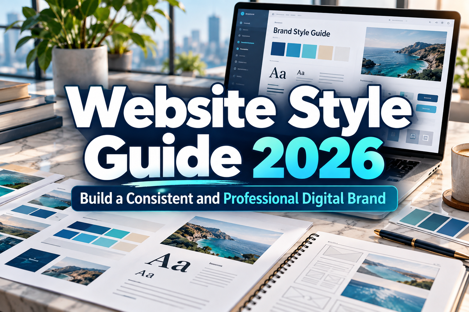
Website Style Guide 2026: The Foundation of Consistent Digital Branding
A professional website is not created page by page without rules. It is built from a system.
That system is defined through a website style guide, a practical reference that explains how the brand should look, communicate, and behave across digital interfaces. It helps designers, developers, marketers, writers, and other stakeholders make consistent decisions without reinventing the visual language for every new page.
In 2026, websites often expand across product pages, landing pages, blogs, dashboards, ecommerce interfaces, mobile layouts, and campaign microsites. Without shared standards, that growth can quickly create inconsistent typography, colors, buttons, spacing, imagery, and messaging.
A strong website style guide 2026 turns brand identity into repeatable design rules.
Initial Suggestion: Build the Guide Around Real Website Components
Do not create a style guide as an abstract branding document that nobody uses.
Begin by auditing actual website elements.
Review the homepage, navigation, forms, product pages, blog posts, buttons, cards, banners, footer, checkout, mobile interface, and any other recurring component. Identify inconsistencies and decide which patterns should become the standard.
For example, if three different blue colors are being used for primary buttons, the style guide should establish one approved primary color and define when secondary or neutral buttons should appear.
The goal is simple: when a new page is created, the team should already know how it should look and behave.
Define the Typography System
Typography is one of the strongest signals of brand personality.
A website style guide should specify the fonts used for headings, body copy, navigation, buttons, captions, labels, and other interface elements.
Do not stop at font names.
Define:
- font family,
- font weight,
- font size,
- line height,
- letter spacing,
- heading hierarchy,
- paragraph width,
- mobile behavior.
For example, a brand might use a distinctive display font for H1 and H2 headings while using a highly readable sans serif for body text and UI controls.
That combination allows personality without sacrificing usability.
Brands looking for more distinctive digital typography can explore PutraCetol Studio for display, serif, script, retro, experimental, and branding-focused fonts. The important point is to use those typefaces consistently and pair expressive fonts with readable supporting typography where necessary.
Create a Clear Color System
A style guide should define more than a few brand colors.
Separate colors by function.
You may have:
Primary brand color
Secondary brand color
Accent color
Background colors
Text colors
Border colors
Success states
Warning states
Error states
This makes the system easier to use.
Instead of telling designers to “use green,” define exactly which green represents success and which one belongs to the brand identity.
Also consider accessibility.
Text should remain readable against its background, interactive states should be clear, and important information should not depend entirely on color.
A visually consistent website feels more professional because users learn what each color means.
Standardize Layout and Spacing
Inconsistent spacing is one of the easiest ways to make a website feel unfinished.
A website style guide should define a spacing scale used for margins, padding, section gaps, cards, buttons, and forms.
For example, a team might use:
8px
16px
24px
32px
48px
64px
The exact values matter less than consistency.
The same principle applies to containers and grids.
Define maximum content width, number of columns, gutter sizes, section spacing, and breakpoint behavior. This gives designers and developers a predictable structure for desktop, tablet, and mobile layouts.
A clear layout system also reduces design time because teams are not constantly debating how much space each element should receive.
Document Buttons, Forms, and UI Components
A modern website style guide should include interface components, not only visual branding.
Document how primary buttons, secondary buttons, text links, input fields, dropdowns, checkboxes, cards, notifications, modals, and other components should look and behave.
Each component should include different states when relevant:
default, hover, focus, active, disabled, error, and success.
This is particularly important for ecommerce websites, SaaS platforms, and other interactive products.
Consistency helps users understand the interface faster. If every primary action looks the same throughout the website, users quickly learn what is clickable and what matters most.
Define Image and Illustration Direction
Photography and illustration should also follow recognizable rules.
A fashion brand might use high-contrast editorial photography, while a technology startup may use clean product screenshots and minimal 3D illustrations.
The style guide can specify:
image composition,
background treatment,
lighting direction,
cropping style,
corner radius,
illustration style,
icon treatment.
This prevents the website from feeling like a collection of unrelated assets.
If AI-generated imagery is used, the style guide becomes even more important. Define prompts, visual characteristics, color palettes, camera perspective, and editing rules so AI-generated content still looks like it belongs to the same brand.
Include Tone of Voice
Website consistency is not only visual.
The way a brand writes should also follow a recognizable style.
Define whether the brand voice is professional, conversational, playful, technical, premium, educational, or another combination.
Then provide practical rules.
For example:
Use short, direct sentences.
Avoid unnecessary jargon.
Explain technical concepts in simple language.
Use active voice for calls to action.
Keep error messages helpful rather than robotic.
A button saying “Start Your Project” and another saying “Execute Submission Process” may perform the same function, but they communicate very different brand personalities.
Visual design and writing should support each other.
Make Accessibility Part of the Style Guide
Accessibility should not be treated as a separate document that designers consult only at the end of a project.
Include it directly in the design system.
Document minimum text sizes, color contrast expectations, keyboard focus states, link styling, form labels, error messaging, alternative text guidelines, and responsive behavior.
A beautiful interface that becomes difficult to read or navigate for part of the audience is not a strong design system.
Accessibility rules also improve consistency because teams know in advance how interactive elements should behave.
Comparison: Without vs. With a Website Style Guide
| Area | Without Style Guide | With Style Guide |
|---|---|---|
| Typography | Different fonts and sizes | Defined hierarchy |
| Colors | Random variations | Consistent functional palette |
| Layout | Different spacing per page | Shared grid and spacing |
| Buttons | Multiple unrelated styles | Standard component states |
| Imagery | Mixed visual directions | Consistent art direction |
| Content | Inconsistent tone | Defined brand voice |
| Development | Repeated decisions | Reusable components |
| Branding | Fragmented | Recognizable and scalable |
A good style guide reduces unnecessary decisions while making future website development faster.
Common Mistakes When Creating a Website Style Guide
One common mistake is making the guide too complicated. A 100-page document may look impressive but becomes useless if the team cannot quickly find practical rules. Start with the elements that appear most often: typography, colors, spacing, buttons, forms, imagery, and voice. Add complexity only when the website genuinely requires it.
Another mistake is documenting styles without explaining how they should be used. Showing six colors does not tell a designer which one belongs to primary actions. Listing five font weights does not explain which weight should be used for navigation or headings. A useful guide combines visual specifications with clear usage rules.
Finally, avoid treating the style guide as permanent. Websites evolve, brands expand, and new components appear. Review the guide whenever the design system changes and remove outdated patterns. The document should represent the current website, not an earlier version of the brand.
Conclusion
A strong website style guide 2026 transforms branding from a collection of visual preferences into a repeatable digital system.
Typography, colors, layout, spacing, imagery, UI components, accessibility, and tone of voice should all work together to create a recognizable experience.
For growing businesses, the benefit is not simply visual consistency. A clear style guide speeds up design, reduces development confusion, improves collaboration, and makes future website expansion easier.
Start with the elements users interact with most, define practical rules, and maintain the guide as the website evolves. When the system is clear, every new page can feel like part of the same brand.
Explore these fonts and many more at PutraCetol.com to build a business identity that looks professional, trustworthy, and memorable.
Additionally, if you want to explore some free typography options, you can check out Putracetol Studio on Dafont. Happy reading and designing!