
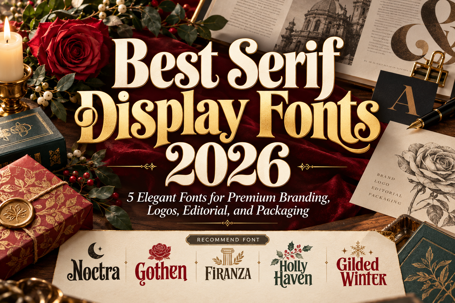
Best Serif Display Fonts 2026 for Elegant Modern Branding
Serif typography continues to play an important role in premium branding because it can communicate heritage and sophistication without forcing a design to feel old-fashioned.
Modern display serifs take that foundation much further.
They introduce dramatic contrast, unusual curves, condensed proportions, decorative terminals, or stronger silhouettes that allow typography to become the primary visual element rather than simply supporting the layout.
The best serif display fonts 2026 are particularly effective for logos, fashion campaigns, packaging, magazine covers, beauty branding, wedding materials, and website hero sections where first impressions matter.
The key is choosing a serif whose personality matches the brand rather than assuming every serif automatically communicates luxury.
Choose Personality Before Elegance
Start by deciding what kind of sophistication the project needs.
A fashion magazine might need tall editorial lettering. A perfume brand may benefit from more restrained classical proportions, while seasonal packaging can support warmer curves and decorative details.
Then test the actual brand name.
Display serifs often contain unusual shapes that become much more noticeable in large typography. Check spacing, letter combinations, uppercase forms, and the complete word silhouette before building the identity around the font.
For long paragraphs, pair the display serif with a quieter text family. Let the expressive typeface handle the moments that deserve attention.
Jump to Recommended Serif Display Fonts
1. Noctra Display Font

Noctra is the most dramatic option in this collection. Its tall proportions, thick strokes, controlled contrast, rounded terminals, organic curves, and slight irregularities create a bold silhouette with a theatrical personality. Decorative serif details add individuality while the spacing keeps large headlines reasonably clear.
Although PutraCetol positions Noctra strongly toward playful dark and seasonal themes, its exaggerated forms can also work for brands that deliberately want unconventional, memorable typography rather than traditional luxury.
PROS: Dramatic curves, strong visual weight, tall proportions, memorable character.
BEST FOR: Statement logos, entertainment branding, posters, creative packaging, dark editorial concepts.
2. Gothen Serif Font

Gothen offers a more refined direction. Its condensed proportions allow longer names and headlines to occupy less horizontal space while maintaining an elegant display character. PutraCetol has positioned Gothen for fashion branding, editorial layouts, premium logos, luxury concepts, publishing, and packaging.
That combination of narrow structure and classic serif styling makes Gothen especially useful for vertical packaging panels and magazine compositions where typography needs presence without becoming excessively wide.
PROS: Condensed structure, elegant proportions, efficient headline width, strong editorial versatility.
BEST FOR: Fashion, luxury packaging, editorial covers, premium logos, romantic branding.
3. Firanza Display Classic Serif Font
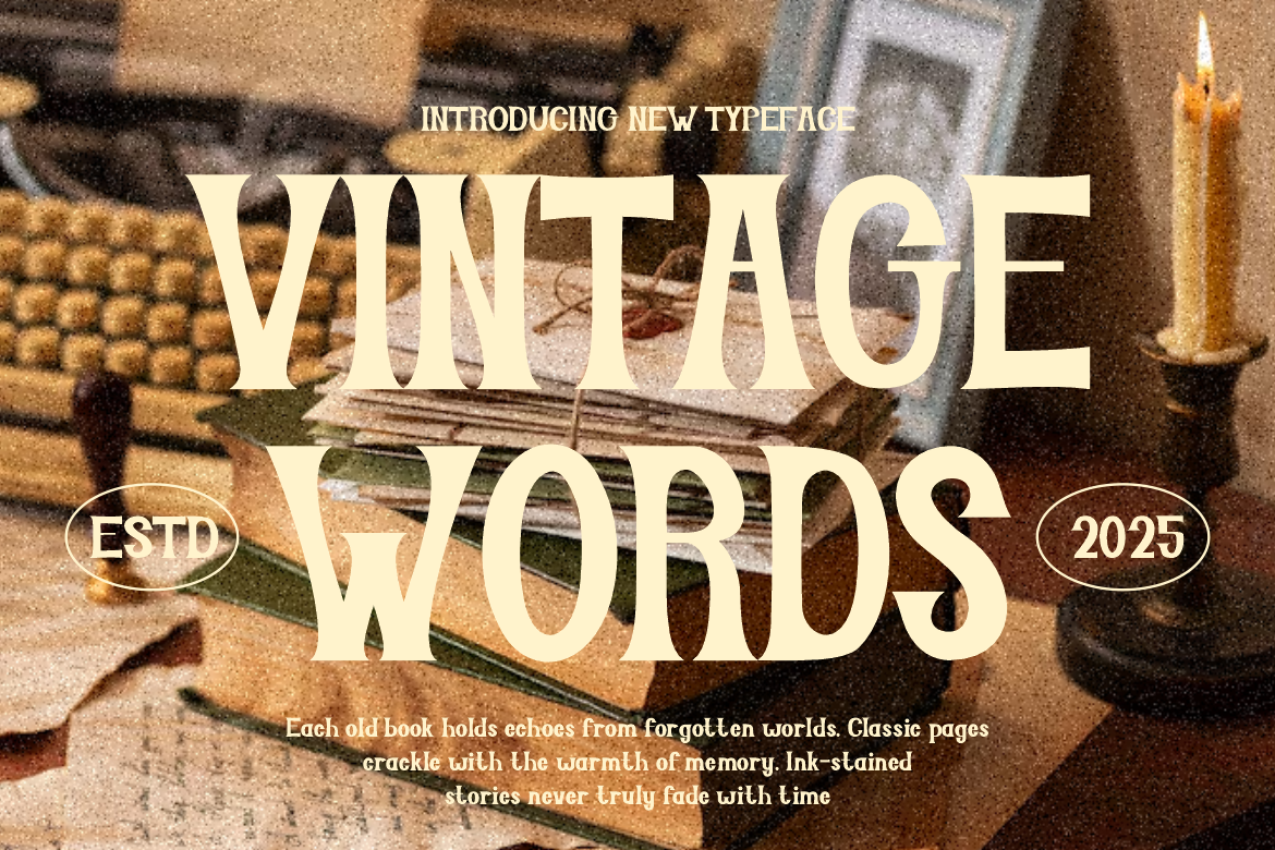
Firanza combines classic serif principles with a more contemporary finish. Its clean structure and elegant proportions create sophistication without relying on excessive ornamentation, making it easier to integrate into professional branding systems. PutraCetol also highlights refined ligatures and its suitability for fashion, cultural publishing, branding, advertising, and print applications.
This is one of the strongest choices when a brand wants timeless elegance rather than a highly stylized visual theme.
PROS: Classic-modern balance, refined proportions, ligatures, broad commercial versatility.
BEST FOR: Premium branding, fashion, editorial design, cultural projects, sophisticated packaging.
4. Holly Haven Serif Display Font

Holly Haven combines bold construction with a softer decorative personality. Its smooth curves, slightly tapered strokes, balanced thick-to-thin contrast, tall proportions, and gentle serif details produce an elegant rhythm that still feels welcoming rather than formal.
The font has a strong seasonal identity, particularly around Christmas and New Year themes, but its structure also makes it useful for brands that want warmth, celebration, and classic personality in headline-driven layouts.
PROS: Graceful tall forms, smooth curves, balanced contrast, friendly decorative character.
BEST FOR: Seasonal branding, gift packaging, invitations, cafés, event graphics, greeting products.
5. Gilded Winter Serif Display Font

Gilded Winter takes a warmer vintage-classic approach. Its tall letterforms use confident vertical stress, moderate contrast, slightly flared serifs, rounded curves, and crisp terminals. The result feels traditional and established while retaining enough softness to avoid becoming overly formal.
Its handcrafted quality is particularly effective for brands built around storytelling, tradition, celebration, hospitality, or artisanal products.
PROS: Strong vertical rhythm, classic flared serifs, vintage warmth, cohesive uppercase and lowercase forms.
BEST FOR: Heritage branding, bakeries, cafés, gift products, seasonal packaging, traditional editorial design.
Comparison: Which Serif Display Font Fits Your Brand?
| Font | Main Personality | Strongest Direction |
|---|---|---|
| Noctra | Dramatic, expressive | Creative statement branding |
| Gothen | Condensed, elegant | Fashion and editorial |
| Firanza | Refined, timeless | Premium modern branding |
| Holly Haven | Warm, decorative | Seasonal and event design |
| Gilded Winter | Classic, nostalgic | Heritage and artisanal branding |
For broad premium branding, Firanza is the most versatile. Gothen works better when editorial elegance and space efficiency matter. Noctra provides stronger personality, while Holly Haven andGilded Winter bring warmer, more traditional character.
How to Use Display Serifs Effectively
Display serifs benefit from scale and whitespace.
Use them prominently for logos, hero headlines, packaging names, editorial titles, and campaign messages. Avoid surrounding them with too many competing decorative elements.
Modern photography and restrained layouts can also make classical serif forms feel contemporary. Designers can explore these fonts through PutraCetol Studio and build consistent identities across packaging, social campaigns, websites, advertising, and printed materials.
Common Mistakes
A common mistake is assuming every serif automatically creates luxury. Serif construction can communicate many moods, including playful, historical, dramatic, academic, rustic, or festive. Evaluate the actual proportions, stroke contrast, terminals, and rhythm rather than choosing purely by category.
Another mistake is using an expressive display serif for every piece of text. A beautiful headline font may become uncomfortable in long descriptions, ingredient lists, navigation, or mobile interfaces. Use display typography selectively and pair it with a simpler supporting typeface.
Finally, avoid adding unnecessary effects before evaluating the letterforms themselves. Heavy shadows, metallic gradients, outlines, and textures can quickly overpower sophisticated typography. Start with scale, spacing, contrast, and composition first.
Conclusion
The best serif display fonts 2026 offer very different interpretations of premium typography.
Noctra creates dramatic impact, Gothen delivers condensed editorial elegance, Firanza provides timeless refinement, Holly Haven introduces decorative warmth, and Gilded Winter adds classic nostalgic authority.
The strongest choice is not necessarily the most luxurious-looking font. It is the one whose proportions, contrast, and personality reinforce the identity the brand wants audiences to remember.
Explore these fonts and many more at PutraCetol.com to build a business identity that looks professional, trustworthy, and memorable.
Additionally, if you want to explore some free typography options, you can check out Putracetol Studio on Dafont. Happy reading and designing!