
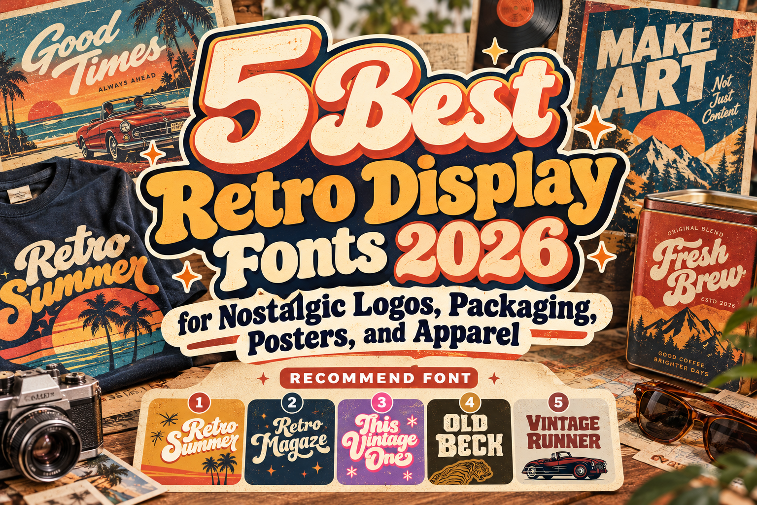
Best Retro Vintage Display Fonts 2026 for Nostalgic Branding
Retro typography remains powerful because nostalgia can create an emotional connection before audiences fully process the message.
Rounded scripts can recall 1970s advertising. Rough textures suggest old printed posters, while chunky serif forms reference vintage storefronts, sports graphics, and classic product labels. Used carefully, these influences can make contemporary branding feel warmer and more distinctive.
The best retro vintage display fonts 2026 do more than imitate typography from the past. They combine recognizable historical references with modern flexibility, allowing designers to build logos, packaging, posters, merchandise, and digital campaigns that still feel relevant today.
The five PutraCetol fonts below approach retro design differently, from luxury-inspired script lettering to muscular motorsport typography.
Choose a Specific Kind of Nostalgia
“Retro” covers several decades and visual cultures.
A 1960s-inspired food brand should not necessarily use the same typography as a vintage racing event. Likewise, a groovy fashion campaign needs a different personality from a heritage coffee package.
Start by defining the mood: playful, luxurious, handcrafted, sporty, groovy, or rugged.
Then test the font with the actual brand name. Display typography depends heavily on word shape, so alternates, swashes, spacing, and letter combinations can completely change the result.
Jump to Recommended Retro Vintage Display Fonts
1. Retro Summer

Retro Summer combines vintage script lettering with a more polished, aesthetic character. Its bold connected forms are designed to work across retro, vintage, and luxury-oriented projects, while clean and rough versions allow designers to choose between polished branding and a more weathered nostalgic finish. The family also includes OpenType alternates and ligatures for customized lettering.
That flexibility makes Retro Summer especially useful when nostalgia needs to feel stylish rather than heavily distressed.
PROS: Clean and rough versions, alternates, ligatures, strong script personality.
BEST FOR: Fashion branding, summer campaigns, apparel, posters, packaging, lifestyle logos.
2. Retro Magaze Vintage Bold Script
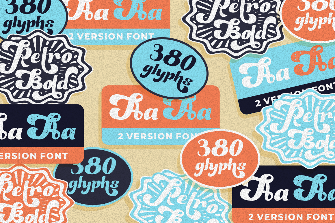
Retro Magaze delivers a heavier and friendlier interpretation of vintage script. Its rounded, fluid letters have slightly irregular shapes that create a handmade character, while more than 380 glyphs provide numerous ligatures, alternates, and swashes for customizing logos and display compositions.
Its substantial weight gives it excellent presence on packaging and promotional graphics without losing the energetic movement expected from retro script lettering.
PROS: Bold rounded construction, extensive glyph set, swashes, playful vintage rhythm.
BEST FOR: Food brands, cafés, packaging, posters, apparel, friendly retro identities.
3. This Vintage One
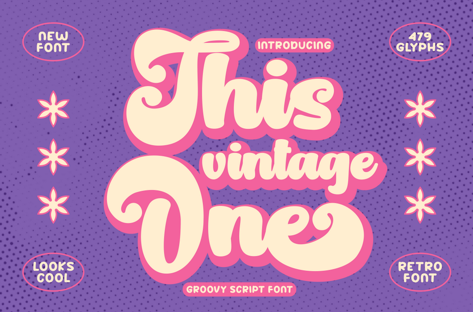
This Vintage One pushes retro script toward a more dramatic and decorative direction. Its thick lettering, large swashes, natural irregularities, and numerous alternative characters create the kind of expressive silhouette associated with bold 1970s-inspired branding. PutraCetol also highlights its handcrafted, casual quality, which gives the font warmth rather than formal vintage elegance.
It works particularly well when the lettering itself needs to become the main illustration.
PROS: Dramatic thickness, large swashes, many alternates, distinctive handcrafted personality.
BEST FOR: Retro logos, merchandise, music artwork, posters, invitations, lifestyle branding.
4. Old Beck Display Vintage Retro Serif
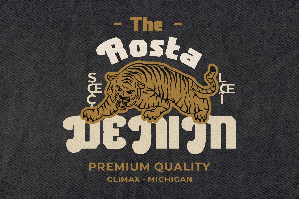
Old Beck provides a different alternative to script-heavy retro branding. This bold serif combines classic structure with groovy letter endings, giving it a strong 1960s and 1970s display personality. It is available in both clean and rough versions, allowing the same underlying typography to work in polished campaigns or more distressed vintage compositions.
Its serif structure makes Old Beck particularly useful when a brand needs nostalgia but still wants a solid, headline-driven appearance.
PROS: Bold serif construction, groovy terminals, clean and rough versions, excellent headline presence.
BEST FOR: Editorial covers, labels, posters, fashion campaigns, beverage branding, signage.
5. Vintage Runner Display Retro Sport Font

Vintage Runner combines retro display typography with old-school athletic and motorsport energy. Its thick, chunky characters use wide proportions, rounded corners, muscular curves, and irregular internal cuts, creating a dense silhouette suited to badges, emblems, merchandise, and high-impact titles. PutraCetol positions it particularly well for racing, automotive, sports, garage culture, and vintage commercial branding.
This makes Vintage Runner the strongest choice in the collection when nostalgia needs to feel energetic rather than decorative.
PROS: Broad silhouette, heavy visual weight, rounded readability, strong emblem potential.
BEST FOR: Motorsport, sportswear, garages, racing events, badges, merchandise, automotive branding.
Comparison: Which Retro Font Fits Your Project?
| Font | Main Retro Direction | Strongest Application |
|---|---|---|
| Retro Summer | Stylish retro script | Lifestyle and fashion |
| Retro Magaze | Friendly bold script | Food and packaging |
| This Vintage One | Decorative 70s script | Posters and merchandise |
| Old Beck | Groovy vintage serif | Editorial and labels |
| Vintage Runner | Retro sport display | Motorsport and apparel |
Choose Retro Summer for polished nostalgia, Retro Magaze for friendly commercial branding, This Vintage One when expressive lettering should dominate, Old Beck for a structured groovy serif, and Vintage Runner for athletic or automotive energy.
Making Retro Typography Feel Contemporary
The easiest way to modernize vintage typography is to keep the surrounding design disciplined.
Combine expressive lettering with clean grids, generous whitespace, contemporary photography, and a restrained palette. Instead of adding faded textures, retro illustrations, shadows, borders, and multiple decorative fonts simultaneously, allow one nostalgic element to carry the concept.
These fonts from PutraCetol Studio can be extended across logos, packaging, social graphics, merchandise, posters, editorial covers, and promotional campaigns so the vintage personality remains consistent across the brand.
Common Mistakes
A common mistake is treating every retro font as interchangeable. A rounded 1970s script communicates something very different from an old motorsport display face. Consider the era, industry, audience, and emotional tone before selecting the typeface.
Another mistake is using highly expressive display fonts for long text. Retro scripts and decorative serifs are strongest in logos, headlines, labels, and short statements. Pair them with a simpler supporting family for descriptions and functional information.
Finally, avoid adding excessive vintage effects. Rough textures, halftones, shadows, outlines, and faded colors can strengthen a concept, but using all of them together often makes contemporary branding look like a historical imitation rather than a modern interpretation.
Conclusion
The best retro vintage display fonts 2026 show how varied nostalgic typography can be.
Retro Summer brings stylish script energy, Retro Magaze feels bold and friendly, This Vintage One creates dramatic 1970s personality, Old Beck delivers groovy serif structure, and Vintage Runner adds muscular sports nostalgia.
Explore these fonts through PutraCetol Studio, test them with your real brand name, and combine their historical character with modern layouts.
The goal is not simply to recreate the past. Great retro branding borrows its emotional appeal and gives it a fresh visual purpose.
Explore these fonts and many more at PutraCetol.com to build a business identity that looks professional, trustworthy, and memorable.
Additionally, if you want to explore some free typography options, you can check out Putracetol Studio on Dafont. Happy reading and designing!