

Separate Expression From Interface Reading
The best luxury digital fonts do not need to appear everywhere. Use a distinctive serif or signature font for the logo, homepage hero, collection title, and editorial storytelling. Pair it with a restrained sans serif for navigation, product details, forms, prices, and checkout.
This balance lets the display font communicate exclusivity while the supporting family protects clarity. Always test mobile layouts, because delicate strokes, long swashes, and condensed forms can lose definition when reduced.
What Makes Digital Typography Feel Luxurious?
Luxury typography feels intentional rather than crowded. Refined contrast, graceful proportions, careful spacing, and generous white space can create prestige without relying on gold effects or excessive animation.
Choose one memorable typeface for recognition, then establish hierarchy through scale, weight, and placement. Sophistication usually comes from restraint.
Jump to Recommended Fonts
Veloria Palace | Elarion | Rosy Meadow | Velisse | Final Parade | Graceluxe
1. Veloria Palace Classic Serif Font

Veloria Palace uses tall, condensed forms, strong contrast, and a graceful vertical rhythm. It gives digital headlines a stately identity while using horizontal space efficiently.
PROS: Elegant, space-efficient, authoritative.
BEST FOR: Luxury hotels, cosmetics, jewelry, and editorial landing pages.
2. Elarion Elegant Serif Font

Elarion combines tall letterforms, refined contrast, graceful curves, and soft terminals. Its polished construction suits brands that need calm authority rather than loud decoration.
PROS: Refined, artistic, composed.
BEST FOR: Architecture, fashion, premium food, and cultural branding.
3. Rosy Meadow Handwritten Font
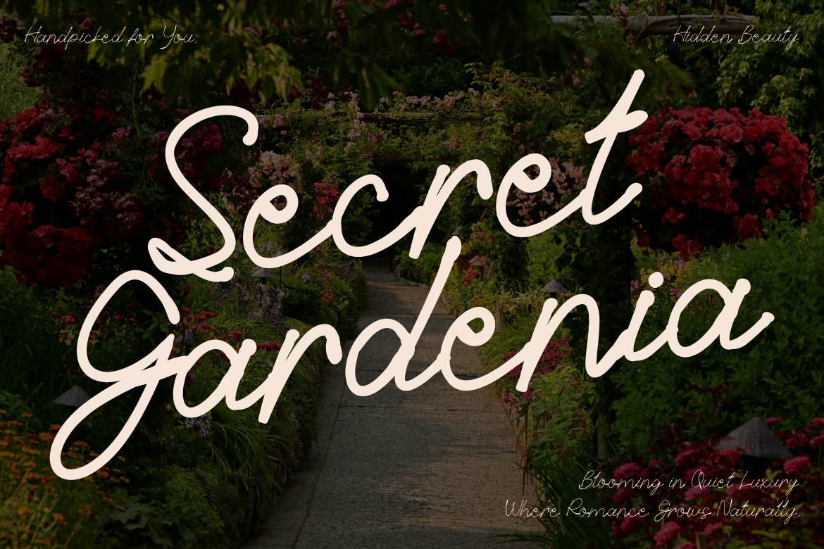
Rosy Meadow uses light monoline strokes, rounded turns, natural connections, and long swashes. Its airy rhythm adds a personal voice to premium digital storytelling.
PROS: Warm, romantic, human.
BEST FOR: Beauty, florists, weddings, boutique gifts, and personal brands.
4. Velisse Feminine Serif Font
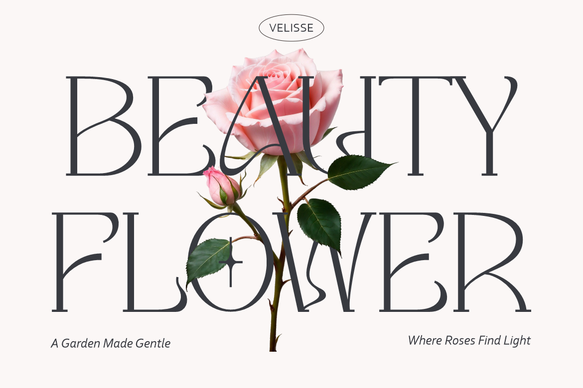
Velisse balances decorative charm with professional clarity through tall proportions, smooth curves, and controlled contrast. It feels feminine without becoming fragile.
PROS: Soft, polished, versatile.
BEST FOR: Skincare, fashion, lifestyle, and premium social content.
5. Final Parade Luxury and Elegant Font Duo
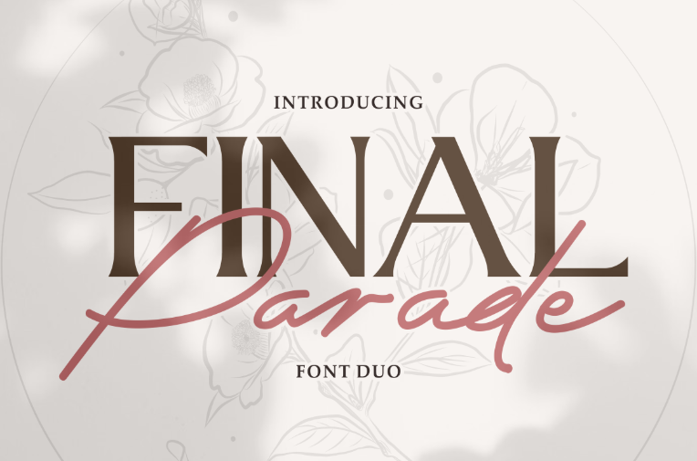
Final Parade pairs a commanding luxury serif with a signature style featuring long swashes. The duo creates hierarchy while keeping headlines and accents visually coordinated.
PROS: Built-in pairing, strong contrast, flexible.
BEST FOR: Fashion launches, invitations, packaging campaigns, and boutique websites.
6. Graceluxe Luxury Signature Font
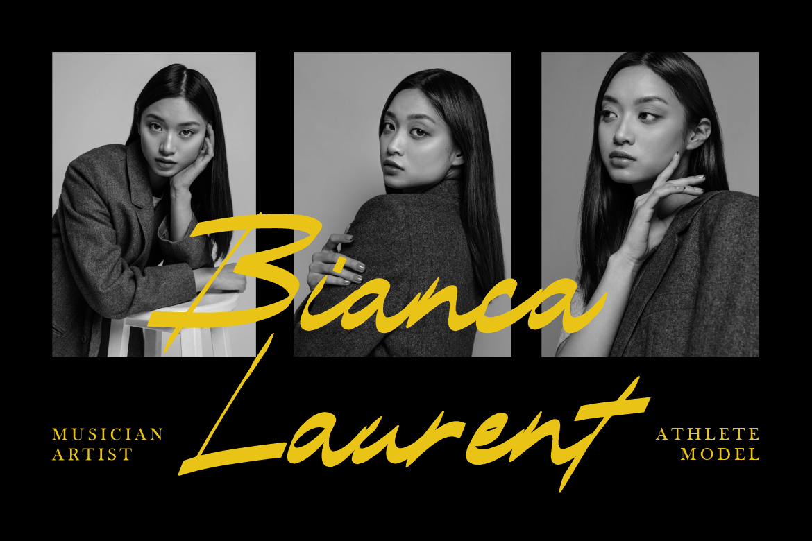
Graceluxe has a slightly slanted, confident handwritten form with bold yet graceful connections. It adds exclusivity to short, high-value brand moments.
PROS: Expressive, confident, exclusive.
BEST FOR: Designer logos, photography, beauty, hospitality, and premium campaigns.
Comparison
| Font | Main Character | Strongest Digital Role |
|---|---|---|
| Veloria Palace | Stately condensed serif | Hero headlines |
| Elarion | Calm elegant serif | Editorial storytelling |
| Rosy Meadow | Light handwritten script | Personal accents |
| Velisse | Feminine modern serif | Beauty campaigns |
| Final Parade | Serif and signature duo | Campaign hierarchy |
| Graceluxe | Bold luxury signature | Logos and signatures |
Common Mistakes
The first mistake is using a luxury font for every interface element. High-contrast serifs and signatures may look beautiful in a hero section but become tiring in menus, filters, forms, or specifications. Give expressive typography a focused role and use a functional companion for repeated reading.
Another mistake is assuming thin lettering, wide spacing, and gold color automatically create luxury. When hierarchy is weak or mobile text is difficult to read, the experience feels decorative rather than premium. Test contrast, line breaks, loading performance, and small-size clarity before approval.
The final mistake is overlooking licensing. Static campaign graphics, live webfont embedding, registered logos, apps, and customer-editable platforms are different uses. Select PutraCetol coverage that matches the real website, trademark, advertising, or software implementation.
Conclusion
Luxury digital fonts translate exclusivity into screens through proportion, rhythm, hierarchy, and personality. Veloria Palace and Elarion offer serif authority, Velisse adds softer elegance, Rosy Meadow and Graceluxe create a personal signature voice, and Final Parade provides a coordinated campaign system.
Use these PutraCetol Studio fonts where identity matters most, then support them with readable interface typography. A luxury digital experience should not merely look expensive. It should feel clear, considered, and memorable.
Explore these fonts and many more at PutraCetol.com to build a business identity that looks professional, trustworthy, and memorable.
Additionally, if you want to explore some free typography options, you can check out Putracetol Studio on Dafont. Happy reading and designing!