
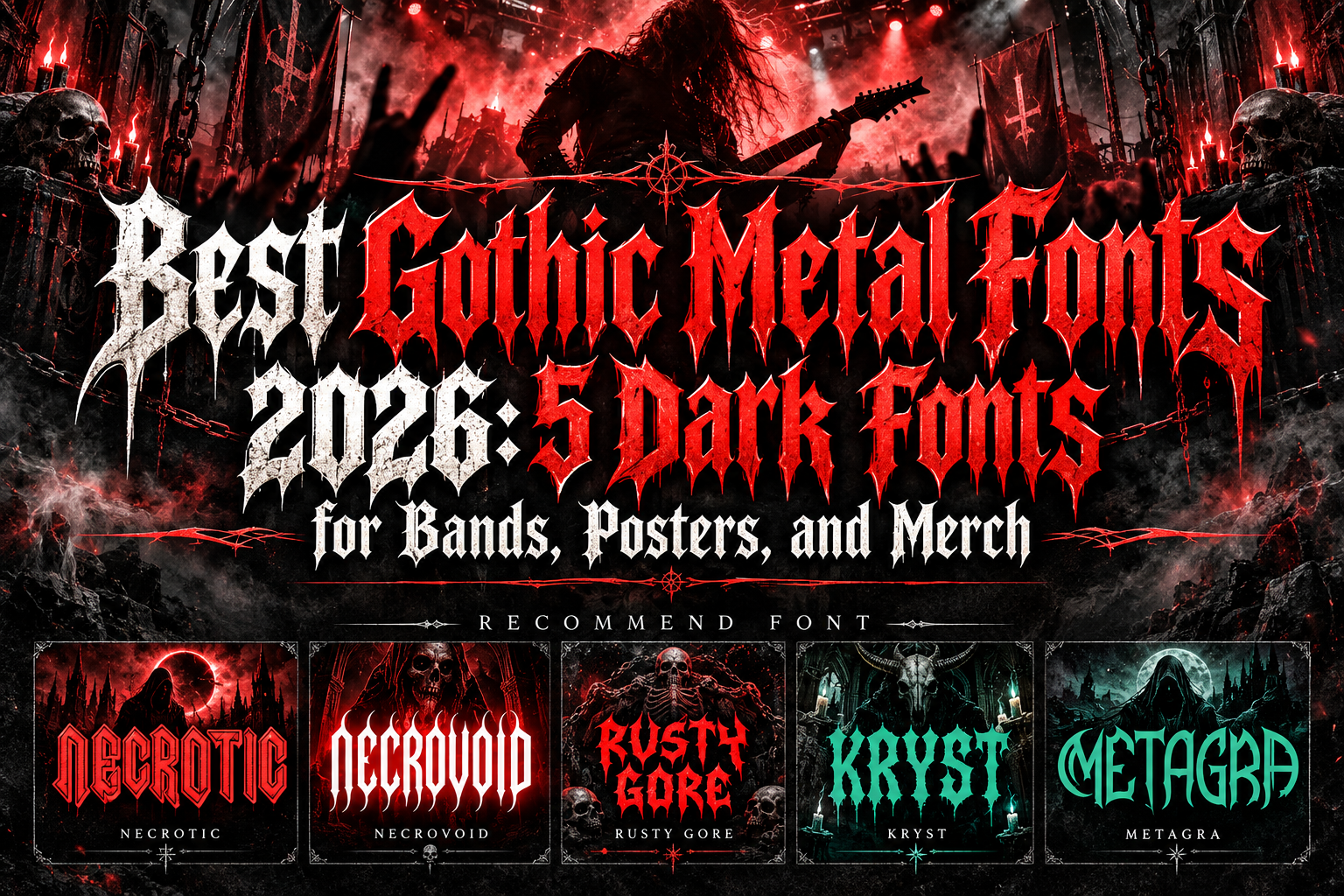
Best Gothic Metal Fonts 2026 for Dark and Aggressive Branding
Gothic and metal typography is designed to do something ordinary type rarely attempts: create atmosphere before the audience has even read the words.
Sharp terminals can suggest danger. Tall blackletter structures evoke medieval darkness. Distorted strokes communicate chaos, while narrow aggressive silhouettes immediately connect with underground music culture.
The best gothic metal fonts 2026 use these qualities to build identities that feel dramatic, rebellious, mysterious, and unmistakably visual.
These fonts are especially useful for metal bands, concert organizers, alternative fashion labels, tattoo studios, horror projects, fantasy games, and artists who need typography to become part of the artwork itself.
The key is choosing the right level of aggression. A death-metal logo and a gothic fantasy title may both be dark, but they should not necessarily use the same visual language.
Decide How Extreme the Typography Should Feel
Before selecting a metal font, consider where people will see it.
Album artwork and oversized merchandise can support elaborate letterforms because viewers have time to explore the details. Festival schedules, event information, social thumbnails, and packaging need more immediate recognition.
A good dark identity often uses one expressive metal font as the focal point and a simpler supporting typeface for dates, track lists, descriptions, prices, or navigation.
This keeps the design intense without sacrificing usability.
Jump to Recommended Gothic Metal Fonts
1. Necrotic Heavy Metal Font

Necrotic is a strong starting point for designers who want an unmistakable heavy-metal identity with greater stylistic variety. The family includes multiple variations, allowing creators to explore different treatments of the same underlying metal aesthetic rather than depending on one fixed appearance. PutraCetol classifies the design within its Horror and Blackletter collection, while external font listings confirm a family containing ten styles.
That flexibility makes Necrotic especially valuable for building a complete campaign where album titles, tour graphics, merchandise, and secondary artwork should feel connected without being identical.
PROS: Multiple styles, strong heavy-metal identity, flexible display system, effective for large typography.
BEST FOR: Metal bands, album covers, tour branding, festival posters, merchandise, horror visuals.
2. Necrovoid Heavy Metal Font
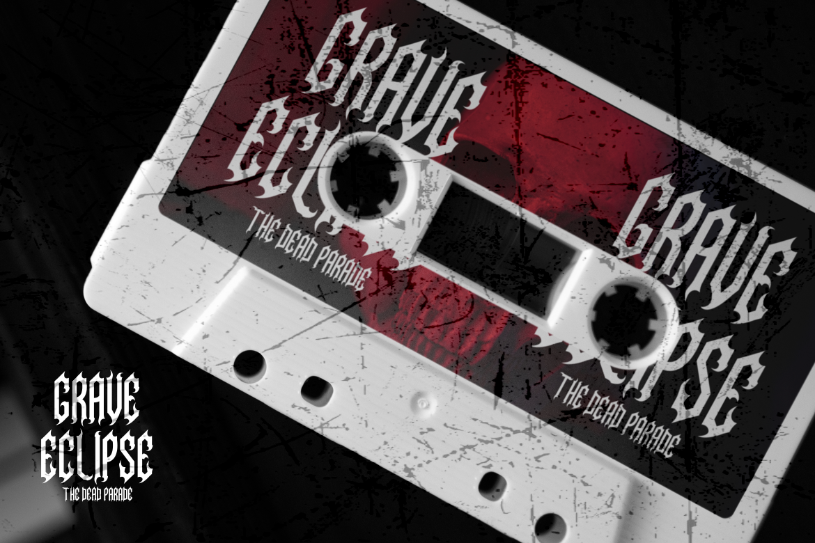
Necrovoid pushes deeper into razor-edged gothic territory. PutraCetol describes it with sharp edges and gothic influences designed to communicate rebellion, strength, and the darker character associated with metal music. Its expressive letterforms are intended for bold statements rather than quiet supporting typography.
Because its personality is immediately recognizable, Necrovoid can turn relatively simple layouts into distinctive visual identities without requiring excessive additional decoration.
PROS: Razor-sharp styling, gothic influence, aggressive presence, strong logo potential.
BEST FOR: Black metal branding, band logos, poster headlines, album artwork, edgy merchandise.
3. Rusty Gore Metal Font

Rusty Gore is the most brutal and chaotic option in this selection. Its sharp, jagged, spiked forms combine extreme-metal energy with gothic-inspired curves, creating a raw visual language suited to heavier genres and horror-oriented design. PutraCetol specifically positions it for heavy metal, death metal, band logos, album covers, underground branding, festival graphics, merchandise, game projects, and horror titles.
The design is especially effective when the typography should feel dangerous, distressed, or deliberately uncomfortable rather than conventionally polished.
PROS: Jagged construction, intense spikes, extreme-metal character, immediate visual aggression.
BEST FOR: Death metal, horror posters, underground events, extreme sports, tattoo branding, dark games.
4. Kryst Gothic Font
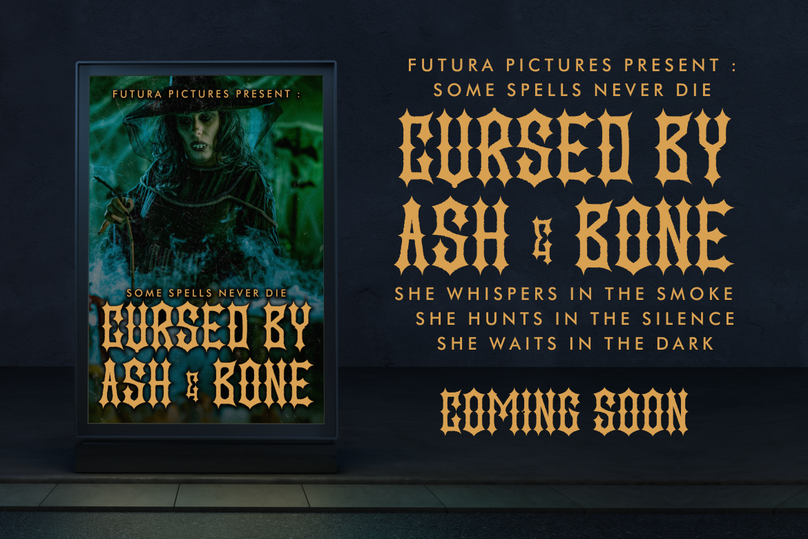
Kryst offers a more disciplined gothic approach. Its letterforms are tall and narrow with strong vertical emphasis, angular cuts, pointed terminals, and relatively tight spacing. The result feels aggressive but structured, giving it a commanding black-metal personality while maintaining clearer word shapes than highly distorted extreme-metal lettering.
This balance makes Kryst particularly useful when a project needs authentic darkness but still requires the title or brand name to remain visually identifiable.
PROS: Tall narrow proportions, sharp terminals, strong gothic rhythm, comparatively controlled readability.
BEST FOR: Gothic branding, black metal, occult artwork, book covers, dark editorial design, event posters.
5. Metagra Metal Font

Metagra combines tall, narrow proportions with sharp inner cuts, elongated spines, claw-like terminals, and pointed contours. Its slim structure creates strong vertical movement, while slight irregularities introduce a handcrafted underground quality without completely destroying clarity. PutraCetol describes it as suitable for heavy music culture, rock branding, black-metal artwork, dark merchandise, film titles, and Halloween-oriented projects.
Metagra therefore works particularly well when designers want aggressive metal styling with a slightly cleaner and more contemporary silhouette.
PROS: Tall dramatic construction, claw-like details, relatively clean structure, strong dark identity.
BEST FOR: Band logos, apparel, album covers, rock posters, horror campaigns, dark fantasy titles.
Comparison: Which Gothic Metal Font Fits Your Project?
| Font | Main Character | Strongest Direction |
|---|---|---|
| Necrotic | Varied, heavy metal | Complete music branding |
| Necrovoid | Razor-sharp gothic | Band logos and posters |
| Rusty Gore | Brutal and chaotic | Death metal and horror |
| Kryst | Structured gothic | Black metal and dark fantasy |
| Metagra | Tall and spiked | Modern metal branding |
Choose Rusty Gore when maximum aggression matters. Kryst is stronger for a more controlled gothic mood, while Metagra provides a tall contemporary metal silhouette. Necrovoid delivers sharp traditional metal energy, and Necrotic is particularly useful when multiple related styles are valuable across a larger campaign.
How to Use Gothic Metal Typography Effectively
Dark typography works best when the surrounding composition gives it enough space.
Large band names can be paired with atmospheric photography, textured backgrounds, monochrome palettes, metallic finishes, or restrained red accents. For merchandise, test the design in one color before adding effects because the underlying silhouette should remain strong on its own.
Designers can explore these fonts through PutraCetol Studio for album artwork, band identities, concert campaigns, apparel, entertainment graphics, and other alternative creative projects.
Common Mistakes
A common mistake is assuming the hardest-to-read font automatically looks more authentic. Extreme illegibility can work intentionally for specific underground genres, but it becomes a problem when audiences need to identify a festival name, game title, product, or new band quickly. Match readability to the purpose rather than treating distortion as a requirement.
Another mistake is combining several aggressive fonts in the same composition. Gothic letterforms already carry substantial visual information. Pairing an elaborate band logo with another highly decorative font for dates and supporting text often creates unnecessary competition. One dominant display font with a clean secondary family usually produces stronger hierarchy.
Finally, avoid relying entirely on textures, blood effects, scratches, flames, or metallic treatments to create a metal aesthetic. If the typography has a strong silhouette, those effects should reinforce it rather than compensate for a weak type choice.
Conclusion
The best gothic metal fonts 2026 offer different ways to communicate darkness and intensity.
Necrotic provides stylistic variety, Necrovoid brings razor-sharp gothic energy, Rusty Gore delivers brutal extreme-metal aggression, Kryst combines darkness with disciplined structure, and Metagra creates a tall, modern, spiked silhouette.
The right font should not simply look dark. It should reinforce the specific world your band, game, fashion label, event, or creative project wants audiences to enter.
Explore these fonts and many more at PutraCetol.com to build a business identity that looks professional, trustworthy, and memorable.
Additionally, if you want to explore some free typography options, you can check out Putracetol Studio on Dafont. Happy reading and designing!