
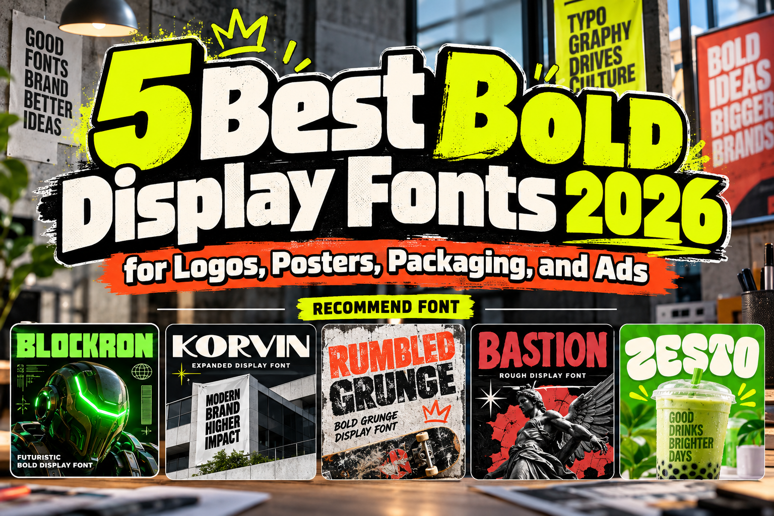
Best Bold General Display Fonts 2026 for Powerful Visual Branding
Bold typography has one fundamental advantage: it gets noticed quickly.
In branding, advertising, packaging, and social media, audiences often see a design for only a few seconds. A strong display typeface can establish hierarchy, communicate personality, and make the most important words visible before viewers process the rest of the composition.
The best bold general display fonts 2026 combine that immediate visibility with enough character to make a brand memorable.
However, bold does not mean every font communicates the same message. Wide geometric sans serifs can feel technological and confident, distressed fonts communicate grit, heavy serifs bring handcrafted authority, and rounded retro forms can create friendliness.
The five PutraCetol fonts below demonstrate how different bold typography can become.
Choose the Kind of Impact You Need
Before choosing the heaviest font available, define what “bold” should communicate.
A technology company may need precision and engineered geometry. An automotive brand might benefit from wide proportions, while a rock poster can support distressed texture. Food packaging may need something softer and more playful.
Also consider viewing distance.
Poster headlines, storefront signage, packaging names, social thumbnails, and website hero sections all benefit from strong silhouettes, but excessive detail can disappear when typography becomes small.
Use the display font for the message that deserves attention, then support it with a quieter typeface for functional information.
Jump to Recommended Bold Display Fonts
1. Blockron Industrial Tech Display Font

Blockron brings a highly engineered interpretation of bold display typography. Its blocky proportions, square construction, subtly rounded edges, consistent stroke weight, and angular structure create a strong mechanical rhythm. The result combines industrial solidity with a futuristic, cyber-influenced personality that looks intentionally designed rather than simply heavy.
This makes Blockron particularly effective when a brand needs to communicate technology, machinery, performance, or digital innovation.
PROS: Heavy geometric construction, strong square silhouette, futuristic personality, excellent headline authority.
BEST FOR: Technology brands, gaming, sci-fi projects, industrial packaging, film titles, electronics, digital campaigns.
2. Korvin Expanded Display Sans Font

Korvin uses expanded proportions rather than relying only on stroke thickness. Its wide structure, substantial weight, clean strokes, generous spacing, smooth curves, and selected angled cuts create a broad silhouette with modern authority. The expanded construction gives short words impressive horizontal presence while maintaining geometric clarity.
Korvin is especially useful when conventional condensed bold fonts feel too compressed or predictable.
PROS: Expanded proportions, geometric clarity, open spacing, bold visibility, contemporary details.
BEST FOR: Automotive branding, architecture, agencies, startups, fitness, corporate campaigns, large-scale headlines.
3. Rumbled Grunge Bold Vintage Texture Font
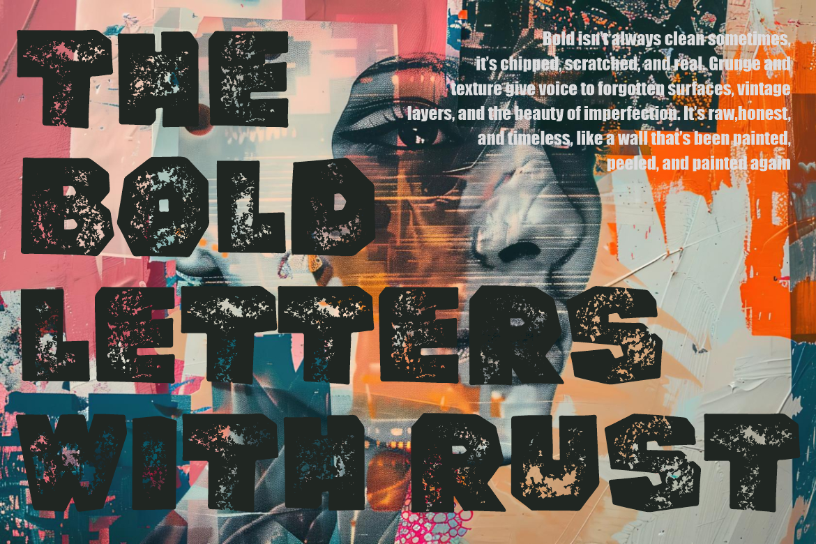
Rumbled Grunge takes bold typography in a deliberately rough direction. Its heavy block-like characters are covered with distressed textures inspired by worn paint, old posters, and weathered urban surfaces. Instead of hiding imperfections, the design uses them as the main visual feature, giving headlines an immediate rebellious and tactile quality.
This font works best when clean digital perfection would actually weaken the concept.
PROS: Strong distressed texture, heavy construction, immediate grunge identity, high-impact vintage character.
BEST FOR: Music artwork, streetwear, posters, retro fashion, movie titles, rebellious packaging, urban campaigns.
4. Bastion Serif Bold Font

Bastion introduces serif structure into this collection while retaining substantial display weight. Its tall, chunky proportions, thick stems, uneven strokes, organic edges, and textured surface create a hand-carved quality that feels rugged and physical. The serif details give the font a stronger historical or crafted association than a conventional heavy sans serif.
For branding, Bastion is particularly useful when strength needs to feel handcrafted rather than technological.
PROS: Bold serif structure, handmade texture, tall proportions, rugged personality, strong storytelling potential.
BEST FOR: Craft brands, adventure themes, vintage packaging, merchandise, film titles, posters, rustic products.
5. Zesto Bold Display Font

Zesto offers the most cheerful interpretation of bold typography in this selection. Its chunky rounded letters use thick strokes, soft corners, inflated curves, and decorative internal cuts that introduce movement without sacrificing the heavy silhouette. Wide, balanced proportions give titles confidence, while the retro-inspired forms keep the overall mood friendly and approachable.
That combination makes Zesto particularly effective for commercial branding that needs instant visibility without looking aggressive.
PROS: Chunky rounded construction, friendly retro energy, wide proportions, excellent shelf presence.
BEST FOR: Food packaging, cafés, beverages, snacks, dessert brands, posters, social campaigns, playful retail.
Comparison: Which Bold Display Font Fits Your Project?
| Font | Visual Direction | Strongest Use |
|---|---|---|
| Blockron | Industrial, futuristic | Technology and gaming |
| Korvin | Wide, modern, geometric | Corporate and automotive |
| Rumbled Grunge | Rough, distressed | Music and streetwear |
| Bastion | Rugged, handcrafted serif | Craft and heritage branding |
| Zesto | Rounded, playful retro | Food and lifestyle |
For maximum technological impact, choose Blockron. Korvin provides a cleaner and more versatile modern presence, while Rumbled Grunge works when texture should dominate. Bastion creates stronger handcrafted authority, and Zesto is the best fit for friendly, consumer-focused branding.
Making Bold Typography Work Across a Brand
Bold display fonts are most effective when they are given room to dominate.
Use them for logos, campaign hooks, package names, poster headlines, social graphics, advertising, and editorial covers. Pair them with simpler typography for descriptions, specifications, navigation, and longer text.
Designers can explore these fonts through PutraCetol Studio and test real brand names before committing to a final system. A font that looks excellent with a short sample word may behave very differently with a long company name.
Common Mistakes
A common mistake is assuming heavier typography automatically creates stronger branding. Weight creates visibility, but personality comes from proportion, spacing, curves, terminals, texture, and structure. A futuristic technology company and an artisanal coffee brand may both need bold typography, but they should not necessarily use the same typeface.
Another mistake is making every element bold. If the logo, headline, subtitle, body copy, button, and promotional message all have similar weight, there is no meaningful hierarchy. Allow the display typeface to dominate while supporting information stays visually quieter.
Finally, test bold fonts at real output sizes. Distressed textures may disappear in small digital graphics, while extremely wide fonts can become difficult on narrow layouts. Responsive branding sometimes requires adjusting size, tracking, line breaks, or companion typography rather than forcing one treatment everywhere.
Conclusion
The best bold general display fonts 2026 prove that strong typography can communicate very different personalities.
Blockron delivers cyber-industrial power, Korvin creates expansive modern authority, Rumbled Grunge adds raw distressed energy, Bastion brings handcrafted serif strength, and Zesto offers playful commercial impact.
The strongest font is not simply the thickest. It is the one whose shape, proportion, and personality make the brand’s most important message impossible to overlook.
Explore these fonts and many more at PutraCetol.com to build a business identity that looks professional, trustworthy, and memorable.
Additionally, if you want to explore some free typography options, you can check out Putracetol Studio on Dafont. Happy reading and designing!