

A logo is often considered the face of a brand, the first visual cue audiences recognize, remember, and associate with values, experiences, and promises. But like everything in business, markets shift, customer expectations evolve, and strategic priorities change. When that happens, the logo cannot remain frozen in time. It must evolve alongside the brand.
For many companies, redesigning a logo is not simply an aesthetic decision but a strategic one. As brands grow, enter new industries, launch new products, or reposition toward new audiences, the visual identity must adapt to reflect this evolution. In an era defined by digital platforms, global competition, and rapid innovation, logo relevance has become a key driver of brand perception and competitive advantage.
This article explores why logos must evolve as businesses grow, the signals that indicate it is time for an update, and the tangible benefits brands gain from refreshing their visual identity.
The Strategic Reason Logos Cannot Stay Still
One of the biggest misconceptions in branding is that logos are static, once designed, they remain untouched for decades. Yet, in practice, nearly every major brand has evolved its logo as part of ongoing growth and maturity. Coca-Cola simplified its script. Apple moved from a rainbow emblem to a minimalist silhouette. Starbucks refined its mermaid icon for digital clarity. Airbnb introduced a universal symbol rooted in community and travel. Even Google flattened and modernized its typography for better screen readability.
What these cases highlight is simple: logos evolve because businesses evolve.
There are several strategic drivers behind this:
- Changing audience demographics
- New product categories
- Global expansion
- Digital interface requirements
- Cultural shifts in aesthetics and design
- New brand values or mission
When these elements shift, the logo must communicate the brand’s evolution visually.
Outdated Logos Signal Irrelevance
If a logo feels outdated or visually stale, it can unintentionally signal that the brand is behind the times. Consumers rarely articulate this consciously, but they react to it. Visual cues influence whether a brand feels modern, premium, trustworthy, or innovative.
Outdated logos often reveal their age through:
- old-fashioned typefaces
- heavy gradients or shadows
- overly detailed illustrations
- poor scalability
- pre-digital formatting
From a design perspective, the typography alone can anchor a brand in the wrong decade. Modern branding favors cleaner sans-serifs or contemporary serifs with high legibility. Display fonts such as Deco Vogue, Enjoying Typeface, or Malow Display from Putracetol Studio are examples of contemporary typefaces used to build modernized identity systems across packaging, websites, and brand kits.
Logos Should Mirror Business Strategy
Businesses change direction. They enter new markets, target new audiences, reposition themselves from affordable to premium, or adopt new missions and values. When this happens, the logo must reflect this evolution outwardly.
Examples include:
- Market expansion: A local coffee shop scaling into retail distribution may require a simpler, more scalable logo for packaging and digital marketplaces.
- Repositioning: A DTC mattress brand shifting from value-driven to premium may move from playful typography to elegant serif lettering.
- Mission shift: A tech company that once focused on hardware might reposition around software ecosystems and UX.
If the logo does not change with the strategy, a disconnect forms between what the brand promises and how it is perceived.
Readability and Flexibility in the Digital Era
The past decade has forced logos to adapt to a wide range of digital touchpoints small screens, responsive layouts, app icons, social avatars, wearable devices, and even dark mode interfaces. A logo that once worked well on storefronts and print materials may now struggle at 14 pixels wide on an iWatch or inside a social media profile circle.
Flexibility has become one of the most important criteria for contemporary logos:
- scalable across sizes
- monochrome-friendly
- works in horizontal and vertical formats
- icon variant available
- clear on light and dark backgrounds
Minimalist brand systems rose in popularity not because minimalism is trendy, but because digital requires clarity.
Companies that failed to adapt suffered misrecognition and usability issues on mobile and digital platforms.

When Logo and Brand Identity Fall Out of Sync
Brand identity is not static, it consists of tone, personality, visuals, audience, and cultural positioning. When a company evolves, the voice may shift from playful to serious, local to global, experimental to premium, or niche to mass adoption.
If the logo does not match this tonal evolution, brand inconsistency emerges.
Example scenarios:
- A fintech startup matures into a regulated financial institution → playful logos lose credibility.
- A craft coffee brand moving into lifestyle retail → typographic refinement becomes necessary.
- A legacy mattress brand modernizing for DTC audiences → serif heritage blends with modern minimalism.
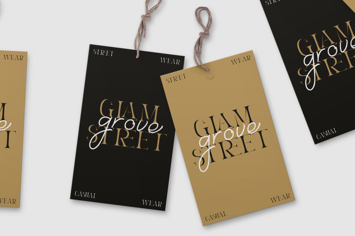
Typography plays a crucial role here, especially in brand touchpoints such as packaging, websites, and signage. Putracetol fonts such as Vidage, Cozy Caps, or Reske Wuite embody this balance between heritage and contemporary appeal.
Competitive Pressure: Visual Weakness is Market Weakness
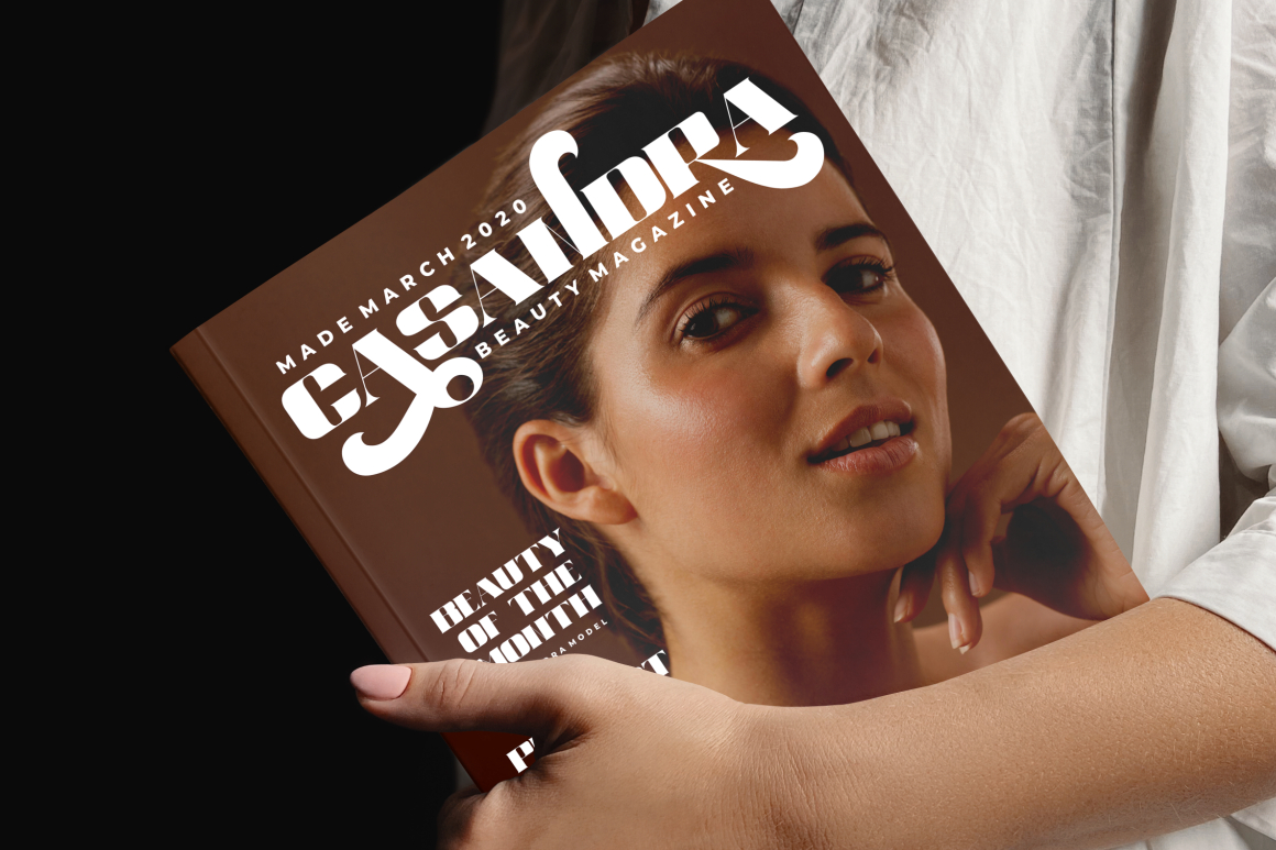
Competition forces evolution. If competitors adopt modern, flexible, premium-feeling identities, while your logo remains stuck in an era of heavy gradients and skewed 3D lettering, the audience will perceive the difference even without design literacy.
Visual perception impacts:
- perceived price
- trustworthiness
- category fit
- memorability
- product quality
The cost of doing nothing becomes larger than the cost of redesign.
Signs Your Logo Needs a Redesign
Below are common signals brands encounter during growth phases:
| Sign | Explanation |
|---|---|
| Outdated | Feels visually old-fashioned vs. today’s design language |
| Not flexible | Hard to apply to digital, packaging, or mobile |
| Irrelevant | No longer reflects values, mission, or audience |
| Visually weak | Does not stand out against competitors |
| Low recognition | Audiences struggle to associate logo with brand |
| Overcomplicated | Too many details, weak scalability |
Most brands experience at least one of these during a growth phase.
The Benefits of Logo Evolution
A redesign done thoughtfully delivers measurable benefits:
1. Boosts Relevance
A refreshed identity signals that the brand is aware of cultural shifts and audience expectations.
2. Strengthens Brand Identity
Logos help articulate:
- who the brand is
- what it values
- who it serves
3. Enhances Appeal
A modernized logo improves perception across touchpoints from packaging to digital ads.
4. Improves Consistency
Updating the logo often leads to improved brand systems, templates, and guidelines.
5. Supports Market Strategy
Brand visuals align with new positioning, pricing, and categories.
6. Drives Credibility
Investors, partners, and consumers take visually coherent brands more seriously.
Logo Evolution vs. Full Rebrand
Evolution does not always mean reinvention. Some brands require micro-adjustments:
- refined typography
- softened color palette
- improved spacing
- simplified form
Others require complete transformation due to strategic repositioning.
What matters is alignment between business goals + audience expectations + cultural signals.
Conclusion
Logos serve as visual shorthand for brand identity, which means they must evolve with business growth, strategy, competition, and culture. Keeping an outdated logo is not a sign of tradition, but often a sign of misalignment. Brands that invest in logo evolution gain relevance, clarity, differentiation, and trust all crucial advantages in a crowded marketplace.
Thank you for taking the time to read this article. If you are looking for more great articles, feel free to visit Putracetol Blog
Additionally, if you want to explore some free typography options, you can check out Putracetol Studio on Dafont. Happy reading and designing!