
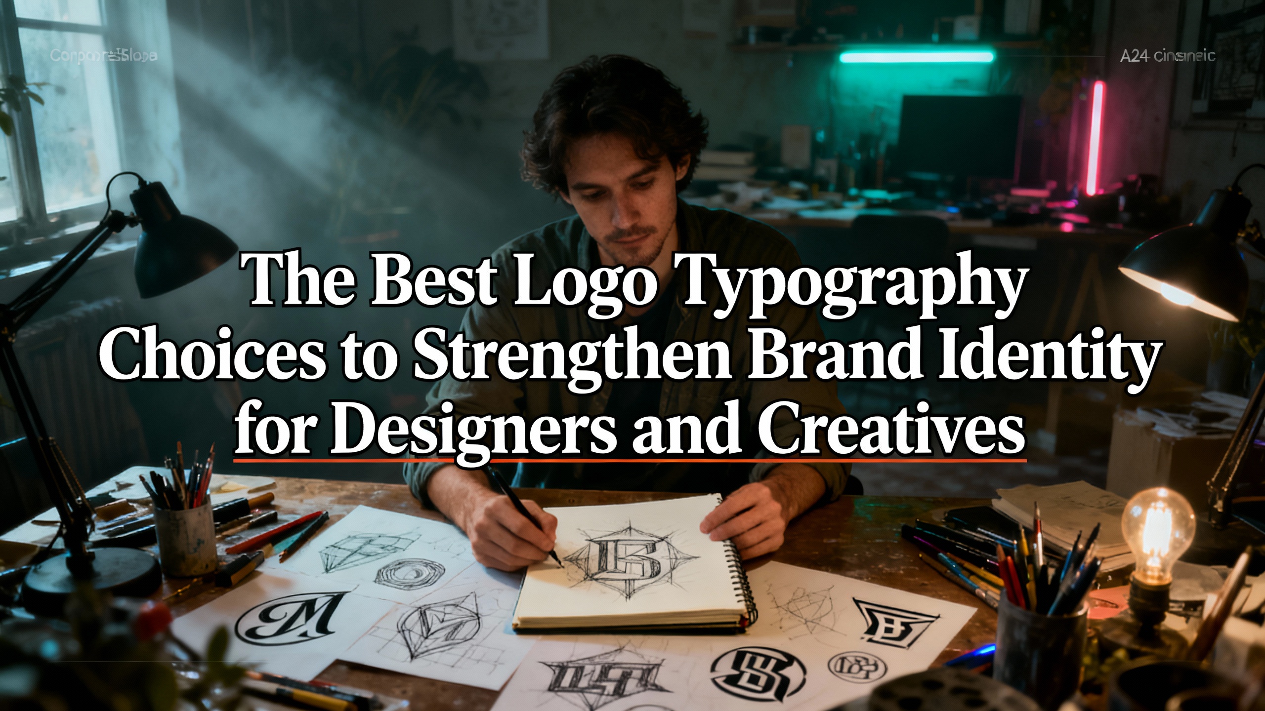
A logo is more than a visual mark it is the core symbol of a brand’s identity. While color palettes and icon shapes play important roles, the typography behind a logo is often what gives it personality, emotion, and long-term recognizability. Typography fonts help communicate who the brand is, what it stands for, and how it wants to be perceived.
Whether a brand aims to appear premium, playful, creative, nostalgic, or bold, the right typography font makes all the difference. In this article, we explore how choosing the right typography font for logos supports brand identity, what factors designers should consider, and the best font recommendations from Putracetol.com.
The Importance of Typography Fonts for Logos
Typography influences how audiences interpret a brand the moment they see its logo. A strong typeface not only shapes first impressions but also reinforces consistency and professionalism across all brand materials.
Reflect Brand Character
A font must match the brand’s personality.
- A luxury brand might use an elegant serif.
- A tech company might prefer modern geometric lettering.
- A creative agency might choose something bold and expressive.
Typography acts as a visual voice that communicates values through style.
Enhance Readability
Logos must stay clear in every size and context on websites, packaging, social media, merchandise, and signage. Fonts with balanced spacing, clean shapes, and strong structure help maintain legibility even at smaller scales.
Build Professionalism
A polished font instantly elevates a brand. It signals credibility, trustworthiness, and intentional design. Poor font choices, on the other hand, can make the brand appear inconsistent or amateurish.
Differentiate From Competitors
In crowded markets, unique typography helps brands stand out. Even simple wordmark logos can become iconic with the right font. Many famous brands rely solely on well-crafted lettering to define their identity.
Recommended Typography Fonts from Putracetol.com
Putracetol.com provides a curated collection of creative and professional fonts suitable for modern logo design. Here are standout recommendations:
Luxerna Display – Elegant and Modern

Luxerna Display is sleek, premium, and contemporary. Its refined curves and clean shapes make it perfect for luxury brands, fashion labels, beauty products, and premium digital services.
Faded Glory – Retro-Modern with Character
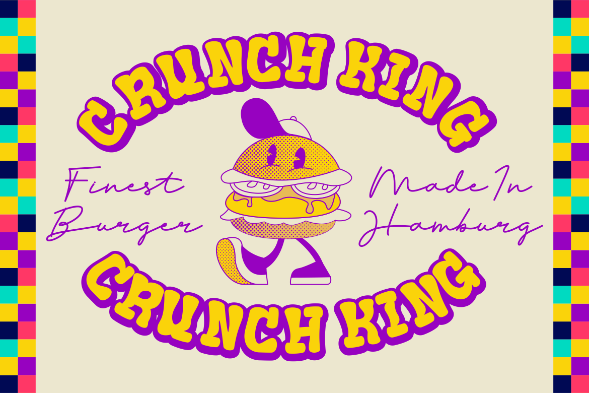
Faded Glory combines retro charm with modern readability. It works well for brands wanting a nostalgic touch while remaining professional.
Happy Groov – Nostalgic and Polished
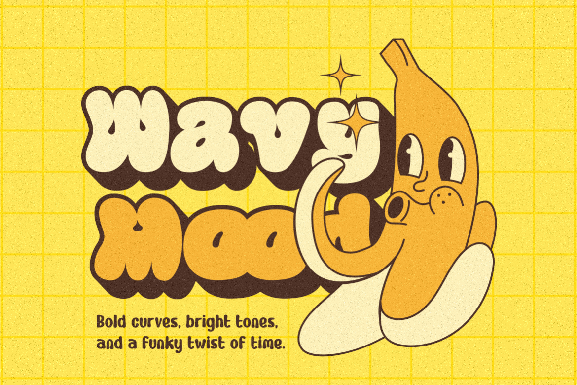
This font brings warmth and subtle retro vibes without compromising clarity. It suits lifestyle brands, creative studios, and artisan businesses.
Violense – Stylish with a Retro Vibe
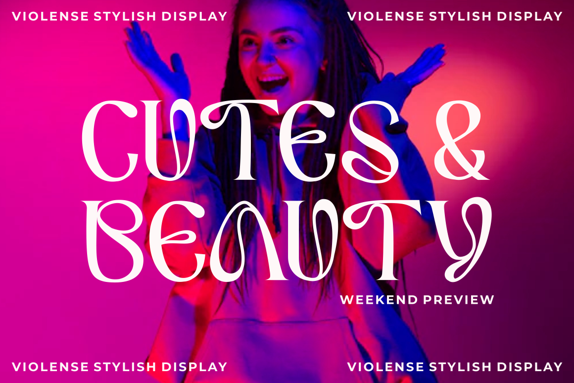
Violense offers strong stylistic personality. It blends boldness with artistic curves, making it great for editorial brands, entertainment businesses, and expressive logos.
Redfire – Creative and Standout
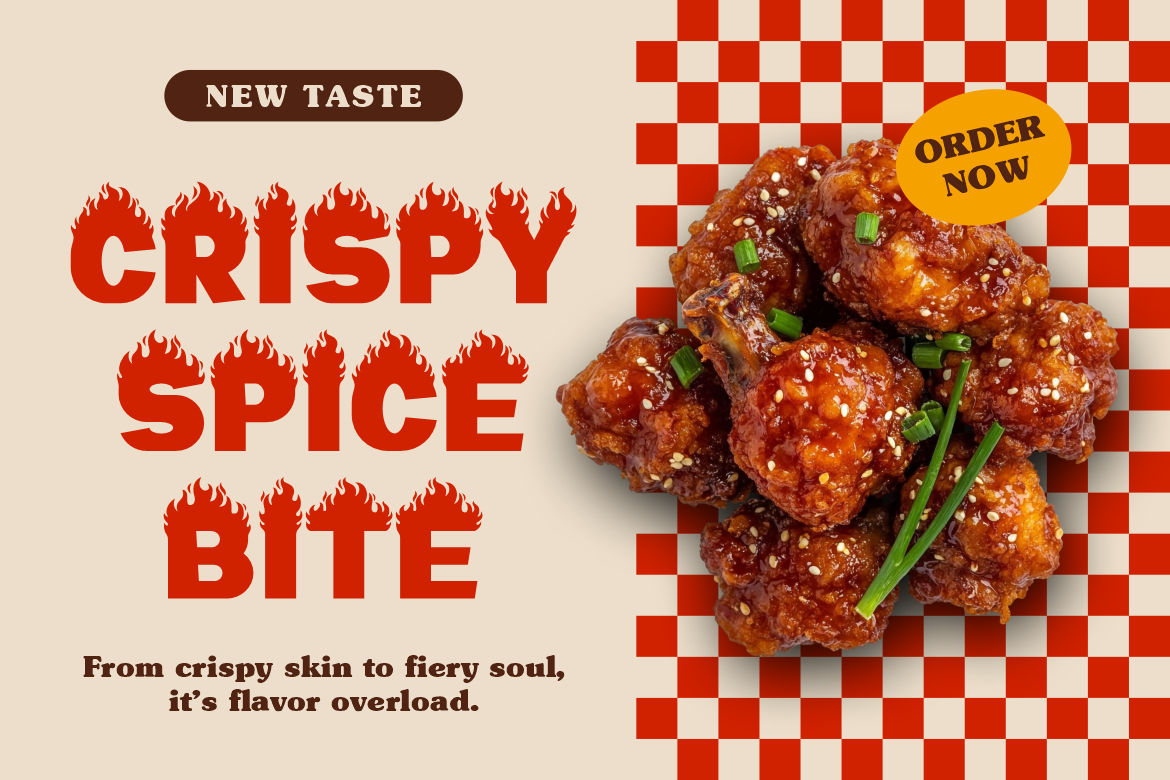
Redfire is bold, energetic, and visually unique. Creative agencies, tech startups, entertainment brands, or gaming companies can use Redfire to express innovation and confidence.
Mega Boldy – Playful yet Professional
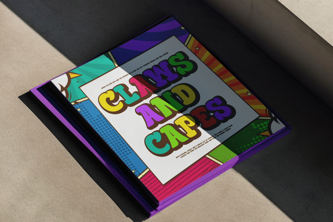
Rounded and friendly, Mega Boldy works for youth brands, food products, casual fashion labels, or lifestyle companies. It strikes the right balance between fun and clarity.
Bloxine – Strong and Trustworthy
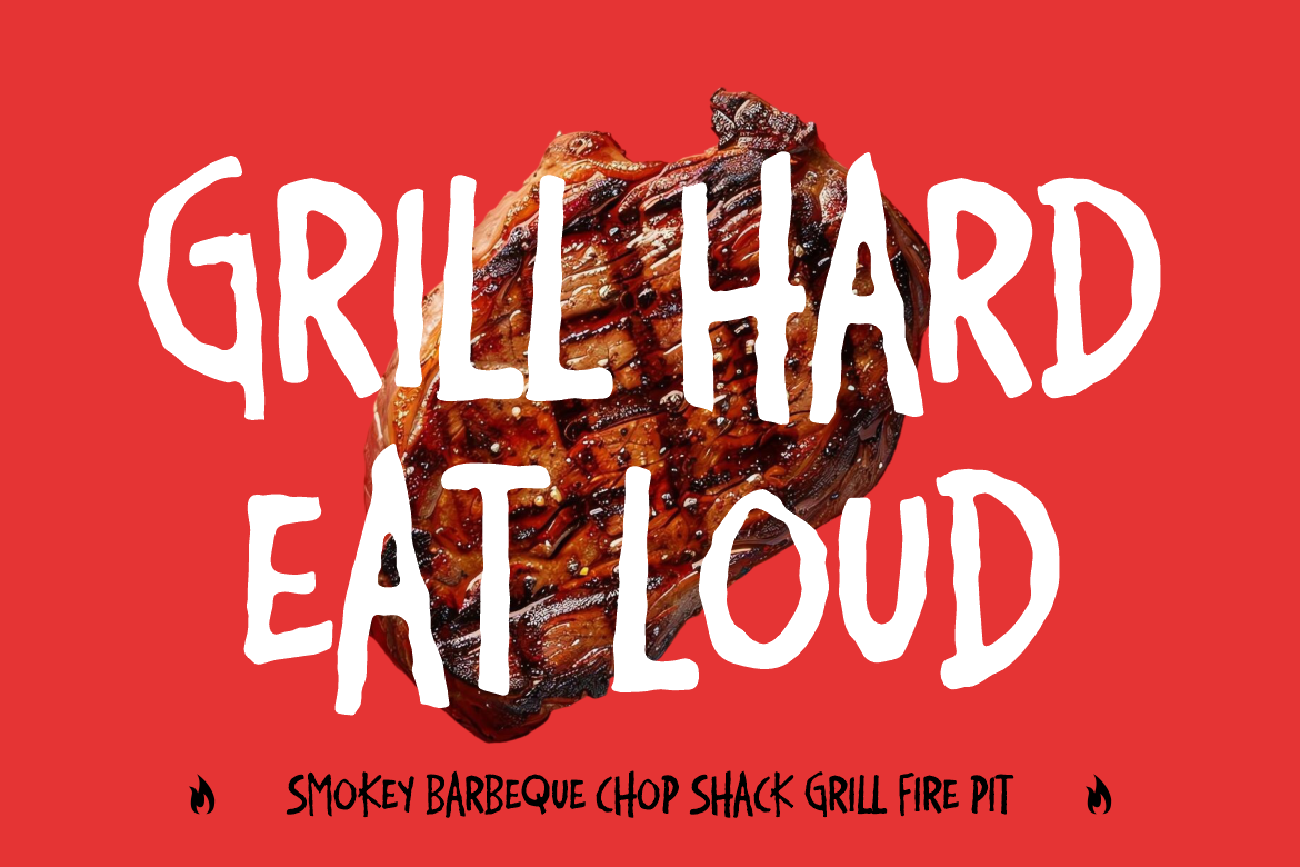
With its solid structure and dependable appearance, Bloxine conveys reliability. Ideal for corporations, industrial brands, or tech companies seeking a stable and modern identity.
How Typography Shapes Brand Identity
Typography isn’t just decoration it’s a long-term branding tool that helps communicate a brand’s mindset and message.
Creates Long-Lasting Recognition
A logo font used consistently across social media, packaging, ads, and websites becomes an identifiable signature. Think of major brands often, the typography is the strongest element of the logo.
Influences Emotional Perception
Fonts carry emotional cues:
- Rounded fonts feel friendly
- Sharp fonts feel strong and futuristic
- Serif fonts feel traditional or elegant
- All-caps fonts feel bold or assertive
Choosing the right emotional tone helps brands connect more deeply with their audience.
Supports Brand Consistency
Typography helps unify visual communication across all platforms. When used consistently, it reinforces the brand’s voice and makes the design system more cohesive.
Fits Into the Overall Visual System
Logos rarely stand alone they are part of a larger identity system. The chosen font must pair well with body text, headlines, website fonts, and promotional materials. Many Putracetol.com fonts, including Luxerna and Bloxine, work well with minimalist sans-serifs or editorial-style serifs for cohesive branding.
Tips for Choosing the Right Logo Font
Selecting a typography font for a logo requires a balance between creativity, clarity, and long-term usability. Here are key considerations:
Match the Font to Your Brand Identity
Start with the brand personality.
Ask yourself:
- Is the brand professional or playful?
- Modern or vintage?
- Minimalist or expressive?
Fonts like Luxerna Display suit premium brands, while Mega Boldy suits more casual, friendly identities.
Ensure High Readability
Avoid overly complex or decorative fonts that become hard to read at small sizes. A logo must remain recognizable across all media formats.
Check Flexibility
Your font should look strong in:
- Digital platforms
- Print materials
- Mobile apps
- Merchandise
- Packaging
Choose a typeface that holds its form wherever it’s used.
Create Differentiation
Your font should help the brand stand apart. A distinctive typeface, especially one with a unique silhouette or structure, makes your logo more memorable.
Consider Pairings
If your brand uses multiple fonts, ensure they complement each other.
For example:
- Luxerna Display pairs well with clean sans-serifs
- Faded Glory pairs well with simple modern fonts
- Bloxine pairs well with geometric typefaces
Typography harmony is essential for professional branding.
Practical Applications of Logo Typography
Typography plays a foundational role across many design assets:
Brand Logos
Typography defines the core visual identity whether in a full wordmark or as part of a combined logo.
Business Cards
Readable and polished text helps create a professional first impression.
Digital Interfaces
Apps and websites rely heavily on typography clarity and hierarchy.
Packaging
Fonts shape customer perception the moment they pick up a product.
Advertising and Marketing
Typography controls how viewers process messages across posters, banners, social media, and email marketing.
Editorial and Merchandise
Fonts bring consistency to brochures, magazines, apparel, and product labels.
Having a strong typographic foundation ensures every asset supports and strengthens the brand identity.
Conclusion
Typography is one of the most powerful elements in logo design. Choosing the right typography font for logos helps define brand character, enhances readability, and sets a company apart in a competitive market. When chosen with intention, typography becomes a long-lasting asset that reinforces professionalism, personality, and visual consistency.
The curated font collection from Putracetol.com including Luxerna Display, Faded Glory, Happy Groov, Violense, Redfire, Mega Boldy, and Bloxine gives designers high-quality options for building strong, memorable brand identities.
Explore more premium typography solutions and elevate your logo design at Putracetol.com to elevate your visual identity.
Thank you for taking the time to read this article. If you are looking for more great articles, feel free to visit Putracetol Blog
Additionally, if you want to explore some free typography options, you can check out Putracetol Studio on Dafont. Happy reading and designing!