
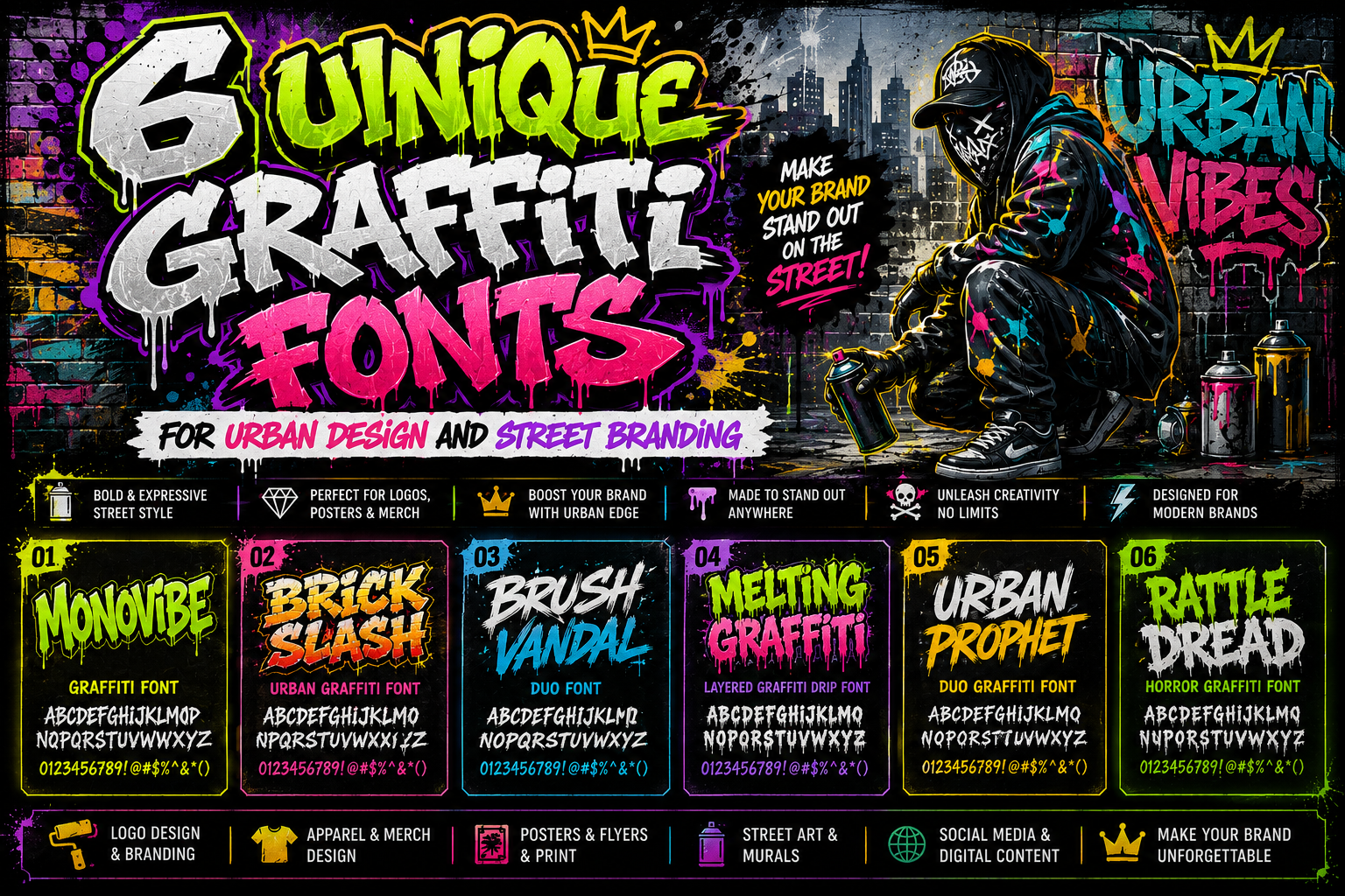
Unique Graffiti Fonts for Urban Design
Graffiti typography has become one of the most recognizable visual styles in modern urban culture. Originally born from street art movements, graffiti lettering evolved from expressive wall writing into a global design trend used in branding, posters, fashion, music, gaming, and digital media.
Today, graffiti fonts for urban design are no longer limited to street murals. Designers use graffiti typography to create energetic visual identity systems that feel bold, rebellious, creative, and culturally expressive. Graffiti fonts carry strong personality and emotional energy, making them perfect for projects that need to stand out immediately.
Urban typography reflects:
- Freedom of expression
- Street culture
- Artistic rebellion
- Youth energy
- Visual experimentation
Whether used in streetwear branding, music promotions, event posters, or digital campaigns, graffiti fonts create powerful visual communication that feels authentic and memorable.
In this article, we’ll explore unique graffiti fonts and explain how urban typography strengthens modern creative design.
Why Graffiti Typography Matters in Design
Typography is more than readable text. In urban design, typography becomes part of the artwork itself.
Graffiti fonts communicate:
- Attitude
- Identity
- Emotion
- Movement
- Cultural influence
Unlike minimalist corporate typography, graffiti fonts intentionally feel expressive and raw.
Graffiti Fonts as Urban Visual Identity
Street typography developed as a visual language connected to:
- Hip-hop culture
- Skateboarding communities
- Underground art scenes
- Music movements
- Urban youth identity
Today, designers use graffiti typography to bring authentic urban atmosphere into branding and visual campaigns.
Characteristics of Graffiti Fonts
Graffiti fonts are visually distinct from traditional typography styles.
1. Expressive Letterforms
Graffiti typography often includes:
- Distorted shapes
- Dynamic curves
- Hand-drawn energy
- Layered textures
These features create movement and individuality.
2. Bold Visual Presence
Urban typography is designed to capture attention quickly.
This is why many graffiti fonts use:
- Thick strokes
- Sharp angles
- Drip effects
- Oversized structures
3. Creative Imperfection
Graffiti design intentionally embraces:
- Rough textures
- Organic flow
- Experimental forms
This creates authenticity and artistic personality.
1. Monovibe Graffiti – Bold and Dynamic
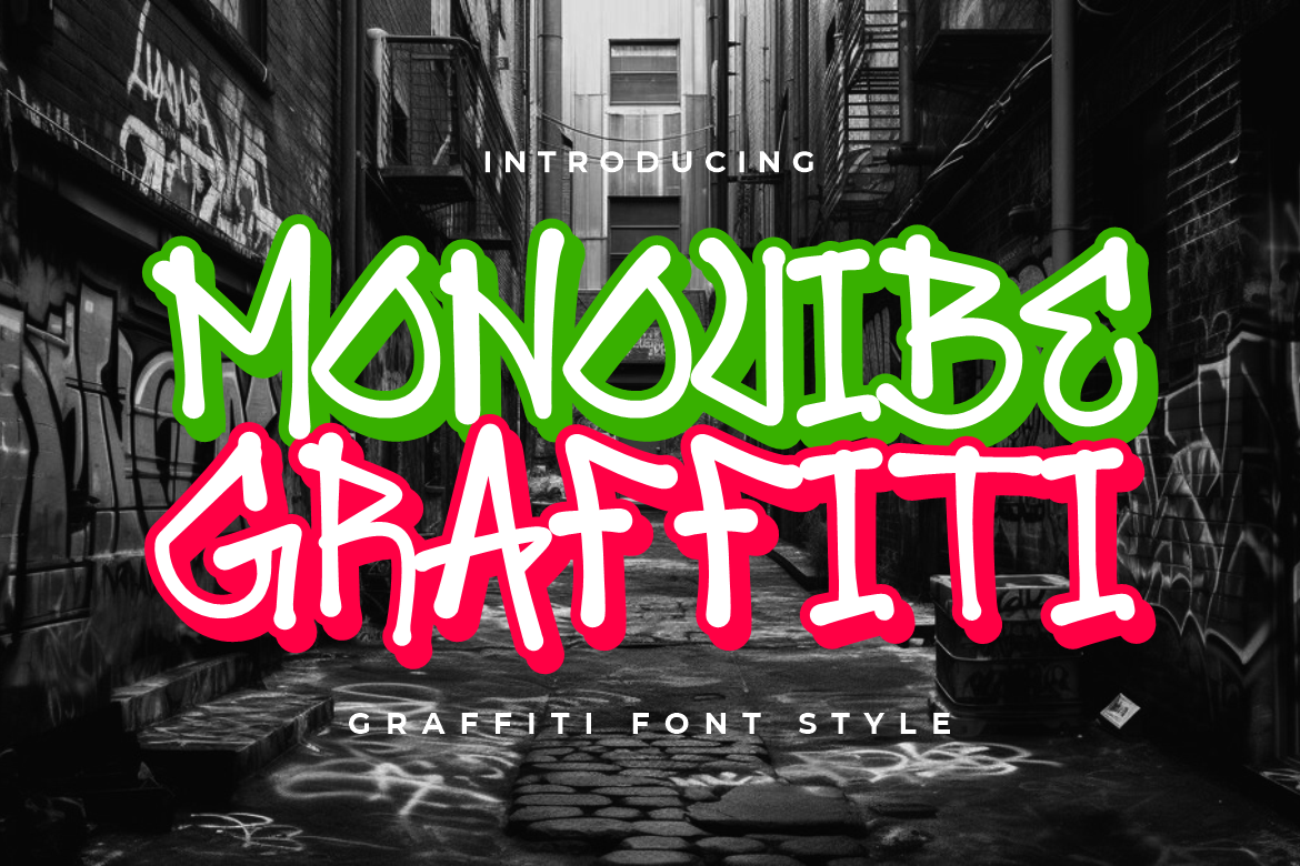
Monovibe Graffiti combines bold urban energy with modern readability.
Why It Works for Urban Design
Its thick and energetic structure creates:
- Strong visual impact
- Youthful atmosphere
- Streetwear aesthetics
The font immediately feels modern, loud, and expressive.
Best For
- Music posters
- Streetwear branding
- Urban social media campaigns
Visual Personality
Monovibe Graffiti feels:
- Bold
- Dynamic
- Rebellious
- Creative
making it highly effective for youth-focused branding.
2. Brick Slash Urban – Rough and Underground
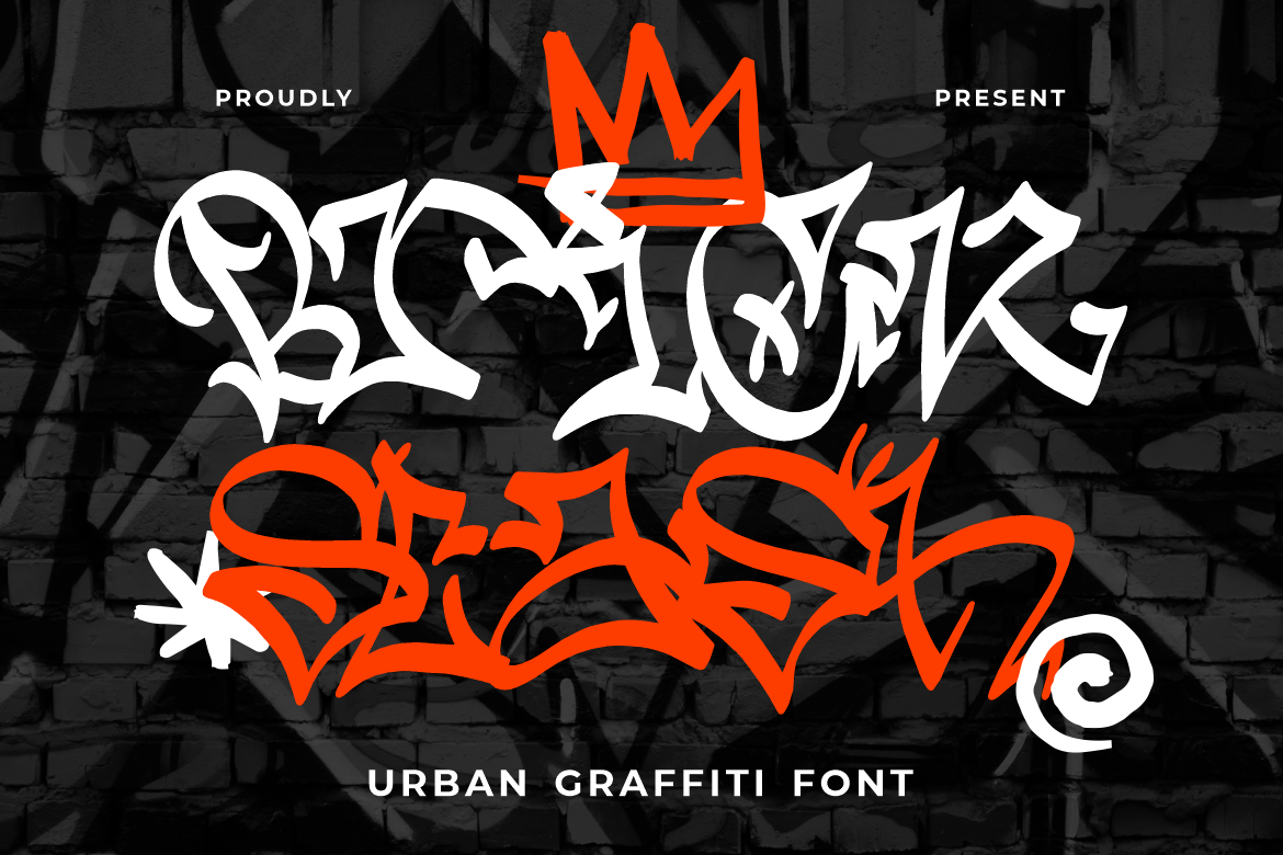
Brick Slash Urban captures the rough textures and raw feeling of underground street art.
Why It Works for Urban Design
Its distressed structure creates:
- Authentic urban identity
- Industrial street atmosphere
- Raw visual energy
The font feels heavily connected to street culture and mural aesthetics.
Best For
- Murals
- Underground branding
- Skate culture visuals
Design Strength
Brick Slash Urban works beautifully in large-format graphics and gritty visual systems.
3. Brush Vandal Duo – Expressive Brush Style

Brush Vandal Duo combines hand-painted brush energy with graffiti-inspired movement.
Why It Works for Urban Design
Brush-style typography creates:
- Human expression
- Artistic flow
- Organic visual rhythm
This makes the font feel energetic and emotionally engaging.
Best For
- Merchandise
- Creative posters
- Urban packaging
Visual Mood
Brush Vandal Duo feels:
- Artistic
- Fast-moving
- Handmade
- Expressive
4. Melting Graffiti Layered – Drip and Drama
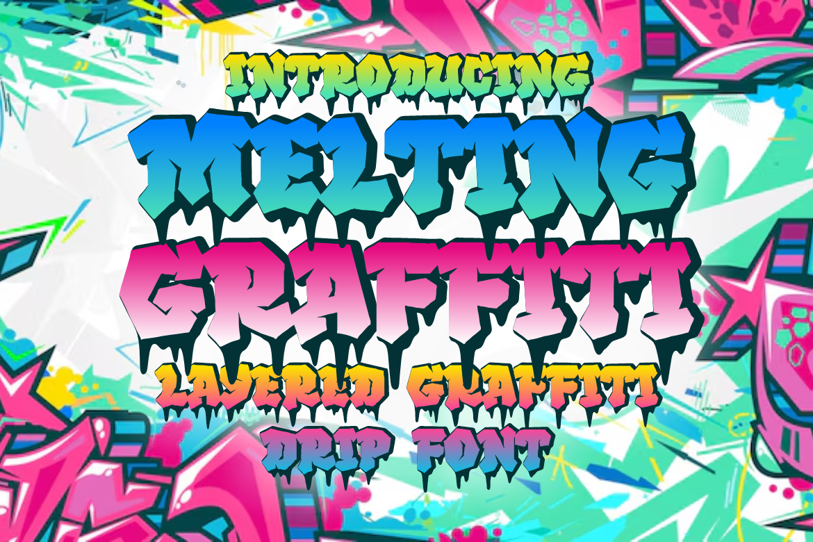
Melting Graffiti Layered uses dramatic dripping effects inspired by spray paint and street murals.
Why It Works for Urban Design
Drip-style typography instantly creates:
- Graffiti authenticity
- Urban rebellion
- Aggressive visual energy
The layered structure also adds dimensional impact.
Best For
- Event posters
- Album covers
- Street campaigns
Design Advantage
Its dramatic style helps visuals feel louder and more memorable.
5. Urban Prophet Duo – Modern Graffiti with Classic Influence
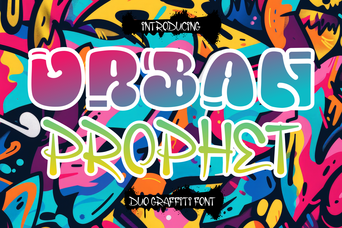
Urban Prophet Duo blends classic graffiti aesthetics with modern branding flexibility.
Why It Works for Urban Design
The font balances:
- Urban personality
- Modern readability
- Branding versatility
This makes it suitable for both edgy and professional creative projects.
Best For
- Urban branding
- Creative businesses
- Fashion campaigns
Typography Strength
Urban Prophet Duo adapts well across:
- Digital graphics
- Posters
- Merchandise
- Packaging
6. Rattle Dread Horror Graffiti – Dark and Eerie
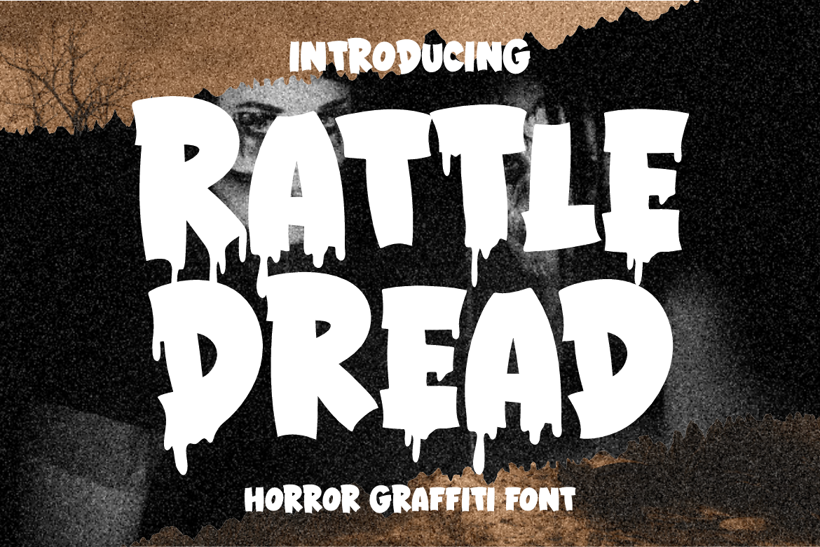
Rattle Dread Horror Graffiti combines graffiti aesthetics with horror-inspired visuals.
Why It Works for Urban Design
The font creates:
- Dark atmosphere
- Aggressive personality
- Horror-style tension
Its distorted styling feels cinematic and highly expressive.
Best For
- Horror posters
- Halloween events
- Gaming visuals
- Film branding
Visual Personality
The font feels:
- Intense
- Chaotic
- Dark
- Fear-driven
making it ideal for dramatic creative projects.
Quick Summary Table
| Font Putracetol | Characteristics | Best Use |
|---|---|---|
| Monovibe Graffiti | Bold, dynamic | Music posters, streetwear |
| Brick Slash Urban | Rough, urban | Murals, underground branding |
| Brush Vandal Duo | Expressive brush | Merchandise, creative design |
| Melting Graffiti Layered | Drip, dramatic | Event posters, album covers |
| Urban Prophet Duo | Modern + classic | Flexible branding |
| Rattle Dread Horror Graffiti | Horror, eerie | Films, games, Halloween |
Why Graffiti Fonts Work in Branding
Graffiti typography creates stronger emotional impact than conventional fonts.
Urban fonts help brands appear:
- Creative
- Rebellious
- Youth-oriented
- Energetic
- Authentic
This is why graffiti aesthetics remain highly influential in modern branding.
Industries That Benefit from Graffiti Typography
Streetwear Fashion
Urban typography naturally fits:
- Skate brands
- Sneaker campaigns
- Youth fashion labels
Music Industry
Graffiti fonts work exceptionally well for:
- Hip-hop visuals
- Album covers
- Concert posters
- DJ branding
Gaming & Entertainment
Urban typography strengthens:
- Action visuals
- Horror aesthetics
- Competitive gaming identity
Creative Advertising
Graffiti fonts help campaigns appear:
- More expressive
- More rebellious
- More visually memorable
Best Practices for Graffiti Typography
Balance Style with Readability
Expressive fonts should still remain readable enough for audiences to understand quickly.
Use Strong Contrast
Graffiti typography often works best with:
- Dark backgrounds
- Neon accents
- High contrast palettes
Combine with Urban Visual Elements
Graffiti fonts pair well with:
- Spray textures
- Street photography
- Concrete textures
- Motion graphics
Common Mistakes in Urban Typography
Overloading Effects
Too many:
- Splashes
- Shadows
- Drips
can reduce readability.
Poor Hierarchy
Urban design still requires clear information flow.
Inconsistent Branding
Mixing unrelated graffiti styles weakens visual identity.
Modern Trends in Graffiti Typography
Modern urban typography increasingly blends:
- Graffiti aesthetics
- Minimal layouts
- Streetwear branding
- Digital-first visuals
- Motion graphics
This creates more versatile urban design systems.
Final Thoughts
Using graffiti fonts for urban design helps designers create bold, expressive, and culturally resonant visual identities. Graffiti typography captures the spirit of street culture while strengthening branding, posters, merchandise, and digital campaigns.
Fonts like Monovibe Graffiti, Brick Slash Urban, Brush Vandal Duo, Melting Graffiti Layered, Urban Prophet Duo, and Rattle Dread Horror Graffiti demonstrate how urban typography can adapt to many creative contexts, from music and fashion to gaming and underground branding.
The best graffiti typography balances:
- Expression
- Readability
- Energy
- Cultural authenticity
When used strategically, graffiti fonts become powerful visual tools that help brands stand out while creating memorable urban identity.
For more inspiration, creative resources, and practical design tips, visit Putracetol.com and explore creative resources that can elevate your next web project. Thank you for taking the time to read this article. If you are looking for more great articles, feel free to visit Putracetol Blog.
Additionally, if you want to explore some free typography options, you can check out Putracetol Studio on Dafont. Happy reading and designing!