
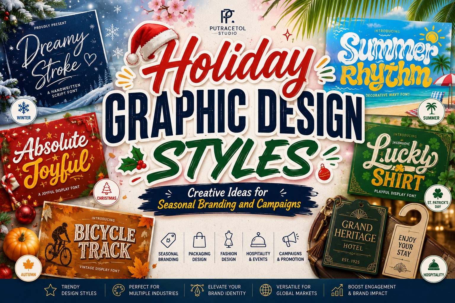
Holiday graphic design styles help brands capture the emotion, atmosphere, and visual energy associated with a particular season or celebration. These styles may draw from summer vacations, tropical destinations, family gatherings, winter festivities, road trips, cultural events, or year-end retail campaigns.
Successful seasonal design goes beyond adding obvious icons to an ordinary layout. It combines color, typography, illustration, photography, texture, and composition to create a complete visual mood. Bright palettes can communicate celebration and optimism, while nostalgic colors and handmade details may create warmth and familiarity.
Typography is especially important because it sets the emotional tone before audiences process the complete message. A flowing handwritten font can suggest a relaxed beach holiday, while wavy decorative lettering creates movement and youthful energy. Rounded playful fonts work well for family campaigns, and quirky ligature fonts can give invitations or packaging a more personal identity.
Current visual culture is moving away from overly sterile minimalism toward expressive typography, saturated colors, tactile textures, retro references, and personality-driven compositions. This gives designers more freedom to create holiday campaigns that feel human, joyful, and distinctive.
This guide explores the main elements of effective seasonal design and introduces five fonts from PutraCetol Studio that can strengthen holiday branding, packaging, social content, posters, and promotional campaigns.
Initial Suggestion
Define the Holiday Mood First
Before choosing colors or fonts, decide what kind of experience the design should communicate.
Possible directions include:
- Tropical and adventurous
- Warm and family-oriented
- Playful and child-friendly
- Nostalgic and retro
- Premium and relaxing
- Energetic and festival-inspired
- Handmade and personal
A summer travel promotion requires a different visual language from a Christmas gift campaign or a family holiday event. The mood should determine every design choice that follows.
Build a Seasonal Color System
Color is often the fastest way to establish a holiday atmosphere.
Bright Vacation Colors
Use turquoise, coral, yellow, lime, sky blue, and warm orange for tropical destinations, summer products, beach events, and youth-focused campaigns.
Nostalgic Seasonal Colors
Muted red, mustard, faded teal, cream, brown, and dusty pink can create a retro holiday feeling. These combinations work well for road-trip campaigns, vintage postcards, cafés, and lifestyle products.
Premium Holiday Colors
Deep green, navy, burgundy, champagne, ivory, and metallic accents create a more refined mood for hospitality, luxury packaging, gift products, and boutique travel services.
Playful Family Colors
Primary colors, pastels, candy tones, and colorful gradients can make children’s events, family packages, and casual promotions feel cheerful and approachable.
Use a limited palette with one dominant color, one supporting color, and one or two accents. Too many equally strong colors can weaken hierarchy.
Choose Motifs That Support the Story
Seasonal motifs should reinforce the campaign rather than simply fill empty space.
Useful visual elements include:
- Waves and sun shapes
- Palm leaves and tropical fruit
- Stars and decorative lights
- Gift ribbons and patterned wrapping
- Postcards and travel stamps
- Bicycles, suitcases, and road signs
- Snowflakes and winter foliage
- Fireworks and confetti
- Hand-drawn flowers
- Food, drinks, and festive tableware
Try combining familiar motifs with a distinctive illustration style. Geometric icons feel modern, while hand-drawn artwork creates warmth. Cut-paper elements can make the campaign playful, and vintage engravings can introduce heritage.
Use Typography as the Main Seasonal Element
A strong font can sometimes replace several decorative graphics. Wavy, handwritten, rounded, or quirky typography can become the central visual feature of a holiday campaign.
Use expressive typography for:
- Campaign names
- Promotional headlines
- Destination names
- Packaging titles
- Greeting messages
- Event posters
- Social media announcements
Pair it with a simple supporting font for dates, prices, schedules, descriptions, and booking information.
Create Adaptable Campaign Assets
Holiday campaigns often appear across many formats, including:
- Website banners
- Email headers
- Instagram posts and Stories
- Product packaging
- Store signage
- Printed flyers
- Promotional merchandise
- Digital advertisements
Develop a flexible design system with clear typography, color, illustration, and spacing rules. This keeps the campaign recognizable even when the layout changes.
Jump to Recommended Fonts
1. Dreamy Stroke Handwritten Script Font
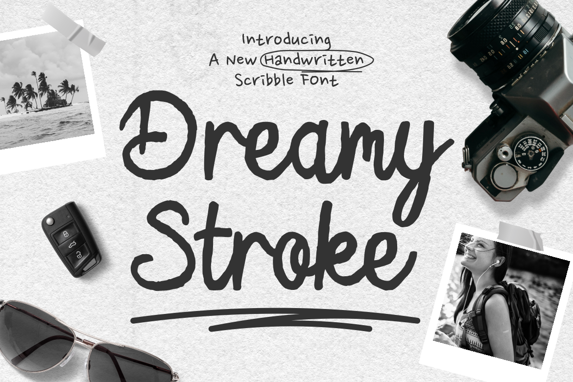
Dreamy Stroke brings a soft, relaxed, and organic feeling through connected handwritten forms and rounded strokes. Its natural rhythm makes holiday designs feel personal, as if the message was written directly on a postcard or travel journal. The font has enough visual weight to remain readable while preserving a warm and informal personality.
PROS
- Natural handwritten appearance
- Warm and approachable tone
- Smooth connected rhythm
- Works across print and digital design
- Easy to pair with simple sans-serif fonts
BEST FOR
- Travel campaigns
- Beach resort branding
- Holiday postcards
- Lifestyle packaging
- Social media quotes
- Boutique hospitality
2. Summer Rhythm Decorative Wavy Font

Summer Rhythm uses expressive wavy letterforms to create movement, energy, and a carefree seasonal atmosphere. Its decorative construction immediately suggests music, sunshine, festivals, creative youth culture, and warm-weather experiences. It is particularly effective when typography needs to become the primary visual attraction.
PROS
- Strong summer personality
- Dynamic wavy construction
- High visual impact
- Memorable headline performance
- Suitable for vibrant color combinations
BEST FOR
- Summer festivals
- Beachwear branding
- Travel posters
- Photography campaigns
- Social media promotions
- Seasonal merchandise
3. Absolute Joyful
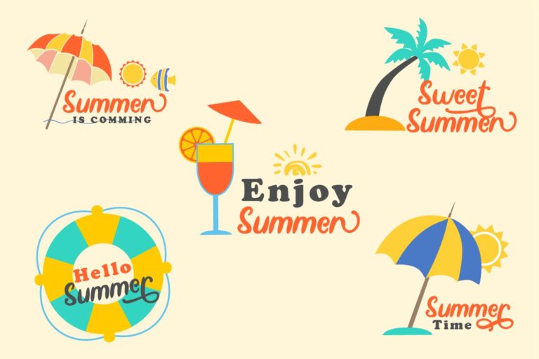
Absolute Joyful is a bold, rounded, and quirky display font designed to communicate happiness and friendliness. Smooth corners make it approachable, while alternate characters give designers more flexibility when building playful logos and headlines. Its cheerful personality is especially useful for family-oriented campaigns and products that need to feel immediately positive.
PROS
- Bold and highly visible
- Friendly rounded forms
- Playful alternate characters
- Strong emotional appeal
- Effective for young audiences
BEST FOR
- Family holiday campaigns
- Children’s events
- Gift packaging
- Food promotions
- Greeting cards
- Festive social content
4. Lucky Shirt Quirky Ligature Font
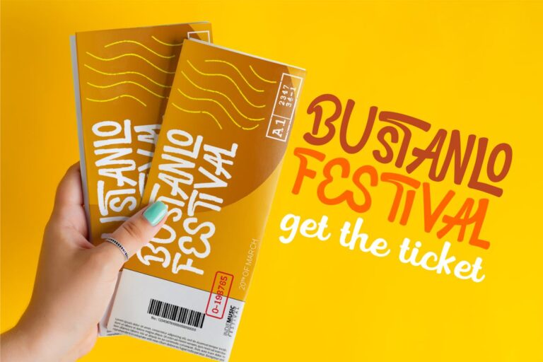
Lucky Shirt combines playful letter construction with numerous ligatures that help words feel more customized and dynamic. Its casual personality works well for seasonal branding that needs to feel youthful, friendly, and slightly unexpected. The font can add character to apparel, posters, invitations, packaging, and promotional headlines without requiring complex illustration.
PROS
- Numerous decorative ligatures
- Fun and quirky personality
- Strong logo potential
- Multilingual support
- Useful across merchandise and campaigns
BEST FOR
- Holiday apparel
- Party invitations
- Family promotions
- Creative packaging
- Event posters
- Youth lifestyle brands
5. Bicycle Track Quirky Display Font
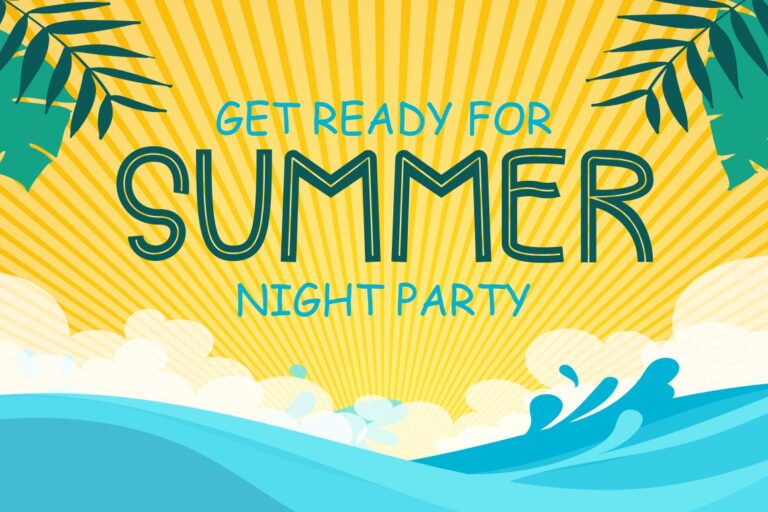
Bicycle Track is a playful display font with an extensive ligature system that helps designers create lively and distinctive lettering. Its quirky forms suggest movement, outdoor activity, childhood adventures, and relaxed travel. This makes it particularly effective for holiday campaigns centered on road trips, family experiences, recreation, and exploration.
PROS
- Rich ligature selection
- Playful visual movement
- Multilingual character support
- Strong branding flexibility
- Suitable for fashion and children’s projects
BEST FOR
- Road-trip campaigns
- Cycling events
- Family tourism
- Outdoor products
- Summer apparel
- Adventure branding
Comparison
| Font | Main Style | Holiday Personality | Strongest Application |
|---|---|---|---|
| Dreamy Stroke | Handwritten script | Relaxed and personal | Travel and hospitality |
| Summer Rhythm | Wavy decorative display | Energetic and tropical | Festivals and summer campaigns |
| Absolute Joyful | Bold rounded display | Cheerful and family-friendly | Gifts and children’s promotions |
| Lucky Shirt | Quirky ligature font | Youthful and playful | Apparel and invitations |
| Bicycle Track | Quirky display font | Adventurous and active | Outdoor and travel branding |
Best Overall Holiday Font
Summer Rhythm creates the strongest immediate seasonal impact through its wavy forms and expressive visual movement.
If you want Best for Travel and Hospitality
Or yau want Best for Family Campaigns
There are Best for Summer Promotions
And Best for Merchandise
Best for Invitations and Greeting Cards
Common Mistake
One common mistake is relying too heavily on obvious seasonal symbols. Adding palm trees, snowflakes, gift boxes, or fireworks does not automatically create a strong holiday design. When too many familiar icons appear together, the campaign can feel generic and visually crowded. A stronger approach is to choose one central seasonal idea and build the typography, illustration style, colors, and photography around it. For example, a road-trip campaign might focus on winding lines, postcards, faded colors, and playful travel lettering rather than using every possible vacation symbol.
Another mistake is choosing decorative typography without considering readability. Wavy, handwritten, and quirky fonts can create an excellent emotional tone, but they may become difficult to understand in long text, small packaging, or mobile advertisements. Use expressive fonts for short headlines and campaign names, then pair them with a clear supporting typeface for prices, dates, descriptions, and calls to action. Testing the design at its actual publication size is essential, particularly when thin strokes, ligatures, shadows, or outlines are involved.
Designers also sometimes treat every seasonal campaign as a temporary visual experiment with no connection to the core brand. This can make the business look completely different during every holiday. Seasonal graphics should introduce new energy while preserving recognizable brand elements such as logo placement, color relationships, photography style, and supporting typography. The most effective holiday graphic design styles feel festive without losing the identity customers already know.
Conclusion
Holiday graphic design styles help brands turn seasonal moments into memorable visual experiences. Bright colors, decorative typography, nostalgic motifs, expressive illustration, and carefully chosen textures can create emotional connections that encourage audiences to explore, celebrate, travel, shop, or participate.
The strongest seasonal campaigns begin with a clear mood rather than a collection of decorative symbols. Tropical promotions benefit from movement and saturated color, family campaigns need friendliness and warmth, while premium hospitality designs often require greater restraint and sophistication.
Typography gives these campaigns a recognizable voice. Dreamy Stroke creates personal warmth, Summer Rhythm delivers energetic movement, Absolute Joyfull communicates happiness, Lucky Shirt adds playful customization, and Bicycle Track introduces adventure and activity.
Explore these fonts at PutraCetol.com and use them to develop seasonal packaging, social campaigns, event posters, travel promotions, merchandise, and holiday branding that feels festive, clear, and distinctly your own.
Explore these fonts and many more at PutraCetol.com to build a business identity that looks professional, trustworthy, and memorable.
Additionally, if you want to explore some free typography options, you can check out Putracetol Studio on Dafont. Happy reading and designing!