

Before choosing colors, decide what kind of premium experience the food brand should represent. A handcrafted bakery, luxury chocolate label, organic tea company, modern noodle restaurant, and gourmet sauce producer may all target quality-conscious customers, but they should not look identical.
A premium identity can feel refined, artisanal, exclusive, contemporary, traditional, or indulgent. The right direction depends on the product’s ingredients, price level, origin, customer profile, and selling environment.
Color should therefore communicate a specific brand promise rather than simply make the packaging appear expensive. Research in marketing has shown that color contributes to brand personality and influences how consumers interpret visual identity. However, its effectiveness depends on whether the color feels appropriate for the product and the message being communicated.
What Makes Food Brand Colors Look Premium?
Premium color systems usually rely on restraint. Instead of filling every surface with bright competing shades, they establish a clear hierarchy between the primary color, supporting neutrals, and smaller accents.
Deep colors can create visual authority, while cream, ivory, pearl, or parchment tones introduce softness. Metallic-inspired accents such as champagne, brass, copper, or antique gold can suggest refinement when used sparingly. A premium palette also needs enough contrast to keep product names, flavor information, ingredients, and practical instructions readable.
The material matters as much as the digital color. Matte paper can make burgundy or forest green feel sophisticated, while foil details can turn a simple neutral label into a more exclusive presentation. Glossy finishes, transparent containers, embossed lettering, and natural paper will all change how the same color appears.
Five Premium Food Brand Color Palettes
Black, Champagne Gold, and Ivory
Use deep black as the dominant color, ivory for text and breathing room, and champagne gold as a limited accent.
This combination works well for luxury chocolate, specialty coffee, truffle products, premium spices, gourmet gift boxes, and exclusive restaurant identities. Avoid covering the entire design in gold. A few carefully placed gold details often feel more refined than a large metallic surface.
Suggested colors:
Black #171512
Champagne Gold #C5A66A
Ivory #F6F0E5
Deep Burgundy, Warm Cream, and Copper
Burgundy communicates richness without feeling as aggressive as bright red. Warm cream softens the composition, while copper adds an artisanal quality.
This palette is suitable for premium bakeries, sauces, confectionery, fermented products, specialty beverages, and heritage-inspired restaurants. It also works particularly well with vintage typography and handcrafted illustrations.
Suggested colors:
Burgundy #641F2C
Warm Cream #F3E7D2
Copper #B66E48
Forest Green, Parchment, and Antique Gold
Forest green can support natural, botanical, organic, and ingredient-focused positioning. Parchment creates warmth, while antique gold prevents the identity from feeling overly rustic.
Consider this combination for tea, olive oil, herbs, organic snacks, plant-based products, natural preserves, and farm-to-table businesses.
Suggested colors:
Forest Green #193B2C
Parchment #ECE2CC
Antique Gold #AE914D
Midnight Navy, Pearl, and Brass
Navy offers a quieter alternative to black. It feels structured and professional while remaining distinctive in food categories dominated by red, orange, or brown.
Use it for premium seafood, gourmet frozen foods, specialty beverages, fine dining, imported products, and contemporary culinary brands.
Suggested colors:
Midnight Navy #172639
Pearl #F4F1E9
Brass #9F7F46
Cocoa Brown, Almond, and Soft White
Brown does not need to look old-fashioned. A deep cocoa tone paired with almond and soft white can create a warm, elegant, and highly appetizing identity.
This palette is ideal for bakeries, chocolate, coffee, cookies, bread, granola, nut products, and handcrafted desserts.
Suggested colors:
Cocoa Brown #3C271E
Almond #D8C0A5
Soft White #FBF7EF
Balance Premium Positioning With Appetite Appeal
Elegant packaging must still look appetizing. A palette can be visually sophisticated but ineffective when it makes the product feel cold, medicinal, or disconnected from its flavor.
Food packaging research indicates that color can influence expectations before a product is tasted. Lighter packaging may increase perceptions of healthiness, while darker or warmer presentations can create stronger expectations of richness or flavor. These effects also vary between indulgent foods and more functional or health-oriented products.
A premium dessert brand might therefore use cocoa, burgundy, cream, or muted orange. A wellness drink may benefit from pearl, sage, navy, or cool green. The goal is not to follow a universal color formula, but to match the visual cue with the customer’s expected experience.
Apply the Palette as a Complete Brand System
A practical starting point is to assign approximately 60 percent of the design to a dominant color, 30 percent to a supporting color, and 10 percent to an accent. This does not need to be mathematically exact. It simply prevents every shade from competing for attention.
The primary color should identify the brand. The secondary color can separate flavors or product categories. The accent should highlight important details such as quality claims, limited editions, seals, or calls to action.
Test the system across packaging, menus, storefront signs, delivery boxes, social media, websites, labels, uniforms, and advertising. A palette that only works on one mockup is not yet a complete brand identity.
Jump to Recommended Fonts
Noodle Factory | Maison Veloria | Chinese Empire | Moochy Pops | Crust Cream
1. Noodle Factory Curly Food Font
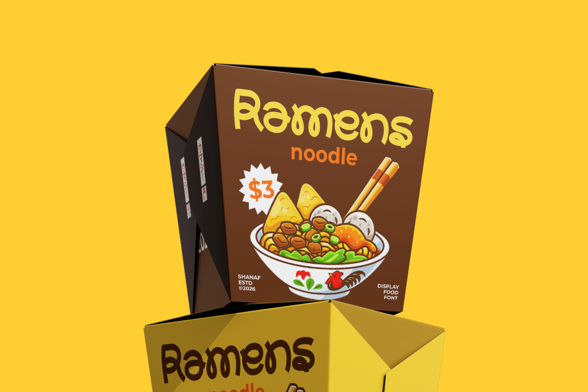
Noodle Factory brings a cheerful handcrafted character through rounded terminals, flowing lines, playful loops, and irregular curves inspired by the movement of noodles. It can make a culinary identity feel welcoming and memorable without relying on generic food icons. Pair it with a restrained premium palette so its expressive letterforms remain the main attraction.
PROS: Food-focused personality, distinctive curves, approachable appearance, strong display impact.
BEST FOR: Noodle brands, ramen shops, food trucks, casual restaurants, sauces, snacks, and culinary events.
2. Maison Veloria Condensed Font

Maison Veloria uses tall, narrow letterforms with a refined structure and subtle vintage warmth. Its condensed proportions allow longer business names to fit neatly on labels, menus, storefronts, and narrow packaging panels. The design works especially well with cream, forest green, burgundy, navy, and restrained metallic accents.
PROS: Elegant proportions, efficient use of space, polished appearance, versatile readability.
BEST FOR: Artisan bakeries, gourmet stores, coffee roasters, bread brands, pastry shops, and premium cafés.
3. Chinese Empire Chinese Style Font
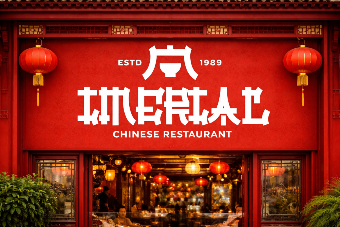
Chinese Empire is a bold display typeface featuring thick strokes, squared edges, geometric cuts, and angular details influenced by traditional East Asian visual forms. Its strong silhouette gives restaurant names and packaging headlines immediate recognition. Combine it with deep red, black, jade green, warm cream, or antique gold for a confident premium identity.
PROS: Strong cultural character, bold visibility, memorable structure, effective headline presence.
BEST FOR: Noodle shops, dim sum brands, tea houses, Asian restaurants, festival campaigns, and specialty food packaging.
4. Moochy Pops Bold Retro Script Font
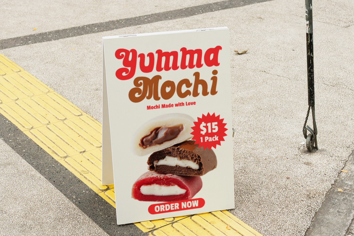
Moochy Pops combines thick connected strokes, rounded terminals, gentle swashes, and a slightly condensed retro structure. It communicates sweetness, warmth, and friendly indulgence, making it particularly effective for food products that should feel nostalgic but professionally presented. Pair it with burgundy and cream, cocoa and almond, or muted pastel colors with a dark neutral foundation.
PROS: Warm retro personality, expressive connections, bold readability, inviting appearance.
BEST FOR: Dessert shops, confectionery, cafés, snack brands, ice cream, cookies, and sweet beverages.
5. Crust Cream Bold Font

Crust Cream uses wide, heavy letterforms, rounded corners, tight spacing, and small carved details that create a powerful but friendly identity. Short product names become strong visual focal points, which is useful on crowded retail shelves and compact social media graphics. Its combination of boldness and warmth works particularly well with dark brown, cream, copper, muted orange, or deep green.
PROS: High visibility, strong shelf presence, friendly geometry, memorable display style.
BEST FOR: Bakeries, street food, coffee brands, snacks, beverages, dessert stores, and retro food businesses.
Font and Color Comparison
| Font | Visual Personality | Recommended Premium Palette | Best Brand Category |
|---|---|---|---|
| Noodle Factory | Playful and handcrafted | Burgundy, cream, copper | Noodles and casual dining |
| Maison Veloria | Elegant and refined | Forest green, ivory, gold | Bakeries and gourmet retail |
| Chinese Empire | Bold and cultural | Deep red, black, antique gold | Asian food and tea brands |
| Moochy Pops | Sweet and nostalgic | Cocoa, almond, muted pink | Desserts and confectionery |
| Crust Cream | Heavy and energetic | Brown, cream, copper | Snacks, coffee, and bakery products |
Common Mistakes When Choosing Premium Food Brand Colors
A common mistake is assuming that black and gold automatically create a premium identity. These colors can communicate exclusivity, but they quickly become generic when they have no connection to the ingredients, flavor, origin, or customer. Excessive metallic effects may also make affordable products appear misleadingly expensive. Begin with product positioning, then choose colors that reinforce its real qualities. A handcrafted bread brand may look more convincing in cocoa and parchment than in glossy black and bright gold.
Another mistake is creating a beautiful palette without testing readability or production conditions. Thin gold text may disappear on a cream background, dark colors may print differently across paper and plastic, and subtle details may become unclear on small labels. Test the design at actual package size, under normal store lighting, and on the intended material. Important information such as flavor, weight, allergens, and preparation instructions should remain easy to read.
The final mistake is pairing elegant colors with typography that communicates the wrong personality. A highly playful font may weaken a formal fine-dining identity, while an extremely delicate typeface can make a snack package difficult to recognize. Use one distinctive display font for the logo or major headline, then support it with a simpler typeface for ingredients, descriptions, and practical information. Color and typography should tell the same brand story.
Conclusion
The best premium food brand colors do more than make packaging look expensive. They establish expectations about flavor, craftsmanship, origin, quality, and the type of experience customers will receive.
Begin with clear positioning, create a restrained color hierarchy, test the palette across real materials, and combine it with typography that supports the same personality. Fonts from PutraCetol Studio can help transform a promising palette into a distinctive food identity, whether the brand needs refined elegance, handcrafted warmth, cultural character, retro sweetness, or bold shelf presence.
A thoughtful combination of color and type can make the product easier to recognize, more professional, and more valuable in the customer’s eyes.
Explore these fonts and many more at PutraCetol.com to build a business identity that looks professional, trustworthy, and memorable.
Additionally, if you want to explore some free typography options, you can check out Putracetol Studio on Dafont. Happy reading and designing!