
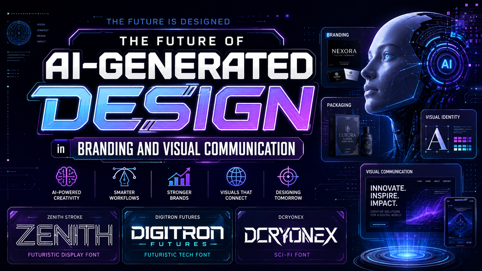
AI-generated design in 2026 is no longer limited to producing a single image from a text prompt. Artificial intelligence is becoming part of complete creative workflows, helping designers research ideas, generate visual directions, edit assets, build layouts, adapt campaigns, organize feedback, and prepare content for multiple channels.
The most important shift is from isolated generation toward collaborative and agentic creation. Instead of asking AI for one finished result, designers can now describe a goal, compare several directions, edit individual elements, preserve brand rules, and continue refining the work through conversation.
This does not remove the need for designers. It changes where their value is concentrated. Speed, production volume, and basic execution are becoming easier to automate. Creative direction, visual judgment, storytelling, cultural awareness, typography, ethical decision-making, and quality control are becoming more important.
For graphic designers, brand strategists, students, and creative businesses, AI-generated design creates both opportunity and pressure. Teams can explore more ideas and produce campaigns faster, but audiences are also becoming more sensitive to repetitive, generic, or poorly directed AI visuals.
The future belongs to creators who use AI as a capable production partner while maintaining a clear human point of view.
Initial Suggestion
Treat AI as a Creative System, Not a Shortcut
AI can accelerate design, but speed alone does not create a meaningful brand.
Before generating anything, define:
- The audience
- The business goal
- The emotional message
- The visual direction
- The brand personality
- The required output formats
- The quality standard
A weak brief usually produces generic results. A clear strategic direction gives both the designer and the AI system better boundaries.
Begin With Exploration
AI is especially useful during early creative development.
Designers can use it to:
- Generate mood-board directions
- Explore visual metaphors
- Test different compositions
- Study color combinations
- Create storyboard variations
- Visualize campaign concepts
- Produce rough product scenes
- Compare photographic and illustrative styles
These outputs should be treated as starting points rather than automatic final answers.
Keep the Workflow Editable
One of the defining standards of AI-generated design in 2026 is editability. Professional designers need control over text, images, layers, spacing, colors, typography, and brand assets.
A useful AI workflow should allow creators to:
- Replace individual objects
- Correct typography
- Refine lighting
- Adjust composition
- Preserve approved elements
- Apply brand guidelines
- Create responsive variations
- Export production-ready assets
Flattened images may be useful for ideation, but layered and editable outputs provide far more value for professional branding.
Protect Human Creative Direction
AI can generate many options, but it does not automatically know which option is strategically correct.
Human designers remain responsible for:
- Selecting the strongest concept
- Removing clichés
- Evaluating cultural context
- Protecting brand consistency
- Checking accessibility
- Correcting factual errors
- Reviewing visual hierarchy
- Confirming licensing and usage rights
- Deciding when the work is finished
Creative judgment becomes more valuable as generating content becomes easier.
Build a Recognizable Typography System
AI-generated layouts often rely on predictable fonts or inconsistent type choices. Professional typography can immediately separate a polished brand from a generic AI composition.
A strong system may include:
- A distinctive display font for headlines
- A functional typeface for body copy
- Clear sizing and spacing rules
- Consistent numerals and punctuation
- Defined mobile and desktop behavior
- Approved font licenses for every use
The following futuristic fonts can help creative teams build a stronger visual language for AI, technology, gaming, digital products, and innovation-focused campaigns.
Jump to Recommended Fonts
1. Zenith Stroke Futuristic Display Font

Zenith Stroke uses sharp geometric lines, linear construction, and an aerodynamic visual rhythm to create a sleek high-tech identity. Its neon-like appearance suits brands that want to communicate digital innovation without relying on excessively heavy or mechanical typography. The balanced spacing keeps short headlines readable while preserving a futuristic and immersive personality.
PROS
- Clean geometric construction
- Strong futuristic identity
- Excellent readability at display sizes
- Works across print and digital media
- Effective on dark or neon-themed layouts
BEST FOR
- AI startup branding
- Technology campaigns
- Esports identities
- Digital interfaces
- Sci-fi titles
- Product packaging
2. Digitron Futures Futuristic Tech Font

Digitron Futures creates a precise digital aesthetic through strong vertical structures, compact proportions, square corners, and horizontal stripe details. Its consistent visual system communicates artificial intelligence, engineered technology, and data-driven environments. The font is bold enough for logos and campaign headlines while remaining controlled and readable across posters, packaging, and digital products.
PROS
- Precise digital-tech appearance
- Strong vertical construction
- Consistent character system
- Clear uppercase and lowercase forms
- Suitable for branding and editorial layouts
BEST FOR
- Artificial intelligence brands
- Software companies
- Technology magazines
- Digital products
- Gaming studios
- Innovation events
3. DCryonex Sci-Fi Font
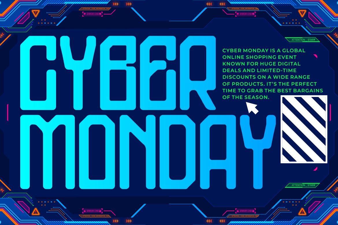
DCryonex combines tall condensed proportions, medium-bold strokes, angular terminals, and rounded internal corners. This creates a mechanical rhythm that feels futuristic but not visually chaotic. Its compact structure helps designers create powerful titles without consuming too much horizontal space, making it useful for interfaces, banners, posters, and campaign systems.
PROS
- Space-efficient condensed structure
- Strong cyber and industrial character
- Balanced readability
- Clean numeric and punctuation styling
- Versatile across promotional formats
BEST FOR
- Robotics branding
- Virtual reality projects
- Gaming interfaces
- Electronic music events
- Futuristic architecture
- Tech advertising
Comparison
Human-Led Design vs AI-Assisted Design
| Area | Traditional Workflow | AI-Assisted Workflow |
|---|---|---|
| Ideation | Manual research and sketching | Rapid generation of multiple directions |
| Image Creation | Photography or manual illustration | Prompting, generation, and visual editing |
| Layout Development | Built one composition at a time | Multiple responsive formats generated quickly |
| Brand Adaptation | Repeated manual adjustments | Automated application of brand rules |
| Revision | Designer edits each requested change | Conversational and targeted iteration |
| Production Volume | Limited by team capacity | Scalable content production |
| Creative Judgment | Fully human-led | Still requires human leadership |
| Differentiation | Based on craft and original thinking | Depends heavily on direction and refinement |
Recommended Font Comparison
| Font | Main Style | Personality | Strongest Application |
| Zenith Stroke | Linear futuristic display | Sleek and immersive | AI and digital branding |
| Digitron Futures | Structured tech display | Precise and engineered | Software and technology |
| DCryonex | Condensed sci-fi display | Mechanical and powerful | Gaming and interfaces |
Best Overall Font for AI Branding
Digitron Futures offers the strongest balance between technological character, readability, and broad professional use.
If you want Best for Futuristic Campaigns
Or you want Best for Software and Technology Brands
Best for Gaming and Esports
Common Mistake
One of the most common mistakes in AI-generated design is confusing quantity with quality. Generating dozens of images or layouts may create the appearance of progress, but a large number of options does not replace a strong concept. Without a clear strategy, AI often produces familiar visual patterns, shallow symbolism, inconsistent details, and work that resembles existing trends rather than establishing a distinctive identity. Designers should reduce the number of directions, evaluate each one against the brief, and refine only the concepts with genuine strategic potential.
Another mistake is publishing AI output without enough human revision. Generated visuals may contain incorrect text, inconsistent objects, unrealistic anatomy, weak hierarchy, cultural inaccuracies, or elements that do not match the brand. Even when the image looks impressive at first glance, closer inspection may reveal problems that reduce trust. Professional teams need a review process covering typography, composition, accessibility, factual accuracy, originality, licensing, and production quality before any AI-assisted design reaches the public.
A third mistake is allowing automation to weaken the brand’s human character. When every campaign uses the same polished lighting, cinematic composition, artificial texture, or predictable prompt aesthetic, the brand becomes less memorable. The strongest creative teams use AI for speed and exploration but preserve human taste through original photography, custom typography, illustration, art direction, and real cultural insight. AI should expand the designer’s visual vocabulary, not replace it with one standardized style.
Conclusion
AI-generated design in 2026 is changing how creative work moves from idea to execution. Conversational tools, agentic workflows, layered editing, image generation, campaign automation, and brand-aware systems are reducing repetitive production work and making advanced design capabilities more accessible.
However, accessibility does not guarantee excellence. As more people gain access to powerful creative tools, strategy, craft, judgment, and originality become the true differentiators.
Designers who succeed in this environment will not compete with AI by trying to work faster manually. They will learn how to direct AI effectively, evaluate its results critically, and add the human insight that automated systems cannot provide on their own.
Typography remains an important part of that differentiation. Fonts such as Zenith Stroke, Digitron Futures, and DCryonex can help AI-focused brands build a visual identity that feels deliberate rather than automatically generated.
Explore these fonts at PutraCetol.com to develop logos, posters, product packaging, gaming graphics, editorial campaigns, and digital experiences with a stronger futuristic voice.
Explore these fonts and many more at PutraCetol.com to build a business identity that looks professional, trustworthy, and memorable.
Additionally, if you want to explore some free typography options, you can check out Putracetol Studio on Dafont. Happy reading and designing!