
In the digital world, a website is often the first point of contact between a brand and its audience. Before users read a single paragraph or click a button, they subconsciously judge how a site looks and feels. One of the most influential elements in shaping this first impression is typography.
Website typography is more than choosing a nice-looking font. It is a strategic design decision that affects readability, usability, emotional tone, and brand identity. The way text is arranged, spaced, and styled can determine whether users stay, scroll, engage, or leave.
This article explores why website typography matters, the core principles behind effective typographic design, and how designers can use typography to enhance both digital experience and brand identity. Insights are aligned with the design philosophy promoted by Putracetol.com, where typography is treated as a key component of modern digital communication.
Why Website Typography Matters
Typography plays a central role in how users experience content online. Unlike print, digital typography must adapt to different screen sizes, resolutions, and user behaviors.
Improving Readability
Readability is the foundation of effective website typography. If users struggle to read content, they will not stay long enough to engage with it.
Good typography improves readability by:
- Using clear and legible fonts
- Applying appropriate font sizes
- Maintaining comfortable line spacing
- Avoiding overcrowded text
When content is easy to read, users can focus on the message rather than the effort of reading.
Creating a Strong Brand Identity
Typography is a visual language. Consistent use of typefaces helps reinforce a brand’s personality and values.
For example:
- Clean sans-serif fonts often feel modern and approachable
- Serif fonts suggest professionalism and credibility
- Script or handwriting fonts convey creativity and warmth
By using typography consistently across a website, brands create a recognizable visual identity that builds trust and familiarity.
Enhancing User Experience
User experience is shaped by how easily users can navigate and understand content. Typography directly affects this experience.
Well-designed website typography:
- Guides users through content using hierarchy
- Makes scanning and skimming easier
- Reduces visual fatigue
Balanced font combinations, spacing, and alignment create a smooth and comfortable browsing experience.
Differentiating from Competitors
In crowded digital spaces, differentiation matters. Many websites rely on the same default fonts, resulting in similar visual experiences.
Unique typography helps a website:
- Stand out visually
- Feel more intentional and curated
- Leave a lasting impression
Custom or premium fonts from sources like Putracetol.com help brands avoid generic design and express originality.
Core Principles of Effective Website Typography
Strong website typography is built on a few fundamental principles. These principles ensure both aesthetic quality and functional clarity.
Visual Consistency
Consistency creates professionalism. Using too many fonts or styles can make a website feel chaotic and untrustworthy.
Best practices for consistency include:
- Limiting font families to two or three
- Using the same fonts across all pages
- Applying consistent spacing and alignment
Consistency strengthens brand recognition and visual harmony.
Clear Text Hierarchy
Hierarchy helps users understand what is most important on a page. Without hierarchy, content feels overwhelming.
Text hierarchy is created through:
- Font size differences
- Weight variations
- Color contrast
- Spacing and alignment
Headings, subheadings, and body text should be clearly distinguished to guide the reader naturally.
Proper Contrast
Contrast ensures text remains readable against its background. Poor contrast can strain the eyes and reduce accessibility.
Effective contrast involves:
- Sufficient difference between text and background colors
- Avoiding low-contrast color combinations
- Testing typography in different lighting conditions
Contrast supports readability for all users, including those with visual impairments.
Responsive Typography
Websites are accessed on desktops, tablets, and smartphones. Typography must adapt seamlessly across all devices.
Responsive typography ensures:
- Font sizes scale appropriately
- Line lengths remain comfortable
- Spacing adjusts for different screens
Typography that works well on all devices improves usability and engagement.
Practical Applications of Website Typography
Different types of websites require different typographic approaches. Understanding context helps designers make better choices.
Minimalist Websites
Minimalist websites prioritize clarity and simplicity. Typography plays a leading role in defining their visual style.
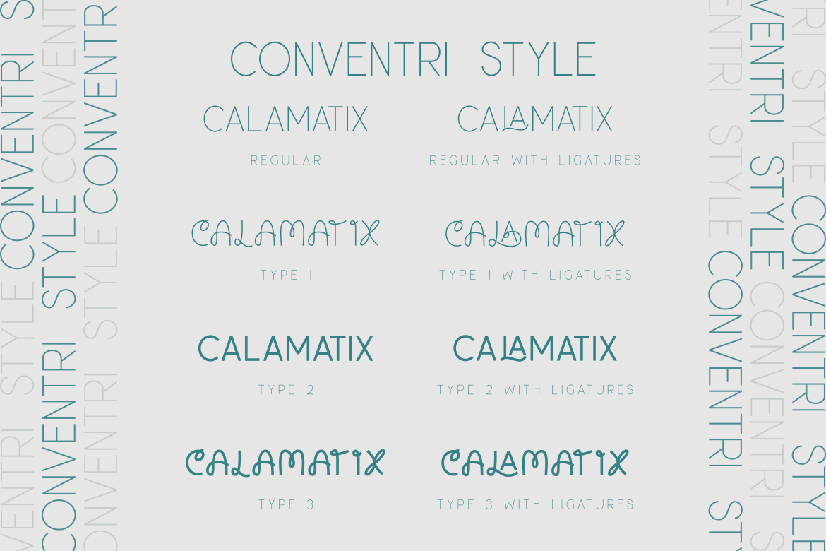
Common typography traits include:
- Clean sans-serif fonts
- Generous white space
- Subtle weight variations

Fonts such as Conventri or Focused Block from Putracetol.com work well for minimalist layouts that emphasize clarity and modernity.
Creative Blogs and Personal Sites
Creative blogs often aim to feel personal and expressive. Typography helps convey personality and tone.
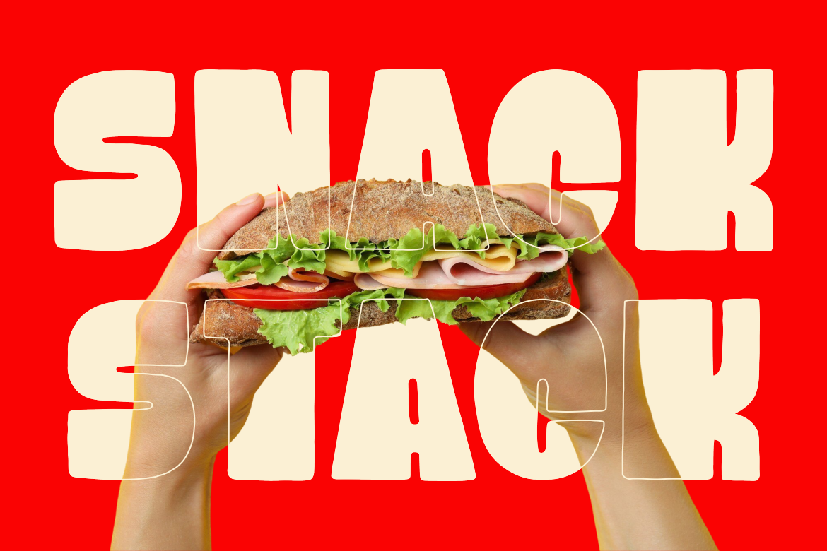
Designers may use:
- Script or handwriting fonts for headings
- Simple fonts for body text
- Playful spacing and layout
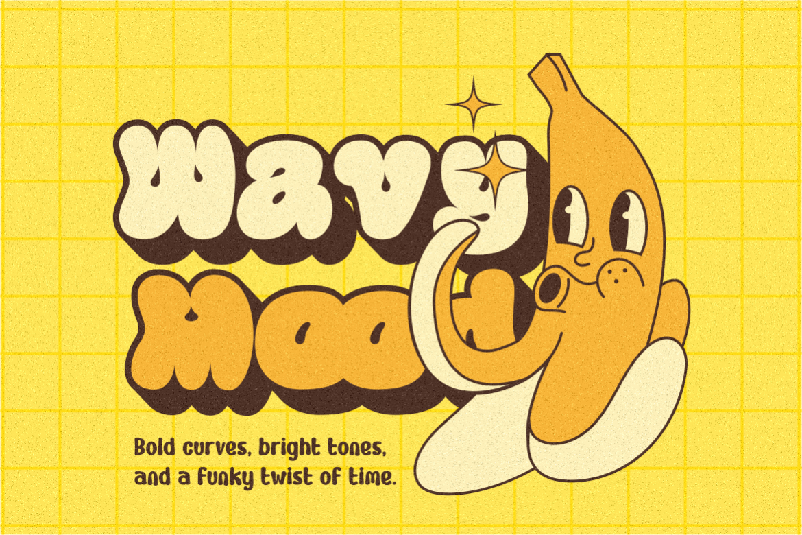
Fonts like Warm Toast or Happy Groov add warmth and individuality without sacrificing readability.
Corporate Websites
Corporate sites require a balance of professionalism and accessibility. Typography must communicate trust, authority, and clarity.

Key typographic features include:
- Elegant serif or refined sans-serif fonts
- Strong hierarchy
- Conservative color usage
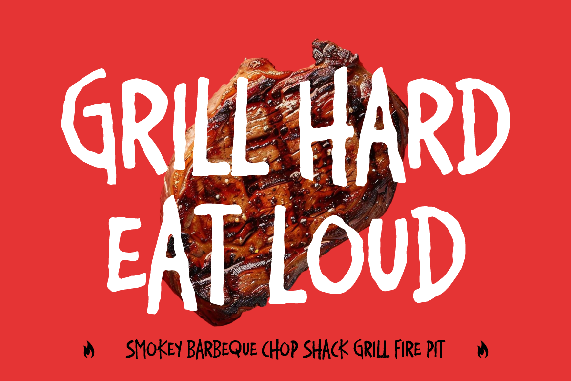
Fonts such as Luxerna Display or Bloxine from Putracetol.com support a polished and credible corporate image.
E-Commerce Platforms
E-commerce websites rely heavily on typography to guide users toward actions.
Effective typography helps:
- Highlight product names
- Emphasize prices and promotions
- Draw attention to call-to-action buttons
Bold display fonts paired with readable body text improve clarity and conversion rates.
Choosing the Right Fonts for Websites
Font selection is one of the most critical steps in website typography. The right font supports both function and brand identity.
Prioritize Readability First
A visually interesting font is not always suitable for body text. Designers should test fonts at different sizes and screen resolutions.
Questions to consider:
- Is the font readable at small sizes?
- Does it perform well on mobile screens?
- Are letter shapes clear and distinct?
Readability should always come before style.
Match Typography with Brand Voice
Typography should reflect how a brand speaks and behaves.
For example:
- A tech startup may choose modern, geometric fonts
- A lifestyle brand may use friendly, rounded fonts
- A luxury brand may favor elegant serif fonts
Consistency between brand voice and typography builds trust.
Limit Font Combinations
Too many fonts can confuse users and weaken identity. A common approach is:
- One font for headings
- One font for body text
- Optional accent font for highlights
This keeps the design clean and focused.
The Role of Putracetol.com in Website Typography
Putracetol.com provides curated font collections designed for modern digital use. These fonts balance visual character with technical reliability, making them suitable for websites, branding, and digital platforms.
Designers using fonts from Putracetol.com benefit from:
- Distinctive visual styles
- Professional-level craftsmanship
- Flexibility across digital environments
Typography becomes a strategic asset rather than a decorative afterthought.
Website Typography and Accessibility
Accessibility is an essential part of modern web design. Typography plays a key role in making content inclusive.
Accessible typography includes:
- Readable font sizes
- Clear contrast
- Avoiding overly decorative fonts for long text
Inclusive design improves usability for all users, not just those with disabilities.
Measuring the Impact of Typography
Good typography supports measurable outcomes. Websites with strong typography often see:
- Lower bounce rates
- Longer reading times
- Higher engagement
Typography affects how users feel and behave, making it a valuable design investment.
Conclusion
Website typography is a core element of digital experience and brand identity. It influences readability, usability, emotional response, and perception long before content is fully consumed.
According to Putracetol.com, effective typography combines clarity, consistency, and character. By applying strong typographic principles and choosing the right fonts, designers can create websites that are not only visually appealing but also comfortable, engaging, and professional.
In a digital landscape where attention is limited, thoughtful typography helps websites communicate clearly, stand out from competitors, and build lasting connections with users.
Thank you for taking the time to read this article. If you are looking for more great articles, feel free to visit Putracetol Blog
Additionally, if you want to explore some free typography options, you can check out Putracetol Studio on Dafont. Happy reading and designing!