
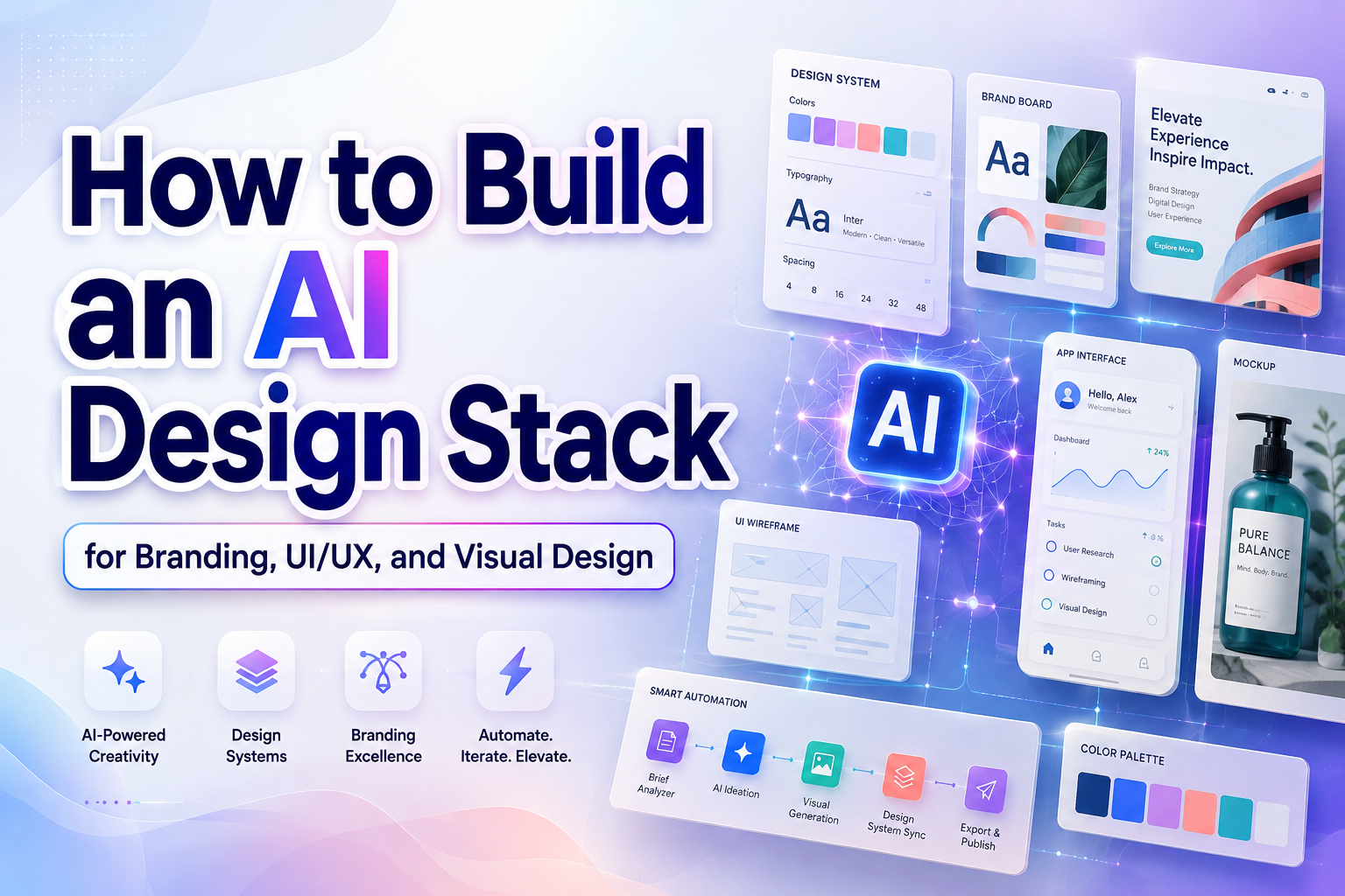
The most effective AI design stack does not begin with a list of fashionable applications. It begins with a clear map of the creative process.
Identify where your current workflow becomes slow, repetitive, inconsistent, or difficult to manage. A branding team may struggle to convert research into several visual directions. A UI/UX designer may spend too much time producing early wireframes, while a graphic designer might need faster campaign variations without losing the original identity.
Once the problem is clear, assign AI to a specific task. Do not add a tool simply because it can generate images, layouts, or copy.
A useful principle is:
AI should expand options and reduce repetitive work, while people remain responsible for meaning, judgment, taste, and approval.
The goal is not to automate every stage. It is to create more time for research, storytelling, typography, customer understanding, and the decisions that make one design meaningfully different from another.
What Is an AI Design Stack?
An AI design stack is a connected group of artificial intelligence tools, design applications, font resources, review methods, and working rules used throughout a creative project.
A complete stack may support:
- Research synthesis
- Creative briefing
- Moodboard development
- Image and illustration concepts
- Font exploration
- Information architecture
- Wireframing
- Layout generation
- UI prototyping
- Content adaptation
- Accessibility testing
- Asset production
- Version management
- Rights and provenance documentation
The word stack is important because one application rarely performs every role equally well. A conversational tool may be effective for organizing research but unsuitable for final typography. An image generator can explore visual atmosphere but may not create a reliable interface. A layout generator can accelerate wireframes, but the design still needs product logic, accessibility, and brand refinement.
The strongest workflow combines specialized tools and establishes a clear handoff between them.
Why AI Should Remain a Creative Assistant
AI is useful because it can produce alternatives quickly. It can summarize information, identify patterns, suggest layout directions, generate visual references, resize content, and explain common design issues.
However, speed is not the same as creative quality.
AI does not automatically understand which tension makes a brand interesting, why a cultural reference may be inappropriate, or which small visual detail creates emotional recognition. It can imitate patterns found in its available context, but the designer must decide whether those patterns serve the audience and project.
A human-led process gives AI four limited responsibilities:
- Explore: Generate possible directions.
- Organize: Structure information and assets.
- Assist: Reduce repetitive production work.
- Evaluate: Flag potential issues for human review.
The designer remains responsible for:
- Defining the problem
- Understanding the audience
- Setting creative constraints
- Choosing and combining directions
- Verifying factual and cultural accuracy
- Protecting accessibility
- Confirming licensing
- Approving the final design
The Eight Layers of a Practical AI Design Stack
| Stack Layer | Main Question | Useful AI Role | Required Human Decision |
|---|---|---|---|
| Research | What do we know about the audience and problem? | Summarize notes and group themes | Decide which evidence is credible and relevant |
| Strategy | What should the design communicate? | Draft briefs and positioning alternatives | Define the final promise and priorities |
| Concept | What could the visual world look like? | Generate moodboards and creative territories | Select an original, appropriate direction |
| Typography | Which visual voice supports the concept? | Compare categories and create mockup scenarios | Select, license, and refine the real fonts |
| Structure | How should information be organized? | Suggest sitemaps, flows, and wireframes | Confirm user needs and content hierarchy |
| Execution | How should the direction become a working design? | Generate layouts, assets, and prototypes | Refine interaction, composition, and identity |
| Quality | Does the design work for real users? | Detect repeatable errors and inconsistencies | Conduct manual, contextual, and user evaluation |
| Governance | Can the work be reused and defended responsibly? | Organize prompts, versions, and asset metadata | Approve rights, privacy, provenance, and release |
Each layer should have one clear source of truth. Research might live in a shared project document, visual design in Figma, and final brand assets in an approved library. Allowing several AI tools to independently change the same content can quickly create conflicting versions.
Layer 1: Research and Creative Briefing
AI can reduce the time needed to organize interview notes, survey responses, competitor observations, support questions, and stakeholder comments.
For example, a brand strategist could provide twenty anonymized customer comments and ask the tool to group them into recurring needs, frustrations, trust signals, and language patterns. The output can help the team identify where deeper analysis is required.
AI should not invent customer evidence. Separate sourced findings from generated suggestions and preserve the original material so the team can verify every important conclusion.
A strong AI-assisted creative brief should include:
- Business objective
- Target audience
- Customer problem
- Main brand promise
- Desired perception
- Required deliverables
- Existing brand assets
- Technical constraints
- Accessibility requirements
- Cultural considerations
- Production formats
- Ideas or references to avoid
- Approval criteria
Instead of asking, “Create a beautiful identity,” ask for several directions based on specific business and audience requirements.
Layer 2: Visual Territory and Moodboard Development
AI image tools can help designers explore atmosphere before investing time in final artwork. The goal is not to generate one perfect image. It is to compare visual territories.
Adobe Firefly currently supports the generation and editing of images, video, audio, and design assets, while Canva AI combines conversational creation with design, writing, and other visual-production tools. These platforms can be useful for moodboards, rough campaign scenes, asset variations, and early concept testing.
Create at least three intentionally different territories:
Conservative Direction
This direction should feel familiar to the market while improving clarity and professionalism.
Differentiated Direction
This version should retain category recognition while introducing a stronger brand personality.
Experimental Direction
This territory can challenge category expectations, explore unusual typography, or introduce a more distinctive visual system.
Comparing several clear territories is more useful than generating twenty nearly identical images. Label each direction with its strategic purpose rather than describing it only through colors or styles.
For example:
- Quiet Authority: Structured typography, restrained colors, and precise imagery
- Cultural Energy: Expressive display lettering, handmade details, and vibrant compositions
- Future Craft: Technical grids combined with imperfect natural texture
These names help stakeholders discuss the intended impression instead of reacting only with “I like it” or “I do not like it.”
Layer 3: Typography and Brand Voice
Typography should become one of the most deliberate layers of the AI design stack. AI can accelerate exploration, but the final identity should use real, licensed font files rather than generated imitations of lettering.
AI can assist typography by:
- Turning brand attributes into a typographic brief
- Comparing serif, sans serif, script, display, and experimental directions
- Suggesting font-pairing roles
- Generating sample headlines and packaging scenarios
- Creating alternative hierarchy structures
- Stress-testing long and short brand names
- Suggesting spacing and scale variations
- Identifying where a display font should be replaced by a simpler companion
A useful typographic prompt might be:
Develop three typography directions for a modern beverage brand inspired by Southeast Asian hospitality. The identity should feel warm, crafted, and contemporary rather than tourist-oriented. Recommend one expressive display role, one functional supporting role, hierarchy rules, packaging applications, and cultural risks to review.
The AI output is a strategic starting point. The designer should then test actual font products using the real brand name, language, packaging size, and production method.
Treat Generated Lettering as a Placeholder
Text appearing inside an AI-generated image should be treated as concept art, not production typography. Rebuild the final wording inside a proper design application using a real font.
This improves:
- Spelling accuracy
- Kerning
- Readability
- Brand consistency
- Multilingual support
- Editing flexibility
- Print quality
- Licensing documentation
The concept generator can suggest the atmosphere. The actual typeface gives the identity a repeatable visual system.
Layer 4: Information Architecture and Wireframes
AI can help teams organize content before visual styling begins.
Relume’s AI Site Builder currently supports the generation of sitemaps, wireframes, and style guides for marketing websites, with workflows that can continue into Figma, Webflow, or React.
This type of tool is useful for quickly exploring:
- Page hierarchy
- Navigation structures
- Landing-page sections
- Content order
- Calls to action
- Reusable website components
- Alternative user journeys
The generated wireframe should still be challenged.
Ask:
- Does the page answer the visitor’s main question early enough?
- Is every section necessary?
- Does the content order reflect user intent?
- Are important actions visible?
- Does the structure work on mobile?
- Has the AI repeated generic website patterns without understanding the business?
A wireframe is not successful because it was generated quickly. It is successful when it gives the right information to the right person at the right time.
Layer 5: Layout, Interface, and Prototyping
Current Figma AI features can support design exploration, image editing, diagram creation, file search, and other in-editor tasks. Figma Make can turn prompts and design context into interactive prototypes, while the newer Figma agent can generate and refine editable design layers before a concept moves into more detailed behavior.
These tools can help designers:
- Produce several layout directions
- Populate realistic content
- Generate interface states
- Explore onboarding flows
- Create rough prototypes
- Test different information hierarchies
- Build early interactions
- Compare alternative visual systems
The designer should inspect every generated component for:
- Logical behavior
- Correct hierarchy
- Responsive performance
- Design-system consistency
- Keyboard interaction
- Empty and error states
- Realistic content
- Accessibility
- Technical feasibility
AI-generated interfaces often look convincing before the complete workflow has been considered. Do not evaluate only the ideal screen. Test what happens when content is long, data is missing, an action fails, a translation requires more space, or a user needs help.
Layer 6: Campaign Production and Adaptation
Once the main direction has been approved, AI can help adapt it into multiple formats.
Canva AI supports conversational design workflows and element-level refinement, while Adobe Firefly can assist with image generation, expansion, editing, and other production tasks.
Typical adaptation tasks include:
- Resizing social graphics
- Extending image backgrounds
- Creating campaign variations
- Producing alternative crops
- Removing unwanted visual elements
- Translating rough concepts into presentation mockups
- Generating supporting illustrations
- Preparing several headline options
- Adapting one concept across print and digital formats
Automation should preserve the approved visual rules. A faster production process is not useful when every generated variation changes the typography, spacing, color behavior, or tone.
Create a short production specification covering:
- Approved fonts
- Type scale
- Color palette
- Grid
- Margins
- Image treatment
- Illustration style
- Logo placement
- CTA behavior
- Required legal information
Use this specification as context for every AI-assisted adaptation.
Layer 7: Accessibility and Design Quality
AI can help detect color-contrast issues, missing labels, inconsistent components, unclear hierarchy, or other repeatable problems. However, an automated tool cannot determine whether the complete experience is accessible.
W3C states that accessibility tools cannot automatically check every requirement, may produce false or misleading results, and require knowledgeable human judgment. W3C also recommends involving people with disabilities early and throughout the design process.
A responsible quality layer should combine:
- Automated accessibility checks
- Color-contrast testing
- Keyboard review
- Screen-reader testing
- Zoom and text-resizing checks
- Motion and animation review
- Content readability
- Localization testing
- Manual design-system inspection
- Usability sessions with representative users
WCAG 2.2 is the current W3C-recommended version for new accessibility work and adds requirements addressing areas such as focus visibility, target size, dragging, consistent help, and accessible authentication.
AI should help teams find problems earlier. It should not be used as evidence that a design automatically meets every accessibility need.
Layer 8: Governance, Rights, and Provenance
Every AI design stack needs rules for what can be uploaded, generated, reused, modified, and released.
NIST’s AI Risk Management Framework organizes risk-management activity around four functions: Govern, Map, Measure, and Manage. This provides a useful model for creative teams that need to define ownership, document risk, evaluate outputs, and establish approval procedures.
A practical AI design policy should document:
- Approved tools
- Restricted client information
- Whether confidential assets may be uploaded
- Who reviews generated content
- How prompts and source files are stored
- Which outputs require cultural or legal review
- How AI involvement is disclosed
- How licenses are verified
- How final assets are approved
- How generated work is archived
Adobe’s Content Credentials can attach tamper-evident metadata describing how supported files were created or edited, including whether generative AI was involved. This can improve transparency and help creators preserve information about their contribution.
Copyright treatment also depends on jurisdiction and the nature of the human contribution. The U.S. Copyright Office’s current guidance distinguishes human-authored expression from material generated entirely by AI, making documentation of meaningful human selection, arrangement, modification, and creative control especially valuable.
A Practical AI Design Prompt Framework
A strong prompt should provide enough structure for the tool to understand the design problem without dictating every visual decision.
Use this formula:
Role + project context + audience + objective + deliverable + brand personality + required content + technical constraints + accessibility requirements + cultural considerations + exclusions + output format
Example Prompt for a Global Food Brand
Act as a senior brand design assistant. Develop three visual territories for a premium Asian tea brand entering an international market. The audience is design-conscious adults aged 25–45 who value craft, modern hospitality, and transparent sourcing. Deliver a typography direction, color palette, packaging layout concept, photography approach, and landing-page hero structure for each territory. Avoid generic temple, dragon, or tourist imagery. Use culturally inspired display typography only for short English headlines, and flag any native-language text that requires a verified script-specific font. Explain the strategic advantage and cultural risk of each direction.
This prompt gives AI a defined role while keeping the designer responsible for research and final cultural judgment.
Establish Human Approval Gates
Do not let one generated output automatically become the input for the next tool without review.
Set approval gates at four points:
Gate 1: Strategy Approval
Confirm the audience, problem, positioning, and message before generating visual concepts.
Gate 2: Direction Approval
Choose one visual territory before producing a large number of layouts and assets.
Gate 3: System Approval
Approve typography, color, spacing, components, imagery, and accessibility rules before scaling production.
Gate 4: Release Approval
Confirm accuracy, rights, cultural suitability, accessibility, and technical quality before publication.
These gates prevent a weak early assumption from spreading through the complete stack.
How to Evaluate an AI Design Tool
Do not judge a tool only by how quickly it generates a polished image.
Evaluate it across these criteria:
| Criterion | Question |
| Problem fit | Does it solve a real bottleneck in the workflow? |
| Editability | Can the result be changed at an element level? |
| Control | Can designers provide references, constraints, and brand rules? |
| Consistency | Can it maintain an approved system across variations? |
| Export quality | Can the output move into professional production tools? |
| Collaboration | Can teams review, comment, and manage versions? |
| Accessibility | Does the workflow support accessible design and evaluation? |
| Privacy | Is it appropriate for confidential client material? |
| Rights | Are generated and uploaded assets covered for the intended use? |
| Provenance | Can the team record how and where the asset was created? |
| Cost | Does the saved time justify the subscription and training effort? |
A tool that generates impressive but uneditable assets may be less useful than a simpler tool that integrates cleanly with the team’s existing workflow.
Three Example AI Design Stacks
Lean Stack for a Solo Graphic Designer
- Conversational AI for research and briefing
- Firefly or Canva AI for visual exploration
- Professional design software for final composition
- PutraCetol fonts for distinctive typography
- Manual accessibility and production checks
- Shared folder for prompts, licenses, and final assets
This stack prioritizes speed without adding too many subscriptions.
Product Design Stack for a UI/UX Team
- AI-assisted research synthesis
- FigJam AI for workshop organization
- Relume for sitemap and early wireframes
- Figma AI and Figma Make for layouts and prototypes
- Approved design-system typography
- Automated and manual accessibility testing
- Version history and governance documentation
This workflow keeps Figma as the central design source while using AI around it.
Brand Campaign Stack for an Agency
- Research assistant for stakeholder and audience synthesis
- Firefly for visual territory generation
- Licensed display fonts for identity exploration
- Figma or Adobe tools for final brand systems
- Canva AI for controlled campaign adaptation
- Content Credentials and asset records for transparency
- Human creative direction, legal review, and client approval
The agency should maintain clear rules about which generated assets are exploratory and which may enter final commercial production.
Using AI With Culturally Inspired Typography
The seven fonts recommended below can give AI-assisted concepts a distinctive international character. However, cultural inspiration should remain precise and researched.
Do not ask an AI tool to “make the design Asian” or “add a tribal look.” Describe the specific market, creative reference, audience, and intended emotional effect.
Also verify whether the selected font contains the script needed for the project. A Korean-inspired Latin display font should not automatically be used to typeset Korean text, just as a Greek-inspired headline font may not provide the complete character support required for Greek-language communication.
Use AI to explore composition and atmosphere. Use professional typography, native-language review, and human cultural judgment to complete the identity.
Jump to Recommended Fonts
Hangul Street Korean Style Font | Lyros Greek Font | Golden Dynasty Chinese Style Font | Sukhara Thai Style Font | Sacred Obsidian Ethnic Tribal Display Font | Bushido Stroke Japanese Brush Display Font | Pueblo Trails Mexican Font
1. Hangul Street Korean Style Font
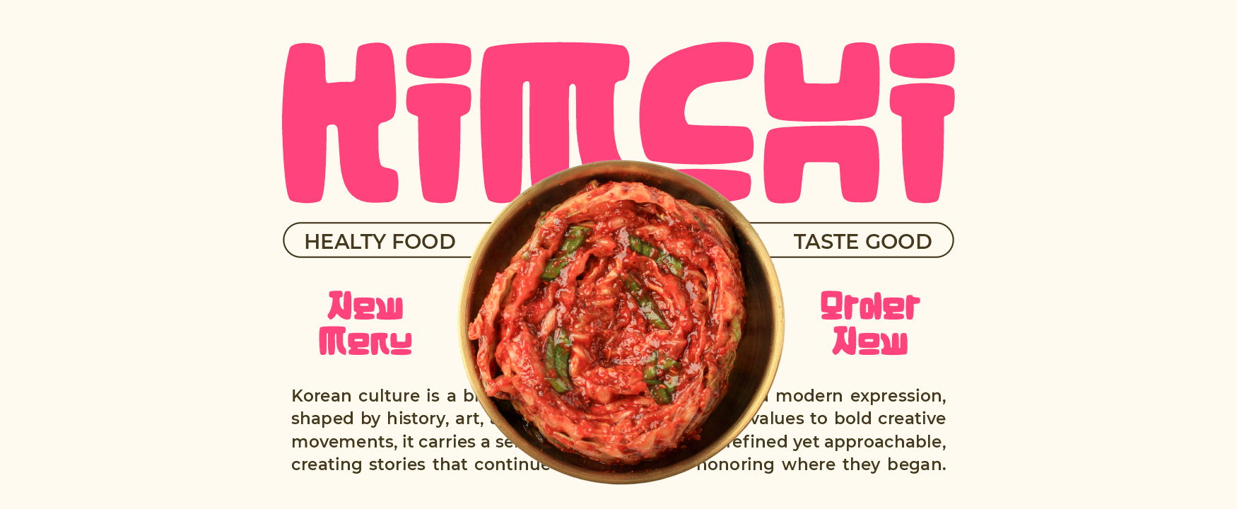
Hangul Street uses bold, rounded forms and compact proportions to create a playful, pop-driven personality inspired by contemporary Korean street branding. Its strong silhouette remains visible across packaging, social graphics, posters, and AI-generated brand mockups, while the softened corners prevent the design from feeling overly rigid. It is an effective typographic anchor when an AI concept needs youthful energy rather than a generic geometric font.
PROS: Bold visibility, friendly rounded structure, youthful rhythm, and strong digital campaign appeal.
BEST FOR: K-pop visuals, Korean-inspired snack packaging, streetwear, youth brands, entertainment, stickers, and social campaigns.
2. Lyros Greek Font
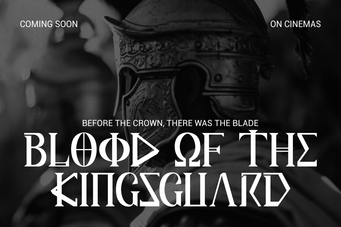
Lyros combines tall proportions, carved details, sharp angles, and strong vertical emphasis inspired by classical Greek letterforms. Its monumental construction can give AI-generated moodboards and identity concepts a sense of mythology, historical scale, and cinematic authority. The typeface is particularly effective for short titles that need to feel heroic and established without becoming visually overloaded.
PROS: Monumental silhouette, disciplined geometry, clear headline presence, and strong historical atmosphere.
BEST FOR: Mythology, museums, film titles, historical games, architecture, cultural events, and premium heritage branding.
3. Golden Dynasty Chinese Style Font
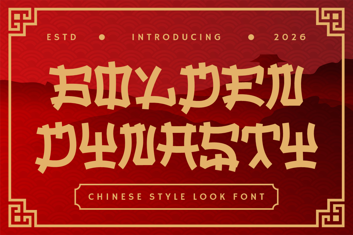
Golden Dynasty uses bold strokes, angular construction, cut edges, and ornamental details to build a dramatic Chinese-inspired display identity. Its highly structured forms can help AI-generated packaging and campaign concepts appear festive, confident, and immediately recognizable. Pair it with a neutral supporting font so ingredients, descriptions, prices, and other practical information remain clear.
PROS: Powerful visual structure, sharp ornamental details, strong packaging visibility, and memorable cultural character.
BEST FOR: Tea, noodles, restaurant branding, beverage packaging, festivals, tourism, games, posters, and seasonal campaigns.
4. Sukhara Thai Style Font
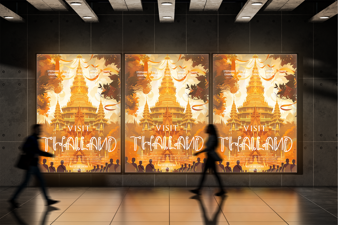
Sukhara brings flowing decorative details and an elegant Southeast Asian atmosphere to display typography. Its graceful movement can soften AI-generated layouts that otherwise feel too mechanical, making it useful for hospitality, wellness, food, and travel concepts. Use it for short English titles and pair it with appropriate native-script typography whenever actual Thai-language content is required.
PROS: Flowing visual rhythm, elegant cultural mood, decorative personality, and strong hospitality appeal.
BEST FOR: Thai-inspired restaurants, resorts, spas, herbal products, wellness brands, travel campaigns, and premium food packaging.
5. Sacred Obsidian Ethnic Tribal Display Font

Sacred Obsidian uses carved letter shapes, angular cuts, rough hand-drawn edges, and symbolic internal details to create an artifact-like visual presence. Its irregular construction can give AI concept boards a tactile, archaeological, or handcrafted quality that polished generators often struggle to establish consistently. Because ethnic and tribal references can be culturally sensitive, it is strongest in carefully researched heritage projects or fictional creative worlds that do not make unsupported cultural claims.
PROS: Carved appearance, handmade texture, symbolic character, and powerful display impact.
BEST FOR: Museum projects, fictional archaeology, craft brands, exhibitions, folklore-inspired publishing, galleries, and heritage product concepts.
6. Bushido Stroke Japanese Brush Display Font
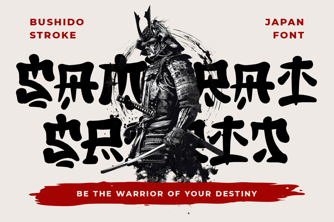
Bushido Stroke uses expressive brush-inspired construction, substantial marks, organic edges, and visible handcrafted energy. It can add movement and human imperfection to AI-generated visuals, making it particularly effective for action-focused branding, food packaging, films, and cultural campaigns. The font works best as a prominent display element supported by simpler typography for detailed communication.
PROS: Energetic brush movement, bold silhouette, organic texture, and strong dramatic personality.
BEST FOR: Japanese-inspired food brands, ramen packaging, martial arts, animation, games, film posters, tea products, and cultural events.
7. Pueblo Trails Mexican Font
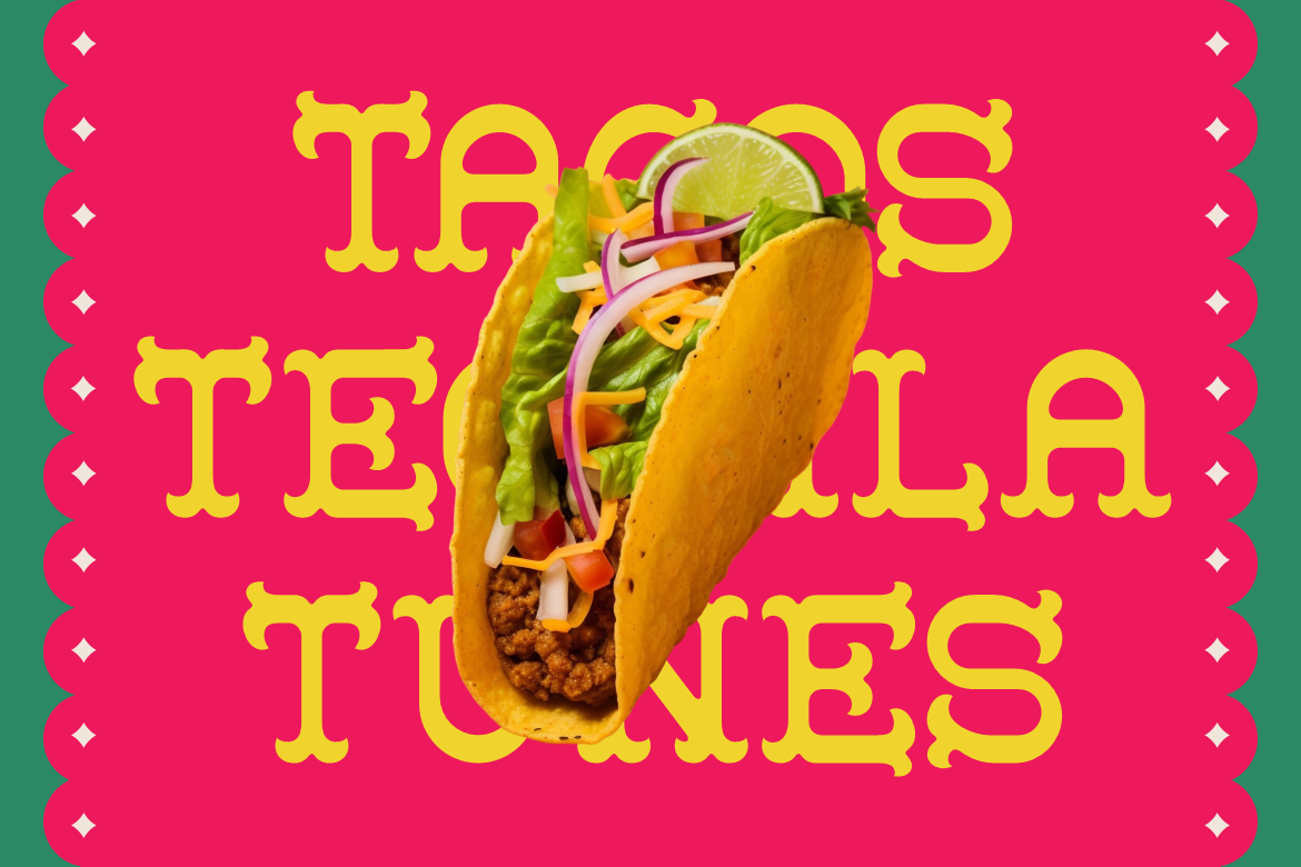
Pueblo Trails combines thick structured forms with decorative serifs, tall proportions, and generous spacing. Its festive handcrafted character brings warmth and cultural energy to packaging, posters, restaurant identities, and AI-assisted campaign concepts while maintaining strong headline readability. It is particularly useful when the design needs to feel celebratory and approachable rather than overly formal.
PROS: Festive serif details, strong readability, warm handcrafted personality, and distinctive packaging presence.
BEST FOR: Mexican restaurants, taco brands, sauces, snacks, festivals, event posters, tourism, souvenirs, and craft labels.
Comparison
| Font | Main Visual Direction | Strongest AI Design Role | Ideal Project Type |
| Hangul Street | Rounded, bold, and pop-driven | Youthful branding territory | Entertainment, snacks, and streetwear |
| Lyros | Monumental, angular, and classical | Heritage and cinematic concepts | Films, museums, mythology, and games |
| Golden Dynasty | Structured, festive, and ornamental | Dramatic packaging exploration | Food, tea, festivals, and restaurants |
| Sukhara | Flowing, elegant, and decorative | Hospitality and wellness moodboards | Resorts, spas, travel, and premium food |
| Sacred Obsidian | Carved, symbolic, and handcrafted | Artifact and fictional-world concepts | Museums, publishing, exhibitions, and crafts |
| Bushido Stroke | Organic, energetic, and brush-led | Action and expressive visual territories | Food, films, games, and martial arts |
| Pueblo Trails | Festive, serif-led, and approachable | Warm packaging and campaign direction | Restaurants, events, tourism, and retail |
Common Mistakes
The first mistake is building an AI design stack around the largest possible number of tools. Designers may generate research in one platform, copy it into a second tool, create images in three different generators, and then rebuild the same layout several times because none of the outputs share a common system. This creates subscription costs, lost context, conflicting versions, and inconsistent assets. Choose one tool for each meaningful role, define the source of truth, and remove any application that does not solve a measurable workflow problem.
The second mistake is sending vague prompts through the complete stack and treating polished output as strategic evidence. A beautiful AI-generated layout can still be based on an invented audience need, generic category assumptions, inaccurate cultural references, or an inaccessible interaction. Provide real project context, preserve original research, and establish human approval gates before each major handoff. AI should suggest possibilities, but people must verify the concept, choose the typography, test the user journey, and decide whether the work supports the brand’s actual objective.
The final mistake is overlooking rights, licensing, accessibility, and cultural responsibility until production is nearly complete. A generated visual may contain elements that are difficult to trace, a display font may require additional coverage for logos, websites, digital ads, applications, or customer-editable tools, and an automated accessibility score may miss serious contextual barriers. PutraCetol’s current licensing system separates static work from uses such as live webfonts, registered logos, digital advertising, apps, broadcast, and SaaS, so the chosen coverage should match the real output. Document every important asset, use culturally inspired fonts with researched context, and keep human review central to the final release.
Conclusion
A successful AI design stack is not a machine that produces finished creativity without human effort. It is a structured workflow that gives designers more time to think.
AI can organize research, generate alternative visual territories, assist with wireframes, build early prototypes, adapt campaign assets, and identify repeatable quality issues. Professional fonts, design systems, human judgment, accessibility evaluation, and cultural understanding turn those generated possibilities into a coherent final result.
Begin with the workflow rather than the software. Assign each tool a defined responsibility, preserve one source of truth, and establish human approval gates at strategy, concept, system, and release stages.
Typography should remain one of the strongest human-controlled layers. Hangul Street can add youthful Korean-inspired energy, Lyros offers monumental Greek character, Golden Dynasty creates dramatic Chinese-inspired branding, and Sukhara introduces graceful Thai-inspired atmosphere. Sacred Obsidian brings a carved artifact quality, Bushido Stroke provides dynamic Japanese brush movement, and Pueblo Trails delivers festive Mexican warmth.
Fonts from PutraCetol Studio can help transform generic AI-generated layouts into more distinctive visual identities. When AI accelerates production and designers protect meaning, craft, and context, the stack becomes more than a collection of tools. It becomes a practical creative system for producing faster work without giving up originality.
Explore these fonts and many more at PutraCetol.com to build a business identity that looks professional, trustworthy, and memorable.
Additionally, if you want to explore some free typography options, you can check out Putracetol Studio on Dafont. Happy reading and designing!