
Test a Task Before Reviewing the Look
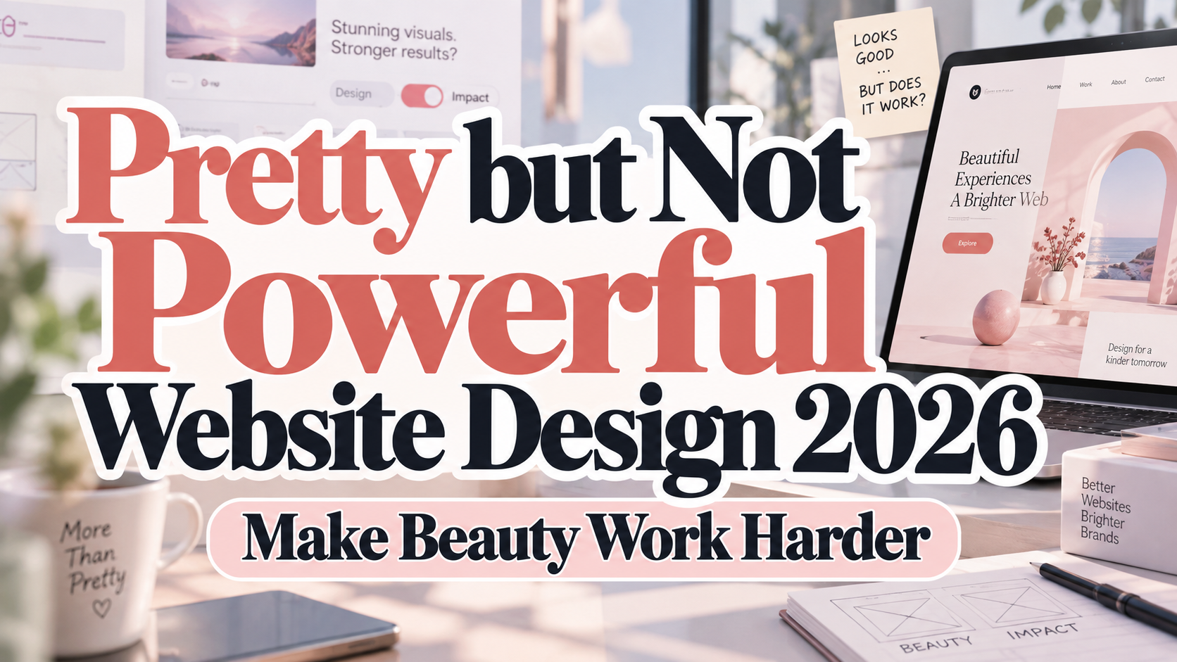
Imagine a beautifully animated agency website where visitors cannot find services, understand pricing, or request a proposal. The visual presentation is impressive, but the customer journey remains unfinished.
Before redesigning, ask someone unfamiliar with the site to complete one realistic task. Can they identify the offer, find relevant proof, and take the next step without coaching?
Define “powerful” according to purpose. A shop needs understandable purchasing; a publisher needs comfortable reading; a service business needs qualified inquiries. Do not judge every website by the same conversion target.
Where Attractive Websites Lose Their Purpose
The Message Sounds Polished but Says Little
Replace “We create extraordinary possibilities” with a concrete statement about your audience, service, and value.
For a hypothetical studio, try: “Packaging design for independent food brands, from identity development to print-ready artwork.”
Follow with relevant work, a clear process, and an honest explanation of what happens after contact. Let the visual identity reinforce the offer rather than substitute for it.
Navigation Makes Visitors Guess
Keep expressive language in storytelling, but use recognizable labels for essential destinations. “Services,” “Pricing,” and “Contact” deserve consideration before abstract labels such as “Universe” or “Connect Beyond.”
Build logical headings and meaningful page regions. W3C explains that structured content supports navigation for keyboard users, screen-reader users, and people who need clearer orientation.
Typography Looks Elegant but Becomes Unreadable
Test body text, captions, and buttons at realistic sizes. Pale lettering on a pale background is not an acceptable trade for a premium mood.
WCAG 2.2 AA generally requires contrast of at least 4.5:1 for ordinary text and 3:1 for qualifying large text, with defined exceptions. Thin or unusual letterforms can require additional practical care.
Explore PutraCetol Studio for distinctive headline typography, then pair your choice with a readable supporting family. Give brand expression and functional reading different responsibilities.
Visual Effects Take Priority Over Responsiveness
Evaluate loading, responsiveness, and stability rather than animation alone. Google’s current Core Web Vitals targets are LCP within 2.5 seconds, INP at 200 milliseconds or less, and CLS at 0.1 or less, assessed at the 75th percentile of visits.
Inspect oversized images, unnecessary scripts, and loading shifts. Keep motion when it explains a transition or demonstrates a product; remove effects that delay access to essential information.
The Form Looks Simple but Offers Little Help
A minimal form still needs understandable labels, instructions, validation, and confirmation. W3C recommends requesting only necessary information and providing feedback that helps people correct errors and recognize successful completion.
Use a specific call to action such as “Request a Project Quote.” Explain what happens next instead of leaving visitors with a generic “Submitted” message.
Build a Better Redesign Process
Map one complete journey from entry page to outcome. Record unanswered questions, missing evidence, navigation problems, and technical barriers before changing the visual style.
Prioritize blockers over decoration. Prototype the revised flow, then test it on actual phones, with enlarged text, and without a mouse. Include people with disabilities in evaluation. Automated checks help, but W3C states that no tool alone can determine accessibility conformance.
Measure task completion, form errors, qualified inquiries, or successful purchases according to the goal. Compare traffic sources and device groups before attributing every improvement to design.
Comparison
| Design Decision | Appearance-First Approach | Purpose-Led Alternative |
|---|---|---|
| Homepage | Dramatic but vague introduction | Specific offer and relevant proof |
| Navigation | Inventive labels everywhere | Predictable routes to important pages |
| Typography | Decorative styling throughout | Expressive headlines, readable information |
| Motion | Constant visual spectacle | Effects that explain or guide |
| Forms | Minimal appearance, unclear feedback | Clear labels, errors, and confirmation |
| Evaluation | Stakeholder preference | Real tasks and meaningful outcomes |
Common Mistakes
The first mistake is replacing an entire visual identity before diagnosing the problem. Start by checking whether visitors misunderstand the offer, encounter technical barriers, or arrive with expectations the page does not meet. Preserve recognizable brand elements when the issue lies elsewhere.
Another mistake is treating conversion optimization as permission to pressure visitors. Avoid artificial urgency, hidden conditions, and repeated interruptions. Present genuine evidence, transparent expectations, and a clear next step. Make informed decisions easier rather than making refusal harder.
The final mistake is assuming that longer visits always indicate engagement. Investigate whether people are reading useful content or struggling to find basic information. Pair behavioral metrics with observed tasks and feedback, and keep refining the site after launch.
Conclusion
Escaping pretty but not powerful website design does not require abandoning beauty. It requires connecting visual decisions to clear communication, dependable interactions, and meaningful customer outcomes.
Keep distinctive typography, thoughtful imagery, and purposeful motion. Support them with readable content, accessible components, realistic testing, and an understandable journey.
Let PutraCetol Studio typography express your brand’s personality while the wider experience delivers on its promise. A successful website should be worth using, not just worth admiring.
Explore these fonts and many more at PutraCetol.com to build a business identity that looks professional, trustworthy, and memorable.
Additionally, if you want to explore some free typography options, you can check out Putracetol Studio on Dafont. Happy reading and designing!