
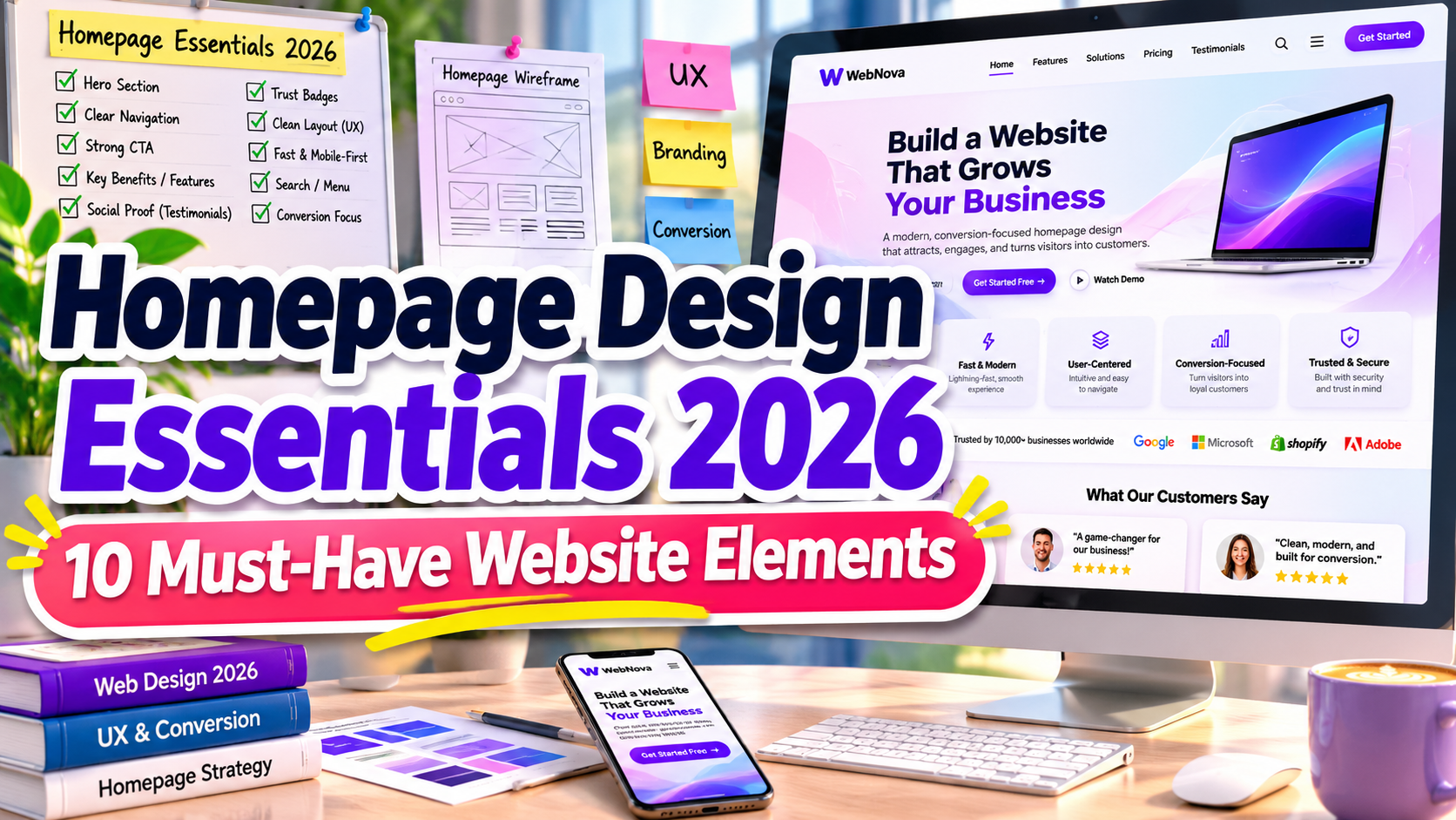
Homepage Design Essentials 2026: 10 Must-Have Elements for a High-Converting Website
Your homepage is often the first interaction visitors have with your business. Within moments, they begin evaluating whether your website looks trustworthy, provides relevant information, and deserves their attention.
Understanding the homepage design essentials 2026 helps businesses create websites that balance attractive visuals, intuitive navigation, professional branding, and conversion-focused experiences.
Whether you’re launching a startup, running an online store, or managing a creative agency, an effective homepage should communicate your value immediately while guiding visitors toward meaningful actions.
Make Every Homepage Element Serve a Purpose
Before designing your homepage, identify what visitors need to understand and accomplish.
An e-commerce website should make product discovery effortless, while a consulting business might prioritize credibility and consultation requests.
Start by defining your audience, primary business objective, and most important conversion action.
Organize your content around a simple journey: introduce your business, explain its value, demonstrate credibility, and encourage visitors to take the next step.
10 Essential Homepage Design Elements for 2026
1. Clear and Compelling Value Proposition
Your homepage should immediately explain what your business offers and why it matters.
Create a concise headline that communicates your primary benefit rather than relying on generic marketing statements.
For example, instead of “Welcome to Our Agency,” use “Helping Small Businesses Build Memorable Brands.”
Support your headline with a short explanation and relevant visuals that reinforce your message.
2. Simple and Intuitive Navigation
Navigation should help visitors find important information without unnecessary effort.
Include clearly labeled menu items such as Services, Products, About, Portfolio, and Contact, depending on your business model.
Keep the navigation structure logical and avoid overwhelming visitors with excessive options.
For content-heavy websites, organized dropdown menus and search functionality can improve content discovery.
3. Prominent Call-to-Action Buttons
Every business homepage needs a clear primary call to action.
Your CTA should communicate exactly what visitors can expect after clicking.
Examples include “Shop the Collection,” “Book a Consultation,” and “Explore Our Services.”
Use contrasting colors, readable typography, and strategic placement to make important actions easy to recognize.
Secondary actions can provide alternatives without competing with your main conversion goal.
4. Engaging Hero Section Design
The hero section introduces your brand through a combination of typography, imagery, messaging, and layout.
High-quality photography, creative illustrations, or product demonstrations can establish an immediate emotional connection.
A creative studio might use oversized typography and experimental graphics, while a luxury brand could choose elegant imagery with generous white space.
Prioritize clarity and avoid decorative elements that distract from your primary message.
5. Trust Signals and Social Proof
Visitors often need reassurance before contacting a business or making a purchase.
Customer testimonials, verified reviews, relevant certifications, client logos, and case studies can strengthen credibility.
For example, a digital agency could showcase measurable project results alongside authentic customer feedback.
Display trust signals near important conversion sections, and avoid unverified claims or fabricated testimonials.
6. Consistent Branding and Professional Typography
Your homepage should reflect a recognizable visual identity across every section.
Consistent colors, typography, spacing, imagery, and graphic elements help establish professionalism.
Typography is especially important because it influences readability, personality, and visual hierarchy.
Use distinctive display fonts for headlines and readable typefaces for supporting content.
For creative branding projects, explore the font collections at PutraCetol Studio to discover typography that complements your website’s identity.
7. Clear Products or Services Overview
Visitors should understand your primary offerings without navigating through multiple pages.
Present products or services using concise descriptions, relevant visuals, and organized content sections.
A service company could feature three core solutions with individual links to detailed pages.
E-commerce businesses might highlight popular collections, product categories, or featured items to encourage exploration.
8. Mobile-Friendly and Accessible Layout
Responsive design is essential for delivering consistent experiences across smartphones, tablets, and desktop devices.
Use adaptable layouts, readable text, sufficiently sized interactive elements, and touch-friendly navigation.
Accessibility also matters. Maintain strong color contrast, support keyboard navigation, and provide descriptive alternatives for meaningful images.
A homepage should remain functional and understandable regardless of device or user ability.
9. Fast Loading and SEO-Friendly Structure
Visual creativity should never come at the expense of website performance.
Optimize images, reduce unnecessary scripts, and use efficient font-loading practices to improve responsiveness.
Monitor Google’s Core Web Vitals, including Largest Contentful Paint, Interaction to Next Paint, and Cumulative Layout Shift.
For search visibility, use descriptive headings, relevant internal links, meaningful image descriptions, and naturally integrated keywords.
10. Accessible Contact Information and Footer
An effective homepage should make contacting your business straightforward.
Include appropriate contact options, such as email, telephone, inquiry forms, or booking links.
Your footer should provide useful navigation, essential company information, privacy policies, and relevant social media links.
For service businesses, adding operating hours or location details can help customers make informed decisions.
Comparison: Effective vs. Ineffective Homepage Design
Understanding the differences between strong and weak homepage structures can help identify improvement opportunities.
| Homepage Element | Ineffective Design | Effective Design |
|---|---|---|
| Headline | Generic introduction | Clear value proposition |
| Navigation | Confusing menus | Intuitive structure |
| CTA | Hidden or unclear | Visible and specific |
| Typography | Inconsistent styling | Readable brand hierarchy |
| Trust signals | Unsupported claims | Authentic social proof |
| Performance | Slow and unstable | Fast and responsive |
Which Homepage Elements Should You Prioritize?
New businesses should focus first on clear messaging, intuitive navigation, recognizable branding, and a functional conversion path.
Established websites can prioritize improving performance, strengthening credibility, and testing different layouts to identify opportunities for better engagement.
Common Mistakes in Homepage Design
One common mistake is overcrowding the homepage with excessive text, decorative graphics, animations, and competing calls to action. Although these elements may seem visually impressive, they can weaken communication and overwhelm visitors. A successful homepage should prioritize essential information through clear visual hierarchy, sufficient white space, and organized content sections. Designers should avoid presenting every business detail immediately and instead guide users toward relevant supporting pages.
Another mistake is focusing exclusively on appearance while overlooking usability and credibility. Beautiful typography cannot compensate for confusing navigation, slow-loading images, inaccessible controls, or missing contact information. Businesses should regularly evaluate their homepage across different devices and test important user journeys. Reviewing visitor behavior, conversion rates, and customer feedback can reveal practical opportunities for improvement while preserving a consistent visual identity.
Conclusion
The homepage design essentials 2026 focus on creating digital experiences that communicate value, establish credibility, and encourage meaningful interactions.
A successful homepage combines compelling headlines, accessible navigation, clear calls to action, authentic trust signals, professional typography, and reliable performance.
Rather than adding unnecessary complexity, focus on building a homepage that helps visitors understand your business and confidently take the next step.
For memorable website headlines and distinctive visual branding, explore the creative typeface collections at PutraCetol Studio and bring a professional personality to your next website project.
Explore these fonts and many more at PutraCetol.com to build a business identity that looks professional, trustworthy, and memorable.
Additionally, if you want to explore some free typography options, you can check out Putracetol Studio on Dafont. Happy reading and designing!