
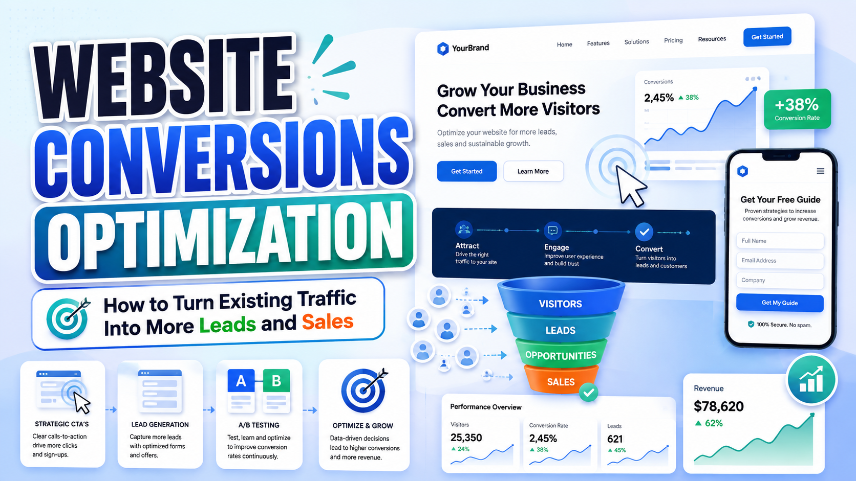
A website can receive thousands of visits from search engines, advertisements, social media, and referral partners while producing very few purchases, inquiries, registrations, or bookings. In this situation, increasing traffic alone may increase marketing costs without correcting the actual problem.
Website conversions optimization focuses on what happens after visitors arrive.
It examines whether the website helps the right audience understand the offer, trust the business, find relevant information, and complete an important action without unnecessary friction.
The goal is not to pressure every visitor into buying immediately. It is to create a clearer path between customer intent and a meaningful business outcome.
Diagnose the Customer Journey Before Redesigning the Website
Do not begin a conversion redesign by changing colors, replacing the homepage image, or moving the call-to-action button.
Begin by identifying where the current customer journey breaks.
Ask:
- Which pages receive the most qualified traffic?
- What do visitors expect when they arrive?
- Which action should each page support?
- Where do people hesitate or leave?
- What information is missing?
- Which objections remain unanswered?
- Does the mobile experience create additional friction?
- Are visitors arriving from campaigns that promise something different from the landing page?
- Can users understand the unique value proposition within a few seconds?
- Does the website provide enough proof to justify the next step?
A conversion problem is often caused by a combination of issues rather than one weak button.
A visitor might leave because the headline is vague, the page loads slowly, the offer feels generic, the form asks for too much information, and the mobile navigation makes the next step difficult to find.
A successful redesign should therefore connect business strategy, customer research, copywriting, UX design, technical performance, accessibility, and measurement.
What Is Website Conversions Optimization?
Website conversions optimization is the process of improving a website so a greater percentage of qualified visitors complete a valuable action.
A conversion may include:
- Purchasing a product
- Requesting a quotation
- Booking a consultation
- Starting a free trial
- Creating an account
- Joining an email list
- Downloading a resource
- Contacting sales
- Completing onboarding
- Renewing a subscription
- Using an important product feature
The basic conversion-rate formula is:
Conversion rate = completed conversions ÷ eligible visitors × 100
For example, when 2,000 qualified visitors reach a landing page and 80 complete the lead form, the conversion rate is 4%.
That number is useful, but it needs context.
A page can achieve a high conversion rate by attracting only a small group of existing customers. Another page may have a lower rate while generating substantially more qualified revenue. A lead form may produce many submissions but create poor sales opportunities.
Measure conversion quality as well as conversion volume.
Macro Conversions and Micro Conversions
Macro Conversions
A macro conversion represents the primary business outcome.
Examples include:
- Completed purchase
- Qualified sales inquiry
- Paid subscription
- Confirmed booking
- Signed contract
Micro Conversions
A micro conversion indicates progress toward the larger outcome.
Examples include:
- Viewing pricing
- Comparing plans
- Adding an item to a cart
- Starting checkout
- Watching a product demonstration
- Reading a case study
- Opening a lead form
- Using a calculator
- Downloading a guide
Micro conversions help identify where the journey succeeds or fails.
For example, a product page may persuade visitors to add items to their carts, while the checkout process loses them later. In that case, redesigning the product-page headline may not address the real problem.
Why Websites With Traffic Still Fail to Convert
The Value Proposition Is Too Vague
Many websites describe the company using broad language such as:
Innovative solutions for modern businesses.
This does not explain:
- What the company provides
- Who it serves
- Which problem it solves
- What makes it different
- Why the visitor should act now
A clearer statement could be:
Inventory forecasting software that helps small ecommerce teams reduce stockouts and avoid excess purchasing.
The second version identifies the audience, product, and practical benefit.
The Traffic and Page Intent Do Not Match
A visitor searching for pricing should not land on a page focused entirely on the company’s history.
A user clicking an advertisement for a free audit should not arrive on a generic homepage that does not mention the audit.
Conversion improves when the page continues the promise that earned the visit.
This is often called message match.
The Website Creates Too Much Friction
Friction may appear through:
- Slow loading
- Confusing navigation
- Long forms
- Hidden pricing
- Unclear buttons
- Unexpected account requirements
- Difficult checkout
- Poor mobile layouts
- Missing product information
- Weak error messages
- Distracting popups
Some friction is necessary. A financial company may need identity verification, while a B2B service may need qualifying information.
The objective is to remove friction that does not protect the customer, business, or transaction.
The Website Does Not Create Enough Trust
Visitors may understand the offer but remain uncertain about:
- Product quality
- Delivery
- Data security
- Customer support
- Return policies
- Professional experience
- Pricing
- Contract terms
- Results
- Company legitimacy
Trust should be demonstrated through relevant evidence rather than broad claims such as “trusted,” “leading,” or “best.”
The Next Step Is Not Obvious
A page may contain several buttons with similar visual weight:
- Learn More
- Explore
- Discover
- Contact
- Read More
- Get Started
- View Services
When visitors cannot distinguish the primary action, they may postpone all of them.
Every important page should have a clear conversion objective and one visually dominant next step.
Establish a Conversion Measurement System
Define the Primary Outcome for Each Page
Different pages can support different conversions.
| Page | Primary Conversion |
|---|---|
| Homepage | Enter the appropriate product or service journey |
| Product page | Add to cart or start purchase |
| Service page | Request consultation or quotation |
| Pricing page | Choose plan or contact sales |
| Article | Continue to a relevant offer or resource |
| Campaign landing page | Complete the campaign-specific action |
| Support page | Resolve issue or contact the correct support channel |
Do not judge every page using the same metric.
Track Meaningful Events
Google Analytics 4 uses events to measure interactions such as page views, clicks, and purchases. Actions that are especially important to the business can be marked as key events, which is the current GA4 terminology for important success actions.
A practical event plan may include:
view_pricingselect_planbegin_checkoutpurchasegenerate_leadbook_consultationdownload_guidestart_trialcontact_supportcomplete_onboarding
Use consistent naming and document what causes each event to fire.
Segment the Data
A single overall conversion rate can hide important differences.
Review conversion by:
- Device
- Landing page
- Traffic source
- Campaign
- Country
- New vs. returning visitor
- Product category
- Browser
- Customer type
A desktop experience may convert well while mobile visitors struggle. Paid traffic may perform poorly because the campaign attracts the wrong audience, while organic traffic converts strongly.
Segmentation helps the team solve the correct problem.
Combine Quantitative and Qualitative Evidence
Analytics can show where users leave, but it cannot always explain why.
Combine performance data with:
- Customer interviews
- Usability testing
- Support questions
- Sales objections
- Form feedback
- Search queries
- Session recordings
- On-page surveys
A high exit rate on a pricing page may indicate confusion, price resistance, missing information, or simply that visitors found the answer they needed.
Qualitative research helps separate those possibilities.
Map the Customer Journey
A customer journey describes the steps a person takes from initial awareness to conversion and continued use.
A simplified journey may include:
- Discover the brand
- Identify personal relevance
- Understand the offer
- Compare alternatives
- Evaluate risk
- Complete the action
- Receive confirmation
- Continue as a customer
For each step, document:
- Customer question
- Needed information
- Emotional state
- Relevant page
- Possible objection
- Primary action
- Business owner
For example:
| Journey Stage | Customer Question | Website Response |
|---|---|---|
| Discovery | Is this relevant to me? | Specific headline and audience positioning |
| Evaluation | How is this different? | Benefits, comparison, and proof |
| Risk assessment | Can I trust the company? | Reviews, policies, credentials, and transparency |
| Decision | What should I choose? | Clear offer structure and recommendation |
| Conversion | How do I complete it? | Short, understandable form or checkout |
| Confirmation | Did it work? | Clear success message and next steps |
Conversion design becomes easier when every page answers a specific customer question.
Strengthen the Unique Value Proposition
A value proposition should tell visitors:
- Who the offer is for
- What it helps them achieve
- How it solves the problem
- Why it is meaningfully different
A practical formula is:
We help [audience] achieve [outcome] through [solution], without [common frustration].
For example:
We help independent online stores forecast inventory through simple weekly recommendations, without requiring an enterprise planning team.
A strong value proposition should appear prominently on high-intent pages.
It can be supported by:
- Short explanatory subheading
- Product or service visual
- Primary CTA
- Relevant proof
- Brief risk reduction
Weak Hero Section
Grow Your Business With Confidence
We provide innovative solutions.
Stronger Hero Section
Turn More Website Visitors Into Qualified Sales Calls
Conversion-focused website redesign for B2B service companies with existing traffic.
The stronger version is narrower, but it allows the right customer to recognize relevance faster.
Design the Opening Viewport for Clarity
The top of the page should normally communicate:
- What the offer is
- Who it serves
- Why it matters
- What action is available
- Why the visitor should trust the business enough to continue
It does not need to contain every feature or objection.
A practical opening structure may include:
- Specific headline
- One- or two-sentence explanation
- Primary CTA
- Relevant image, product view, or demonstration
- One concise proof point
Avoid opening with a large decorative image that pushes the actual offer below the viewport.
Also avoid displaying several popups, cookie panels, newsletter prompts, discount banners, and chat invitations before visitors can understand the page. Google describes intrusive interstitials as overlays or dialogs that obstruct access to the underlying content and recommends avoiding them.
Make the Website Mobile-First
Mobile design is not a smaller version of the desktop layout.
Google uses the mobile version of a website’s content for indexing and ranking through mobile-first indexing, which makes mobile content and technical parity important for search visibility as well as usability.
Mobile Conversion Priorities
Prioritize:
- Clear headline without excessive wrapping
- Large, readable body text
- Buttons that are easy to tap
- Short forms
- Visible pricing
- Simple navigation
- Fast-loading media
- No horizontal scrolling
- Stable page layout
- Easy access to support
- Persistent CTA when useful
WCAG 2.2 sets a minimum pointer-target size of 24 by 24 CSS pixels, subject to defined exceptions and spacing conditions. Larger controls can be easier for many people to use, especially for important mobile actions.
Test Real Mobile Conditions
Do not review mobile layouts only inside a desktop browser simulator.
Test on physical phones with:
- One-handed use
- Slow connection
- Mobile keyboard open
- Text zoom
- Bright outdoor light
- Long translated content
- Autofill
- Error states
- Older hardware where relevant
A checkout can look correct in a design file while becoming difficult when the keyboard covers the main action.
Improve Website Performance
A conversion-focused website should respond quickly and remain visually stable.
Google’s current Core Web Vitals thresholds define a good experience as:
- Largest Contentful Paint at 2.5 seconds or less
- Interaction to Next Paint at 200 milliseconds or less
- Cumulative Layout Shift at 0.1 or less
These targets are evaluated at the 75th percentile of page visits.
Practical Performance Improvements
Review:
- Oversized hero images
- Unnecessary video backgrounds
- Unused JavaScript
- Heavy third-party scripts
- Too many font files
- Unoptimized animations
- Late-loading banners
- Missing image dimensions
- Slow hosting
- Excessive tracking tools
- Render-blocking resources
Reserve space for images, advertisements, embeds, and dynamic components so content does not unexpectedly move after the visitor begins reading.
Use Field Data
Laboratory testing is useful during development, but real-user data reflects actual devices, connections, and browsing conditions.
Review field performance through suitable analytics and performance-monitoring tools, then segment slow experiences by page type and device.
Google recommends good Core Web Vitals as part of a strong page experience, while also noting that perfect technical scores alone do not guarantee top search rankings.
Optimize performance for users, not merely for a perfect audit score.
Simplify Navigation and Information Architecture
Navigation should reflect customer goals rather than internal company departments.
Instead of vague labels such as:
- Solutions
- Capabilities
- Resources
- Discover
consider more specific labels such as:
- Website Redesign
- Conversion Audit
- Pricing
- Case Studies
- Customer Support
A visitor should be able to predict what appears after selecting a link.
Reduce Competing Paths
Too many navigation choices can delay decisions.
Prioritize:
- Core offers
- Pricing
- Proof
- Support
- Primary CTA
Secondary content can remain accessible without receiving equal visual weight.
Provide Search Where It Adds Value
Search is useful for:
- Large product catalogs
- Documentation
- Knowledge bases
- Media archives
- Multi-location businesses
Search should return understandable results, tolerate common wording variations, and provide useful filters.
Create Strong Message Match
A landing page should continue the message from the advertisement, email, search result, or social post that led to it.
Align:
- Headline
- Offer
- Image
- Audience
- CTA
- Pricing
- Promotional conditions
For example, an advertisement promising a “free website conversion audit” should link to a page where that audit is immediately visible.
It should not send the visitor to a generic services homepage requiring several additional clicks.
Build Intent-Specific Landing Pages
Different visitors may need different pages.
Possible segments include:
- First-time buyers
- Returning customers
- Enterprise teams
- Small businesses
- Industry-specific audiences
- Different product categories
- Geographic markets
Do not create unnecessary pages that repeat the same generic content. Create a dedicated page when customer intent, objections, proof, or offer structure changes meaningfully.
Use Trust Evidence Strategically
Trust elements should answer specific doubts.
Testimonials
Strong testimonials explain:
- The customer’s original problem
- What changed
- Why the experience was valuable
- What measurable or practical result followed
“Great company” is less persuasive than a short description of a relevant outcome.
Case Studies
A case study can show:
- Customer context
- Problem
- Approach
- Solution
- Result
- Relevant evidence
Place case studies near services or products where similar buyers are likely to have the same concerns.
Reviews
Show review source, rating context, and enough detail to feel credible.
Avoid fabricated urgency, hidden negative reviews, or selective presentation designed to mislead customers.
Credentials and Policies
Depending on the industry, trust may also come from:
- Professional qualifications
- Certifications
- Security information
- Delivery terms
- Return policy
- Warranty
- Privacy controls
- Transparent pricing
- Real contact details
- Named team members
Place proof near the decision it supports rather than collecting every trust element in one distant section.
Improve Calls to Action
A CTA should describe the next step clearly.
Generic CTAs
- Submit
- Click Here
- Continue
- Learn More
More Specific CTAs
- Request My Conversion Audit
- Compare Pricing Plans
- Start the Free Trial
- Check Product Availability
- Book a 30-Minute Consultation
- Download the Website Checklist
The action should match what happens next.
Do not label a button “Get Started” when it immediately asks for payment or a lengthy sales form without warning.
One Primary Action Per Section
A page can contain several actions, but each section should have a clear priority.
For example:
Primary: Start Free Trial
Secondary: View Product Demo
The primary CTA should have stronger visual emphasis. Secondary actions should remain available without competing equally.
Reduce Commitment When Appropriate
A visitor who is still comparing may not be ready to “Buy Now.”
A lower-commitment action may perform better:
- View Pricing
- See How It Works
- Calculate Savings
- Compare Features
- Read a Case Study
Match the CTA to the visitor’s decision stage.
Optimize Forms
Forms are often the final point of conversion friction.
Ask Only for Information You Need at That Stage
A newsletter form may need only an email address.
A consultation form may require:
- Name
- Work email
- Company
- Main challenge
- Preferred contact method
Do not request postal address, phone number, budget, team size, and detailed company information unless that data supports immediate routing or qualification.
Use Visible Labels
Place clear labels next to or above fields.
Do not rely only on placeholder text, which may disappear after users begin typing.
W3C recommends properly associated labels, clear instructions, understandable errors, and feedback that helps users correct mistakes.
Enable Autofill
Use appropriate field names, types, and autocomplete attributes so browsers can help users complete common information such as names, email addresses, telephone numbers, passwords, and shipping details.
Explain Errors Clearly
Do not display only:
Something went wrong.
Identify the field and explain how to fix it:
Enter a work email address in the format name@company.com.
WCAG 2.2 requires automatically detected input errors to be identified and described in text.
Break Long Forms Into Logical Steps
When the process genuinely requires substantial information, divide it into understandable stages and show progress.
W3C’s forms guidance recommends breaking long forms into logical steps and informing users about their progress.
Do not artificially split a short form into several screens merely to increase interaction counts.
Optimize Ecommerce Product Pages
A high-converting product page should make the purchase decision easier.
Include:
- Clear product name
- Price
- Variant selection
- High-quality images
- Key benefits
- Product specifications
- Delivery information
- Returns
- Reviews
- Availability
- Primary purchase action
- Relevant support
Clarify Total Cost
Do not hide important fees until the final checkout step.
Unexpected shipping charges, mandatory subscriptions, or additional service fees can damage trust even when the customer eventually completes the order.
Explain Variants
Color, size, capacity, subscription interval, and configuration choices should be understandable.
When a selection changes the price or availability, update that information immediately.
Preserve Customer Progress
Do not empty the cart or reset product choices unnecessarily when a customer returns from another page.
The website should help users continue rather than punish exploration.
Optimize Service and Lead-Generation Websites
A service website needs to answer a different set of questions:
- Is this company relevant to my situation?
- What result can it help me achieve?
- What does the process involve?
- How long might it take?
- What level of investment should I expect?
- Has it solved a similar problem before?
- What happens after I submit the form?
A strong service page may include:
- Audience-specific headline
- Problem and outcome
- Service explanation
- Process
- Relevant proof
- Pricing context
- Frequently asked questions
- Consultation CTA
Avoid making every visitor schedule a call simply to discover whether the service is remotely affordable or relevant.
Pricing ranges, starting prices, or clear qualification criteria can reduce poor-fit inquiries while improving trust.
Add Interactivity That Reduces Uncertainty
Interactive elements can improve conversion when they help visitors understand the offer.
Useful examples include:
- Pricing calculators
- Product configurators
- Quizzes
- Assessment tools
- Before-and-after sliders
- Interactive demonstrations
- Comparison tools
- Conversational product search
- Booking calendars
Every interaction should answer a customer question.
Do not add animation, sliders, chat widgets, and hover effects merely to make the website feel modern.
Interactivity that delays the decision or hides information can reduce conversion instead of improving it.
Use Typography to Support Conversion
Typography influences trust, hierarchy, readability, and brand recognition.
A practical website type system may contain:
- Display font for major brand statements
- Heading font for page structure
- Body font for comfortable reading
- Semibold functional style for buttons and labels
- Numerical style for prices or data
Give Headlines a Distinctive Voice
An expressive font can make the unique value proposition more recognizable.
PutraCetol Studio offers display, serif, sans serif, script, retro, experimental, luxury, playful, technology, and industry-specific fonts that can help businesses build a more distinctive visual identity.
Use personality where attention matters most:
- Homepage hero
- Campaign title
- Product name
- Section headline
- Brand storytelling
Keep Functional Text Readable
Use a quieter typeface for:
- Body copy
- Navigation
- Buttons
- Forms
- Pricing
- Product details
- Error messages
- Checkout information
Do not force a decorative display font into every interface element simply to maintain consistency.
Limit Font Files
Loading several families and many weights can increase technical complexity.
Choose only the styles required by the hierarchy, optimize font delivery, and provide appropriate fallback fonts.
The website should not sacrifice loading performance for typographic variety.
Make Accessibility Part of Conversion Design
Accessibility helps more people perceive information, navigate the website, complete forms, and purchase products.
Text Contrast
WCAG 2.2 requires a minimum contrast ratio of 4.5:1 for normal text and 3:1 for qualifying large text.
Be careful with:
- Light grey text
- Thin fonts
- Text over photography
- Pale brand colors
- Disabled-looking buttons
- Low-contrast form borders
Keyboard Access
Users should be able to navigate links, buttons, menus, forms, dialogs, and interactive tools without a mouse.
Focus Visibility
Keyboard users need to see which element currently has focus.
Do not remove focus outlines without providing a clear replacement.
Clear Form Instructions
Labels, required-field indicators, examples, and error descriptions help users complete forms correctly and reduce repeated effort.
Accessibility should be tested during design and development, not added as a final overlay after launch.
Avoid Dark Patterns
Conversion optimization should help people make decisions, not manipulate them.
The FTC identifies dark patterns such as disguising advertisements, making subscriptions difficult to cancel, hiding important fees or conditions, and steering people into sharing data they did not intend to provide.
Avoid:
- Fake countdown timers
- Fabricated stock warnings
- Preselected paid extras
- Hidden recurring billing
- Misleading button labels
- Difficult cancellation
- Confirm-shaming
- Disguised advertisements
- Forced account creation without necessity
- Unclear data consent
These tactics may increase a short-term metric while weakening customer trust, creating complaints, and introducing legal risk.
A high-quality conversion experience should make the customer’s decision clearer and more informed.
Test Changes Through Controlled Experiments
Start With a Hypothesis
A useful hypothesis includes:
- Observed problem
- Proposed change
- Expected behavior
- Success metric
For example:
Mobile users may abandon the consultation form because the current seven-field layout feels too demanding. Reducing the initial form to four fields should increase qualified form completion without reducing lead quality.
Change One Strategic Variable
Possible test variables include:
- Headline
- CTA wording
- Form length
- Proof placement
- Price presentation
- Hero visual
- Page structure
- Offer
- Mobile sticky CTA
Avoid testing several unrelated redesign changes when you need to understand what caused the result.
Measure Downstream Quality
A form variation may generate more leads but fewer qualified opportunities.
Review:
- Conversion rate
- Lead quality
- Revenue
- Refunds
- Sales acceptance
- Completion rate
- Customer-support demand
- Retention
The best variant is not always the one producing the highest immediate click rate.
A Practical Website Redesign Workflow
Phase 1: Audit
Review:
- Traffic sources
- Conversion rates
- Key events
- Mobile performance
- Core Web Vitals
- Forms
- Navigation
- Customer objections
- Technical errors
- Accessibility
Phase 2: Customer Research
Gather:
- Interview findings
- Support questions
- Sales objections
- Reviews
- Search behavior
- Usability observations
- Competitor patterns
Phase 3: Conversion Strategy
Define:
- Primary audiences
- Main offers
- Value propositions
- Page goals
- Proof requirements
- Conversion paths
- Measurement plan
Phase 4: Information Architecture
Organize:
- Navigation
- Page hierarchy
- Landing pages
- Product or service categories
- Help content
- Conversion routes
Phase 5: Wireframes
Design the hierarchy before polishing the visual style.
Focus on:
- Message order
- CTA placement
- Proof
- Form structure
- Mobile flow
- Content grouping
Phase 6: Visual Design
Apply:
- Brand typography
- Color
- Photography
- Illustration
- Components
- Responsive behavior
- Accessible states
Phase 7: Development and Quality Assurance
Test:
- Performance
- Responsive layouts
- Forms
- Analytics
- Accessibility
- Browsers
- Error states
- Integrations
- Checkout
- Confirmation messages
Phase 8: Launch and Measurement
Compare post-launch results with the baseline.
Monitor:
- Key events
- Conversion rate
- Revenue
- Lead quality
- Mobile performance
- Customer feedback
- Technical errors
A redesign should be treated as the beginning of a new optimization cycle rather than the final version of the website.
Comparison
Traffic-Focused vs. Conversion-Focused Website
| Traffic-Focused Website | Conversion-Focused Website |
|---|---|
| Prioritizes visitor volume | Prioritizes qualified outcomes |
| Uses broad generic messaging | Uses audience-specific value propositions |
| Sends campaigns to the homepage | Uses intent-matched landing pages |
| Measures page views | Measures key events and customer value |
| Adds more features and sections | Removes unnecessary friction |
| Treats mobile as a smaller desktop | Designs mobile journeys deliberately |
| Uses testimonials as decoration | Places proof near relevant objections |
| Uses many equal CTAs | Establishes a primary action |
| Collects extensive form data immediately | Requests information according to the stage |
| Optimizes for clicks | Measures revenue, lead quality, and retention |
Full Redesign vs. Iterative Optimization
| Full Redesign | Iterative Optimization |
|---|---|
| Useful when structure and positioning are fundamentally weak | Useful when the foundation already works |
| Higher cost and implementation risk | Lower risk per experiment |
| Can address brand, UX, and technology together | Produces clearer learning from individual changes |
| May temporarily disrupt existing patterns | Maintains more continuity |
| Requires strong pre-launch research | Requires disciplined measurement |
| Best for major business or product changes | Best for continuous improvement |
Visual Polish vs. Conversion Improvement
| Visual Polish | Conversion Improvement |
|---|---|
| Makes the site appear newer | Makes the journey easier to complete |
| May change colors and imagery | Changes messaging, hierarchy, proof, and friction |
| Can improve perception | Connects design with measurable customer behavior |
| Often judged through preference | Judged through usability and business outcomes |
| Does not automatically solve strategic problems | Begins with customer and business evidence |
Common Mistakes
The first mistake is beginning a website redesign with visual trends rather than evidence. A company may replace its colors, introduce animation, and install a modern page builder while preserving the same vague value proposition, confusing navigation, and weak offer. The new website looks different but asks visitors to solve the same problems. Begin with analytics, customer intent, sales objections, form performance, mobile behavior, and page-level goals. Visual design should communicate the new strategy rather than substitute for one.
The second mistake is trying to maximize every page through urgency, popups, sticky banners, chat invitations, discounts, and repeated CTAs. Constant interruption can make the website feel less trustworthy and make the primary action harder to identify. Use urgency only when a real deadline or availability limit exists. Show interactive tools when they reduce uncertainty. Display proof where it answers a specific objection. Conversion-focused design is not about making every element more aggressive. It is about reducing the effort required to understand and choose.
The final mistake is declaring success after launch without validating lead quality, customer satisfaction, accessibility, and long-term behavior. A shorter form may increase submissions while overwhelming the sales team with poor-fit leads. A promotional discount might increase first purchases while reducing margin or repeat business. A visually bold redesign may perform well on desktop while creating serious mobile or keyboard barriers. Track the complete outcome, compare segments, review real customer feedback, and continue testing after the redesign enters production.
Conclusion
Effective website conversions optimization transforms traffic into a clear customer journey.
It begins with understanding why visitors arrive, what they need to know, which doubts prevent action, and what the website should help them accomplish next.
The strongest conversion-focused websites communicate a specific value proposition, match landing pages to visitor intent, load quickly, work comfortably on mobile devices, provide credible proof, and make forms or checkout processes easier to complete.
They also respect the visitor.
Ethical conversion design does not depend on hidden fees, fake scarcity, difficult cancellation, or confusing consent. It helps customers evaluate the offer with greater clarity and confidence.
Typography, visual hierarchy, and brand consistency contribute to that experience. Expressive fonts from PutraCetol Studio can give hero sections, product names, campaign pages, and major headlines a more recognizable voice. Readable supporting typography should then protect navigation, body copy, forms, pricing, and transactional information.
A conversion-driven redesign should not be judged only by how modern it looks.
It should be judged by whether the right visitors understand the offer faster, trust the business more deeply, and complete valuable actions with less unnecessary effort.
Explore these fonts and many more at PutraCetol.com to build a business identity that looks professional, trustworthy, and memorable.
Additionally, if you want to explore some free typography options, you can check out Putracetol Studio on Dafont. Happy reading and designing!