
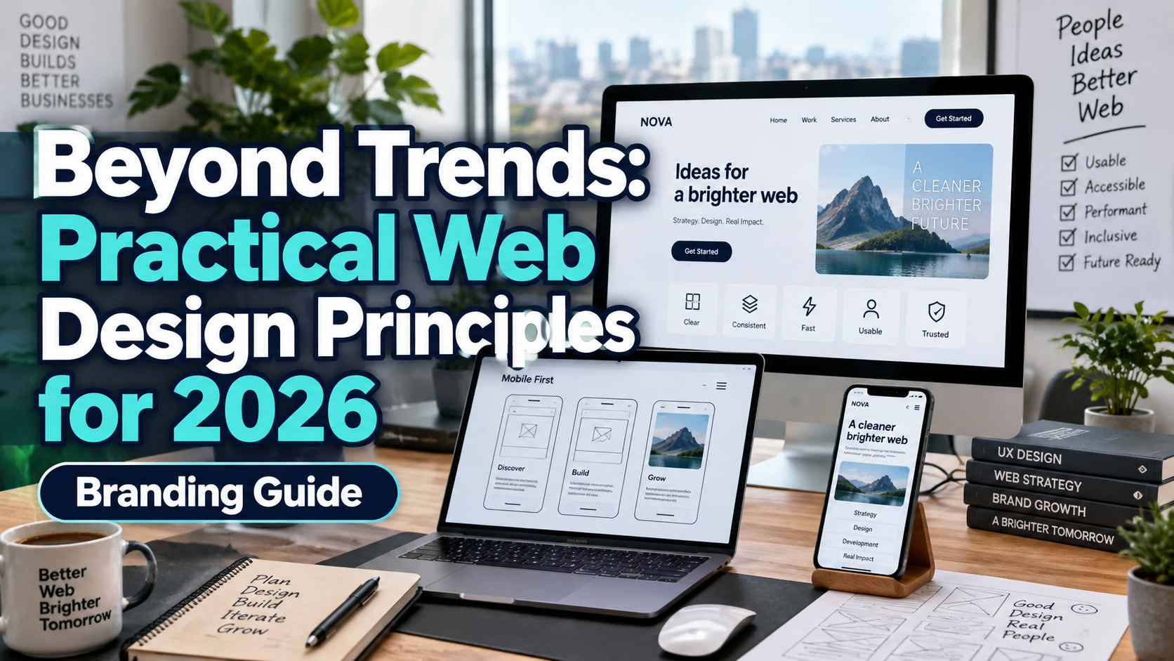
Good Website Design Principles 2026: Make Every Page Useful
Start With the Visitor’s Task
Before choosing colors or animations, identify what visitors need to accomplish. A shop should support confident purchases; a publisher should support comfortable reading; an agency should help prospects assess its services.
Ask someone unfamiliar with the website to complete one task without guidance. Observe where they hesitate, misunderstand, or leave.
Use the findings to shape the layout. Treat visual style as a way to communicate the offer, not as a substitute for a useful experience.
Core Principles for Better Website Design
Make the Offer Clear
Explain what you provide, who it serves, and what happens next. Replace “We create extraordinary possibilities” with something specific, such as “Packaging design for independent food brands.”
Give each page a primary purpose. Use descriptive headings, concise explanations, relevant proof, and an action that matches the visitor’s decision stage.
Make Consistency Behavioral, Not Just Visual
Keep navigation labels, button styles, and interaction patterns predictable. W3C’s consistent-navigation guidance requires repeated navigation to appear in the same relative order, unless users initiate a change.
Document colors, typography, spacing, and component states. Different pages can have different compositions while sharing familiar controls. Consistency does not require turning every page into the same template.
Treat Speed as Part of the Design
Google’s current Core Web Vitals assess loading, responsiveness, and visual stability. Good thresholds are LCP within 2.5 seconds, INP at 200 milliseconds or less, and CLS at 0.1 or less, measured at the 75th percentile of visits.
Audit oversized imagery, unnecessary scripts, and excessive font files. Reserve space for media and test after adding analytics or third-party widgets. Review real-user data, not only laboratory scores.
Design Complete Mobile Journeys
Test discovery, comparison, booking, and payment on actual phones. Keep essential information available instead of removing it to make the mobile layout look cleaner.
Use comfortably sized controls. WCAG 2.2 AA generally specifies pointer targets of at least 24 by 24 CSS pixels, with spacing and other exceptions. Larger controls are preferable when practical.
Check the interface with enlarged text and the keyboard open.
Use Typography for Identity and Reading
Choose an expressive font for selected headlines and a readable companion for paragraphs, navigation, prices, and forms. Explore PutraCetol Studio typography for those distinctive brand moments, then test the actual wording across screen sizes.
WCAG AA generally requires 4.5:1 contrast for ordinary text and 3:1 for qualifying large text, with defined exceptions. Fine or unusual lettering may need stronger practical contrast.
Do not sacrifice readability to achieve a pale, premium-looking palette.
Choose Images That Explain Something
Give each image a purpose: demonstrate the product, explain a process, show relevant work, or introduce the real team.
For a hypothetical furniture shop, show scale, materials, and useful views rather than relying entirely on atmospheric photography. Keep product details truthful when editing or generating visuals.
Write alternative text that communicates an informative image’s purpose. Purely decorative images should use an empty alternative (alt=""), allowing screen readers to skip them.
Earn Trust Through Clear Interactions
Show accurate service details, accessible contact information, and transparent pricing or quotation expectations. Use genuine testimonials and clearly describe the evidence behind results.
Keep forms focused. W3C recommends requesting necessary information, labeling controls, and providing understandable errors and completion feedback.
A quote request should explain the next step, not end with an ambiguous “Done.”
Comparison
Use this checklist to review a design proposal.
| Area | Appearance-First Choice | Purpose-Led Alternative |
|---|---|---|
| Messaging | Abstract slogans | Specific offer and audience |
| Navigation | Inventive labels everywhere | Predictable routes |
| Mobile | Shrunk desktop layout | Reorganized task flow |
| Imagery | Decorative filler | Relevant visual evidence |
| Typography | One display font throughout | Clear roles and readable support |
| Evaluation | Attractive screenshots | Complete journeys and real conditions |
Common Mistakes
The first mistake is assuming automation can approve the experience. AI-generated layouts and accessibility scans still require review. W3C states that no tool alone can determine whether a website meets accessibility standards. Combine automated checks with keyboard testing, screen-reader review, and participation from people with disabilities.
Another mistake is celebrating pageviews, clicks, or longer visits without understanding them. Define success around useful outcomes: completed bookings, qualified inquiries, successful purchases, or satisfied readers. Compare relevant audience and device groups, collect feedback, and retest after updates. Do not assume time spent struggling is engagement.
Conclusion
Good website design principles in 2026 connect clarity, consistency, speed, mobile usability, and purposeful imagery. Start with real tasks, build accessible interactions, and make the visual identity support the message.
Use PutraCetol Studio fonts to add character without compromising practical reading. A strong website should help people understand, decide, and act, not merely admire the screen.
Explore these fonts and many more at PutraCetol.com to build a business identity that looks professional, trustworthy, and memorable.
Additionally, if you want to explore some free typography options, you can check out Putracetol Studio on Dafont. Happy reading and designing!