
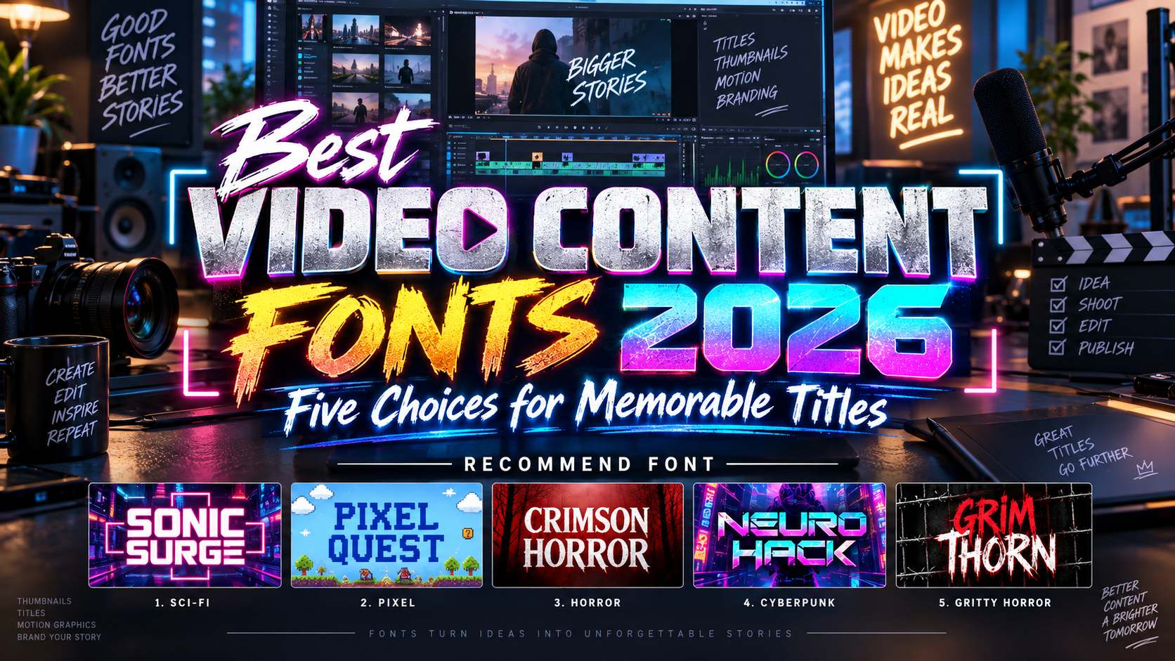
Best Video Content Fonts 2026: Give Every Frame a Clear Visual Voice
Separate Titles From Subtitles
Choosing the best video content fonts for 2026 starts with the role of the text. A horror trailer title should establish atmosphere; subtitles must communicate dialogue without demanding extra effort.
Treat these five PutraCetol Studio selections as expressive display options for short headlines, channel identities, and campaign graphics. Pair them with a simpler reading family for captions, speaker names, and explanations.
For example, a gaming creator could use Pixel Quest for episode titles while keeping spoken dialogue in an understated sans serif. Build recognition through consistency rather than changing typography every time the scene changes.
What to Test Before Choosing
Type the actual title, longest name, numerals, and punctuation. Preview each treatment over bright, dark, and busy footage, then check the final export on a phone.
Give viewers a stable reading moment after an animated entrance. Keep essential words away from platform controls and caption areas, and create separate compositions for horizontal and vertical video. Judge the moving sequence, not only its most attractive still frame.
Jump to Recommended Fonts
1. Grimthorn Hardcore Font
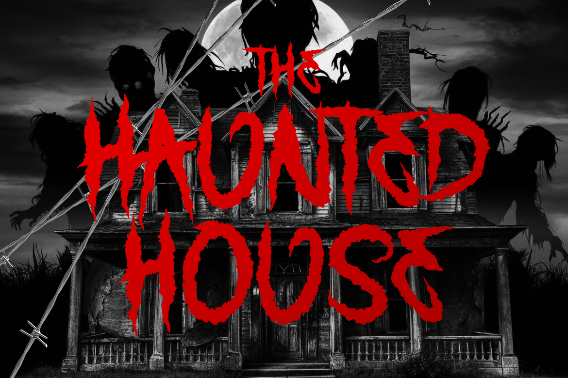
Grimthorn combines tall proportions, uneven strokes, jagged contours, and thorn-like extensions with Gothic and hardcore influences. Its distressed construction creates a tense, confrontational voice for short display wording. Try it for a metal performance intro or dark-fantasy teaser, using a plain background and restrained movement so the intricate silhouette remains visible.
PROS: Distinctive contours, dramatic character, strong title silhouette.
BEST FOR: Metal videos, dark-fantasy trailers, alternative channels, and concert promotions.
2. Neuro Hack Cyberpunk Game Font
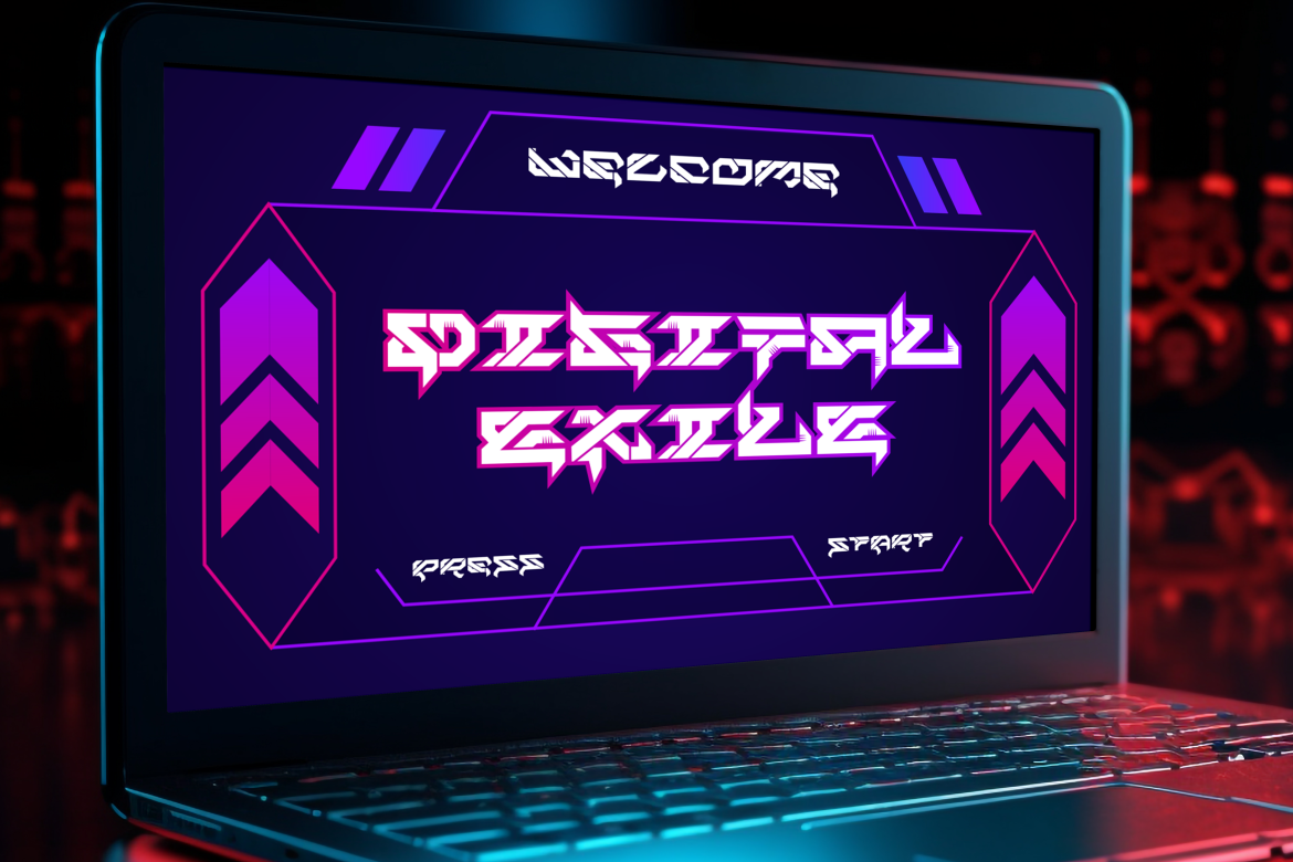
Neuro Hack uses bold letterforms and circuit-like detailing to establish a futuristic cyberpunk identity. Its technical construction offers a visual direction for gaming and technology content without requiring a complicated illustrated background. For a cybersecurity explainer, introduce the topic with a short Neuro Hack heading, then switch to simpler typography for diagrams and instructions.
PROS: Technical detailing, bold structure, distinctive cyberpunk personality.
BEST FOR: Gaming intros, technology launches, esports graphics, and futuristic campaigns.
3. Crimson Horror Horror Font
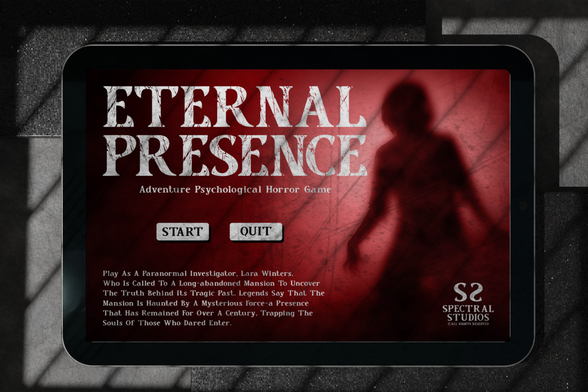
Crimson Horror combines a bold serif foundation with sharp edges, irregular contours, and distressed treatments. Its four styles provide options for carrying a consistent horror identity across title cards and promotional graphics. Try a short opening title against a subdued background, letting the letterforms establish suspense before adding atmospheric effects.
PROS: Four styles, recognizable serif structure, textured horror character.
BEST FOR: Horror trailers, supernatural storytelling, Halloween videos, and film promotions.
4. Pixel Quest Pixel Font
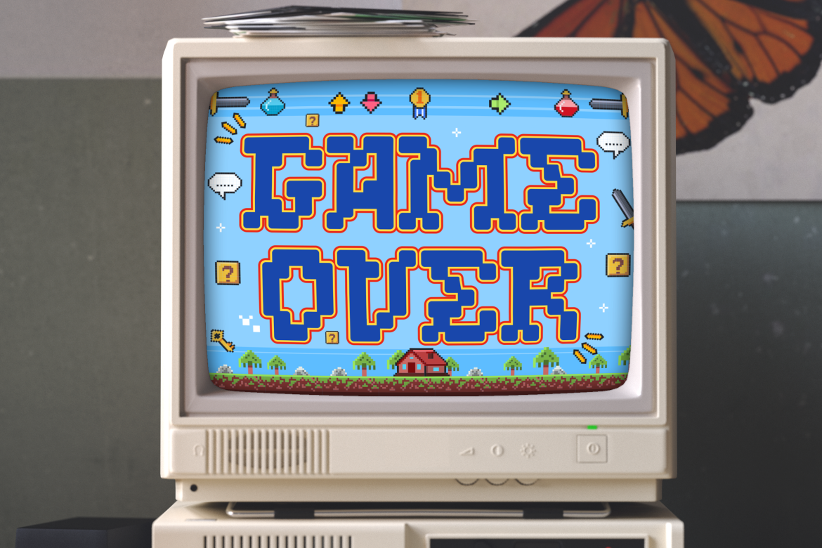
Pixel Quest draws on classic arcade games and role-playing adventures through blocky, 8-bit-inspired construction and rounded pixel edges. Its playful structure provides a lighter alternative to aggressive horror or cyberpunk lettering. For a retro-gaming series, repeat the font across episode titles, chapter screens, and thumbnails while keeping detailed commentary in a quieter companion.
PROS: Retro-game character, rounded pixel shapes, playful display presence.
BEST FOR: Gaming channels, animation intros, coding content, and nostalgic campaigns.
5. Sonic Surge Scifi Font
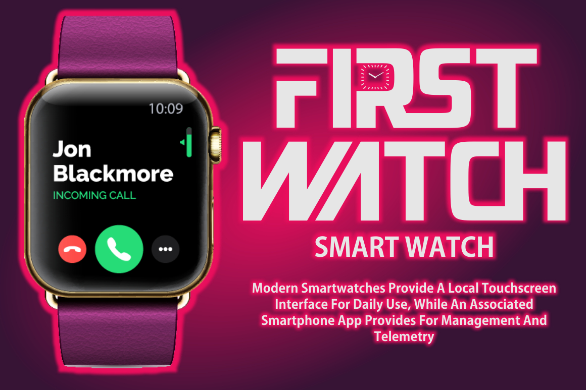
Sonic Surge is a bold display typeface built around abstract shapes and science-fiction styling. Its OpenType alternates and ligatures offer options for customizing short wordmarks and campaign names. Try it for a digital-product reveal or electronic-music visualizer, selecting a consistent set of characters that can recur across the introduction, promotional clips, and closing screen.
PROS: Abstract character, alternate glyphs, customizable display combinations.
BEST FOR: Sci-fi titles, electronic music, product reveals, and digital-brand introductions.
Comparison
| Font | Main Personality | Suggested Video Role |
|---|---|---|
| Grimthorn | Jagged and intense | Alternative music intro |
| Neuro Hack | Technical and futuristic | Gaming or technology title |
| Crimson Horror | Distressed and theatrical | Horror title sequence |
| Pixel Quest | Playful and nostalgic | Retro episode graphics |
| Sonic Surge | Abstract and futuristic | Branded product reveal |
Common Mistakes
The first mistake is using decorative titles as the caption system. Choose an easily readable companion and review timing and contrast throughout the footage. Captions should convey speech and important non-speech audio, including relevant sound effects, rather than functioning only as animated keyword highlights.
Another mistake is animating every word with shakes, flashes, zooms, or distortion. Begin with one purposeful transition and give the completed title time to be read. Test exports at normal speed, including smaller viewing sizes, and remove motion that competes with the message.
The final mistake is overlooking handoff and usage permissions. Confirm the purchased license against monetized content, advertising, client work, and intended distribution. Save editable project files, document the selected font styles, and provide collaborators with a reference export to check their results.
Conclusion
The best video content fonts 2026 should support the story while leaving essential information easy to understand. Choose the genre and typographic role first, then test your wording over real footage.
Explore these PutraCetol Studio fonts for your next intro, title sequence, or campaign. Combine distinctive display lettering with readable captions and consistent layouts to create a video identity that feels deliberate from beginning to end.
Explore these fonts and many more at PutraCetol.com to build a business identity that looks professional, trustworthy, and memorable.
Additionally, if you want to explore some free typography options, you can check out Putracetol Studio on Dafont. Happy reading and designing!