
Best Script Monoline Fonts 2026 for Elegant and Personal Branding
Monoline scripts occupy an interesting space between handwriting and graphic precision.
Unlike traditional calligraphy, where pressure creates dramatic thick and thin strokes, monoline lettering generally maintains a more consistent stroke weight. This gives the writing a cleaner rhythm while preserving the warmth and personality associated with handwritten typography.
The best script monoline fonts 2026 are especially useful for businesses that want branding to feel personal without becoming overly ornamental.
Beauty labels, wedding stationery, boutique packaging, personal brands, cafés, fashion businesses, handmade products, and lifestyle campaigns can all benefit from this balance between human character and visual control.
However, monoline scripts are not identical. Some are bold and assertive, some elegant and flowing, while others introduce vintage texture or exaggerated loops.
Match Stroke Personality to the Brand
Start by deciding whether the brand should feel confident, luxurious, handcrafted, romantic, or minimal.
A thicker connected script can create stronger logo visibility, while a delicate monoline is better suited to elegant invitations or premium packaging. Rougher lettering can support artisanal identities where a perfectly polished script would feel too formal.
Always test the actual brand name.
Script fonts depend heavily on how letters connect. Two beautiful individual characters may form an awkward combination in a specific word, so evaluate the complete wordmark rather than selecting a font from isolated alphabet samples.
Jump to Recommended Script Monoline Fonts
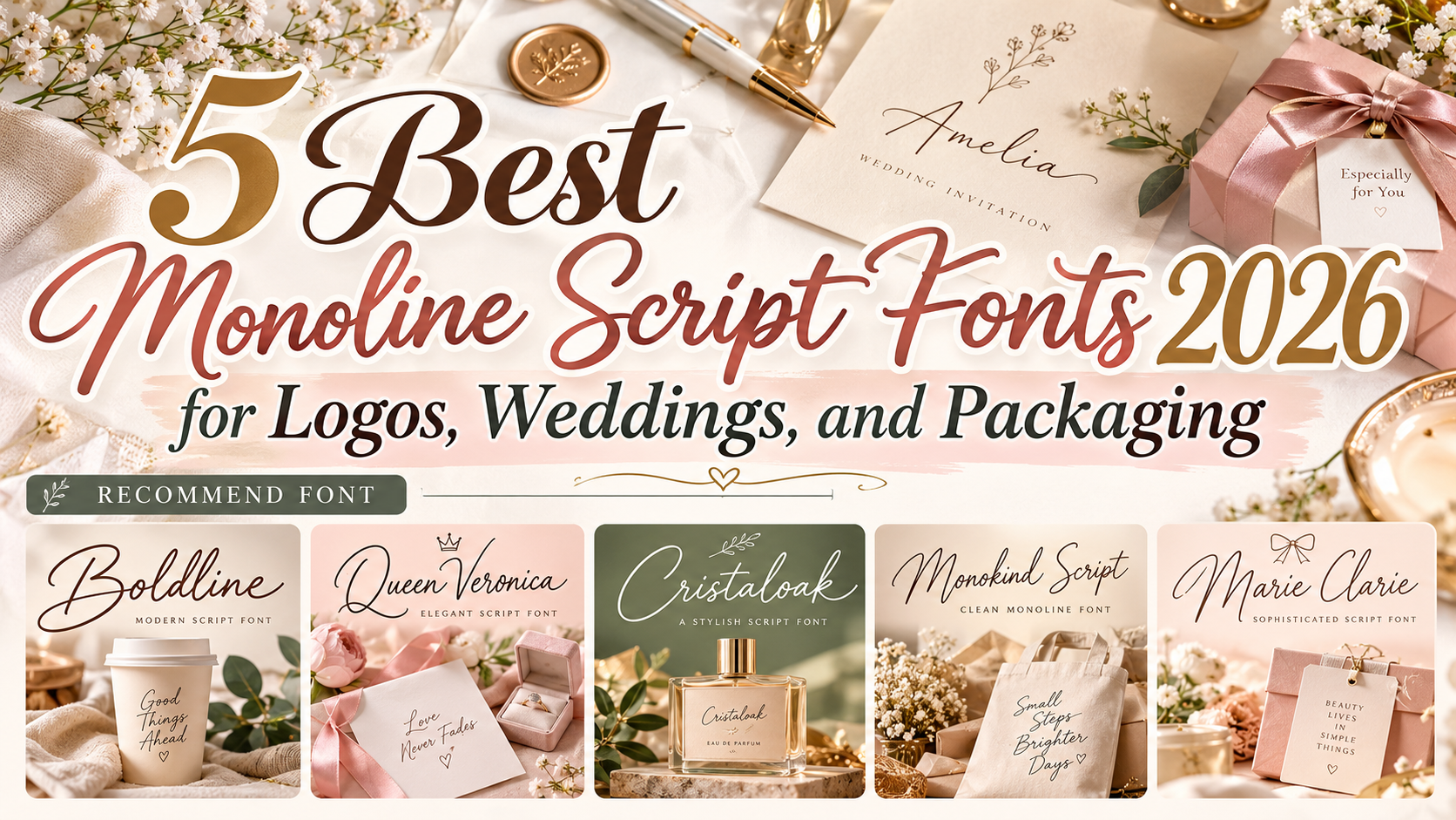
1. Boldline
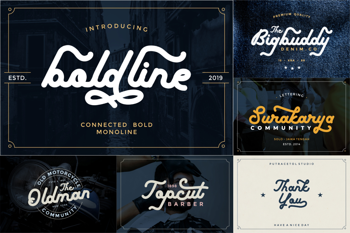
Boldline takes the monoline concept in a stronger direction. PutraCetol describes it as a connected bold monoline typeface with a classy, assertive character. Its consistent heavy construction gives it greater visibility than delicate signature fonts, while OpenType alternates provide options for creating more customized lettering.
That makes Boldline particularly useful when a brand wants handwritten personality but still needs enough visual weight for logos, apparel, packaging, or promotional graphics.
PROS: Bold monoline weight, connected structure, alternates, strong logo visibility.
BEST FOR: Clothing brands, lifestyle logos, packaging, vintage-inspired branding, quotes, promotional graphics.
2. Queen Veronica

Queen Veronica offers a much more refined interpretation of monoline script. It combines elegant handwritten construction with a luxury-oriented personality, using flowing connected forms and decorative alternates to give short names a polished signature quality. PutraCetol specifically positions it for branding, wedding invitations, elegant logos, packaging, stationery, and web use.
Its graceful rhythm makes Queen Veronica particularly appropriate when typography needs to feel sophisticated but still distinctly personal.
PROS: Elegant monoline construction, luxury character, OpenType alternates, graceful handwritten rhythm.
BEST FOR: Weddings, beauty branding, fashion, premium packaging, signature logos, stationery.
3. Cristaloak

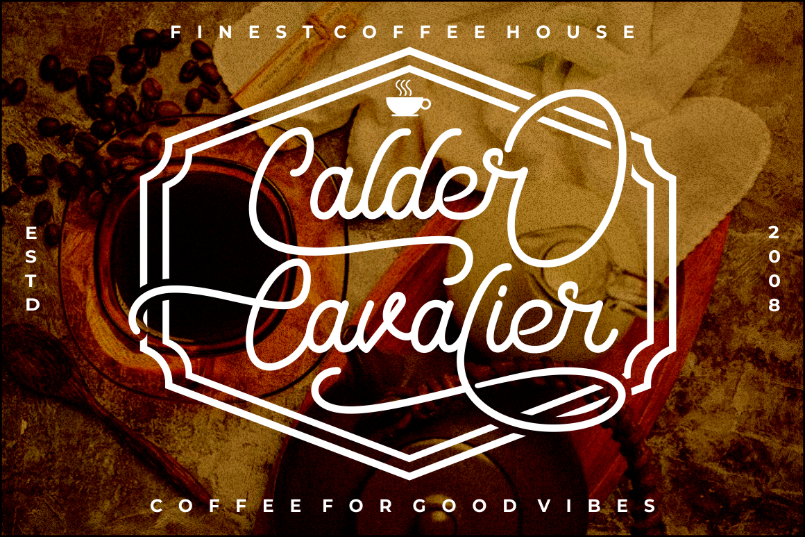
Cristaloak introduces more texture into the monoline category. Its monoline script structure is combined with roughened letterforms, giving the font a stronger vintage and handcrafted character than polished luxury scripts. It also includes alternates, ligatures, and multilingual support, providing flexibility for distinctive short names and badge-like compositions.
That rougher personality makes Cristaloak a strong choice for brands that want authenticity and heritage rather than pristine elegance.
PROS: Monoline rhythm, vintage texture, alternates, ligatures, handcrafted appearance.
BEST FOR: Craft businesses, cafés, apparel, heritage packaging, travel branding, handmade products.
4. Monokind Script

Monokind Script combines elegant monoline construction with a natural handwritten feel. PutraCetol describes it as an elegant handwritten monoline font and includes both alternate characters and ligatures, allowing designers to adjust word shapes rather than accepting a completely fixed script treatment.
It sits comfortably between formal calligraphy and everyday handwriting, making it particularly versatile for brands that want warmth without looking excessively decorative.
PROS: Natural handwriting character, monoline structure, alternates, ligatures, broad creative versatility.
BEST FOR: Personal branding, wedding stationery, packaging, boutique logos, websites, lifestyle businesses.
5. Marie Clarie Monoline Script Font
Marie Clarie takes the lightest and most delicate direction in this selection. Its thin, consistent monoline strokes are paired with flowing script forms and expressive loops, creating an intimate handwritten character rather than a bold commercial silhouette. PutraCetol has positioned the font for elegant, personal, and premium applications.
Because of its lighter weight, Marie Clarie works especially well when the surrounding layout provides generous whitespace and does not demand aggressive visibility.
PROS: Thin consistent strokes, elegant loops, minimalist feel, refined handwritten personality.
BEST FOR: Invitations, personal brands, artisan packaging, fashion, signatures, premium stationery.
Comparison: Which Monoline Script Font Fits Your Project?
| Font | Main Personality | Strongest Direction |
|---|---|---|
| Boldline | Strong, connected | Bold branding |
| Queen Veronica | Elegant, luxurious | Beauty and weddings |
| Cristaloak | Rough, vintage | Craft and heritage |
| Monokind Script | Natural, refined | Versatile lifestyle branding |
| Marie Clarie | Thin, delicate | Minimal premium design |
Choose Boldline when visibility matters, Queen Veronica for refined luxury, Cristaloak for vintage authenticity, Monokind Script for a flexible handwritten identity, and Marie Clarie when the composition needs a lighter and more delicate signature effect.
How to Use Monoline Script Fonts Effectively
Monoline scripts work best when used selectively.
They are excellent for logos, product names, invitations, signatures, social headlines, labels, and short promotional statements. Longer paragraphs should generally use a simpler serif or sans serif because connected handwriting becomes harder to scan at smaller sizes.
Spacing is also important. Give decorative capitals and extended loops enough room so they do not collide with nearby text or packaging elements.
Designers can explore these fonts through PutraCetol Studio and test their actual brand names using the available type previews before finalizing an identity.
Common Mistakes
A common mistake is assuming that every monoline script automatically looks elegant. Stroke weight may be consistent, but personality still depends on letter width, connections, loops, texture, slant, and proportions. Boldline communicates something much stronger than Marie Clarie, even though both sit within the broader monoline-script category.
Another mistake is using too many alternates and swashes simply because they are available. Decorative characters are most effective when they improve the silhouette of a wordmark. Excessive flourishes can make short brand names harder to recognize, especially on small packaging or social-media thumbnails.
Finally, avoid using delicate scripts where visibility is critical. Thin monoline forms may disappear on textured backgrounds, small labels, or distant signage. Always test the design at its final output size rather than judging it only on a large monitor.
Conclusion
The best script monoline fonts 2026 combine the personality of handwriting with the visual discipline of consistent strokes.
Boldline provides strength, Queen Veronica delivers luxury, Cristaloak adds vintage texture, Monokind Script balances natural handwriting with elegance, and Marie Clarie creates a delicate premium impression.
The strongest choice depends on what the brand needs to communicate. When the stroke weight, lettering rhythm, and brand personality align, monoline typography can make even a simple name feel distinctly personal and memorable.
Explore these fonts and many more at PutraCetol.com to build a business identity that looks professional, trustworthy, and memorable.
Additionally, if you want to explore some free typography options, you can check out Putracetol Studio on Dafont. Happy reading and designing!