
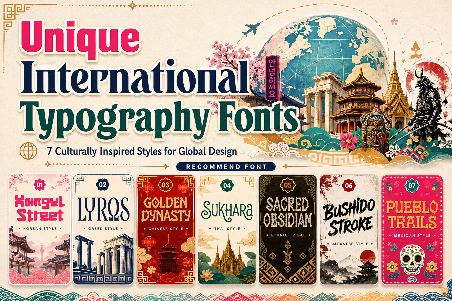
The most responsible way to use unique international typography fonts is to identify exactly what the typeface provides. A font may visually reference Korean street graphics, Greek inscriptions, Chinese signage, Thai ornamentation, Japanese brush lettering, or Mexican poster traditions while still containing primarily Latin-alphabet characters.
That distinction matters. Based on their current character maps, several fonts in this collection provide uppercase and lowercase Latin letters, numbers, punctuation, and multilingual Latin extensions rather than complete Hangul, Greek, Chinese, or Thai character sets. They are best understood as culturally inspired display fonts for Latin-script headlines, not substitutes for typefaces created to typeset those native writing systems.
Unicode defines characters independently from fonts, while fonts map those characters to visible glyphs. A visual resemblance to another writing system does not mean the font contains the encoded characters needed to write that language accurately.
A useful starting rule is:
Use culturally inspired display fonts to establish atmosphere, but use a verified native-script typeface whenever the design contains actual local-language text.
For example, a Korean-inspired restaurant identity could use Hangul Street for the English brand name while pairing it with a professionally designed Hangul typeface for Korean menu information. A Greek-themed film poster could use Lyros for the English title, but genuine Greek text should use a font with complete Greek character support.
This approach gives the project a distinctive international personality without confusing visual inspiration with linguistic accuracy.
What Are Unique International Typography Fonts?
Unique international typography fonts are display typefaces that draw visual references from particular countries, regions, historical traditions, crafts, signage systems, or cultural aesthetics.
These influences may appear through:
- Geometric proportions
- Carved or inscribed letterforms
- Brush-inspired strokes
- Decorative terminals
- Rounded or angular structures
- Symbolic cuts and internal details
- Handcrafted irregularities
- Historical poster styles
- Architectural patterns
- Festival and street-signage references
The purpose is usually not to reproduce another script character by character. Instead, the typeface translates selected visual qualities into a Latin-alphabet design that can be used for English, Indonesian, Spanish, French, and other languages supported by its character set.
These fonts are especially useful for logos, product names, album titles, food packaging, cultural events, tourism campaigns, posters, editorial covers, games, films, and merchandise. Their distinctive structures can communicate a place, mood, historical period, or creative theme much faster than a neutral corporate typeface.
Why International Typography Can Strengthen Branding
It Creates an Immediate Sense of Place
Typography can introduce geographical or cultural context before the audience reads the complete message.
Rounded forms inspired by Korean street branding may suggest youthful urban culture. Monumental Greek-style letters can evoke mythology and historical scale. Decorative Thai-inspired curves can suggest hospitality, craftsmanship, or wellness, while Japanese brush forms may communicate motion, discipline, or handmade energy.
This makes international display fonts valuable when the location or cultural reference is central to the product story.
It Helps Products Stand Out Within Familiar Categories
Restaurants, travel companies, music releases, beverage brands, and cultural events often compete in visually crowded markets. A distinctive display typeface can create a stronger shelf or campaign presence than a generic sans serif.
A tea package using carefully controlled Chinese-inspired typography can feel more connected to its story than one using an unrelated modern font. A Mexican food brand can use festive serif details to establish warmth and energy before customers examine the illustrations or flavor information.
The typeface should still support the individual brand. Two Japanese restaurants should not automatically use identical brush typography simply because they belong to the same category.
It Adds Narrative Value
International typography can help designers build a visual world around a brand.
A Greek mythology game may extend angular carved letter details into borders, icons, and interface panels. A Korean streetwear campaign could repeat compact rounded geometry across stickers and social graphics. A Thai wellness brand might use elongated curves and warm natural materials to create a calmer experience.
Typography becomes more valuable when it influences the full design system rather than appearing as one isolated decorative element.
Cultural Inspiration Is Not the Same as Cultural Authenticity
Authenticity cannot be created by applying one font, traditional pattern, landmark, or national color palette.
A genuinely thoughtful design considers:
- The specific region or community being referenced
- The historical period
- The product’s real origin
- The audience that will encounter it
- The meaning of symbols and decorative elements
- The relationship between language and imagery
- Whether local designers or cultural advisors should be involved
- Whether the brand has permission to use sensitive or sacred material
The phrase “Asian style,” for example, is usually too broad to guide a serious identity. Korea, China, Thailand, and Japan have different scripts, histories, visual systems, and contemporary design cultures.
Similarly, “tribal” should not be treated as one universal aesthetic. It can refer imprecisely to many unrelated peoples and traditions. A project should either identify its reference accurately or use a broader fictional, natural, or artifact-inspired description without claiming to represent a specific community.
W3C’s international typography resources emphasize that writing systems have different typographic conventions, including distinctions in font styles, shaping, spacing, line breaking, and layout. These variations are practical aspects of language support, not merely decoration.
Visual Style, Script, Language, and Font Coverage
These four terms are related but should not be confused.
Visual Style
Visual style describes the appearance of the typeface. It may be rounded, brush-like, monumental, ornamental, carved, rustic, or festive.
A Latin display font can have a Korean-inspired visual style without containing Hangul characters.
Script
A script is a writing system, such as Latin, Greek, Hangul, Thai, Han, Arabic, or Cyrillic.
Different languages may share one script, while one language may use more than one writing system in different contexts.
Language
Language concerns vocabulary, grammar, meaning, and communication. A font does not automatically “support Japanese” simply because its Latin letters look Japanese-inspired.
Japanese text normally uses a combination of kanji, hiragana, and katakana. A typeface intended for actual Japanese content must include and properly render the required characters.
Character Coverage
Character coverage identifies which encoded letters, marks, numbers, symbols, and scripts are included in the font.
Always inspect the character map before selecting a typeface for multilingual work. Do not assume that the product name guarantees native-script support.
For digital products, proper internationalization also requires language metadata, suitable fonts, correct text direction, appropriate line breaking, and support for local typographic conventions.
How to Use Culturally Inspired Typography Responsibly
1. Define the Reference Precisely
Replace broad descriptions with a more focused creative direction.
Instead of:
“We need an Asian font.”
Try:
“We need a bold Latin display font influenced by contemporary Korean street packaging for the English product name.”
Instead of:
“Make it tribal.”
Try:
“We need a carved, handcrafted display style for a fictional archaeological adventure, without claiming association with a living cultural group.”
Precision improves both creativity and cultural responsibility.
2. Research Contemporary and Historical Sources
Do not build a cultural identity from one tourist symbol or search-engine result.
Study:
- Historical inscriptions
- Contemporary local brands
- Street signs
- Book and magazine covers
- Food packaging
- Architecture
- Calligraphy
- Posters
- Music and youth culture
- Museum collections
- Regional crafts
The aim is not to copy these references directly. Research helps designers understand which visual qualities belong together and which combinations create an inaccurate stereotype.
3. Use Native-Script Fonts for Native-Language Content
A culturally inspired Latin font can lead the English headline, while the actual local-language text uses a separate typeface designed for that writing system.
For example:
- English brand name in Hangul Street, Korean translation in a Hangul font
- English movie title in Lyros, Greek subtitle in a Greek typeface
- English packaging title in Golden Dynasty, Chinese product information in a Chinese font
- English resort name in Sukhara, Thai address in a Thai typeface
- English campaign title in Bushido Stroke, Japanese copy in a Japanese type family
The two fonts should share compatible weight, energy, proportion, or formality without forcing one script to imitate the other.
4. Collaborate With Local Readers and Creatives
Native speakers and local designers can identify problems that outside teams may overlook.
They can assess whether:
- The translation is accurate
- The tone feels natural
- The typography appears respectful
- Symbols carry unintended meanings
- The design resembles an inappropriate stereotype
- The local text is readable
- The visual references match the region or audience
Consultation is particularly important for public campaigns, cultural institutions, tourism, education, and brands entering a new international market.
5. Keep the Supporting Typography Neutral
International display fonts usually have strong personalities. Pairing them with an equally decorative companion can make the composition difficult to read.
Use the expressive typeface for:
- Logos
- Product names
- Event titles
- Album names
- Packaging headlines
- Poster hooks
- Major campaign statements
Use a cleaner sans serif or serif for:
- Descriptions
- Ingredients
- Prices
- Addresses
- Dates
- Instructions
- Legal text
- Website navigation
This allows the cultural reference to remain visible without overwhelming practical information.
6. Build Meaning Through More Than Typography
The font should work with photography, illustration, color, materials, layout, and storytelling.
A Korean street-food brand might use compact typography, energetic color blocks, documentary photography, and sticker-style graphics. A Greek historical campaign may use stone texture, disciplined spacing, and a restrained classical palette.
Avoid supporting the font with every obvious national symbol. A Chinese-inspired package does not automatically require dragons, lanterns, bamboo, red, gold, and clouds at the same time. One or two carefully researched references usually feel more sophisticated.
7. Test the Design in Its Real Context
Decorative details may disappear on small labels, mobile screens, embroidery, or low-cost printing.
Test the typography in:
- One color
- Small thumbnails
- Large signage
- Printed packaging
- Mobile layouts
- Social media posts
- Merchandise
- Light and dark backgrounds
- Local-language versions
A typeface that works for a poster title may need a simplified treatment for a profile icon or food-delivery thumbnail.
Applications for International Typography
Music Branding and Cover Art
International display fonts can establish the cultural or historical world of an album, festival, or artist identity.
Lyros can support mythological or cinematic music. Bushido Stroke may suit Japanese-inspired instrumental projects, martial-arts soundtracks, or energetic festival visuals. Sacred Obsidian can bring a carved artifact quality to world music or fictional folklore concepts.
The music, artist background, and visual reference should remain connected. A typeface should not imply cultural origins that the project cannot explain.
Food and Beverage Packaging
Culturally inspired typography can help customers identify a cuisine, ingredient story, or regional influence quickly.
Golden Dynasty can create strong English-language headlines for tea, noodles, sauces, or festival packaging. Sukhara can support wellness drinks, herbal products, Thai-inspired hospitality, and premium food presentation. Pueblo Trails can bring festive warmth to Mexican restaurants, sauces, snacks, and event branding.
Essential product information should remain highly readable in a neutral companion font.
Tourism and Hospitality
Hotels, resorts, travel campaigns, cultural centers, and destination events can use international display type to establish atmosphere.
The design should be specific to the destination rather than presenting a generic “exotic” mood. Include local professionals in the process and make sure all translated information uses appropriate native-script typography.
Film, Games, and Publishing
Display typography can introduce mythology, history, adventure, fantasy, and fictional cultures.
Lyros suits monumental historical themes, while Bushido Stroke can support samurai, martial-arts, manga-inspired, or period-adventure projects. Sacred Obsidian can work for fictional archaeology, artifacts, natural mythology, and handcrafted fantasy worlds.
For invented cultures, designers should combine references carefully so the final result does not unintentionally imitate or misrepresent one living community.
Branding and Product Identity
International-inspired fonts can distinguish restaurants, fashion products, creative studios, craft businesses, festivals, and specialty retailers.
The typeface should support a real positioning statement. A Mexican restaurant might use Pueblo Trails to feel festive and handcrafted, while a contemporary Korean snack brand could use Hangul Street to appear youthful and pop-driven.
The design becomes stronger when typography communicates the same personality as the product, environment, service, and customer experience.
Jump to Recommended Fonts
Hangul Street | Lyros | Golden Dynasty | Sukhara | Sacred Obsidian | Bushido Stroke | Pueblo Trails
1. Hangul Street Korean Style Font
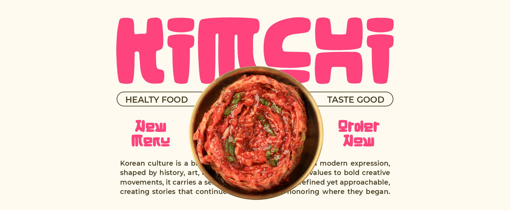
Hangul Street uses thick strokes, compact proportions, wide forms, and soft rounded geometry to create an energetic, youth-oriented display style. Its strong visual blocks and friendly corners connect naturally with contemporary Korean street branding, pop culture, food packaging, and entertainment graphics. Use it for Latin-alphabet headlines and pair it with a genuine Hangul typeface when the project contains Korean-language text.
PROS: Bold visibility, rounded personality, youthful rhythm, compact structure, and strong pop-branding appeal.
BEST FOR: K-pop promotions, Korean food packaging, streetwear, snack brands, stickers, youth events, social campaigns, and entertainment graphics.
2. Lyros Greek Font
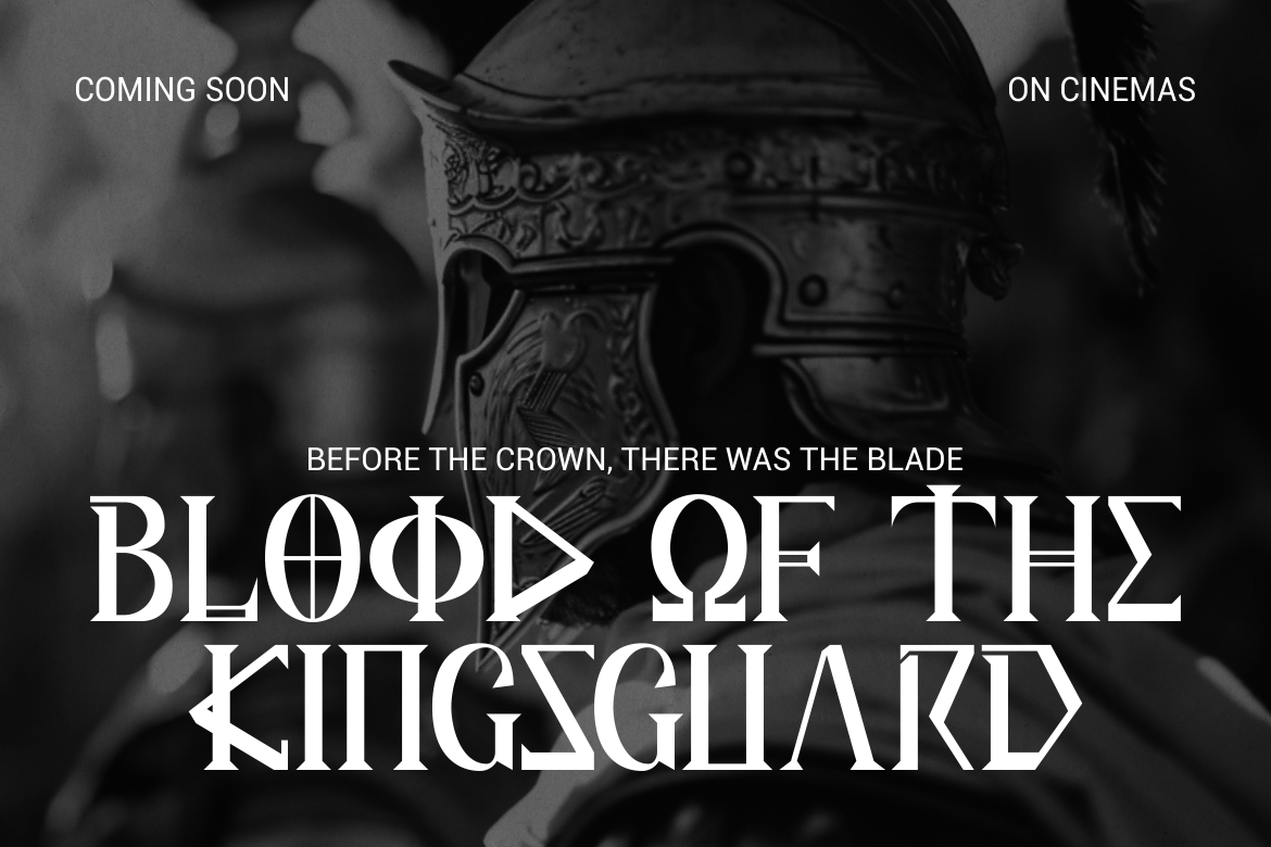
Lyros combines tall proportions, sharp angles, solid strokes, and carved terminals influenced by classical Greek inscriptions. Its disciplined geometry gives titles a monumental, heroic, and cinematic presence without making the letterforms excessively heavy. It is especially effective for projects that need to express mythology, power, historical scale, or institutional prestige.
PROS: Monumental silhouette, strong vertical rhythm, sharp geometry, historical atmosphere, and clear display readability.
BEST FOR: Mythology, film titles, museum exhibitions, historical games, book covers, cultural events, architecture, and premium heritage branding.
3. Golden Dynasty Chinese Style Font
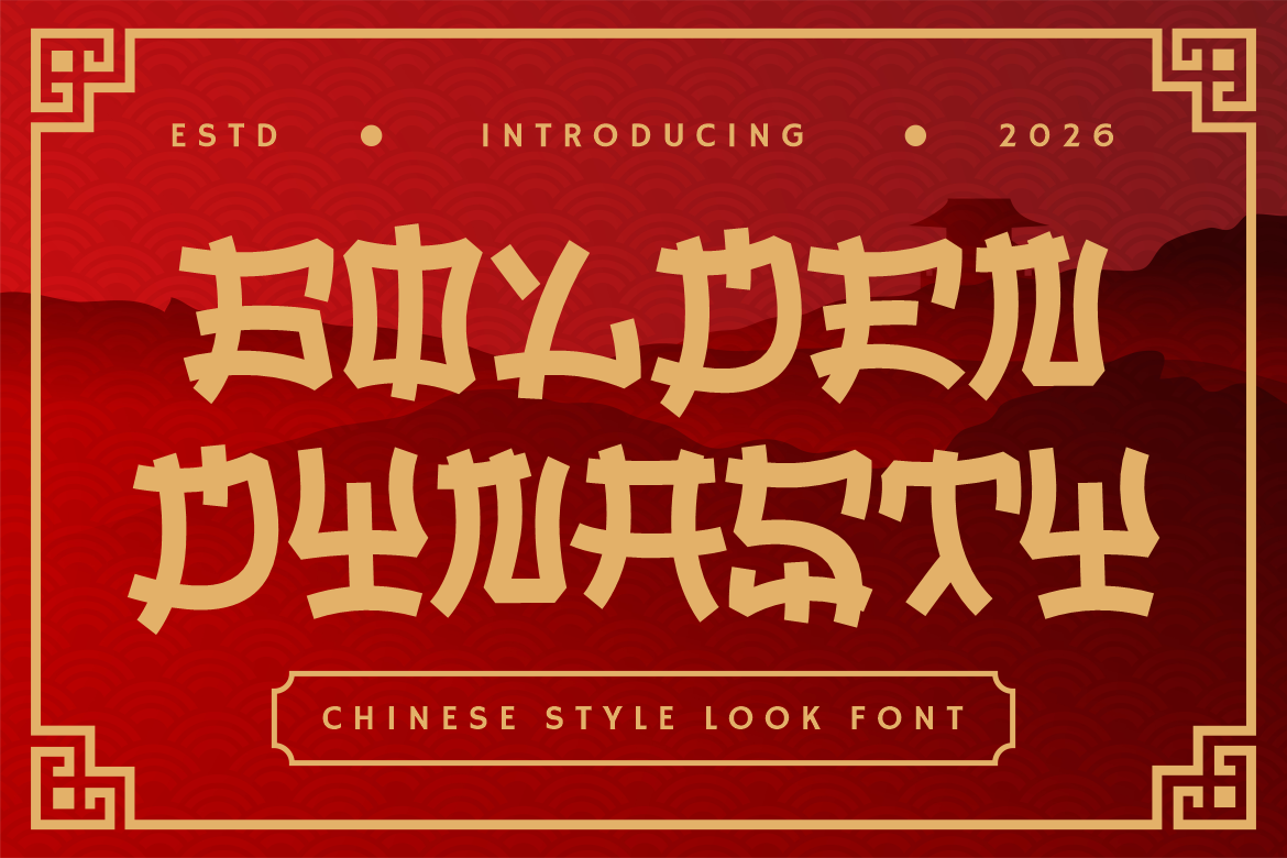
Golden Dynasty uses bold strokes, angular cuts, decorative edges, and structured forms to produce a dramatic Chinese-inspired display identity. Its strong silhouette works well on packaging, storefront signs, posters, menu boards, and promotional graphics where the product name must be recognized quickly. For actual Chinese copy, combine it with a verified Chinese typeface rather than using the Latin display font as a substitute.
PROS: Powerful structure, festive character, bold headline presence, ornamental details, and strong packaging visibility.
BEST FOR: Chinese restaurants, noodle brands, dim sum menus, tea packaging, festival promotions, tourism, film titles, games, and seasonal campaigns.
4. Sukhara Thai Style Font
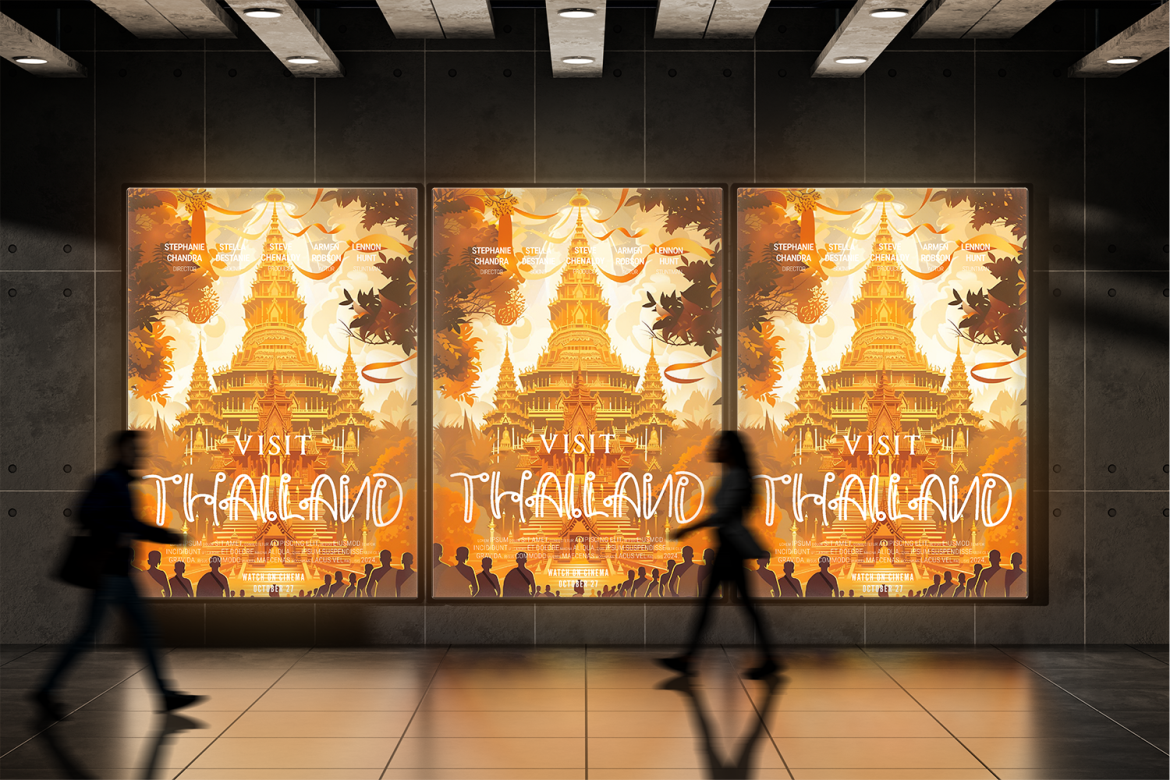
Sukhara features a consistent monoline structure, elongated proportions, rounded terminals, and spiral-inspired ornamental details. These elements create a graceful vertical rhythm that feels artistic, welcoming, and suitable for premium hospitality or wellness branding. Its decorative character can establish a Thai-inspired mood for Latin headlines while a native Thai typeface handles local-language information.
PROS: Elegant monoline construction, flowing details, tall proportions, refined cultural atmosphere, and versatile hospitality appeal.
BEST FOR: Thai restaurants, resorts, spas, wellness brands, herbal products, tea packaging, yoga studios, travel campaigns, and cultural festivals.
5. Sacred Obsidian Ethnic Tribal Display Font

Sacred Obsidian uses carved shapes, angular cuts, hand-drawn edges, irregular proportions, arrows, diamonds, and symbolic internal details. The rough outline creates an artifact-like presence that can support ancient, natural, rustic, or handcrafted visual worlds. Because “tribal” is a broad label, the font is most responsibly used for fictional, archaeological, craft, or general heritage concepts unless a more specific cultural reference has been properly researched.
PROS: Carved appearance, symbolic details, handcrafted irregularity, strong headline power, and distinctive artifact mood.
BEST FOR: Museums, folklore events, fictional archaeology, craft packaging, art galleries, book covers, nature retreats, exhibitions, and heritage-inspired products.
6. Bushido Stroke Japanese Brush Display Font
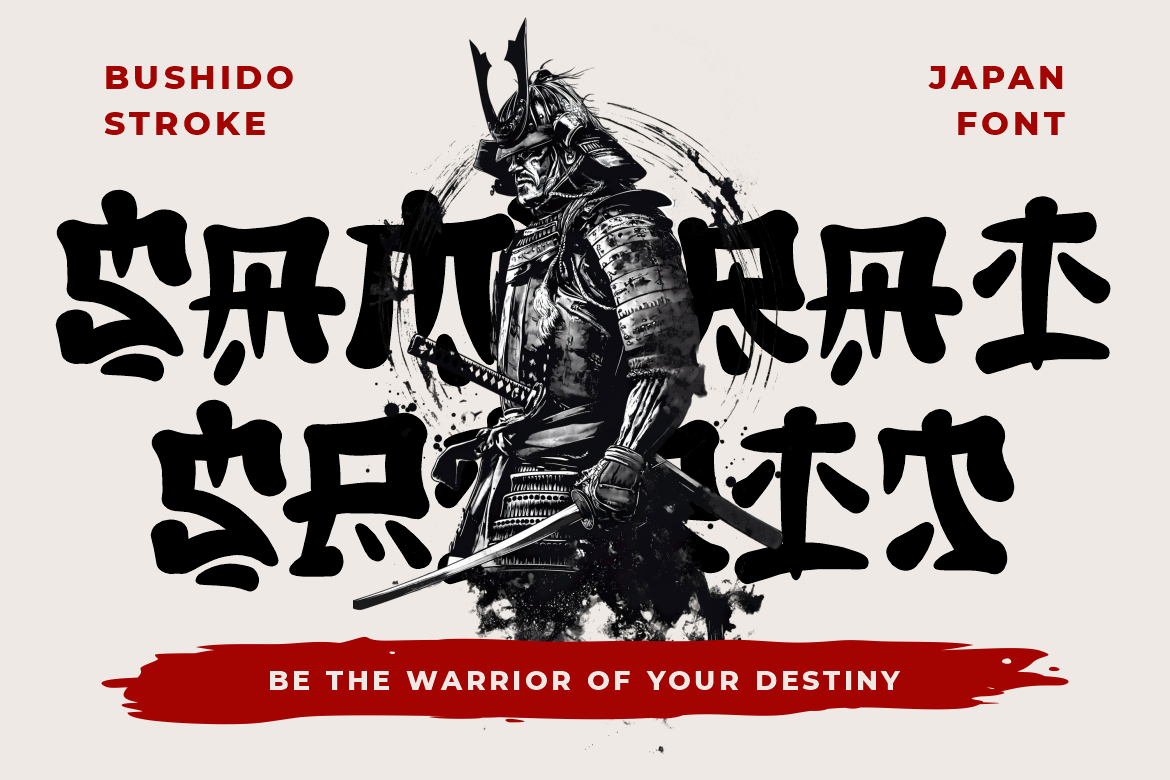
Bushido Stroke uses thick brush-inspired marks, compact proportions, uneven edges, and organic details to create a forceful sense of movement. Its handcrafted structure is well suited to Latin-script titles that need a Japanese-inspired atmosphere connected to brushwork, action, tradition, or dramatic storytelling. Use a proper Japanese typeface for kanji, hiragana, and katakana content.
PROS: Expressive brush energy, bold silhouette, organic texture, dynamic movement, and dramatic cultural character.
BEST FOR: Japanese restaurants, ramen packaging, martial-arts promotions, anime-inspired projects, game titles, film posters, tourism, tea brands, and cultural events.
7. Pueblo Trails Mexican Font
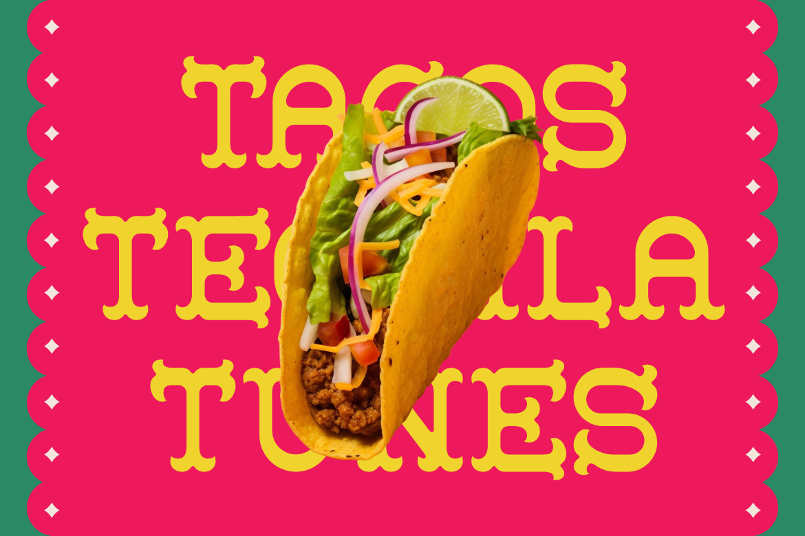
Pueblo Trails combines thick structured letterforms, decorative serifs, tall proportions, and generous spacing. Its handcrafted festive appearance communicates warmth, celebration, and strong visual personality while retaining enough clarity for short product names and headlines. The font is particularly effective when paired with colorful but controlled packaging, illustration, and food photography.
PROS: Festive serif details, strong readability, warm handcrafted personality, tall silhouette, and bold cultural appeal.
BEST FOR: Mexican restaurants, taco shops, food packaging, festivals, event posters, sauces, souvenirs, invitations, craft labels, and tourism campaigns.
Comparison
| Font | Cultural Reference | Main Visual Character | Strongest Application | Recommended Supporting Approach |
|---|---|---|---|---|
| Hangul Street | Contemporary Korean street and pop visuals | Rounded, compact, bold, and youthful | Snacks, K-pop, streetwear, and events | Pair with clean sans serif and native Hangul font |
| Lyros | Classical Greek inscriptions | Tall, angular, monumental, and heroic | Films, mythology, museums, and historical branding | Pair with restrained serif or sans serif |
| Golden Dynasty | Chinese-inspired signage and ornamental forms | Sharp, structured, festive, and dramatic | Restaurants, tea, festivals, and packaging | Pair with neutral sans serif and native Chinese typeface |
| Sukhara | Thai and Southeast Asian decorative aesthetics | Flowing, elongated, graceful, and ornamental | Hospitality, wellness, food, and tourism | Pair with calm sans serif and native Thai typeface |
| Sacred Obsidian | Carved artifact and broad ethnic inspiration | Irregular, symbolic, rustic, and handcrafted | Museums, fiction, crafts, and exhibitions | Use specific cultural claims cautiously |
| Bushido Stroke | Japanese brush and action aesthetics | Bold, textured, compact, and dynamic | Restaurants, games, films, and martial arts | Pair with modern sans serif and native Japanese typeface |
| Pueblo Trails | Mexican poster and handcrafted display traditions | Festive, structured, decorative, and warm | Food, events, packaging, and travel | Pair with readable sans serif or simple slab |
Common Mistakes
The first mistake is assuming that a culturally inspired Latin font can typeset the language associated with its name. A Korean-style font may not contain Hangul, a Greek-inspired display font may not include Greek characters, and a Chinese-style typeface may only provide Latin letters. This becomes a serious problem when a designer promises multilingual support without inspecting the character map. Verify the available glyphs, use a native-script font for translated text, and test the complete language version with local readers before publication.
Another mistake is reducing an entire culture to one decorative stereotype. Combining every familiar symbol, national color, landmark, costume, food item, and historical motif usually produces a generic themed design rather than a credible identity. Research a precise visual context, such as contemporary Seoul street packaging, classical Greek stone inscriptions, Thai hospitality, Japanese brush performance, or Mexican festival posters. Avoid claiming cultural authenticity when the project is only borrowing a visual mood, and seek guidance before using sacred, ceremonial, or community-specific symbols.
The final mistake is letting cultural decoration overpower communication. Complex brush strokes, ornamental serifs, carved marks, and symbolic cuts may look impressive in a large presentation but fail on mobile screens, labels, menus, or multilingual layouts. Use international display fonts for short focal text, pair them with readable supporting typography, and test actual production sizes. The selected license should also match the real application, including logo or trademark use, packaging quantities, webfont embedding, advertising, merchandise, publishing, or interactive products.
Conclusion
The most effective unique international typography fonts do more than add a foreign-looking decoration to a design. They introduce visual references that can strengthen storytelling, establish a sense of place, and help brands communicate a more distinctive personality.
Hangul Street brings contemporary Korean pop energy, while Lyros creates Greek-inspired monumentality. Golden Dynasty supports bold Chinese-themed packaging, and Sukhara introduces flowing Thai-inspired elegance. Sacred Obsidian creates a carved artifact atmosphere, Bushido Stroke adds expressive Japanese brush movement, and Pueblo Trails delivers festive Mexican warmth.
The key is precision. Identify the cultural reference, distinguish visual influence from native-language support, research the context, and use appropriate script fonts for actual translated content. Collaborate with local readers when the project enters a real cultural market, and avoid using one typeface as proof of authenticity.
Fonts from PutraCetol Studio can provide a strong starting point for branding, music, packaging, cover art, hospitality, events, and promotional campaigns. When typography, language, imagery, and cultural context work together, an internationally inspired design can feel memorable and expressive without sacrificing clarity or respect.
Explore these fonts and many more at PutraCetol.com to build a business identity that looks professional, trustworthy, and memorable.
Additionally, if you want to explore some free typography options, you can check out Putracetol Studio on Dafont. Happy reading and designing!