
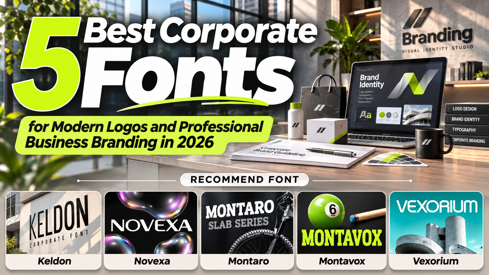
Best Corporate Fonts for Professional Branding in 2026
A company’s typography says a lot about its identity. Before customers read a business message, the shapes, proportions, and structure of its lettering already communicate professionalism, reliability, and personality.
The best corporate fonts for professional branding 2026 combine geometric precision, balanced proportions, and distinctive visual characteristics to create memorable business identities.
Whether you’re developing a technology startup, financial services brand, consulting firm, or established corporate identity, choosing the right typeface helps establish credibility while maintaining a modern appearance.
Choose Typography That Reflects Your Business Identity
Professional branding begins with understanding how your company wants to be perceived.
Geometric sans-serif fonts often communicate innovation, clarity, and efficiency, while structured slab-serif typefaces introduce strength, authority, and stability.
A technology startup might prefer experimental geometric lettering, whereas a consulting company could benefit from confident, balanced typography.
Consider letter spacing, readability, visual hierarchy, and consistency across business materials. The ideal corporate font should feel distinctive without sacrificing professionalism.
Jump to Recommended Corporate Fonts
Explore five carefully selected typefaces from PutraCetol Studio, each offering a different approach to modern corporate branding.
1. Vexorium Modern Experimental Font
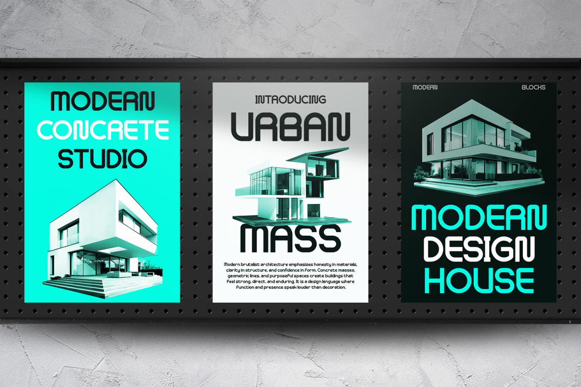
Vexorium is a modern experimental sans-serif font that combines architectural precision with futuristic geometric construction. Its tall letterforms, consistent stroke weight, rounded corners, and unconventional character details create a distinctive visual identity that feels innovative yet carefully organized. The combination of controlled curves and experimental structures makes Vexorium particularly attractive for companies seeking a progressive identity without appearing overly decorative. Its memorable letterforms can transform simple business names into recognizable corporate wordmarks while maintaining a sophisticated technological personality.
PROS: Experimental geometry, architectural proportions, distinctive characters, futuristic professional appearance.
BEST FOR: Technology startups, architectural firms, innovation companies, industrial design studios, and modern corporate logos.
2. Montavox Corporate Logo Font
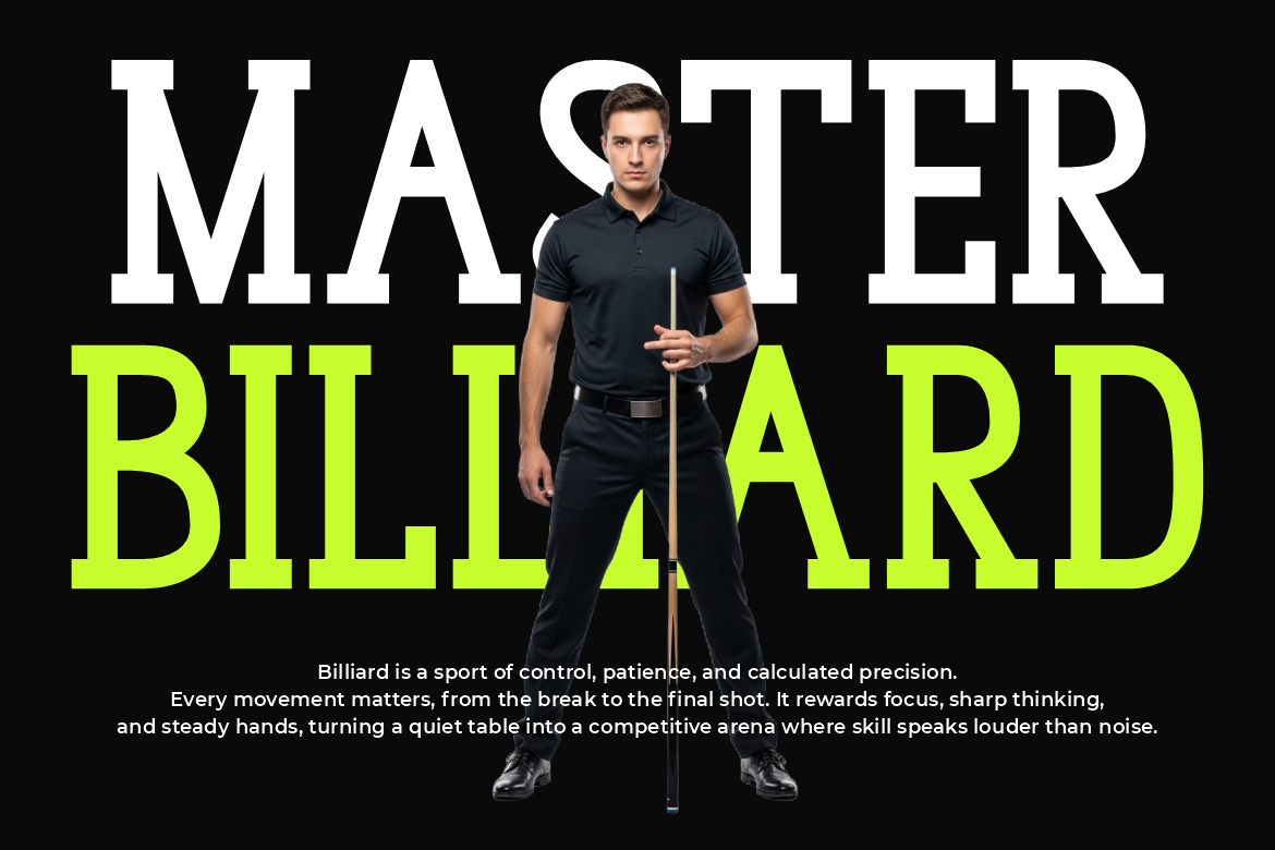
Montavox is a powerful slab-serif typeface designed to communicate authority, confidence, and structural stability. Its substantial vertical strokes, broad rectangular serifs, and upright proportions create a solid geometric appearance that feels dependable and professional. Unlike conventional minimalist corporate fonts, Montavox introduces a bold visual personality while preserving an organized typographic structure. This makes it especially effective for businesses that want their logos, company presentations, and promotional headlines to communicate strength, discipline, and long-term credibility.
PROS: Bold slab serifs, stable geometric proportions, authoritative appearance, strong visual hierarchy.
BEST FOR: Corporate identities, consulting firms, professional services, business presentations, and sports-related organizations.
3. Montaro Corporate Slab Font
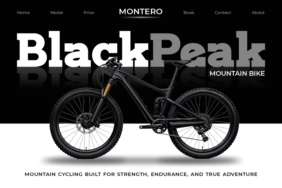
Montaro combines broad letterforms, sturdy proportions, and substantial slab details to create a confident corporate display typeface. Its heavy construction produces a strong visual presence without making the lettering feel unnecessarily crowded or complicated. Compared with more traditional corporate serif fonts, Montaro introduces a slightly more energetic personality inspired by active lifestyles, industrial strength, and performance-oriented branding. Its structured appearance makes it particularly appealing for businesses that want to communicate durability, dependability, and a confident market position.
PROS: Broad proportions, powerful slab construction, distinctive corporate character, bold display impact.
BEST FOR: Engineering companies, automotive businesses, equipment brands, cycling companies, and industrial branding.
4. Novexa Modern Sans Font
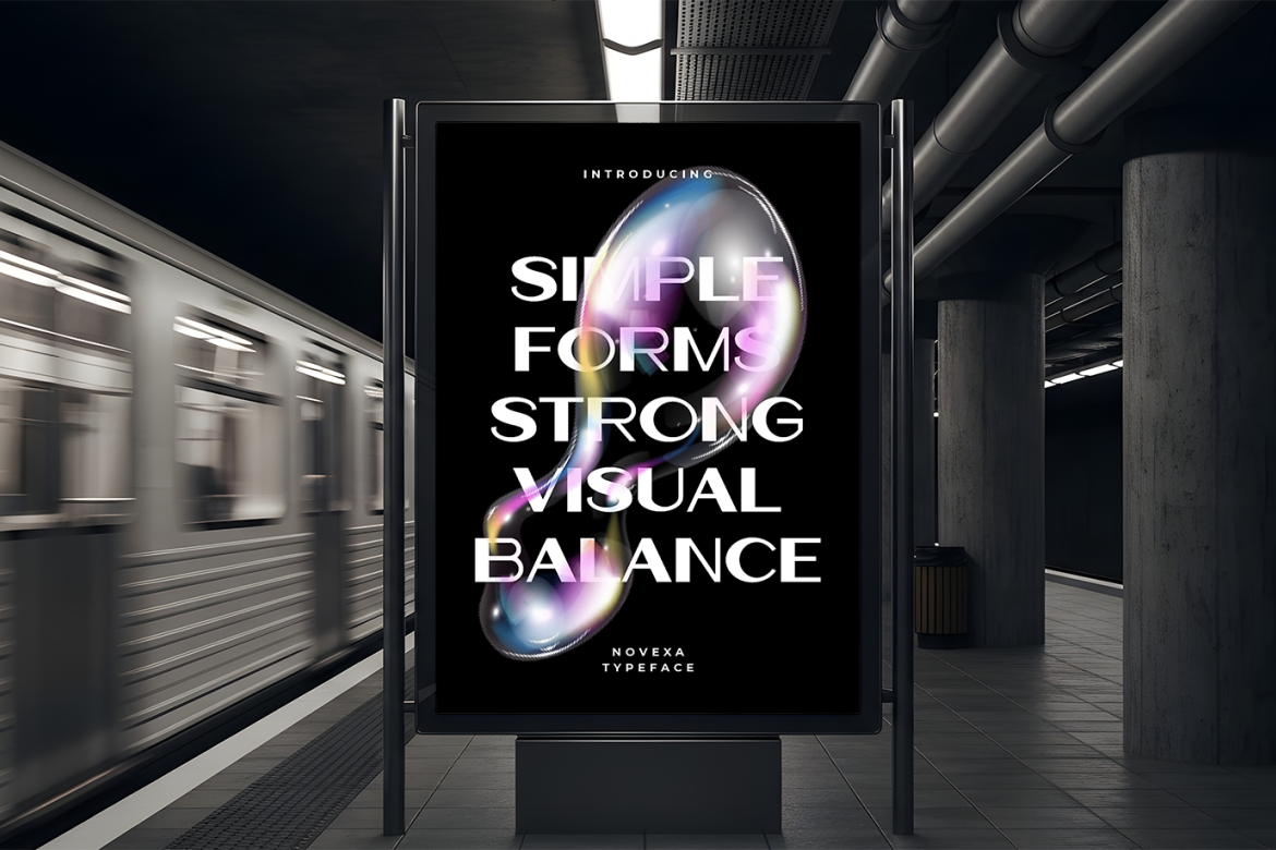
Novexa delivers a refined corporate aesthetic through wide proportions, smooth curves, and balanced geometric construction. Its spacious letterforms establish a calm, confident personality that feels contemporary without relying on exaggerated decorative elements. The clean strokes and controlled shapes create an elegant visual rhythm, making Novexa suitable for businesses that value simplicity, precision, and sophisticated presentation. Designers can adjust letter spacing to develop different visual expressions, from understated premium identities to stronger commercial wordmarks.
PROS: Wide geometric proportions, smooth curves, refined appearance, flexible spacing, contemporary elegance.
BEST FOR: Creative agencies, architecture studios, technology companies, premium corporate brands, and professional portfolios.
5. Keldon Minimal Condensed Headline Font
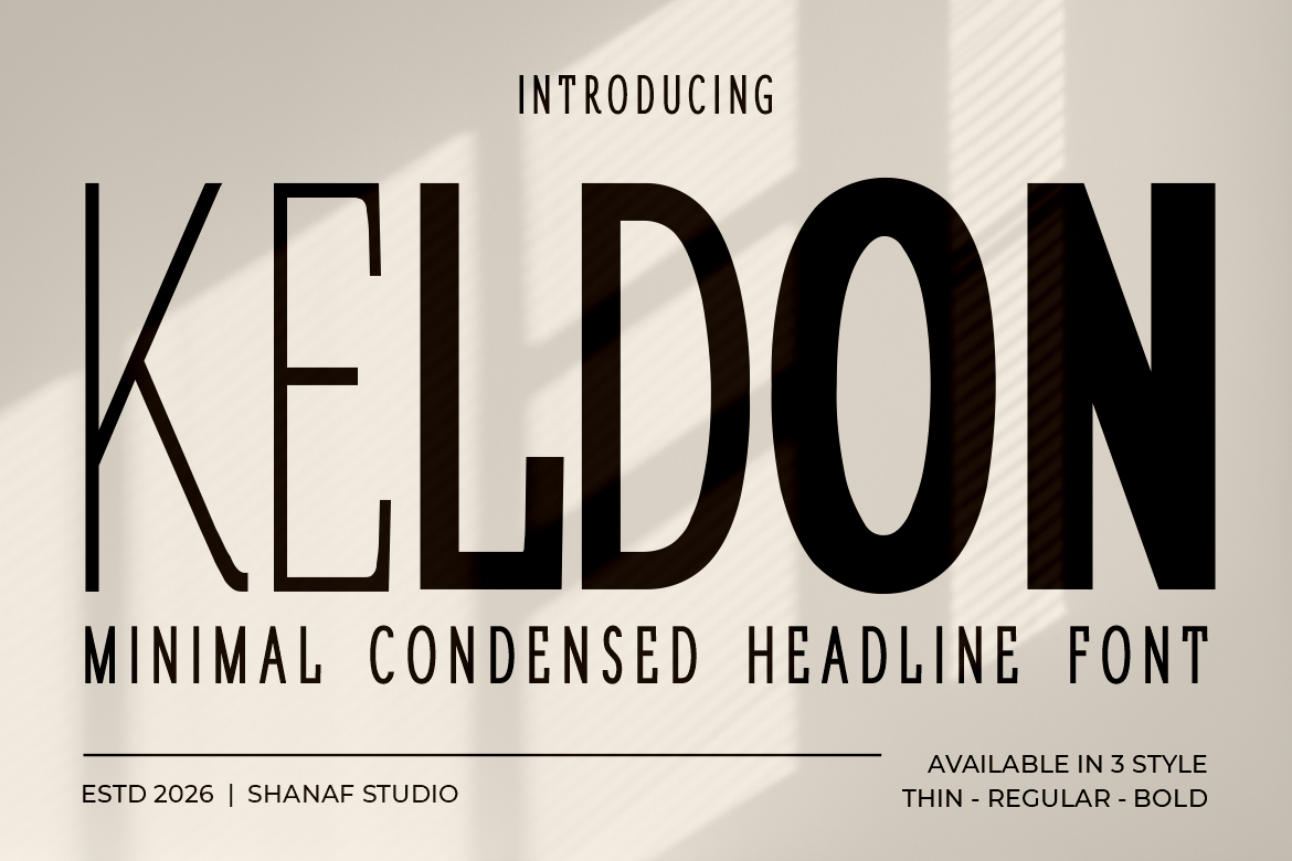
Keldon is a minimal condensed sans-serif font characterized by tall, narrow letterforms and a strong vertical rhythm. Its compact proportions create an organized and confident appearance, allowing designers to establish prominent headlines without occupying excessive horizontal space. The clean construction communicates efficiency, modernity, and understated professionalism, making Keldon particularly useful for businesses seeking a minimalist visual identity. Its distinctive condensed structure works beautifully in corporate logos, company profiles, advertising headlines, and contemporary branding systems.
PROS: Tall condensed letterforms, clean geometry, efficient proportions, minimalist professional character.
BEST FOR: Corporate headlines, business logos, creative studios, product branding, and professional advertising.
Comparison: Which Corporate Font Should You Choose?
Each typeface communicates a different corporate personality. Understanding these differences helps businesses choose typography that supports their positioning.
| Font | Visual Personality | Best Branding Direction |
|---|---|---|
| Vexorium | Experimental, futuristic | Technology and innovation |
| Montavox | Bold, authoritative | Corporate and professional |
| Montaro | Strong, structured | Engineering and industrial |
| Novexa | Refined, geometric | Modern and premium |
| Keldon | Minimal, condensed | Business and creative studios |
How to Use Corporate Typography Effectively
For corporate logos, prioritize distinctive lettering and balanced spacing. For websites and presentations, establish a clear hierarchy between headlines and supporting text.
Pair expressive display fonts with highly readable typefaces for longer content. Consistent typography across business cards, corporate profiles, websites, and marketing materials helps reinforce brand recognition.
Common Mistakes When Choosing Corporate Fonts
One common mistake is assuming that every geometric font automatically communicates professionalism. Although minimalist typography can create a clean appearance, excessively experimental letterforms may reduce readability or conflict with a company’s established identity. Designers should evaluate proportions, spacing, character recognition, and visual consistency before selecting a corporate typeface. A font that works beautifully for a large logo may not be suitable for financial reports, dashboard interfaces, or smaller website text.
Another mistake is using too many font styles throughout a corporate branding system. Combining unrelated typefaces can weaken visual consistency and make business communication appear disorganized. Establish clear typography guidelines covering headlines, subheadings, body text, and promotional materials. Businesses should also verify that their selected font license covers intended commercial applications, including logos, trademark registration, website embedding, and corporate use.
Conclusion
The best corporate fonts for professional branding in 2026 combine visual precision, distinctive character, and a clear sense of business identity.
Vexorium offers futuristic innovation, Montavox communicates authority, and Montaro delivers structural strength. Novexa introduces refined geometric elegance, while Keldon provides compact minimalist confidence.
The ideal choice depends on your industry, audience, and desired brand personality.
Explore these premium corporate typefaces at PutraCetol Studio and discover professional typography that gives your business a distinctive and recognizable identity.
Explore these fonts and many more at PutraCetol.com to build a business identity that looks professional, trustworthy, and memorable.
Additionally, if you want to explore some free typography options, you can check out Putracetol Studio on Dafont. Happy reading and designing!