
Best of Unique & Elegance in Type Design: Where Refinement Meets Originality

Define Elegance Beyond Softness
The Best of unique & elegance in type design appears when a typeface has a recognizable personality without losing visual discipline. Elegance does not have to mean thin strokes, delicate scripts, or feminine styling. It can also appear through bold geometry, unusual proportions, sharp serifs, experimental curves, and culturally influenced forms.
Before selecting a font, define three qualities the project should communicate. A luxury identity might be refined, confident, and artistic, while a creative studio could be experimental, intelligent, and bold.
Use expressive typography for logos, packaging titles, editorial covers, or campaign headlines, then pair it with a quieter companion for body copy and functional information.
What Makes Type Design Unique and Elegant?
Unique typography creates recognition through details that audiences can remember. This might come from an unusual terminal, curved serif, custom ligature, unexpected counter, distinctive proportion, or rhythmic relationship between characters.
Elegance comes from controlling those details.
A typeface can be visually adventurous while still feeling sophisticated when its spacing, proportions, contrast, and overall rhythm remain intentional. One memorable letter can give a logo more identity than decorating every character.
For type designers, this means thinking in systems rather than isolated glyphs. Curves, terminals, stroke contrast, widths, and spacing should repeat with enough consistency to make the alphabet feel related.
Jump to Recommended Fonts
Gilded Glint | Lilard | Wavetra | Crevia | Minar Block
1. Gilded Glint Elegant Serif Font
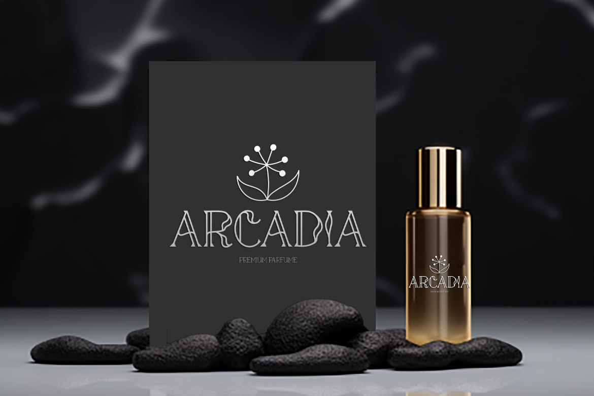
Gilded Glint combines flowing decorative curves with sharper geometric serifs, creating a balance between softness and confident structure. Its two coordinated styles and 263 glyphs provide enough flexibility for distinctive headlines and wordmarks without abandoning an elegant serif foundation.
PROS: Flowing curves, geometric serif details, two styles, strong premium character.
BEST FOR: Luxury branding, fashion, packaging, wedding identities, editorial covers, and dramatic headlines.
2. Lilard Elegant Serif Font
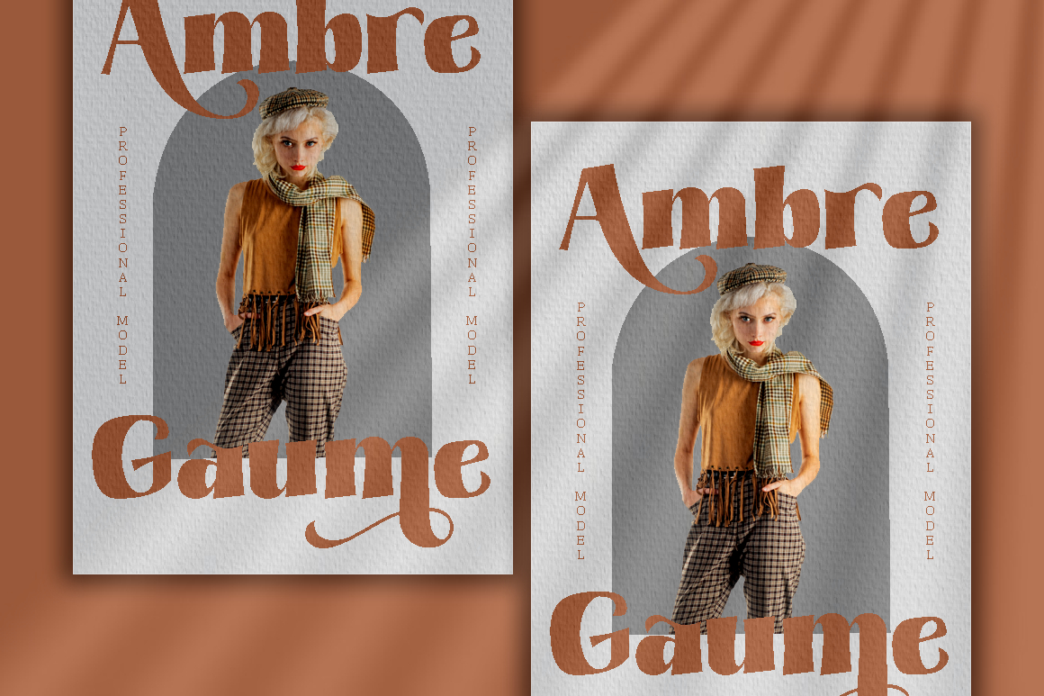
Lilard balances traditional serif sophistication with a cleaner modern appearance. Its graceful construction makes it versatile enough for polished logos and premium packaging while remaining restrained enough for photography, editorial, and lifestyle branding.
PROS: Classic-modern balance, graceful structure, versatile premium mood.
BEST FOR: Fashion labels, photography, cosmetics, packaging, editorial design, and sophisticated logos.
3. Wavetra Unique Experimental Font
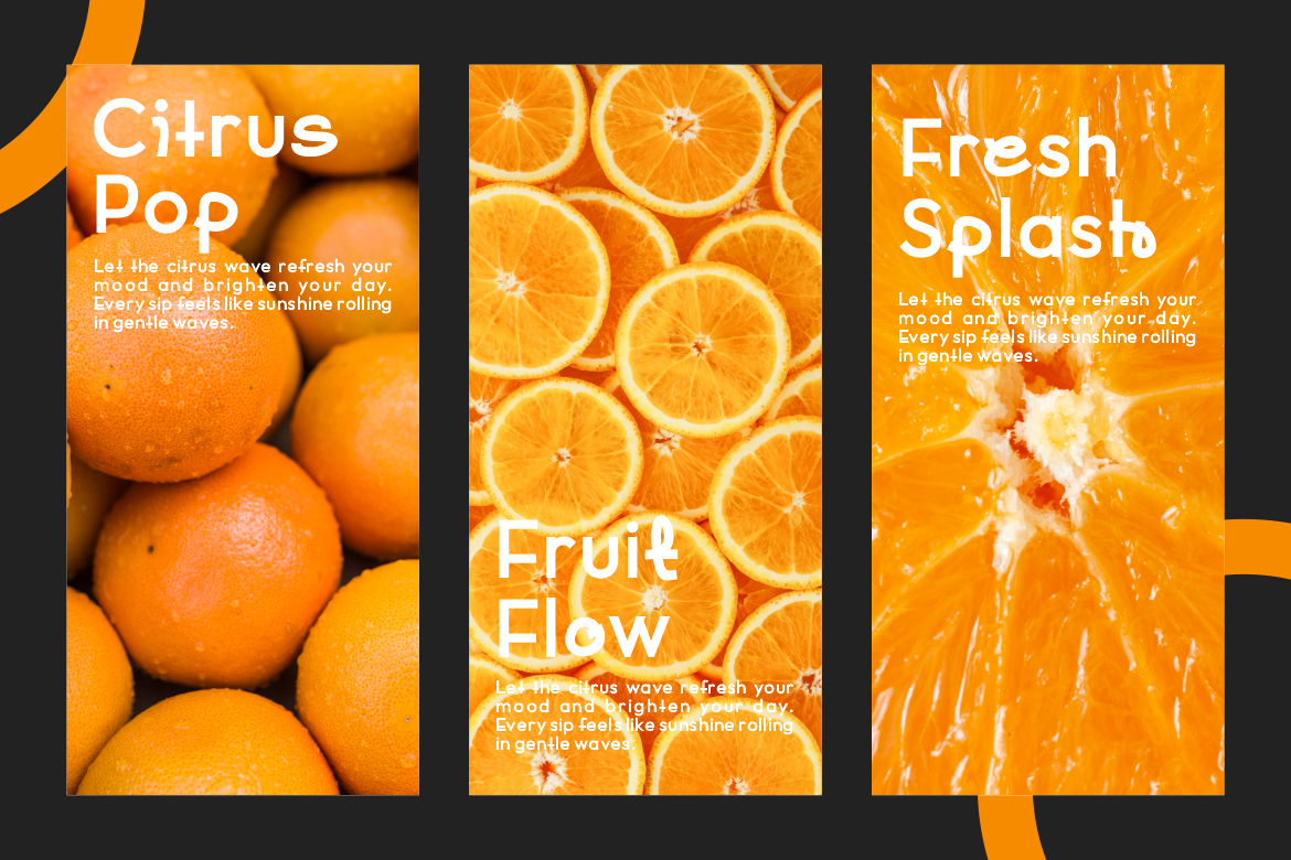
Wavetra takes a more contemporary approach through smooth curves, rounded edges, open counters, and fluid letter construction. Its medium-to-bold presence gives headlines personality, while balanced spacing helps the experimental forms remain approachable rather than chaotic.
PROS: Fluid shapes, open counters, strong rhythm, experimental but readable.
BEST FOR: Creative agencies, lifestyle brands, packaging, magazines, posters, and modern campaigns.
4. Crevia Elegant Font
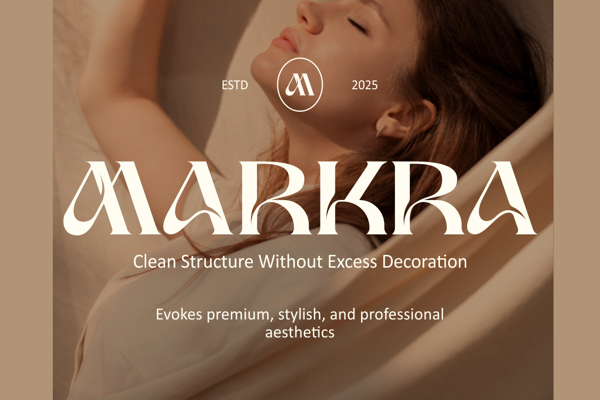
Crevia is a high-contrast serif built around tall proportions, refined serifs, subtle flared terminals, and flowing curves. Its combination of precision and graceful movement gives it a premium editorial personality that can feel timeless without becoming conservative. The family contains two styles for greater flexibility.
PROS: High contrast, tall proportions, flowing structure, two coordinated styles.
BEST FOR: Fashion magazines, luxury packaging, invitations, beauty branding, posters, and editorial titles.
5. Minar Block Arabic-Inspired Display Font
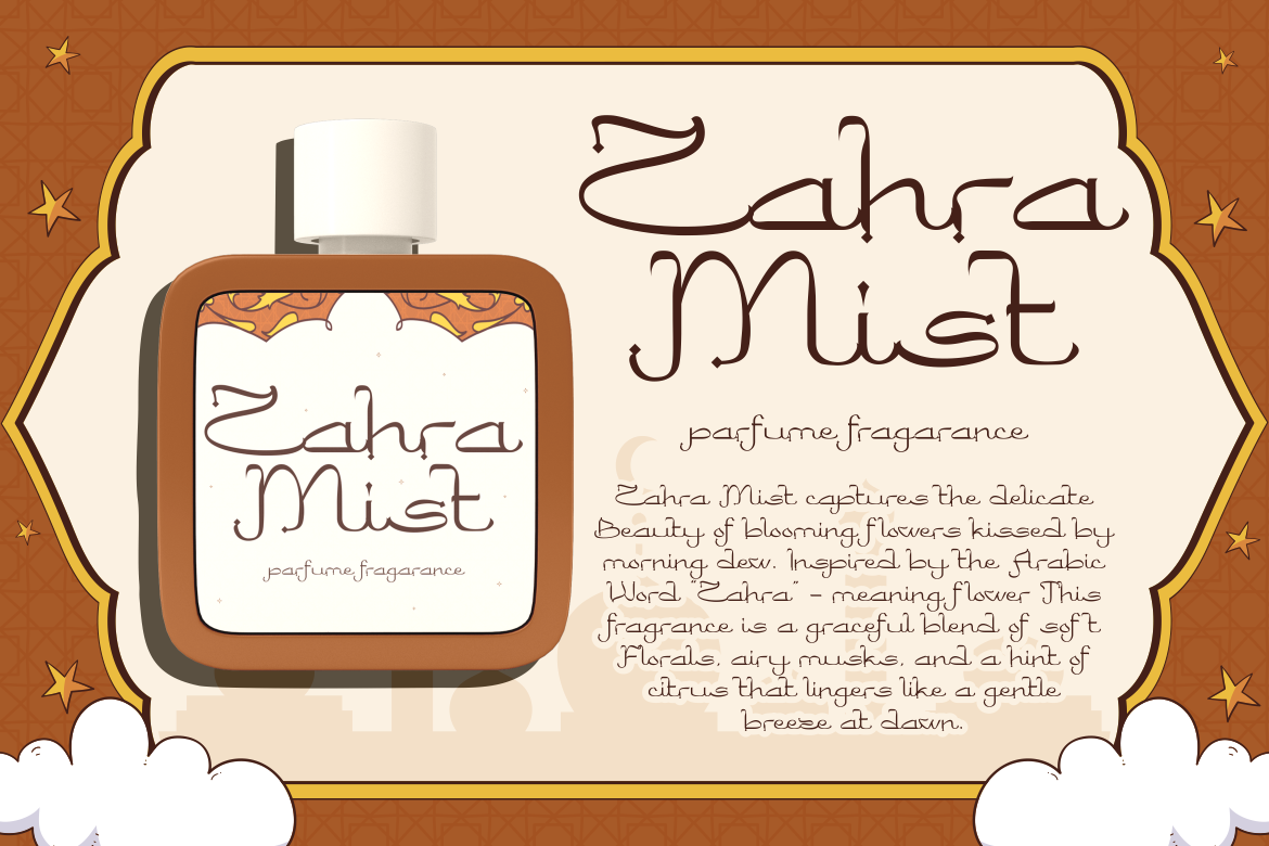
Minar Block uses geometric precision, ornamental flourishes, elegant curves, and visual references to Middle Eastern calligraphic aesthetics. Its structure creates a distinctive cultural atmosphere for display applications while maintaining a contemporary presentation. It should be treated as an Arabic-inspired Latin display style rather than assumed to provide native Arabic-script typography unless the required script coverage is specifically verified.
PROS: Cultural character, geometric structure, ornamental detailing, strong thematic identity.
BEST FOR: Ramadan campaigns, Islamic-themed packaging, hospitality, perfume branding, invitations, and culturally inspired editorial work.
Custom Details Can Transform a Typeface
Elegant typography often becomes memorable through subtle customization.
A designer might modify one capital, adjust a terminal, create a custom ligature, refine kerning, or reshape a final letter to produce a unique wordmark. The goal is not to redesign the entire alphabet but to introduce a controlled signature.
For motion graphics, those distinctive details can also become animation points. A serif may extend into a line, a ligature can connect gradually, or an ornamental curve can reveal the logo.
Cross-Cultural Elegance Requires Research
Cultural inspiration can make typography richer, but it needs context. Architecture, calligraphy, textiles, historical signage, and traditional ornament can provide valuable references when designers understand where they come from.
Avoid treating culturally inspired Latin fonts as substitutes for native scripts. When a project contains Arabic, Japanese, Chinese, Thai, or another writing system, use a typeface designed specifically for that script alongside the decorative Latin display face.
Comparison
| Font | Main Direction | Visual Personality | Strongest Use |
|---|---|---|---|
| Gilded Glint | Decorative serif | Luxurious and artistic | Fashion and premium branding |
| Lilard | Elegant serif | Timeless and clean | Lifestyle and packaging |
| Wavetra | Experimental display | Fluid and contemporary | Creative campaigns |
| Crevia | High-contrast serif | Refined and editorial | Beauty and publishing |
| Minar Block | Cultural display | Geometric and ornamental | Themed branding |
Common Mistakes
The first mistake is assuming elegance always requires delicate typography. Overusing thin strokes, pale colors, and wide spacing can make unrelated brands look identical. Bold or experimental typography can feel equally elegant when the composition, spacing, and supporting elements remain controlled.
Another mistake is adding decorative details before solving the word shape. Ligatures, swashes, alternate glyphs, and ornaments cannot repair weak kerning or poor hierarchy. Test the real brand name in black and white first, then introduce customization selectively.
The final mistake is using culturally influenced typography without understanding its context or language coverage. Research the visual source, respect the associated culture, and verify native-script requirements separately. This creates a more authentic and professionally responsible identity.
Conclusion
The Best of unique & elegance in type design is not one visual style. Gilded Glint offers artistic luxury, Lilard brings timeless sophistication, Wavetra introduces fluid experimentation, Crevia provides editorial refinement, and Minar Block adds culturally inspired geometry.
These PutraCetol Studio fonts show that elegance can be refined, bold, experimental, or culturally expressive. The strongest design comes from choosing a clear visual voice, controlling the details, and allowing typography to become a memorable part of the brand rather than simple decoration.
Explore these fonts and many more at PutraCetol.com to build a business identity that looks professional, trustworthy, and memorable.
Additionally, if you want to explore some free typography options, you can check out Putracetol Studio on Dafont. Happy reading and designing!