
Improving as a Type Designer 2026: Building Better Letterforms and Systems
Improve One Stage at a Time
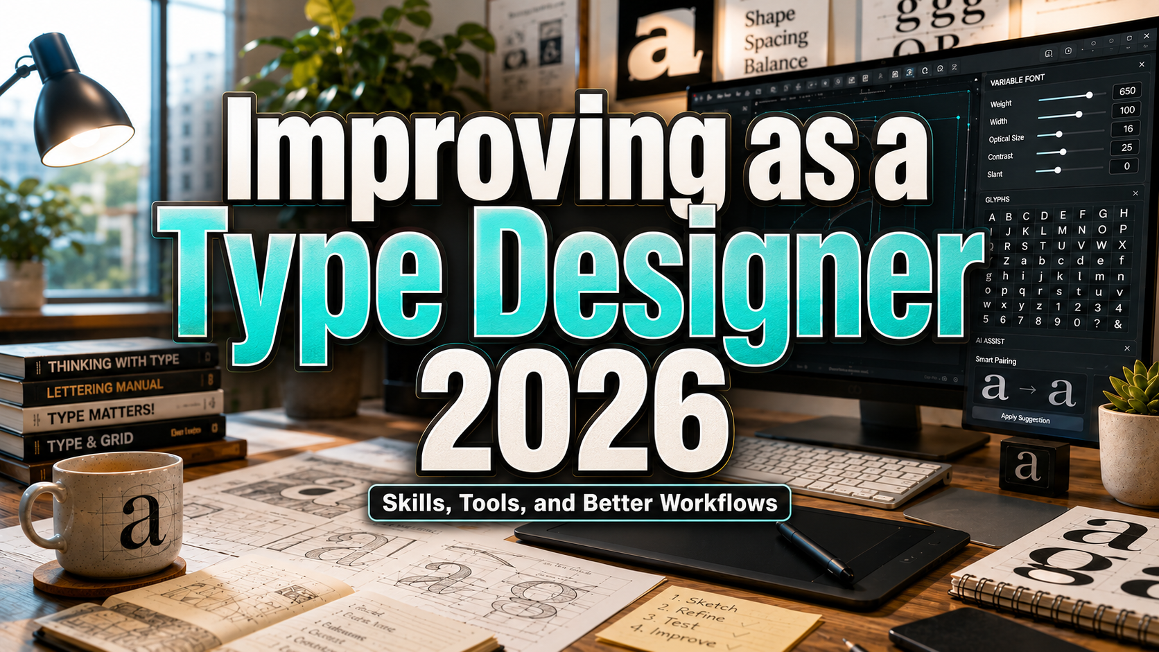
To improve as a type designer in 2026, stop chasing every tool or trend. Identify the stage that weakens your fonts most, such as curves, spacing, interpolation, language coverage, or testing, and build a focused practice cycle.
Finish a small family, proof it, revise it, and compare it with the first version. Completing one controlled system teaches more than starting several unfinished fonts.
What Type Designers Need in 2026
Current typography reports point toward expressive display lettering, renewed serifs, handmade irregularity, and retro-futurist forms. Professional fonts still need coherent rhythm, punctuation, language coverage, OpenType behavior, and consistent rendering.
Build Letterforms as a System
Do not treat every glyph as an isolated illustration. Establish control characters that define proportions, curves, terminals, overshoots, and spacing. In a Latin sans serif, H, O, n, o, p, and v can reveal much of the system.
Compare related groups and proof words early. A letter may look attractive in the glyph editor while creating an uneven texture in real language.
Master Spacing Before Kerning
Spacing defines the sidebearings around an individual glyph. Kerning corrects the space within a specific pair. Glyphs distinguishes these tasks because weak base spacing creates excessive kerning work.
Begin with control strings, then test real words, capitals, numerals, and punctuation. Kern only combinations that normal spacing cannot solve.
Learn Variable-Font Production
Variable fonts can contain multiple related designs in one resource and interpolate across axes such as weight, width, slant, or optical size.
Start with one useful axis. Build compatible masters, inspect intermediate locations, define sensible instances, and test the complete design space. Glyphs’ official workflow moves from axes and masters through compatible glyphs, instances, export, and testing.
Do not add an axis merely because it looks advanced. It should solve a real design or product need.
Design for Real Applications
Test the font where people will use it: mobile interfaces, packaging, printed paragraphs, presentations, campaign headlines, and motion graphics.
A display family may need memorable alternates, while an interface family needs clear numerals and strong character distinction. MDN describes variable fonts as multiple variations accessed through one file and one @font-face reference, but designers must still inspect actual browser and software behavior.
Expand Language Coverage Carefully
Adding accented characters is not simply a production checklist. Research the language, diacritics, punctuation, and local conventions. Test real words and seek feedback from native readers when possible.
Careful, limited coverage is better than broad support filled with incorrect accents or weak mark placement.
Use AI for Assistance, Not Taste
AI can organize references, generate proofing strings, compare versions, draft documentation, and automate repetitive tasks, leaving more time for drawing and evaluation.
Keep proportion, cultural meaning, optical correction, originality, and final approval under human control. A generated glyph may be interesting but still fail to belong to the family.
Make Quality Assurance Continuous
Do not wait until release day to inspect naming, mapping, interpolation, OpenType features, outlines, and application behavior. fontTools includes utilities for manipulating, building, subsetting, and instancing fonts, while FontBakery provides structured project checks.
Test exports across operating systems, browsers, and applications. Technical reliability is part of design quality.
Comparison
| Passive Workflow | Growth-Oriented Workflow |
|---|---|
| Starts many unfinished fonts | Completes focused families |
| Judges isolated glyphs | Proofs words and paragraphs |
| Kerns before spacing is stable | Builds spacing first |
| Adds axes for novelty | Uses axes to solve needs |
| Tests only in the editor | Tests real applications |
| Uses AI to define style | Uses AI for repetitive work |
| Runs QA at release | Tests throughout production |
Common Mistakes
The first mistake is confusing novelty with quality. A dramatic alternate may attract attention, but the family still needs consistent proportions, spacing, punctuation, and text color. Build the ordinary glyphs and reading rhythm before investing heavily in decorative features.
Another mistake is expanding too quickly into many weights, scripts, or axes. Every additional master and language increases the relationships that must remain compatible. Begin with a controlled scope, make it dependable, and expand only when the system can support the added complexity.
The final mistake is treating publication as the end. Real users will expose unexpected words, software problems, and missing characters. Preserve source files and version history, collect focused feedback, test updates, and communicate revisions clearly.
Conclusion
Improving as a type designer 2026 requires equal attention to drawing, spacing, variable technology, language, testing, and real-world use. Trends can inspire the surface, but durable quality comes from disciplined systems and repeated proofing.
Use AI to reduce mechanical work, learn variable-font production when useful, and make QA part of the creative process. Most importantly, finish fonts and observe real use.
Publishing through PutraCetol Studio can turn each release into market feedback. Strong type designers build reliable visual voices for brands, publications, products, and digital experiences.
Explore these fonts and many more at PutraCetol.com to build a business identity that looks professional, trustworthy, and memorable.
Additionally, if you want to explore some free typography options, you can check out Putracetol Studio on Dafont. Happy reading and designing!