
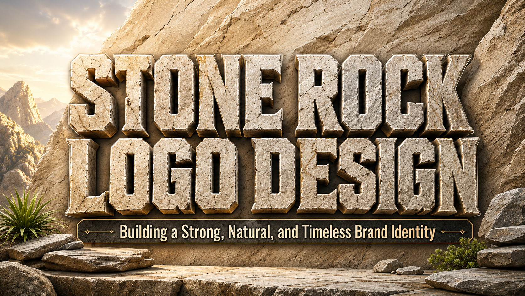
The strongest stone rock logo design does not begin by drawing a random boulder. It begins by deciding what the stone represents in the brand story.
Stone can communicate strength, stability, endurance, protection, permanence, craftsmanship, nature, or exploration. The correct interpretation depends on the industry and audience.
A construction company may use angular rock formations to suggest structural strength. An outdoor brand might prefer mountain stones and weathered surfaces that imply adventure. A premium lifestyle business could use a minimal polished-stone symbol to communicate calmness and durability.
Before sketching the logo, choose three attributes the final identity should express, such as:
- Strong, dependable, and professional
- Natural, adventurous, and rugged
- Minimal, premium, and timeless
- Raw, handcrafted, and authentic
- Bold, resilient, and industrial
This gives the designer a clearer direction than simply requesting a “rock logo.”
What Is Stone Rock Logo Design?
Stone rock logo design uses the visual characteristics of rocks, minerals, mountains, cliffs, or carved stone as the primary inspiration for a logo.
The concept can appear through:
- Rock silhouettes
- Mountain peaks
- Stone blocks
- Cracked surfaces
- Layered geological forms
- Mineral crystals
- Boulder-shaped lettering
- Carved typography
- Stone textures
- Abstract angular symbols
A successful design does not need to reproduce a realistic rock. In many cases, simplifying the natural form creates a stronger and more versatile logo.
A few carefully placed angular shapes may communicate stone more effectively than a highly detailed illustration.
Why Stone Imagery Works in Branding
It Communicates Strength
Stone is naturally associated with weight, endurance, and resistance.
This makes rock-inspired logos useful for companies that want customers to perceive the business as dependable and capable of handling demanding conditions.
Construction firms, equipment companies, outdoor gear brands, and industrial services can all benefit from this association.
It Suggests Longevity
Stone survives weather, pressure, and time.
Brands can use this visual idea to communicate permanence and long-term reliability. This is particularly useful for architecture, property, investment-related visual concepts, building materials, and heritage businesses.
A simple stone symbol can quietly communicate:
Built to last.
It Creates a Connection With Nature
Rock formations belong naturally to mountains, deserts, forests, rivers, and coastlines.
Outdoor and lifestyle brands can use these references to communicate exploration and environmental connection without relying entirely on common symbols such as trees and leaves.
Stone creates a more grounded and rugged interpretation of nature.
It Supports Both Rustic and Modern Branding
Stone is surprisingly flexible.
A realistic textured rock can feel rustic and handcrafted. A simplified geometric boulder can look modern and architectural. A polished mineral icon may feel luxurious, while rough broken shapes can communicate energy and rebellion.
The visual treatment determines the personality.
Main Stone Rock Logo Styles
Minimal Geometric Rock Logos
Minimal rock logos reduce stones into simple geometric shapes.
A designer might combine three angular polygons to create a mountain-like boulder or use one irregular hexagonal form as the main icon.
This direction works well for:
- Architecture
- Construction
- Outdoor technology
- Modern lifestyle brands
- Property companies
- Consulting
- Industrial products
Minimal geometry also performs well on websites, uniforms, vehicles, signage, and app icons because the symbol remains recognizable at small sizes.
Rugged Hand-Drawn Rock Logos
Hand-drawn stones use irregular outlines, rough edges, and visible imperfections.
They can make the identity feel handcrafted, adventurous, and less corporate.
This style suits:
- Camping products
- Outdoor clothing
- Climbing communities
- Coffee brands
- Craft businesses
- Adventure events
- Handmade goods
Pair the rough symbol with simple typography so the composition does not become overly complicated.
Mountain and Rock Combination Logos
Mountain imagery is one of the most familiar approaches to rock branding.
Instead of using a generic triangular mountain, introduce distinctive features such as:
- Layered rock faces
- Broken cliffs
- Boulder clusters
- Geological strata
- Asymmetrical peaks
- Negative-space pathways
This creates a more individual symbol while preserving the recognizable outdoor reference.
Stone Monogram Logos
Letters can be integrated into a rock silhouette.
For example, the initials of a construction company might form two angular blocks. An outdoor brand could hide one letter inside the negative space between mountain shapes.
Monograms are useful because they create compact symbols for:
- Social profiles
- Helmets
- Equipment
- Apparel
- Vehicle decals
- Product labels
The initials should remain readable without requiring explanation.
Carved Stone Typography
Instead of using a separate rock icon, the brand name itself can look carved from stone.
This may involve:
- Angular cuts
- Chiseled corners
- Thick slab forms
- Rough edges
- Deep shadows
- Engraved details
Use this approach carefully. The logo should work as clean typography before adding texture or dimensional effects.
Crystal and Mineral Logos
Rock branding does not need to feel heavy or rugged.
Crystals and minerals can communicate precision, rarity, value, and natural beauty.
This direction works for:
- Jewelry
- Wellness
- Beauty
- Interior products
- Premium lifestyle brands
- Art studios
Use sharper facets and cleaner lines rather than rough boulder shapes.
Stone Badge Logos
Badge-style compositions combine typography and rock imagery inside circles, shields, or other contained structures.
They work particularly well for outdoor clubs and heritage brands.
A typical structure may include:
- Brand name
- Mountain or rock symbol
- Founding year
- Location
- Short tagline
Keep the number of elements limited so the badge remains usable at small sizes.
How to Design a Stone Rock Logo Step by Step
Step 1: Define the Brand Position
Ask whether the company should feel:
- Rugged or polished
- Traditional or modern
- Premium or accessible
- Industrial or organic
- Serious or adventurous
A polished architecture firm and a climbing equipment brand may both use stone imagery, but their logos should look completely different.
Step 2: Choose the Type of Rock
Different rock forms create different impressions.
Boulder: Strength and stability
Mountain: Adventure and ambition
Cliff: Challenge and endurance
Crystal: Precision and premium value
Stacked stones: Balance and wellness
Broken rock: Energy and transformation
Stone block: Construction and engineering
Choose the form that supports the actual brand story.
Step 3: Simplify the Shape
Real rocks contain complex textures and irregular edges.
A logo should capture the idea without reproducing every detail.
Begin with the silhouette. If the symbol cannot be recognized in solid black, additional texture will probably not solve the problem.
Simplification also makes the logo easier to reproduce across embroidery, signage, packaging, and small digital applications.
Step 4: Integrate Typography
Choose typography that reinforces the same personality as the symbol.
A construction logo may use a bold geometric sans serif or slab serif. An outdoor brand can use a rugged display typeface, while a premium mineral brand may benefit from a refined serif.
Avoid pairing a highly detailed rock illustration with equally complicated lettering.
One element should lead.
Step 5: Test the Logo Without Texture
Stone texture can make the concept more realistic, but it should be optional.
Test the logo in pure black and white first.
If the identity works without cracks, gradients, grain, or shadows, it will be much easier to use across multiple media.
Texture can then become a secondary brand element for posters, packaging, or website backgrounds.
Stone-Inspired Color Palettes
Granite Grey and Black
Use charcoal, medium grey, light stone, and white.
This creates a professional industrial identity suited to construction, engineering, architecture, and technology.
Sandstone and Earth
Combine warm beige, clay, dark brown, and muted orange.
This direction feels natural and handcrafted, making it suitable for outdoor lifestyle, hospitality, coffee, and artisan businesses.
Forest and Stone
Use deep green, slate grey, cream, and muted brown.
This palette reinforces the relationship between rock and outdoor environments.
It works well for hiking, camping, sustainable products, and nature retreats.
Mineral Blue and Silver
Combine dark navy, mineral blue, cool grey, and silver.
This creates a cleaner technical impression for modern equipment, architecture, or premium industrial brands.
Obsidian Black and Copper
Use black, warm grey, copper, and cream.
This direction adds a more luxurious personality and can support jewelry, premium lifestyle products, interior design, and boutique hospitality.
Stone Rock Logos for Outdoor Brands
Outdoor businesses can use rock imagery to communicate physical experience.
Examples include:
- Hiking equipment
- Climbing gear
- Camping products
- Adventure tours
- Trail-running brands
- Outdoor apparel
A climbing company might combine a cliff silhouette with a condensed wordmark. A camping brand could use a hand-drawn boulder inside a vintage badge.
The logo should remain identifiable on equipment and clothing, where production may be limited to one or two colors.
Stone Rock Logos for Construction
Construction businesses can use stone forms to express reliability and physical strength.
Suitable imagery includes:
- Stacked blocks
- Geometric rock formations
- Angular monograms
- Simplified building foundations
- Stone walls
- Mountain-like structures
Avoid making the logo overly rustic when the company works in modern engineering or commercial construction.
Clean geometry can communicate stone while maintaining a professional corporate appearance.
Stone Logos for Architecture and Property
Architecture brands can use stone more subtly.
Instead of showing a literal rock, use:
- Faceted geometry
- Layered structures
- Minimal carved lines
- Architectural blocks
- Negative-space forms
Pair these symbols with restrained typography and generous spacing.
This approach makes stone feel structural and premium rather than purely outdoor-oriented.
Rock Logos for Adventure and Lifestyle Brands
Adventure brands can push the identity toward greater movement and personality.
Possible elements include:
- Broken rock edges
- Mountain trails
- Climbing ropes
- Rough badges
- Weathered typography
- Outdoor coordinates
- Hand-drawn illustrations
Lifestyle brands can use the same foundation more selectively by simplifying the rock symbol and applying a modern color palette.
Use Texture Carefully
Stone texture is visually attractive, but it can quickly make a logo difficult to reproduce.
Avoid embedding highly detailed photographic stone inside the core mark.
Instead, use texture in supporting applications:
- Packaging backgrounds
- Posters
- Website banners
- Social graphics
- Business cards
- Event signage
The primary logo should remain simple enough for:
- Embroidery
- Engraving
- Screen printing
- Stamps
- Vehicle graphics
- Small icons
Think of texture as part of the visual system, not as a requirement for recognizing the logo.
Typography Ideas for Stone Branding
Bold Sans Serif
A heavy sans serif communicates strength and modernity.
It works particularly well for construction, industrial equipment, outdoor technology, and sports-related brands.
Slab Serif
Slab serifs have strong horizontal and vertical structures that naturally complement rock imagery.
They can feel rugged, historical, or Western depending on the details.
Condensed Display Fonts
Condensed fonts help longer brand names fit beside compact rock symbols.
Their tall proportions can also reflect cliffs, mountain faces, and vertical structures.
Rough Display Fonts
Distressed typography can make the identity feel handmade and adventurous.
Use it for short brand names rather than supporting information.
Elegant Serif
For premium natural brands, a refined serif can contrast beautifully with an angular stone symbol.
This combination works for architecture, wellness, jewelry, hospitality, and upscale lifestyle products.
Logo Composition Ideas
Symbol Above Wordmark
Place the rock icon above the brand name.
This creates a balanced structure for packaging, signage, and social content.
Symbol Beside Wordmark
A horizontal layout works well for websites, vehicles, and business documents.
Keep the symbol approximately proportional to the height of the wordmark.
Rock Inside Letter
Replace part of a letter with an angular rock shape.
For example, the counter of an “A” could become a mountain opening or a circular letter could contain layered stone.
Negative-Space Rock
Build the rock from empty space between two shapes.
This can create a more sophisticated logo and reduce the need for additional detail.
Enclosed Badge
Place the symbol and name inside a circle or shield.
This works well for clubs, outdoor products, events, and apparel.
Create a Complete Rock-Inspired Identity
A logo is only one part of the brand.
Extend the stone concept through:
- Angular patterns
- Geological lines
- Rough textures
- Material photography
- Topographic graphics
- Earth-toned colors
- Icon shapes
- Packaging structure
- Social templates
- Website dividers
For example, a climbing brand could use its angular logo geometry as a repeating pattern on apparel.
A construction company may use subtle stone textures in presentation covers and vehicle graphics.
The visual language should remain recognizable even when the main logo is not present.
Comparison
| Logo Direction | Main Personality | Strongest Application | Ideal Business |
|---|---|---|---|
| Geometric rock | Modern, stable, and professional | Corporate identity and signage | Construction and architecture |
| Hand-drawn boulder | Natural, rugged, and authentic | Packaging and merchandise | Outdoor and craft brands |
| Mountain rock | Adventurous and ambitious | Apparel and campaigns | Hiking, climbing, and travel |
| Stone monogram | Compact and distinctive | Social icons and product marks | Lifestyle and industrial brands |
| Carved typography | Bold and handcrafted | Posters and product names | Outdoor, events, and heritage brands |
| Crystal/mineral | Precise and premium | Luxury packaging and editorial branding | Jewelry, beauty, and wellness |
| Badge logo | Traditional and community-driven | Merchandise and clubs | Adventure organizations and events |
Common Mistakes
The first mistake is making the rock illustration too realistic. Detailed cracks, shadows, surface texture, highlights, and multiple color gradients may make the rock look impressive on a large presentation, but they reduce logo flexibility. Begin with a simple silhouette and make sure the design works in solid black. Add texture only as a secondary treatment for larger brand applications.
Another common mistake is using the same mountain icon seen across thousands of outdoor logos. A triangular peak above a generic bold wordmark communicates the category but rarely creates strong recognition. Look for a more specific visual story. Use a particular rock formation, geological structure, monogram, climbing route, local landscape, or negative-space idea that connects directly with the business.
The final mistake is forcing rugged typography into every piece of communication. A stone-inspired display font may look excellent in a logo or poster but become difficult to read on websites, product specifications, forms, or safety information. Pair expressive typography with a simpler supporting font and test the complete identity across actual applications. A strong rock brand should feel solid because the system is consistent, not because every element is covered with cracks and rough texture.
Conclusion
A successful stone rock logo design communicates more than the appearance of a rock. It translates strength, stability, endurance, nature, and authenticity into a visual identity that customers can recognize.
The design can be geometric and architectural, rugged and handcrafted, adventurous, luxurious, or minimal depending on the brand.
Start by defining what stone represents for the business, then choose the appropriate rock form, simplify the silhouette, and pair it with typography that reinforces the same personality.
Construction companies may benefit from structured geometric forms, while outdoor brands can use more rugged rocks, mountains, and handcrafted textures. Lifestyle and premium businesses can reinterpret stone through cleaner mineral shapes and refined typography.
The strongest identities remain simple at their core. They work in black and white, scale clearly from social icons to signage, and use texture as an optional supporting element rather than a requirement.
When stone imagery, typography, color, and brand story work together, the result feels stable and natural without becoming generic
Explore these fonts and many more at PutraCetol.com to build a business identity that looks professional, trustworthy, and memorable.
Additionally, if you want to explore some free typography options, you can check out Putracetol Studio on Dafont. Happy reading and designing!