
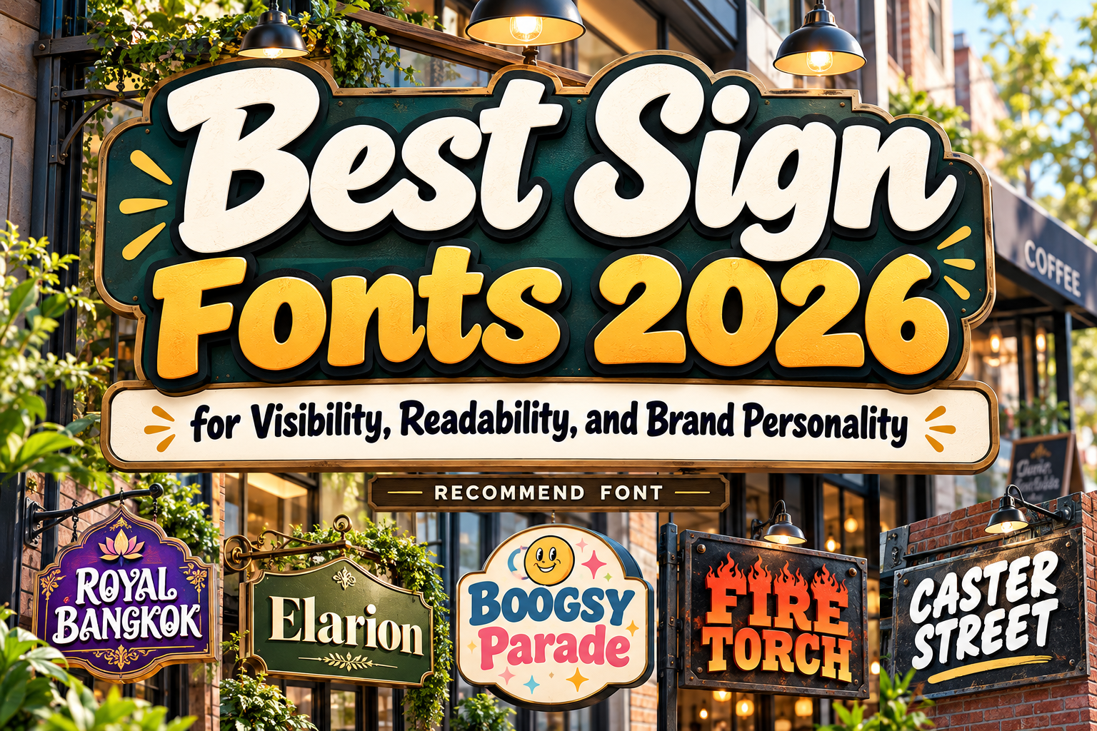
Best Fonts for Signs 2026: Typography for Visibility and Brand Impact
A sign often has only a few seconds to communicate. Someone may see it while walking through a shopping center, approaching a restaurant, entering an event, or passing a storefront from across the street.
That makes choosing the best fonts for signs 2026 different from choosing typography for a website or brochure. Signage needs to balance distance readability, environmental conditions, brand personality, and the amount of information being communicated.
Not every sign has the same purpose, either. Wayfinding needs maximum clarity, while storefront signage can be more expressive. Event signs may need visual energy, and boutique interiors can prioritize atmosphere.
The strongest typography matches the function first and adds personality second.
Initial Suggestion: Design for Viewing Distance
Always test signage at something close to its real size and viewing distance.
A decorative font that looks clear on a desktop monitor may become difficult to identify from ten meters away. Short business names and promotional headlines can tolerate more personality, while directions, room numbers, exits, accessibility information, and public instructions should use simpler lettering.
Contrast and surface treatment matter as well. U.S. ADA standards, for example, require applicable visual sign characters to contrast with their background and use a non-glare finish. They also restrict highly decorative, script, italic, and unusual character forms in regulated visual signage. ADA.gov
This creates a useful general principle even outside regulated signage: branding signs can be expressive, but functional information should be immediately readable.
Jump to Recommended Fonts
1. Royal Bangkok Thailand Font

Royal Bangkok is a highly expressive display typeface inspired by Southeast Asian decorative aesthetics. Its ornate contours and distinctive cultural character make short words highly recognizable, particularly when signage itself is part of the visual experience. PutraCetol positions the font for uses including logos, branding, packaging, poster headlines, and other display applications, making it suitable for destination-oriented signage rather than utilitarian wayfinding. PutraCetol Studio
For example, a Thai restaurant could use Royal Bangkok for its main exterior name while pairing it with a simple sans serif for opening hours, menu information, and directional signs.
PROS: Strong cultural character, memorable silhouette, high branding value.
BEST FOR: Thai restaurants, cultural events, themed cafés, hospitality signage.
2. Elarion Elegant Serif Font
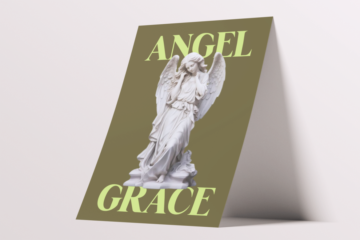
Elarion provides a considerably more refined approach. Its tall letterforms, balanced proportions, controlled contrast, and graceful serif construction create a calm premium identity that works well when signage should communicate elegance rather than loudness. PutraCetol recommends it across hotel branding, galleries, restaurants, cafés, architecture, beauty, and other sophisticated applications. PutraCetol Studio
Its cleaner structure makes it particularly effective for reception signage, boutique storefronts, gallery names, or upscale interior displays where people have enough time to read.
PROS: Polished construction, elegant personality, clear headline forms.
BEST FOR: Hotels, boutiques, galleries, restaurants, beauty businesses.
3. Boogsy Parade Retro Psychedelic Font
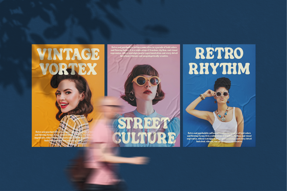
Boogsy Parade brings thick rounded strokes, broad proportions, inflated curves, and a distinctly retro psychedelic rhythm. Rather than disappearing into the environment, it is designed to become a major visual element. PutraCetol identifies it as a display font and positions its expressive construction for nostalgic branding and headline-led designs. PutraCetol Studio
This makes Boogsy Parade especially interesting for signs where personality is part of the attraction, such as vintage shops, music events, pop-up stores, or retro-themed cafés.
PROS: Strong silhouette, retro personality, high visual recognition.
BEST FOR: Music venues, vintage stores, festivals, entertainment signage.
4. Fire Torch Flame Font
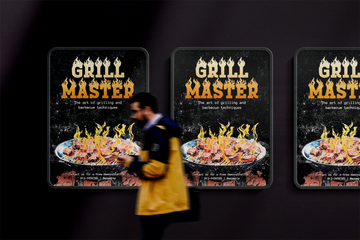
Fire Torch turns lettering into an immediate thematic statement through bold forms combined with flame-inspired details. It communicates heat, intensity, and excitement before the viewer even processes the words. PutraCetol recommends it for BBQ restaurants, burger brands, grill houses, hot sauce products, and food events, where that fiery visual language directly supports the brand concept. PutraCetol Studio
Because the flame details increase visual complexity, Fire Torch performs best as a large logo or short headline rather than long informational copy.
PROS: Immediate thematic impact, bold structure, highly memorable appearance.
BEST FOR: BBQ restaurants, grill houses, spicy-food stores, event signage.
5. Caster Street Modern Brush Font
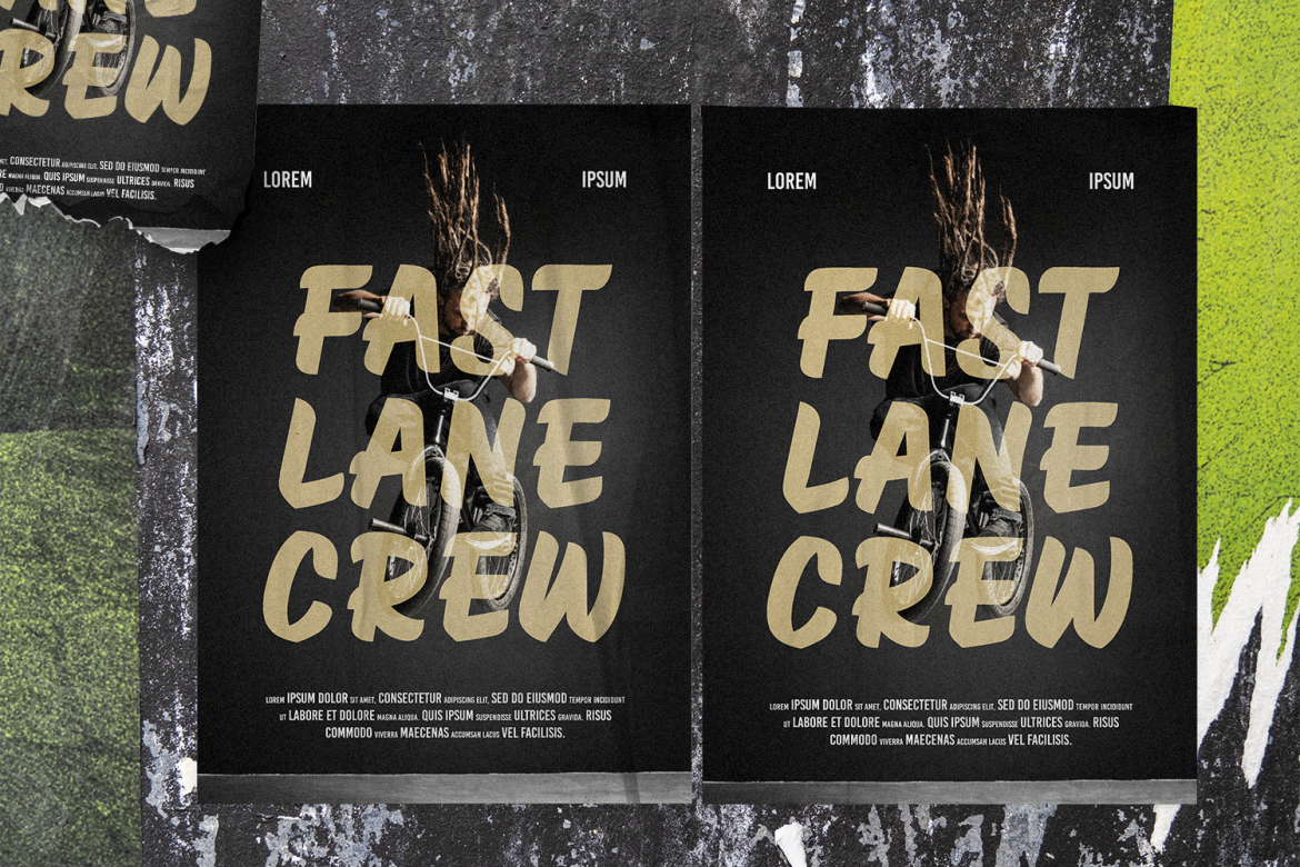
Caster Street combines bold hand-painted strokes with slightly tall, wide proportions and natural variations in stroke weight. Its rounded edges and brush texture introduce movement without sacrificing the substantial forms needed for large display typography. The typeface is positioned for logos, posters, advertising, streetwear, sports visuals, and event promotions. MyFonts
That energetic handmade quality translates naturally to signs for businesses that want to feel urban, independent, or creative.
PROS: Bold brush texture, energetic character, strong display presence.
BEST FOR: Streetwear stores, barbershops, sports events, creative retail spaces.
Comparison: Which Sign Font Fits Your Project?
| Font | Personality | Suggested Signage |
|---|---|---|
| Royal Bangkok | Cultural, ornate | Restaurants and cultural venues |
| Elarion | Elegant, refined | Hotels and premium retail |
| Boogsy Parade | Retro, playful | Events and vintage businesses |
| Fire Torch | Fiery, energetic | BBQ and food signage |
| Caster Street | Urban, handmade | Streetwear and sports |
The main distinction is between identity signage and informational signage. These five fonts are strongest when establishing a business or event personality. Functional wayfinding usually needs more restrained typography.
Signage Readability Matters More Than Decoration
Typography cannot compensate for poor sign design.
Large letters can still be hard to read when contrast is weak, spacing is cramped, lighting produces glare, or the background contains too much texture. Increase visual separation between text and background and leave sufficient space around the message.
Viewing distance also affects letter size. The ADA Standards, for example, scale minimum visual-character height according to the distance from which a sign must be read. ADA.gov
For commercial projects, test a full-size printed section whenever possible. Viewing a mockup on a laptop does not reproduce the experience of approaching an exterior sign from across a street.
Common Mistakes in Sign Typography
One common mistake is choosing the most distinctive font and using it for everything. A restaurant may have an excellent decorative storefront logo but create problems when the same typeface appears on restroom signs, directions, opening hours, prices, and safety information. Build hierarchy instead. Let expressive typography create recognition, then support it with simpler lettering for practical communication.
Another mistake is designing only for appearance and ignoring the physical environment. Outdoor signs face sunlight, shadows, weather, viewing angles, and distance. Interior signs may compete with lighting, architecture, displays, and crowds. Always test contrast, size, spacing, and material finish under realistic conditions.
Finally, accessibility requirements should not be treated as optional styling advice. Certain public and permanent signs may be subject to specific local rules concerning character style, size, placement, tactile lettering, braille, contrast, and other properties. In the U.S., for example, ADA tactile characters must be sans serif and cannot use script or highly decorative forms. ADA.gov Check the regulations that apply to the actual location before production.
Conclusion
The best fonts for signs 2026 depend on what the sign needs to accomplish.
Royal Bangkok creates cultural character, Elarion brings premium sophistication, Boogsy Parade delivers retro energy, Fire Torch communicates heat and excitement, and Caster Street adds an urban handmade voice.
Use distinctive fonts for brand-facing signage where personality matters, but prioritize conventional, highly legible typography for directions, accessibility information, and safety-critical communication.
Explore these fonts at PutraCetol Studio and test your chosen typography at its real size, distance, material, and environment before sending the final signage into production.
Explore these fonts and many more at PutraCetol.com to build a business identity that looks professional, trustworthy, and memorable.
Additionally, if you want to explore some free typography options, you can check out Putracetol Studio on Dafont. Happy reading and designing!