
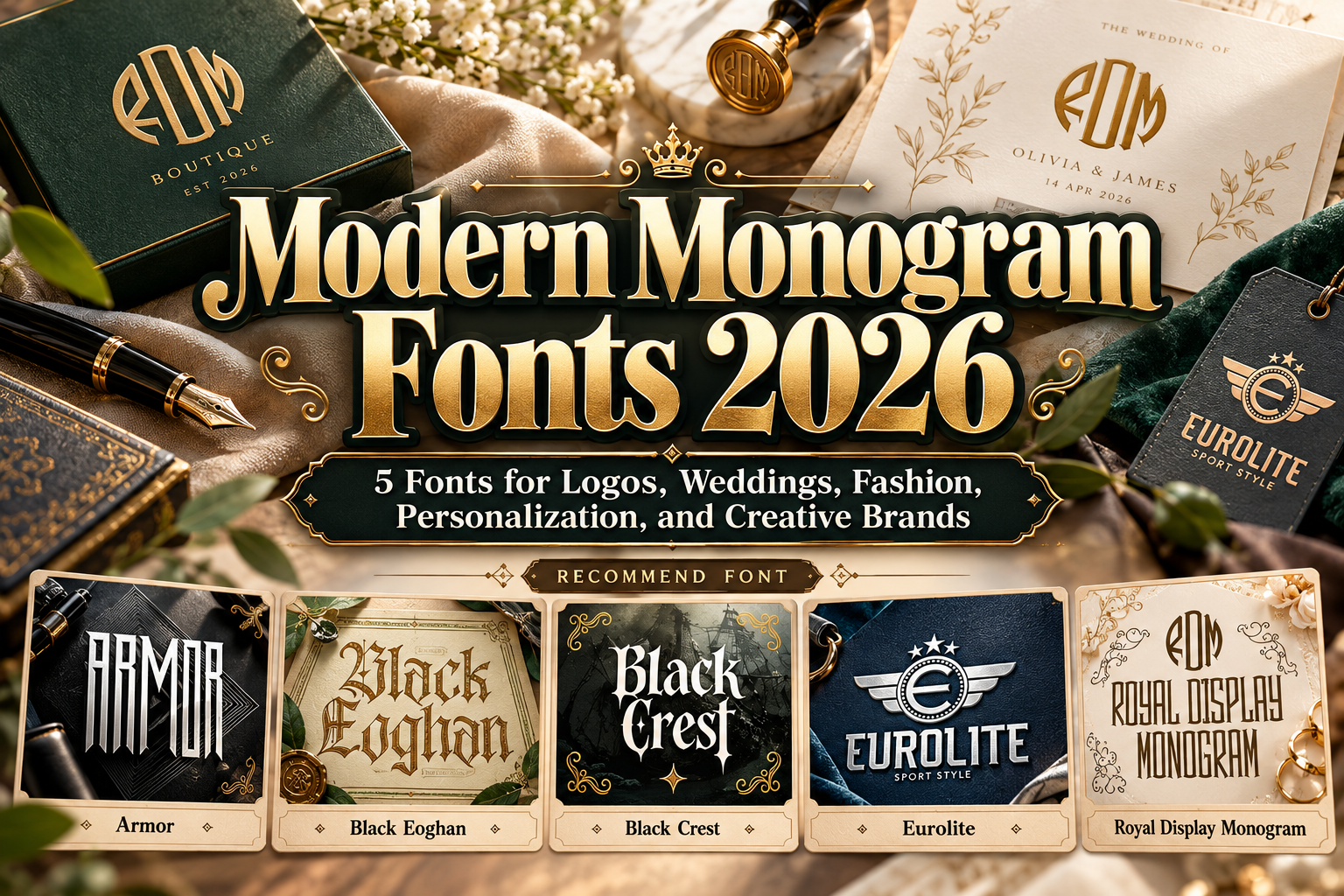
Modern Monogram Fonts 2026: Typography for Distinctive Initials and Brand Identity
A monogram turns a small amount of typography into a recognizable visual signature. Two or three initials can represent a fashion label, hotel, wedding couple, creative studio, restaurant, or personal brand without requiring a complicated symbol.
The strongest modern monogram fonts 2026 combine distinctive letter construction with enough flexibility to create balanced initials. Some are elegant and geometric, while others use blackletter, sports, vintage, or decorative influences to create a very different personality.
Choosing the right font is therefore less about finding one universal “monogram typeface” and more about matching the letterforms to the identity you want to communicate.
Initial Suggestion: Design the Monogram as a Symbol
Do not simply type two initials and consider the design finished.
Experiment with scale, overlap, rotation, negative space, alignment, and framing. Initials such as AM, for example, might work side by side for a minimalist fashion brand, interlocked for a wedding identity, or placed inside a circle for an athletic badge.
Always test the actual letter combination because monogram success depends heavily on the shapes involved. An elegant “A” may pair beautifully with “V” but feel awkward beside “B.”
Also test the mark at small sizes. A monogram that looks impressive on a large presentation board still needs to survive on labels, profile images, stationery, packaging, and embroidered products.
Jump to Recommended Fonts
1. Royal Display Monogram

Royal Display Monogram is the most directly monogram-focused option in this collection. Its tall proportions, slender vertical construction, geometric angles, subtle serifs, and Art Deco influence create a sophisticated balance between classic luxury and contemporary branding. PutraCetol specifically positions it for monograms, initials, logos, certificates, premium labels, invitations, and other high-end applications. PutraCetol Studio
Its symmetrical appearance works especially well when a monogram needs to feel architectural and prestigious without becoming excessively ornamental.
PROS: Elegant proportions, Art Deco character, purpose-built for initials and premium identities.
BEST FOR: Luxury brands, weddings, hotels, fashion labels, beauty branding.
2. Armor

Armor takes monograms in a completely different direction. It is a powerful condensed display font with sharp terminals and a geometric construction, giving initials a fast, athletic, contemporary appearance. PutraCetol recommends it for sports, branding, logos, headers, posters, and apparel, and the font is also categorized for monogram use. PutraCetol Studio
Instead of delicate luxury, Armor creates compact marks with strength and movement, making it useful for initials that need to perform on jerseys, merchandise, or competitive brands.
PROS: Condensed silhouette, sharp geometry, strong visual impact.
BEST FOR: Sports teams, fitness brands, esports, apparel, masculine branding.
3. Black Eoghan

Black Eoghan combines traditional blackletter structure with Celtic-inspired decorative details, angular serifs, strong contrast, and ornamental strokes. This gives monogram initials an old-world, ceremonial personality while retaining enough structure for contemporary logos. PutraCetol highlights applications including liquor labels, tattoo branding, packaging, album artwork, book covers, and ceremonial designs. PutraCetol Studio
It is particularly effective when the initials themselves need to become an intricate emblem rather than a minimalist lettermark.
PROS: Gothic personality, Celtic-inspired ornamentation, highly distinctive initials.
BEST FOR: Distilleries, tattoo studios, heritage brands, ceremonial projects, premium packaging.
4. Black Crest Pirates

Black Crest Pirates offers another blackletter direction, but with a stronger cinematic and adventurous personality. Its tall, slightly condensed letters use pointed serifs, angular cuts, controlled curves, and thick-to-thin contrast to produce a dramatic silhouette. PutraCetol describes it for logos, branding, movie titles, book covers, packaging, and monogram applications. PutraCetol Studio
The font works well when a monogram needs to suggest heritage, mystery, fantasy, or rugged prestige rather than polished corporate minimalism.
PROS: Dramatic structure, strong vertical rhythm, memorable vintage character.
BEST FOR: Adventure brands, bars, entertainment, fantasy projects, vintage merchandise.
5. Eurolite + Logo Creator

Eurolite is a solid sports-oriented display typeface created for logos, jerseys, branding, posters, and apparel. Its standout feature for this topic is the included Eurolite Circle Logo Creator, a separate typeface designed to make circular logo compositions easier by typing and combining dedicated characters. The package also supports uppercase, lowercase, numerals, punctuation, and multilingual characters. PutraCetol Studio
For designers creating badges rather than traditional luxury monograms, this provides a practical route toward initials enclosed within a stronger sports-style identity.
PROS: Sporty construction, dedicated circle logo creator, practical badge workflow.
BEST FOR: Clubs, varsity identities, sports brands, team apparel, badge-style monograms.
Comparison: Which Monogram Font Should You Choose?
| Font | Visual Character | Best Monogram Direction |
|---|---|---|
| Royal Display Monogram | Elegant, Art Deco | Luxury and weddings |
| Armor | Sharp, condensed | Sports and modern brands |
| Black Eoghan | Ornamental, Gothic | Heritage and premium labels |
| Black Crest Pirates | Dark, cinematic | Adventure and entertainment |
| Eurolite | Solid, athletic | Clubs and badge logos |
There is no single visual formula for a modern monogram. The best choice depends on what the initials need to communicate before the viewer even reads the full brand name.
Create Hierarchy Around the Monogram
A monogram is usually strongest when supported by simpler typography.
For example, a luxury brand might use Royal Display Monogram for the initials while setting the full company name in a restrained serif or sans serif. A sports brand could use Armor for a compact emblem and a cleaner supporting font for player information, website navigation, or product descriptions.
This prevents the identity from becoming visually repetitive.
The same principle applies to wedding stationery. Use an expressive monogram as a focal element, then allow invitations, dates, locations, and guest information to use typography optimized for comfortable reading.
Common Mistakes in Monogram Design
A frequent mistake is making the initials too complicated. Overlapping letters, decorative borders, flourishes, and multiple effects may look impressive at large scale but become unreadable when reduced to an Instagram avatar, packaging stamp, embroidery, or small label. Create a simplified version and test it in black and white before adding color or decorative treatments.
Another mistake is choosing a font based only on individual beautiful letters. Monograms are relationships between characters. Test multiple arrangements and adjust spacing manually when necessary. The default kerning designed for normal words is not always ideal when two initials are being transformed into a logo.
Finally, check licensing before using a font as part of a commercial identity or registered trademark. PutraCetol states that logo use must be covered by the appropriate license, while trademark registration and larger brand systems may require additional coverage depending on the selected package. PutraCetol Studio
Conclusion
The best modern monogram fonts 2026 show how versatile initial-based identity can be.
Royal Display Monogram creates refined luxury, Armor introduces athletic geometry, Black Eoghan brings ornamental heritage, Black Crest Pirates adds cinematic character, and Eurolite offers a strong badge-oriented approach.
The font provides the raw personality, but the final monogram depends on thoughtful composition. Test the initials, simplify the silhouette, establish strong spacing, and make sure the design remains recognizable at every size.
Explore these typefaces at PutraCetol Studio to create monograms for branding, fashion, weddings, packaging, merchandise, events, and other personalized creative projects.
Explore these fonts and many more at PutraCetol.com to build a business identity that looks professional, trustworthy, and memorable.
Additionally, if you want to explore some free typography options, you can check out Putracetol Studio on Dafont. Happy reading and designing!