

The best fonts for stone inscriptions are selected according to the material, surface finish, carving method, viewing distance, and amount of text. A typeface that looks excellent on polished granite may lose definition on coarse sandstone, while a cracked display font that works on a large entrance sign may become illegible in a small memorial verse.
Begin by answering five practical questions:
- Which stone will be used?
- Will the lettering be incised, V-cut, sandblasted, carved in relief, painted, gilded, or made from applied metal?
- From what distance must the inscription be read?
- How many names, dates, or lines must fit?
- Is the typography intended for permanent information or a decorative headline?
Stone is durable but not visually or physically uniform. Historic England notes that memorials may use limestone, sandstone, granite, marble, slate, and other materials, each of which weathers differently. Even strong stone is porous, and environmental exposure can gradually weaken surfaces or reduce inscription definition.
For permanent memorial work, coordinate with an experienced stone carver or monumental mason before finalizing the typeface. Local cemetery or churchyard regulations may also control inscription methods, dimensions, colors, and decorative treatments. Some burial-ground rules specifically require lettering to be incised or carved in relief and allow painted cut letters to improve long-term visibility.
Stone-Inspired Display Fonts vs. Practical Inscription Fonts
A critical distinction should be made between a font inspired by rocks and a font optimized for physical stone carving.
Stone-inspired display fonts use broken edges, cracks, fragments, stacked shapes, and rough textures to create a rocky visual personality. They are excellent for:
- Quarry and construction branding
- Outdoor entrance signs
- Adventure parks
- Climbing businesses
- Product packaging
- Film and game titles
- Decorative plaques
- Large architectural headlines
Traditional inscription fonts are usually simpler. Roman capitals, sturdy serifs, clean sans serifs, and carefully drawn custom lettering remain effective because their counters, strokes, and spacing can survive reduction, carving, weather, and changing light.
The six PutraCetol fonts recommended in this article are expressive stone-themed display faces. They can create powerful large inscriptions and stone-related branding, but highly textured details may need to be simplified before they are transferred into granite, slate, marble, sandstone, or limestone.
For a memorial containing a name, dates, dedication, and verse, a practical system could use:
- A stone-themed display font for one large name or heading
- A classical serif or clear sans serif for dates and supporting lines
- A simplified monogram or symbol for decoration
This preserves visual character without sacrificing the dignity or readability of important information.
What Makes a Font Suitable for Stone Inscription?
Strong Stroke Weight
Stone carving removes material from a solid surface. Extremely thin strokes can be difficult to carve consistently and may lose definition as the stone weathers.
A suitable inscription font should have enough structural weight to create visible depth and shadow. This is particularly important on rough or porous stone.
The correct weight depends on the technique. Fine V-cut lettering can produce elegant results in suitable materials, while sandblasted or rough-surface inscriptions often benefit from simpler and heavier forms.
Open Counters
Counters are the enclosed or partially enclosed spaces inside letters such as A, B, D, O, P, and R.
When counters are too small, they can close during carving, paint filling, gilding, or weathering. This makes letters harder to distinguish.
Test especially:
Band8Oand0PandRCandGI,l, and1Sand5
Decorative stone fonts frequently have narrow, angular counters. Use them at generous sizes or modify the outlines before fabrication.
Clear Internal Spacing
A digital font can tolerate tight spacing because the screen presents clean edges. Stone requires more breathing room.
Letters that are too close together may visually merge when shadows fall across the surface. Painted or gilded lettering can also appear heavier than the original digital outline.
Increase tracking when necessary and inspect the inscription at its intended size rather than judging an enlarged screen preview.
Recognizable Silhouette
The complete word should remain understandable before texture, color, bevels, or shadows are added.
Test the design in solid black. When the inscription is unreadable as a flat silhouette, physical depth will rarely solve the problem.
A strong stone wordmark should also remain identifiable under different lighting conditions. Outdoor inscriptions can look substantially different in direct sun, overcast weather, rain, or low-angle evening light.
Controlled Decorative Detail
Cracks, chips, broken fragments, and rough edges can support a rock concept, but every detail creates additional production complexity.
Very small cracks may disappear during sandblasting. Thin stone islands can break. Fine distressed marks can fill with paint, dirt, biological growth, or water.
Preserve the major visual idea while removing micro-details that do not materially affect recognition.
Choosing Fonts for Different Stone Materials
Granite
Granite is frequently used for memorials, plaques, architectural signs, and polished monuments. Its hard surface can support precise sandblasting, V-cut carving, and contrasting finishes such as paint or gold leaf.
Dark polished granite creates particularly strong contrast with white, silver, or gilded inscriptions. A professional memorial-lettering guide recommends sandblasting, V-cut carving, and gilding as common techniques for granite.
Granite can support relatively refined lettering, but highly fragmented display fonts should still be tested at full size.
Slate
Slate works beautifully with traditional hand-cut lettering because its fine surface can create crisp edges and natural shadows.
Classical Roman capitals, restrained serifs, and carefully drawn custom letters are especially effective. Painted lettering can increase contrast where required.
Slate is often better suited to controlled detail than coarse stone, but every slab has its own grain and physical characteristics.
Sandstone
Sandstone can create a warm, traditional appearance, but it may require deeper and more robust lettering.
Use open counters, substantial strokes, and simpler terminals. Delicate hairlines or small cracked textures may erode or become visually weak.
Professional memorial guidance commonly recommends deep hand carving for sandstone rather than depending on very fine superficial details.
Limestone
Limestone supports traditional carved inscriptions and can produce an elegant architectural appearance.
Its relatively soft nature can make carving rewarding, but outdoor weathering must be considered. Avoid excessively delicate details in exposed locations and maintain adequate spacing around each character.
Marble
Marble can support refined, elegant lettering and is strongly associated with classical monuments.
However, Historic England notes that marble is particularly sensitive to atmospheric pollutants and may lose its polished surface over time. The inscription should therefore be designed for long-term recognition rather than depending entirely on a pristine finish.
Rough Natural Stone
Unpolished boulders, fieldstone, and irregular rock surfaces create a highly authentic result but reduce control over letter edges.
Use bold, simple forms and inspect the exact area where the lettering will be applied. A naturally smoother inscription panel can improve legibility by separating the lettering from the surrounding rock texture.
Serif, Sans Serif, or Decorative Font?
Classical Roman Serif
Roman inscriptional capitals remain a strong choice for monuments, memorials, civic plaques, and heritage architecture.
Their proportions communicate dignity and permanence. Properly drawn serifs can also help individual letters remain recognizable.
Use them when the inscription should feel:
- Formal
- Historical
- Dignified
- Architectural
- Timeless
Sturdy Traditional Serif
A less formal serif can bring warmth to gravestones, family memorials, gardens, and heritage signs.
Choose moderate contrast rather than extremely thin hairlines. Small serifs should be strong enough to survive the chosen carving technique.
Sans Serif
Sans-serif lettering creates a cleaner and more contemporary appearance.
It works well for:
- Modern memorials
- Architectural wayfinding
- Public-space signs
- Corporate stone plaques
- Contemporary landscape projects
- Smaller supporting information
Its simplified structure can perform well where space is limited, provided the characters remain distinctive.
Script and Calligraphic Lettering
Script can add a personal and emotional quality to names, quotations, or short dedications.
It should be used carefully. Fine connections, overlapping strokes, and long flourishes may be difficult to carve or maintain. A custom hand-lettered treatment can be more suitable than transferring a delicate digital script without modification.
Decorative Rock Fonts
Rock-inspired fonts create immediate visual impact through cracks, fragments, chipped edges, and stone-like shapes.
They are strongest for:
- Large names
- One- or two-word headings
- Entrance signage
- Brand marks
- Decorative plaques
- Themed attractions
- Product and campaign typography
They should rarely be used for a complete memorial inscription containing several lines.
Inscription Methods and Their Typographic Impact
V-Cut Lettering
V-cut lettering creates angled sides that meet at a deeper central point. The shape catches light and produces natural shadow, allowing the inscription to remain expressive without added color.
The method works particularly well with carefully proportioned Roman capitals and traditional serif lettering. It can also support clean sans serifs when the strokes are wide enough.
Sandblasted Lettering
Sandblasting uses a stencil and abrasive pressure to remove material from the stone surface.
It is efficient and consistent, especially for granite. The font needs sufficient stroke width, open counters, and a stencil design that avoids fragile internal pieces.
Highly cracked fonts may require considerable simplification before a reliable stencil can be made.
Relief Carving
Relief lettering leaves the letters raised while the surrounding stone is cut away.
This can create a monumental and architectural appearance, but it requires enough surrounding material and careful planning. Heavy block fonts can work well, especially for large titles.
Painted or Gilded Incisions
Paint and gold leaf can create stronger visual contrast inside carved letters.
Local memorial policies may allow painted incisions because the fill can help lettering remain visible for longer.
A dark stone with pale or gold lettering can be highly legible, while a light stone may benefit from black, dark grey, or another approved fill.
Applied Metal Letters
Bronze, lead, steel, or other metal letters can be attached to stone.
This approach separates the lettering material from the stone and may support clean, architectural forms. Historic England notes that applied lettering introduces its own conservation risks because metal fixings and the stone supporting them can deteriorate over time.
How to Prepare a Digital Font for Stone Carving
Step 1: Type the Final Inscription
Do not choose a font from its specimen image alone.
Test:
- Full names
- Dates
- Quotations
- Punctuation
- Initials
- Long surnames
- Multiple lines
- Required symbols
The final wording determines whether the proportions and spacing are practical.
Step 2: Convert the Type to Vector Outlines
The fabricator will normally need scalable vector artwork or an approved stencil layout.
Once the text is converted to outlines, the designer can adjust individual letters without changing the rest of the font.
Step 3: Remove Fragile Details
Simplify:
- Tiny cracks
- Thin fragments
- Narrow stone islands
- Extremely sharp internal corners
- Overlapping decorations
- Small counters
Preserve the overall rocky personality while making the structure physically achievable.
Step 4: Increase Spacing
Review the spaces between letters and lines.
Stone inscriptions often benefit from more generous spacing than digital headlines because depth, shadow, paint, and surface texture add visual weight.
Step 5: Print a Full-Size Proof
Create a paper stencil at the exact intended dimensions.
View it from the expected reading distance and place it against a surface similar in color to the final stone.
A full-size proof reveals problems that are difficult to see on a monitor.
Step 6: Test the Technique
When the inscription is important or the font is highly decorative, request a sample carving.
The test should use:
- The intended stone
- The actual carving depth
- The planned paint or gilding
- Representative letters
- One difficult counter
- One cracked or distressed detail
This is particularly important for memorials, architectural installations, and expensive stonework.
Step 7: Confirm Local Requirements
Cemetery, churchyard, planning, accessibility, heritage, and property regulations may affect the final inscription.
Confirm permitted dimensions, techniques, materials, wording, finishes, symbols, and installer qualifications before production begins.
Inscription Hierarchy for Memorials
A memorial inscription should help the reader understand the information in a calm and respectful order.
A practical hierarchy may be:
Primary Name
The name receives the largest size and strongest typographic identity.
A decorative or stone-inspired display font may be appropriate here when it remains dignified and readable.
Dates
Dates should be smaller but clearly visible. Use a simpler companion typeface when the display font’s numerals are difficult to distinguish.
Relationship or Dedication
Phrases such as “Beloved Mother,” “In Loving Memory,” or a professional title should support the name without competing with it.
Verse or Quotation
Longer text requires the clearest and least decorative typeface in the composition.
Motif or Symbol
A cross, flower, emblem, landscape, or personal symbol can support the inscription but should not crowd the lettering.
Designing Outdoor Stone Signage
Stone inscriptions are not limited to memorials.
Businesses and organizations may use stone lettering for:
- Resort entrances
- Parks
- Housing developments
- Construction offices
- Museums
- Heritage properties
- Botanical gardens
- Adventure venues
- Quarries
- Landscape companies
Outdoor signage requires strong viewing-distance performance.
A short name may support a highly expressive rock font. Directional information, opening hours, addresses, and safety instructions need clearer typography.
A useful system could use:
- Stone-themed font for the site name
- Simple sans serif for wayfinding
- Consistent icons for facilities
- High-contrast finish for important information
Using Stone Fonts in Branding Before Fabrication
Stone-inspired typography can also be used to establish the identity before the physical sign is produced.
Applications include:
- Logo concepts
- Architectural visualizations
- Construction proposals
- Product packaging
- Website hero sections
- Event posters
- Merchandise
- Presentation covers
- Social media campaigns
The digital identity can preserve more texture than the carved version. Create both:
- A detailed promotional treatment
- A simplified fabrication-ready version
This gives the brand visual richness without making physical production unnecessarily difficult.
Jump to Recommended Fonts
Rock Blox Stone Font | The Stack Stone Display Font | Stone Muscle Rock Stone Font | Dirty Rock | Funk Crackle Display Crack Font | Rock Pile Display Font
These six PutraCetol fonts are best treated as expressive stone-themed display faces. Use them for large names, architectural headlines, outdoor brands, quarry signage, decorative plaques, and concept presentations. For long memorial text or small inscriptions, pair them with a simpler Roman serif or sturdy sans serif.
1. Rock Blox Stone Font

Rock Blox builds each character from irregular block-like fragments inspired by broken stones and raw rock formations. Its thick shapes combine angular and rounded edges, creating a geometric rhythm that feels rugged but still playful and readable at large sizes. The design is particularly useful when a stone inscription or related brand should feel adventurous rather than formal.
PROS: Thick structure, recognizable fragments, strong display visibility, organic geometry, and a playful stone identity.
BEST FOR: Adventure parks, climbing brands, children’s attractions, prehistoric themes, quarry events, outdoor packaging, large decorative plaques, and stone-themed logos.
2. The Stack Stone Display Font

The Stack Stone creates the impression of letters assembled from natural stone formations. It includes two main structural directions with clean and rough treatments, giving designers options for a clearer fabricated version and a more textured promotional version. Its character set includes uppercase and lowercase letters, ligatures, numbers, punctuation, symbols, and multilingual support.
PROS: Four coordinated treatments, stacked-stone atmosphere, useful ligatures, broad character support, and strong construction or landscaping relevance.
BEST FOR: Landscaping companies, architecture presentations, construction branding, garden signage, nature resorts, stone suppliers, posters, and large entrance inscriptions.
3. Stone Muscle Rock Stone Font
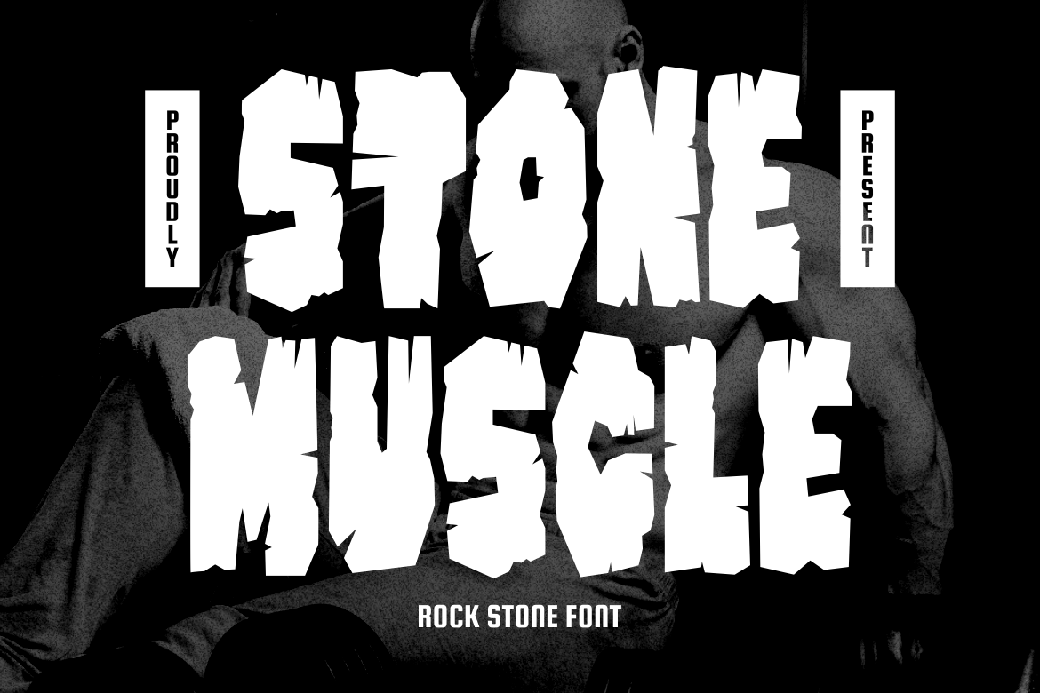
Stone Muscle uses compact, heavy characters with chipped edges, angular counters, and a dense muscular silhouette. The consistently bold strokes create a grounded industrial presence, while its rough fractures make the typography appear carved from a solid rock mass. It is most effective at large sizes where the internal counters and broken edges have enough space to remain clear.
PROS: Powerful weight, compact construction, industrial personality, consistent numerals and punctuation, and strong visual authority.
BEST FOR: Construction companies, gyms, industrial products, heavy equipment, action events, quarry branding, bold stone signage, and large architectural wordmarks.
4. Dirty Rock

Dirty Rock combines a rectangular block foundation with heavy distressed texture and a gritty rock-inspired appearance. The family includes extensive alternate lettering, including a large collection of ligatures that can help designers create less repetitive wordmarks. Its distressed details work strongly in branding and promotional design, but a physical inscription should use a simplified version with the smallest marks removed.
PROS: Blocky construction, rugged texture, extensive ligatures, strong grunge identity, and flexible wordmark customization.
BEST FOR: Rustic venues, music businesses, outdoor apparel, craft workshops, industrial branding, merchandise, quarry promotions, and weathered stone-sign concepts.
5. Funk Crackle Display Crack Font

Funk Crackle uses bold letter structures filled with cracks and fragmented details resembling shattered stone or broken walls. The irregular surface creates visual tension and a rebellious urban personality while preserving enough underlying weight for prominent headlines. For actual carving, retain only the largest cracks and remove thin fragments that could fail during stencil cutting or stone fabrication.
PROS: Dramatic cracked texture, bold base construction, strong movement, urban energy, and immediate visual impact.
BEST FOR: Extreme-sports venues, music memorials, streetwear brands, urban parks, entertainment signage, album-related plaques, event titles, and decorative stone installations.
6. Rock Pile Display Font
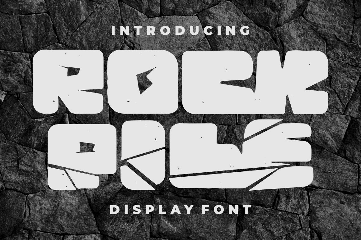
Rock Pile is a bold display typeface designed for powerful rock-oriented branding and prominent headlines. Its character set includes uppercase and lowercase letters, alternates, ligatures, numbers, punctuation, symbols, and multilingual Latin support, making it flexible across larger identity systems. The typeface is useful for designers who want a rugged logo or inscription without relying entirely on photographic rock texture.
PROS: Bold headline structure, alternate characters, ligatures, broad language support, and adaptable rock-brand personality.
BEST FOR: Climbing centers, outdoor clubs, construction suppliers, music venues, stone yards, apparel, product packaging, entrance signs, and decorative inscriptions.
Comparison
| Font | Visual Structure | Strongest Inscription Role | Physical Carving Consideration | Best Overall Direction |
|---|---|---|---|---|
| Rock Blox | Fragmented stone blocks | Large playful name or decorative title | Enlarge counters and remove small fragments | Adventure and family-oriented |
| The Stack Stone | Layered and stacked rock forms | Nature, landscaping, or architectural headline | Use the cleaner styles for fabrication | Earthy and construction-focused |
| Stone Muscle | Compact, heavy, and chipped | Bold industrial wordmark | Requires generous scale because counters are narrow | Powerful and masculine |
| Dirty Rock | Rectangular and distressed | Rustic branded sign or venue name | Simplify fine distress and complex ligatures | Grunge and handcrafted |
| Funk Crackle | Cracked and shattered | Dramatic decorative headline | Retain only major cracks in the carving file | Rebellious and urban |
| Rock Pile | Bold rock display structure | Outdoor logo or large plaque heading | Review alternates and counters with the carver | Versatile and rugged |
Common Mistakes
The first mistake is choosing a font entirely from a digital mockup without considering the stone or inscription process. Cracks, thin serifs, narrow counters, and distressed edges may look sharp on a large screen but fail when converted into a sandblasting stencil or carved into porous stone. Choose the material and technique early, print the typography at full size, and ask the mason to review the most difficult letters before approving the complete inscription. A physical sample is far less expensive than replacing a finished monument or architectural panel.
Another common mistake is using a decorative rock font for every line. A fragmented typeface may create an excellent main name, but dates, addresses, quotations, legal information, or long lists require a calmer companion. Create a clear hierarchy in which the expressive font establishes identity and a traditional serif or simple sans serif protects readability. This is particularly important for memorials, where the information should remain understandable and dignified for future generations.
The final mistake is relying on texture, paint, or gilding to rescue weak letter construction. Finishes can improve contrast, but they cannot fix closed counters, poor spacing, or indistinguishable characters. Build the inscription in one color first, simplify unnecessary cracks, and review it in realistic lighting. Confirm cemetery, heritage, planning, and property requirements before fabrication, and make sure the selected PutraCetol license covers the intended branding, signage, commercial installation, website, or promotional use.
Conclusion
The best fonts for stone inscriptions balance visual character with physical durability.
Classical Roman serifs remain strong choices for formal monuments and memorials, while sturdy sans serifs support modern signage and smaller information. Decorative rock fonts can create remarkable large names, entrance signs, branded plaques, and architectural headlines when their cracks, fragments, and internal details are adapted to the carving method.
Rock Blox brings playful fragmented geometry, while The Stack Stone creates a layered natural-stone appearance. Stone Muscle provides compact industrial power, Dirty Rock adds gritty block-based texture, and Funk Crackle introduces dramatic shattered details. Rock Pile offers a versatile foundation for rugged logos and prominent outdoor lettering.
Fonts from PutraCetol Studio can help designers, architects, stone businesses, outdoor brands, and creative communities establish a strong stone-inspired visual identity. Their most successful use comes from collaboration between designer and craftsperson.
Select the stone first, understand how it will weather, choose the inscription method, and test the type at full size. Simplify decorative details where necessary and use a readable supporting font for longer information.
When material, typography, spacing, and craftsmanship work together, a stone inscription can feel expressive in the present while remaining clear and meaningful far into the future.
Explore these fonts and many more at PutraCetol.com to build a business identity that looks professional, trustworthy, and memorable.
Additionally, if you want to explore some free typography options, you can check out Putracetol Studio on Dafont. Happy reading and designing!