
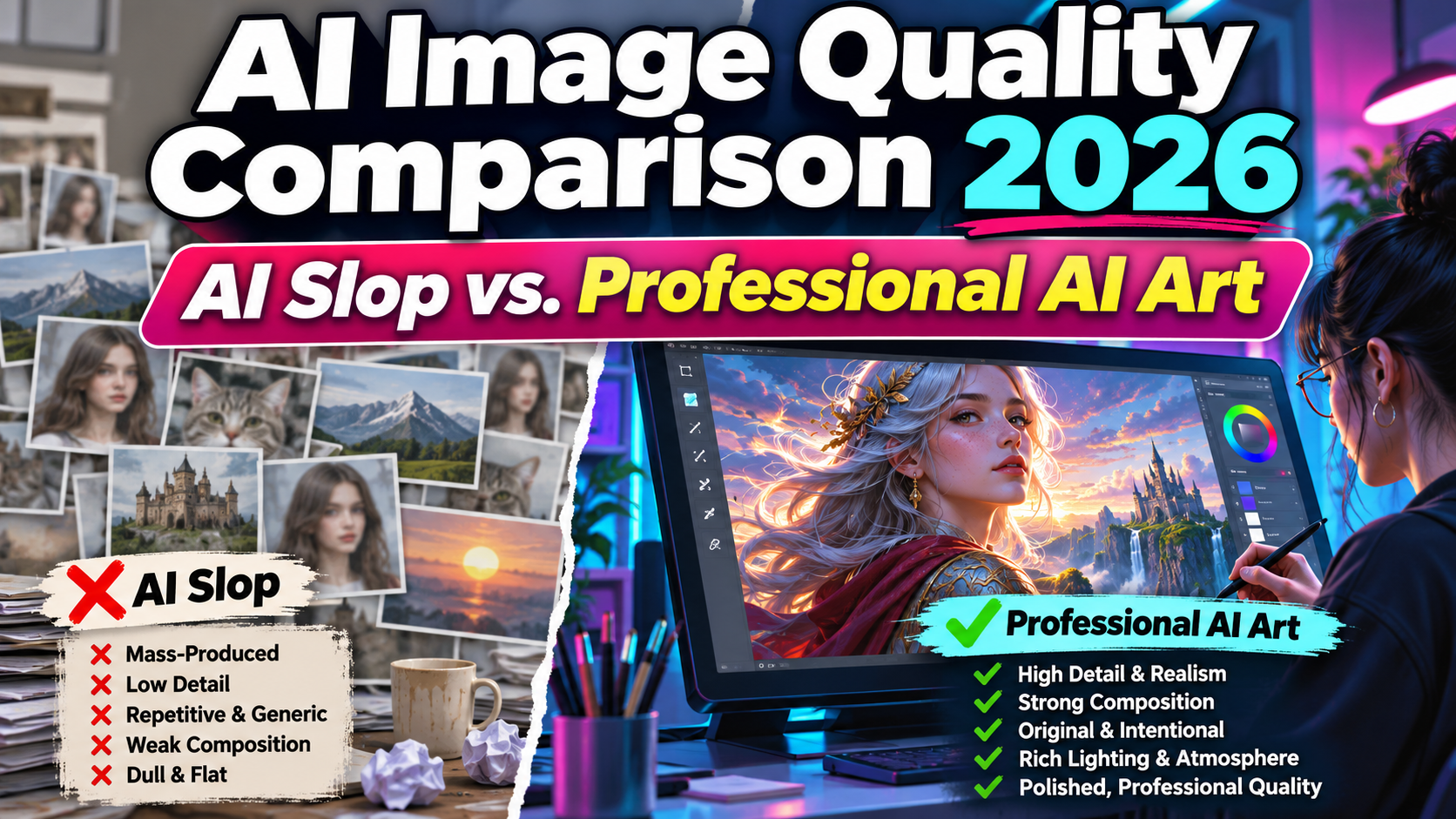
AI Image Quality Comparison 2026: AI Slop vs. High-Quality AI Images
Artificial intelligence has transformed digital content creation, making it possible to produce sophisticated visuals within minutes. However, faster image generation doesn’t automatically guarantee professional results.
The AI image quality comparison 2026 highlights an important distinction between generic, low-effort AI content and carefully developed visuals that demonstrate creativity, technical quality, and artistic direction.
For graphic designers, marketers, and content creators, understanding this difference is essential for producing images that attract attention while maintaining credibility.
Whether you’re developing advertising campaigns, website graphics, or commercial illustrations, image quality should always matter more than generation volume.
What Is AI Slop?
AI slop is an informal term commonly used to describe low-value, repetitive, or poorly executed content produced with generative artificial intelligence.
In visual design, it may involve generic compositions, inconsistent anatomy, excessive artificial effects, meaningless details, or images created without clear creative purpose.
However, not every AI-generated image is AI slop. Carefully directed generative artwork can demonstrate originality, visual sophistication, and professional quality.
The difference often comes from artistic judgment, thoughtful refinement, and relevance to the intended audience.
Evaluate Creative Purpose Before Generating
Before creating AI images, establish a clear visual objective.
Define the target audience, subject, composition, artistic style, lighting, and intended application.
For example, a premium coffee brand should avoid generic promotional imagery that lacks recognizable brand personality.
A more effective prompt could be:
A focused creative brief provides direction beyond simply requesting a beautiful image.
6 Key Differences Between AI Slop and High-Quality AI Images
1. Intentional Composition vs. Random Visual Arrangement
High-quality AI images use thoughtful composition to guide the viewer’s attention.
Elements such as framing, balance, negative space, perspective, and focal points create meaningful visual hierarchy.
AI slop often features overcrowded scenes, unrelated objects, or distracting backgrounds without a clear purpose.
For example, professional product photography should emphasize the product rather than compete with unnecessary decorations.
QUALITY INDICATOR: Clear focal point, balanced composition, and purposeful visual elements.
2. Accurate Details vs. Generative Artifacts
Professional AI images require careful attention to anatomy, object structures, lighting, and textures.
Common generation problems include distorted fingers, inconsistent reflections, malformed accessories, and unrealistic shadows.
These errors become particularly noticeable in advertising or close-up product photography.
Inspect important areas at full resolution and refine problematic elements through masking, inpainting, or manual editing.
Stylized artwork may intentionally break realistic proportions, but those decisions should appear consistent.
QUALITY INDICATOR: Coherent shapes, believable details, and controlled artistic execution.
3. Original Creative Direction vs. Generic Aesthetics
AI slop frequently relies on familiar visual formulas, exaggerated effects, and repetitive compositions.
High-quality AI artwork demonstrates a stronger creative concept through distinctive styling, thoughtful color choices, and intentional visual storytelling.
A technology advertisement, for example, doesn’t necessarily need glowing circuits or futuristic neon backgrounds.
A restrained composition using architectural geometry and sophisticated lighting may communicate innovation more effectively.
QUALITY INDICATOR: Recognizable artistic direction, originality, and meaningful visual choices.
4. Brand Relevance vs. Attractive but Unfocused Imagery
A visually impressive image isn’t automatically suitable for commercial branding.
Professional AI visuals should reflect a brand’s identity, audience, message, and communication goals.
A luxury skincare campaign might require soft lighting and refined textures, while a sports campaign could emphasize dramatic movement and strong contrast.
Typography also plays an important role in completing brand-focused compositions.
Explore distinctive display fonts at PutraCetol Studio to pair polished AI imagery with expressive headlines and recognizable brand identities.
QUALITY INDICATOR: Consistent branding, relevant imagery, and appropriate creative styling.
5. Technical Quality vs. Artificial Enhancement
Resolution alone doesn’t determine image quality.
AI-generated visuals can appear sharp while containing unnatural textures, inconsistent depth, or excessive digital smoothing.
Professional artwork requires appropriate resolution, controlled sharpening, accurate color reproduction, and clean edges.
Designers should inspect images at their intended display size, particularly for posters, packaging, and large-format printing.
Upscaling can improve image usability, but it cannot reliably repair every underlying generation error.
QUALITY INDICATOR: Clean rendering, suitable resolution, natural textures, and reliable output quality.
6. Human Refinement vs. Mass Production
High-quality AI image production involves more than generating dozens of outputs.
Professional creators review alternatives, select promising compositions, refine details, and verify technical accuracy.
Mass-produced content often receives limited inspection, resulting in repetitive images with inconsistent quality.
A productive workflow combines AI generation with artistic evaluation and careful post-production.
QUALITY INDICATOR: Curated results, visible creative decisions, and thorough quality control.
Comparison: AI Slop vs. High-Quality AI Images
Understanding these differences helps designers evaluate AI-generated assets before publication.
| Evaluation Aspect | AI Slop | High-Quality AI Images |
|---|---|---|
| Composition | Generic or cluttered | Intentional and balanced |
| Visual details | Distorted or inconsistent | Carefully reviewed |
| Creativity | Repetitive concepts | Distinctive direction |
| Brand relevance | Weak connection | Audience-focused |
| Technical quality | Unchecked artifacts | Refined output |
| Production process | Mass generation | Selection and editing |
How to Evaluate AI Image Quality
Review every image based on composition, accuracy, originality, relevance, and technical execution.
Check whether the artwork communicates its intended message, remains visually coherent, and meets production requirements.
For commercial projects, also confirm that the image-generation tool permits the intended usage and that any required disclosures are provided.
Common Mistakes When Creating AI Images
One common mistake is assuming that highly detailed prompts automatically produce professional artwork. Although descriptive instructions can improve creative direction, overly complicated prompts may introduce conflicting visual requirements and unpredictable results. Designers should prioritize essential details, refine prompts gradually, and evaluate each variation carefully. Excessive sharpness, unrealistic lighting, and unnecessary decorative elements can also make images appear artificial. Strong visual composition and consistent artistic direction are often more valuable than extreme complexity.
Another mistake is publishing AI-generated images immediately without reviewing their technical accuracy, originality, or commercial suitability. Small anatomical errors, distorted objects, incorrect text, and inconsistent materials can reduce credibility. Designers should also avoid flooding stock marketplaces or social media with nearly identical variations. For commercial submissions, review platform requirements, intellectual property restrictions, and AI labeling policies. Responsible quality control helps protect both creative reputation and audience trust.
Conclusion
The AI image quality comparison 2026 demonstrates that professional generative artwork depends on more than advanced technology.
High-quality AI images combine intentional composition, accurate details, original creative direction, brand relevance, and thoughtful refinement.
AI slop, by contrast, often reflects repetitive production without sufficient artistic evaluation or meaningful purpose.
The strongest creative workflow uses artificial intelligence as a supporting tool while preserving human judgment and visual storytelling.
For designers developing polished branding and marketing campaigns, explore professional typography at PutraCetol Studio to complement high-quality AI visuals with memorable lettering.
Explore these fonts and many more at PutraCetol.com to build a business identity that looks professional, trustworthy, and memorable.
Additionally, if you want to explore some free typography options, you can check out Putracetol Studio on Dafont. Happy reading and designing!