
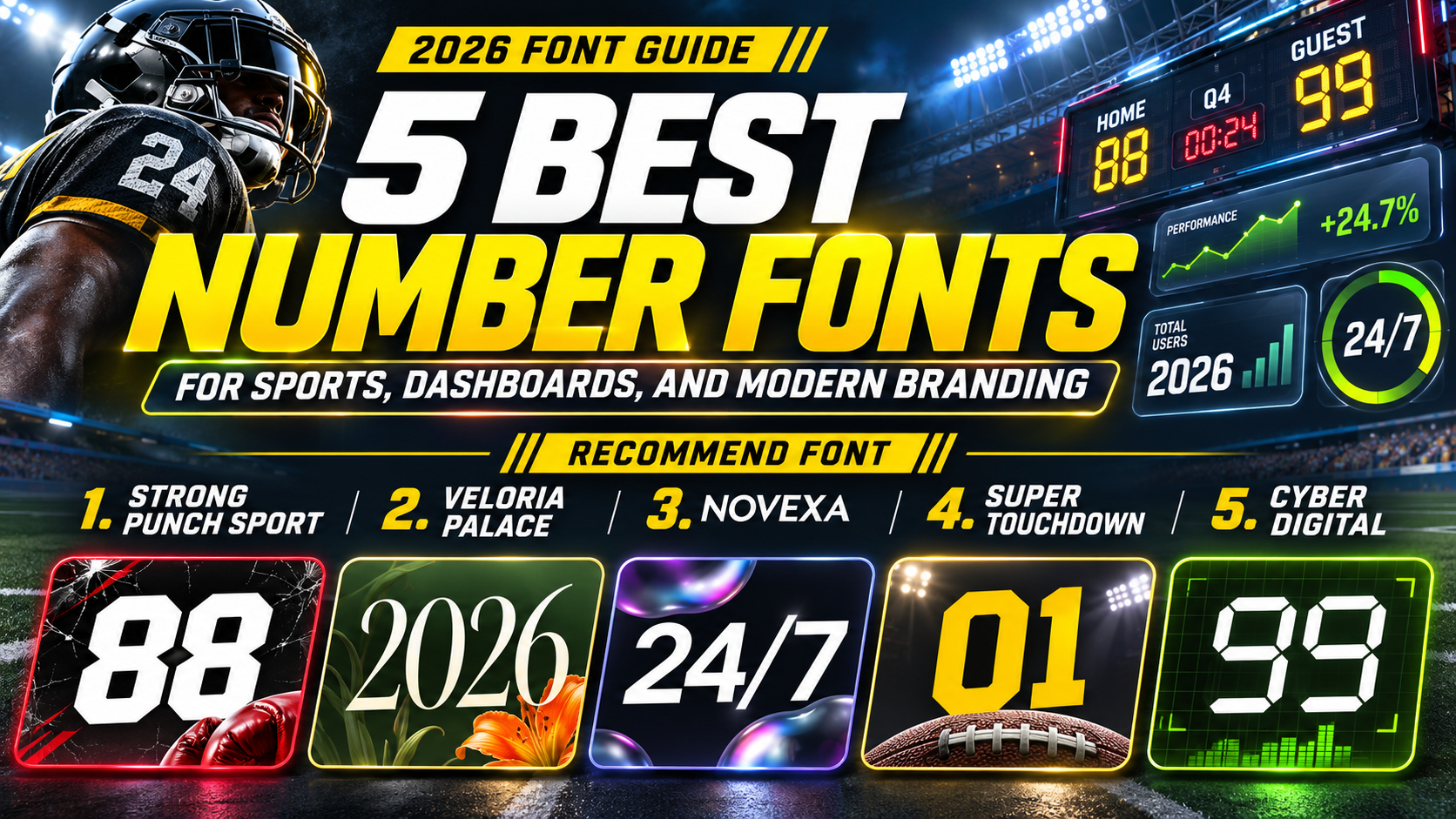
Best Number Fonts 2026: 5 Creative Fonts for Bold and Modern Designs
Numbers are essential elements in modern graphic design. From sports jerseys and digital clocks to financial dashboards and promotional campaigns, numerical typography communicates important information while influencing visual identity.
The best number fonts 2026 combine recognizable digit shapes, balanced proportions, and distinctive styling to create powerful visual statements.
Whether you’re designing athletic merchandise, elegant packaging, digital displays, or data-driven presentations, choosing the right numeric typeface can make your content more engaging and professional.
Choose Number Fonts Based on Their Purpose
Not every number font works equally well across different design applications.
Sports typography benefits from bold, powerful digits, while luxury branding often requires elegant proportions and refined details. Digital interfaces typically prioritize clarity, consistent alignment, and recognizable numerical shapes.
For example, a basketball jersey might feature oversized athletic numbers, while a premium watch advertisement could use sophisticated serif numerals.
Before choosing a font, test the complete sequence 0123456789 alongside realistic combinations such as 2026, 50%, $199, and 10:45.
Pay particular attention to characters that may look similar at smaller sizes.
Jump to Recommended Number Fonts
Explore five distinctive typefaces from PutraCetol Studio, offering different approaches to numerical typography for creative and commercial design.
1. Strong Punch Sport Font

Strong Punch is a powerful athletic display font characterized by wide proportions, heavy strokes, and sharp angular cuts. Its substantial letterforms communicate strength and movement, while diagonal details introduce a competitive personality inspired by boxing and high-energy sports. The included numbers follow the font’s bold visual direction, making them suitable for impactful scores, event dates, promotional figures, and athletic graphics. Strong Punch is an attractive option for designers seeking expressive numerical typography that commands attention without unnecessary ornamentation.
PROS: Heavy construction, dynamic angular details, bold numerical appearance, recognizable athletic personality.
BEST FOR: Sports jerseys, boxing posters, tournament graphics, fitness branding, and athletic merchandise.
2. Veloria Palace Classic Serif Font

Veloria Palace brings classic sophistication to typography through tall, condensed proportions, graceful curves, and elegant stroke contrast. Its slender construction creates a refined appearance that feels luxurious, timeless, and carefully composed. When used for numerical headlines, the classic serif styling provides an appealing alternative to conventional bold sans-serif numbers, particularly for designs emphasizing elegance rather than aggression. The font’s narrow proportions also complement spacious editorial layouts where typography should feel decorative yet controlled.
PROS: Elegant serif structure, condensed proportions, refined contrast, sophisticated visual character.
BEST FOR: Luxury price displays, wedding dates, premium packaging, fashion campaigns, and editorial graphics.
3. Novexa Modern Sans Font
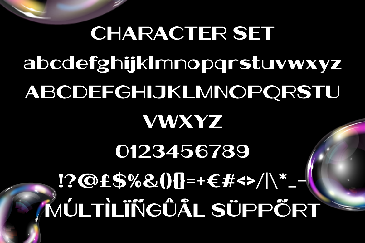
Novexa offers a contemporary typographic personality through wide proportions, smooth curves, and balanced geometric construction. Its clean strokes and spacious letterforms create a polished visual appearance suitable for modern communication and professional branding. For numerical applications, its minimalist aesthetic works particularly well with statistical headlines, financial presentations, and infographic layouts that need visual consistency. Novexa provides designers with an understated alternative to decorative number fonts, allowing important figures to remain the primary focus of the composition.
PROS: Clean geometric styling, balanced proportions, contemporary appearance, versatile branding character.
BEST FOR: Infographics, business presentations, financial graphics, technology branding, and statistical headlines.
4. Super Touchdown Superbowl Sport Font
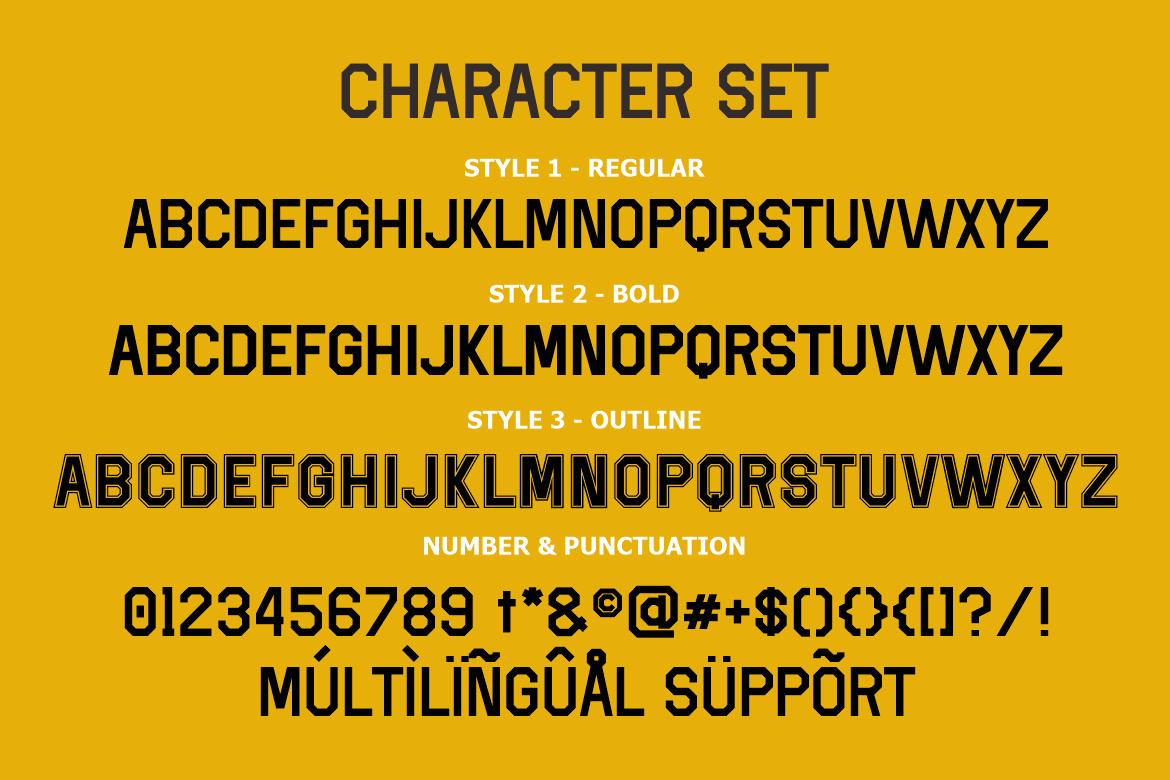
Super Touchdown captures the powerful atmosphere of American football through bold geometric lettering and distinctive athletic construction. Its block-inspired forms feature structured proportions and sharp edges that communicate confidence, competitiveness, and sporting tradition. Available in Regular, Bold, and Outline styles, the family offers flexibility when creating coordinated visual compositions with prominent numerical elements. Its strong display character makes it particularly effective for designs requiring recognizable team identities, large player numbers, and energetic sports messaging.
PROS: Three coordinated styles, strong geometric construction, classic football personality, bold display impact.
BEST FOR: Football jerseys, player numbers, stadium signage, sports merchandise, and championship posters.
5. Cyber Digital Modern LED-Inspired Display Font

Cyber Digital is a futuristic display font inspired by electronic displays and digital segment technology. Its numerals use consistent modular construction, straight geometric strokes, and rounded segment joints that recreate the organized appearance of LED-style lettering. The controlled proportions establish a technical visual rhythm, making numerical combinations feel precise, modern, and connected to electronic devices. Unlike traditional sports or editorial fonts, Cyber Digital emphasizes structured digital aesthetics that complement technology-focused visual identities.
PROS: LED-inspired numerals, modular geometry, consistent proportions, distinctive electronic appearance.
BEST FOR: Digital clock graphics, countdown timers, futuristic dashboards, electronic signage, and technology posters.
Comparison: Which Number Font Should You Choose?
Each font communicates a different personality and suits a particular visual direction.
| Font | Numeric Style | Best Application |
|---|---|---|
| Strong Punch | Bold, angular, athletic | Boxing and sports graphics |
| Veloria Palace | Elegant, condensed, classic | Luxury and editorial design |
| Novexa | Clean, geometric, modern | Infographics and business graphics |
| Super Touchdown | Blocky, competitive, sporty | Jerseys and football branding |
| Cyber Digital | Segmented, electronic, futuristic | Digital clocks and tech displays |
What Makes a Good Number Font?
A good number font balances visual personality with readability.
For dashboards and data tables, look for clear digit differentiation and tabular figures, which keep changing numbers aligned. Decorative display fonts may be better suited to headlines than dense numerical interfaces.
Always test your chosen font at the actual size and viewing distance.
Common Mistakes When Choosing Number Fonts
One common mistake is selecting visually attractive numerals without testing their readability in realistic applications. Some decorative fonts use unusual shapes that make digits difficult to distinguish, particularly when displayed on small screens or crowded layouts. Designers should test combinations such as 1 and 7, 3 and 8, and 0 and 6. They should also evaluate character spacing, contrast, and alignment. A number font that looks impressive on a large poster may not function effectively in financial tables or compact dashboard components.
Another mistake is using the same numerical typography for every design category. Aggressive sports numbers may conflict with luxury branding, while elegant serif numerals can feel inappropriate for electronic displays. Choose typefaces according to audience expectations and visual purpose. When designing commercial products, also verify the appropriate font license for printed merchandise, logos, websites, applications, or embedded software.
Conclusion
The best number fonts for 2026 offer a balance between expressive typography, visual clarity, and practical design applications.
Strong Punch and Super Touchdown deliver athletic impact, Veloria Palace introduces classic elegance, Novexa provides modern simplicity, and Cyber Digital creates a recognizable electronic appearance.
The ideal choice depends on how your numbers will be displayed and what personality your project should communicate.
Explore these distinctive typefaces at PutraCetol Studio and discover creative typography that transforms ordinary numbers into memorable design elements.
Explore these fonts and many more at PutraCetol.com to build a business identity that looks professional, trustworthy, and memorable.
Additionally, if you want to explore some free typography options, you can check out Putracetol Studio on Dafont. Happy reading and designing!