

The right font for slowmaxxing pop culture trend should communicate a different relationship with time. It should help the design feel observant, spacious, personal, and less pressured by the visual urgency common in digital marketing.
Slowmaxxing gained wider cultural visibility as an internet-era response to productivity pressure, short-form content, and the belief that every moment should be optimized. The trend encourages slower rituals, deeper attention, and activities that resist instant completion.
Typography can translate those ideas into a visual rhythm, but a calm identity does not automatically require a thin beige serif. The correct font may be fluid, bold, botanical, psychedelic, or nostalgic depending on the audience and story.
Before comparing typefaces, decide which interpretation of slowmaxxing the project should express:
- Quiet and reflective
- Playful and unhurried
- Botanical and restorative
- Nostalgic and analogue
- Bold but emotionally soft
- Free-spirited and anti-corporate
A skincare brand may need elegant botanical lettering. A fashion campaign could use a bold rounded font inside a spacious editorial layout. A creator documenting analogue hobbies might benefit from vintage script typography that resembles old signs, journals, or personal notes.
The goal is not to make the design appear sleepy. It is to create an experience that does not rush the audience.
What Makes a Font Feel Slowmaxxing?
A Visible Sense of Rhythm
Typography creates pace through curves, weight, spacing, and repetition.
Wavy letterforms can suggest breathing, water, music, or natural movement. A flowing script can resemble handwriting completed without mechanical precision. A tall serif with generous spacing encourages a more editorial reading rhythm.
The letters do not need to move slowly in a literal sense. Their structure should avoid the aggressive compression and sharp visual urgency associated with high-speed promotional graphics.
Enough Space Around the Letters
The slowmaxxing aesthetic depends as much on composition as on the font itself.
A calm typeface can still feel stressful when it is tightly packed between several images, stickers, promotional labels, and calls to action. Conversely, a large bold font can feel surprisingly relaxed when it is surrounded by generous negative space.
Consider:
- Wider margins
- Fewer words per composition
- Open line spacing
- Deliberate line breaks
- One dominant headline
- Limited supporting information
- Clear separation between sections
Whitespace allows the audience to notice the shape and emotional tone of the typography without immediately processing another competing element.
Organic Rather Than Mechanical Construction
Soft curves, irregular connections, rounded terminals, botanical details, and subtle handmade qualities can make a typeface feel more connected to physical life.
These characteristics may reference:
- Water
- Plant growth
- Brush movement
- Vintage sign painting
- Printed books
- Handwritten notes
- Analogue packaging
- Psychedelic poster culture
The organic quality should match the brand. A digital wellness product may use controlled rounded geometry, while an artisan fashion label can support more visible imperfection.
Personality Without Visual Pressure
Slowmaxxing typography can still be expressive.
A bold retro font may celebrate freedom and play, while a botanical serif can create romance and reflection. What matters is how the expression is framed.
Avoid surrounding the font with:
- Several urgent CTAs
- Flashing animation
- Constant countdowns
- Excessive gradients
- Dense badges
- Several competing colors
- Too many font styles
A visually strong typeface needs less decoration, not more.
Five Typographic Directions for Slowmaxxing
1. Fluid Wavy Typography
Wavy typefaces communicate movement without the rigid speed of italic sports fonts or angular technology lettering.
Their curves can suggest tides, breathing, slow music, sunlight on water, or the gentle instability of handmade objects.
This direction works well for:
- Beach lifestyle brands
- Music and culture campaigns
- Travel diaries
- Wellness events
- Creative festivals
- Summer fashion
- Reflective social content
Use broad spacing and a restrained palette so the waves feel immersive rather than chaotic.
2. Soft Bold Display Typography
Slow design does not require delicate type.
Chunky rounded fonts can make a campaign feel emotionally open, friendly, and confident. Their substantial weight also performs well on social media, where thin typography can disappear against photography or small screens.
This direction is useful for:
- Youth lifestyle brands
- Creative communities
- Mindful productivity tools
- Independent magazines
- Fashion collections
- Food and beverage campaigns
- Social-first businesses
Pair the bold display font with simple composition and quieter supporting typography. The contrast makes the headline feel grounded instead of loud.
3. Botanical Serif Typography
Botanical serifs connect slowmaxxing with seasons, gardens, craft, wellness, and natural cycles.
Tall proportions, graceful curves, floral details, and restrained alternates can create an identity that feels thoughtful without becoming overly formal.
This direction fits:
- Beauty and skincare
- Florists
- Wellness
- Tea and botanical drinks
- Weddings
- Candles
- Editorial storytelling
- Artisan products
Use decorative glyphs selectively. One floral connection or elegant terminal often creates more sophistication than applying alternates to every letter.
4. Retro Psychedelic Typography
The slowmaxxing trend does not need to be visually muted.
Psychedelic typography can express freedom from conventional productivity, digital sameness, and rigid corporate design. Wide curves and groovy forms evoke music, analogue culture, community, and a less optimized creative spirit.
This direction works particularly well for:
- Independent fashion
- Music events
- Art collectives
- Lifestyle products
- Youth magazines
- Creative workshops
- Analogue-hobby campaigns
- Alternative social content
Use warm retro colors, simple photography, or a clean monochrome layout to prevent the design from becoming costume-like.
5. Vintage Script Typography
Vintage script can suggest personal memory, old packaging, handwritten signage, record sleeves, cafés, and objects kept for many years.
Its connected rhythm introduces a human presence that contrasts with standardized digital typography.
This makes it useful for:
- Journaling brands
- Cafés
- Handmade products
- Personal creators
- Photography studios
- Fashion labels
- Slow travel
- Heritage-inspired campaigns
Script should remain concentrated in short names and statements. Use a clearer supporting font for dates, product details, captions, and instructions.
Build a Complete Slowmaxxing Typography System
The Main Display Font
The display font should carry the emotional identity.
Use it for:
- Logo or campaign name
- Editorial headline
- Collection title
- Product name
- Social cover
- Poster title
- Short quotation
The text should remain concise enough for the letterforms to breathe.
The Functional Companion
The companion typeface should handle repeated reading and practical information.
Use it for:
- Body copy
- Captions
- Navigation
- Prices
- Product details
- Dates
- Calls to action
- Instructions
A calm humanist sans serif or readable book serif can complement most slowmaxxing display fonts.
The supporting family should feel natural rather than highly technical. Open counters, moderate weight, and comfortable spacing are usually more useful than extreme geometric precision.
The Optional Accent Style
An accent may be created through:
- Italic text
- A handwritten word
- A textured treatment
- An alternate glyph
- A different color
- Increased tracking
- A small ornamental symbol
Use the accent to introduce personality at selected moments, not throughout the entire composition.
Typography and Visual Pace
Use Fewer Words
Slowmaxxing design does not need to explain everything immediately.
A fashion campaign could use:
Wear It Again
A creative journal might say:
Take Your Time
A wellness brand could use:
Nothing Here Is Rushed
Short statements allow the typography to become part of the image.
Use Intentional Line Breaks
Line breaks can slow the reading rhythm.
Compare:
MAKE TIME FOR WHAT MATTERS
with:
MAKE TIME
FOR WHAT
MATTERS
The second treatment encourages the eye to pause between ideas.
Do not divide words arbitrarily. Each line should reinforce meaning or composition.
Avoid Excessive Compression
Tight tracking can make even a gentle serif feel urgent.
Give rounded, wavy, and script fonts enough room to preserve their internal character. This is particularly important when letters contain decorative curves or unusual counters.
Allow One Element to Remain Still
In animated content, not every word needs to move.
A stable headline can become the visual anchor while photography, light, or background texture changes slowly around it.
This creates a calmer experience than animating every letter independently.
Color Palettes for Slowmaxxing Typography
Water and Sunlight
- Deep blue
- Soft yellow
- Pale cream
- Washed turquoise
- Warm white
This palette supports wavy typography, coastal content, music, travel, and summer lifestyle branding.
Garden and Paper
- Moss green
- Warm ivory
- Dusty rose
- Floral yellow
- Charcoal
Use this combination for botanical fonts, wellness, books, florists, and artisan products.
Retro Afternoon
- Burnt orange
- Burgundy
- Mustard
- Avocado green
- Cream
This palette gives psychedelic and vintage typography a nostalgic but lively personality.
Quiet Contemporary
- Off-white
- Soft black
- Muted blue
- Stone grey
- One warm accent
This works well for a bold display font that needs a calmer editorial setting.
Memory and Craft
- Faded red
- Dark brown
- Parchment
- Denim blue
- Weathered black
Use it with vintage scripts, photography, cafés, fashion, and handmade products.
Applying Slowmaxxing Fonts in Fashion
Collection Naming
Use the display font for a carefully named collection rather than a generic seasonal code.
Examples include:
- Worn Slowly
- Everyday Ritual
- A Longer Summer
- Things We Keep
- Made for Repetition
The typography should help the collection feel like an idea rather than another product drop.
Lookbooks
Allow the typeface to appear between long photographic sequences.
Instead of placing copy on every image, use one full page for the collection title, one for a short reflection, and several pages with no typography at all.
This gives the viewer time to observe fabric, movement, wear, and environment.
Garment Labels and Packaging
A decorative font can lead the label, while care instructions remain in a practical companion.
Slowmaxxing fashion branding becomes more credible when it also explains:
- Material origin
- Repair guidance
- Care instructions
- Repeat-wear ideas
- Product longevity
Typography should support that information rather than turning every detail into decoration.
Applying Slowmaxxing Fonts in Photography
Photo Essays
Use typography as an introduction and chapter marker rather than placing text over every photograph.
A photo essay could begin with one reflective title, continue through an uninterrupted sequence, and close with a short handwritten note.
Personal and Documentary Photography
Vintage scripts and botanical serifs can support:
- Family archives
- Everyday rituals
- Slow travel
- Local communities
- Craft processes
- Seasonal observation
- Domestic life
The font should not make the subject feel artificially nostalgic. Select typography that reflects the actual emotional tone of the work.
Image Captions
Keep captions smaller and highly readable.
The display font creates atmosphere, while the caption provides context. Combining both roles inside a highly decorative font can make a thoughtful photo project unnecessarily difficult to follow.
Applying Slowmaxxing Fonts in Branding
Reflect the Business Behavior
A slowmaxxing font should belong to a brand that offers customers more than a calm surface.
The wider experience might include:
- Fewer product launches
- Honest production timelines
- Repair information
- Reduced notification pressure
- Thoughtful packaging
- Longer editorial content
- Clear customer support
- Products designed for repeated use
Typography becomes believable when it reflects what the organization actually does.
Use a Flexible Identity
A brand may need both expressive and quiet moments.
The display font can lead campaigns and product stories. The functional family can support ecommerce, customer service, packaging information, and long-form articles.
A flexible identity is more sustainable than forcing one decorative typeface into every application.
Create Recognition Through Rhythm
Recognition does not depend only on using the same font.
Repeat:
- Similar headline spacing
- Consistent line breaks
- The same type scale
- A stable color system
- Familiar placement
- Recurring image treatment
The audience begins to recognize the brand’s pace as well as its letterforms.
Applying Slowmaxxing Fonts on Social Media
Use Stillness as a Pattern Break
Fast feeds are full of short cuts, captions, stickers, and motion.
A static image with one carefully set phrase can stand out because it asks less of the viewer.
Try:
You Do Not Need to Finish Everything Today
or:
Keep One Part of the Day Unmeasured
Design Reflective Carousels
A slowmaxxing carousel may use:
- One calm opening statement
- A personal observation
- A visual detail
- A practical suggestion
- A final invitation to pause
Use the display font on the opening and closing slides. Keep the middle slides highly readable.
Use Longer Stable Shots
For Reels and short videos, allow the typography to remain visible long enough to be read comfortably.
The background may show:
- Coffee being prepared
- Fabric being repaired
- A book being opened
- Light moving across a room
- A train journey
- A garden changing
- A sketch in progress
Avoid adding rapid movement simply because the platform supports it.
Use Accessible Contrast
Slowmaxxing palettes often contain cream, faded green, pale yellow, and muted pink. These colors can create low contrast when combined carelessly.
WCAG 2.2 recommends a minimum text contrast ratio of 4.5:1 for standard text and 3:1 for qualifying large text. Very thin or unusual fonts may require even stronger practical contrast to remain comfortable.
Use dark brown, charcoal, navy, or deep green for essential wording rather than relying on pale grey.
Jump to Recommended Fonts
Wavy Pulse | Nomza | Blooming Pages | Popdash | Yesterday Time
1. Wavy Pulse Display Wave Style Font

Wavy Pulse uses broad, fluid characters whose curves resemble the natural movement of water. Its visual rhythm can express ease, repetition, and gentle motion while remaining bold enough for posters, campaign covers, and fashion-led packaging. The typeface is especially useful when a slowmaxxing identity should feel immersive and contemporary rather than quiet or traditional.
PROS: Fluid rhythm, wide letterforms, strong display visibility, modern psychedelic character, and clear movement.
BEST FOR: Coastal lifestyle, music, travel, wellness festivals, reflective social content, summer fashion, cover art, and creative branding.
2. Nomza Modern Bold Display Font
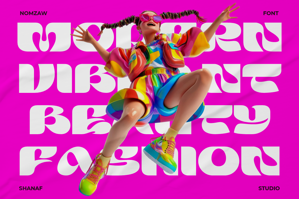
Nomza brings a contemporary visual voice through chunky, rounded, and experimental letterforms. Its substantial weight creates immediate recognition, while the softer geometry makes the font feel approachable rather than aggressive. It is a strong choice for slowmaxxing campaigns that reject fragile minimalism and want calmness to feel confident, youthful, and culturally current.
PROS: Heavy visual presence, rounded experimental forms, friendly personality, strong mobile performance, and memorable silhouette.
BEST FOR: Youth lifestyle brands, modern wellness, fashion campaigns, creative communities, product launches, editorial covers, and bold social media statements.
3. Blooming Pages Spring Font
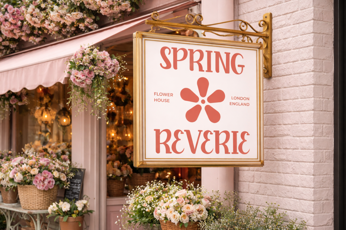
Blooming Pages combines tall, slim serif forms with soft curves, rounded terminals, and restrained decorative details. Its structure feels romantic and botanical, but the readable silhouette keeps it useful for contemporary logos, editorial headlines, packaging, and social campaigns. This balance makes it particularly effective when slowmaxxing is expressed through gardens, seasonal change, personal rituals, and gentle premium storytelling.
PROS: Elegant serif structure, botanical warmth, decorative alternates, readable narrow proportions, and polished emotional character.
BEST FOR: Beauty, florists, wellness, tea, candles, weddings, artisan products, garden events, lifestyle editorials, and reflective branding.
4. Popdash Retro Psychedelic Font

Popdash uses wide, wavy forms and groovy curves influenced by the free-spirited visual culture of the 1970s and 1980s. Its chunky proportions provide strong headline impact while keeping enough clarity for logos, packaging, posters, and magazine titles. It suits slowmaxxing projects that interpret anti-hustle culture through analogue nostalgia, music, community, color, and creative independence.
PROS: Groovy rhythm, broad display forms, nostalgic personality, playful movement, and modern-retro flexibility.
BEST FOR: Independent fashion, music events, art communities, analogue culture, magazines, festivals, lifestyle products, posters, and social campaigns.
5. Yesterday Time Vintage Script Font
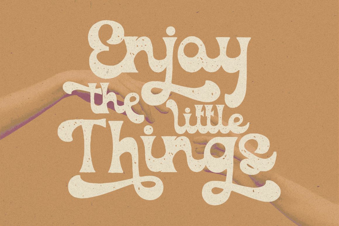
Yesterday Time is presented as a vintage script display font with a strong nostalgic direction. Its connected lettering can bring the feeling of old signage, record packaging, personal notes, and objects that carry visible history, making it useful for brands that want slowmaxxing to feel intimate and memory-led. The font is best reserved for short names and statements, then paired with a simpler typeface for practical information.
PROS: Vintage script personality, human rhythm, nostalgic warmth, strong wordmark potential, and analogue storytelling value.
BEST FOR: Cafés, journals, photography, slow travel, handmade products, personal creators, fashion labels, heritage campaigns, and retro lifestyle branding.
Comparison
| Font | Main Visual Personality | Slowmaxxing Interpretation | Strongest Application | Recommended Companion |
|---|---|---|---|---|
| Wavy Pulse | Fluid, vibrant, and rhythmic | Flow, water, breathing, and gentle movement | Posters, travel, music, and social campaigns | Quiet geometric sans serif |
| Nomza | Bold, rounded, and contemporary | Confident calm and anti-minimalist softness | Fashion, youth branding, and digital covers | Humanist sans serif |
| Blooming Pages | Botanical, elegant, and romantic | Seasonal living, restoration, and mindful craft | Beauty, wellness, packaging, and editorials | Clean modern sans serif |
| Popdash | Groovy, nostalgic, and free-spirited | Analogue culture and creative resistance | Music, fashion, festivals, and magazines | Neutral grotesque |
| Yesterday Time | Personal, vintage, and handcrafted | Memory, ritual, heritage, and everyday intimacy | Cafés, journals, photography, and lifestyle logos | Readable serif or sans serif |
Best for Fluid Visual Storytelling
Wavy Pulse is the strongest choice for campaigns centered on water, rhythm, coastal environments, music, or gentle movement.
Best for Bold Contemporary Branding
Nomza works well when slowmaxxing needs to feel youthful and confident rather than delicate or rustic.
Best for Botanical and Wellness Brands
Blooming Pages provides the clearest combination of elegance, nature, and calm premium storytelling.
Best for Analogue Pop Culture
Popdash fits projects inspired by retro music, print culture, community events, and the rejection of polished corporate aesthetics.
Best for Personal Nostalgia
Yesterday Time brings the strongest handwritten and memory-led character for intimate lifestyle identities.
Common Mistakes
The first mistake is assuming that every font for slowmaxxing pop culture trend must be thin, beige, and extremely minimalist. Slowmaxxing is a cultural response to speed and constant optimization, not one fixed visual style. Bold rounded typography, psychedelic lettering, saturated retro colors, and expressive scripts can all support the trend when the wider composition gives them enough space. Begin with the intended emotional interpretation, then choose the typeface rather than copying a generic wellness aesthetic.
The second mistake is selecting a calm-looking font while preserving an urgent brand experience. A company may use botanical serifs and warm photography while publishing constant countdowns, aggressive discounts, rapid animations, and daily product drops. Audiences experience the complete system, not only its lettering. Align typography with slower content pacing, honest availability, durable products, clear information, and fewer competing calls to action. The typeface should express real behavior rather than cover a fast business model with a quiet surface.
The final mistake is using an expressive font for every piece of communication. Wavy, psychedelic, botanical, bold, and vintage script faces work best as visual anchors. They can become difficult to read in long captions, product details, navigation, instructions, or small mobile text. Give the display font one focused role, pair it with functional typography, test the design at real sizes, and confirm that the selected license covers the intended logo, packaging, website, social media, advertising, or merchandise application.
Conclusion
The right font for slowmaxxing pop culture trend should make the audience feel that there is enough time to observe the design.
That feeling can come from fluid curves, rounded weight, botanical details, psychedelic movement, or vintage handwritten rhythm. The correct direction depends on how the project interprets slowness.
Wavy Pulse expresses gentle motion and immersive rhythm. Nomza gives calm branding a bolder contemporary voice, while Blooming Pages supports botanical elegance and seasonal storytelling. Popdash connects slowmaxxing with analogue culture and free-spirited nostalgia. Yesterday Time introduces the warmth of memory, craft, and personal ritual.
Fonts from PutraCetol Studio can help creators, fashion brands, photographers, wellness businesses, and lifestyle strategists translate the anti-hustle mood into a recognizable visual identity.
The most effective result does not simply look relaxed. It uses typography, spacing, color, imagery, motion, and brand behavior to reduce unnecessary urgency.
Slowmaxxing typography succeeds when it gives the message room to breathe and gives the audience permission to stay with it a little longer.
Explore these fonts and many more at PutraCetol.com to build a business identity that looks professional, trustworthy, and memorable.
Additionally, if you want to explore some free typography options, you can check out Putracetol Studio on Dafont. Happy reading and designing!