
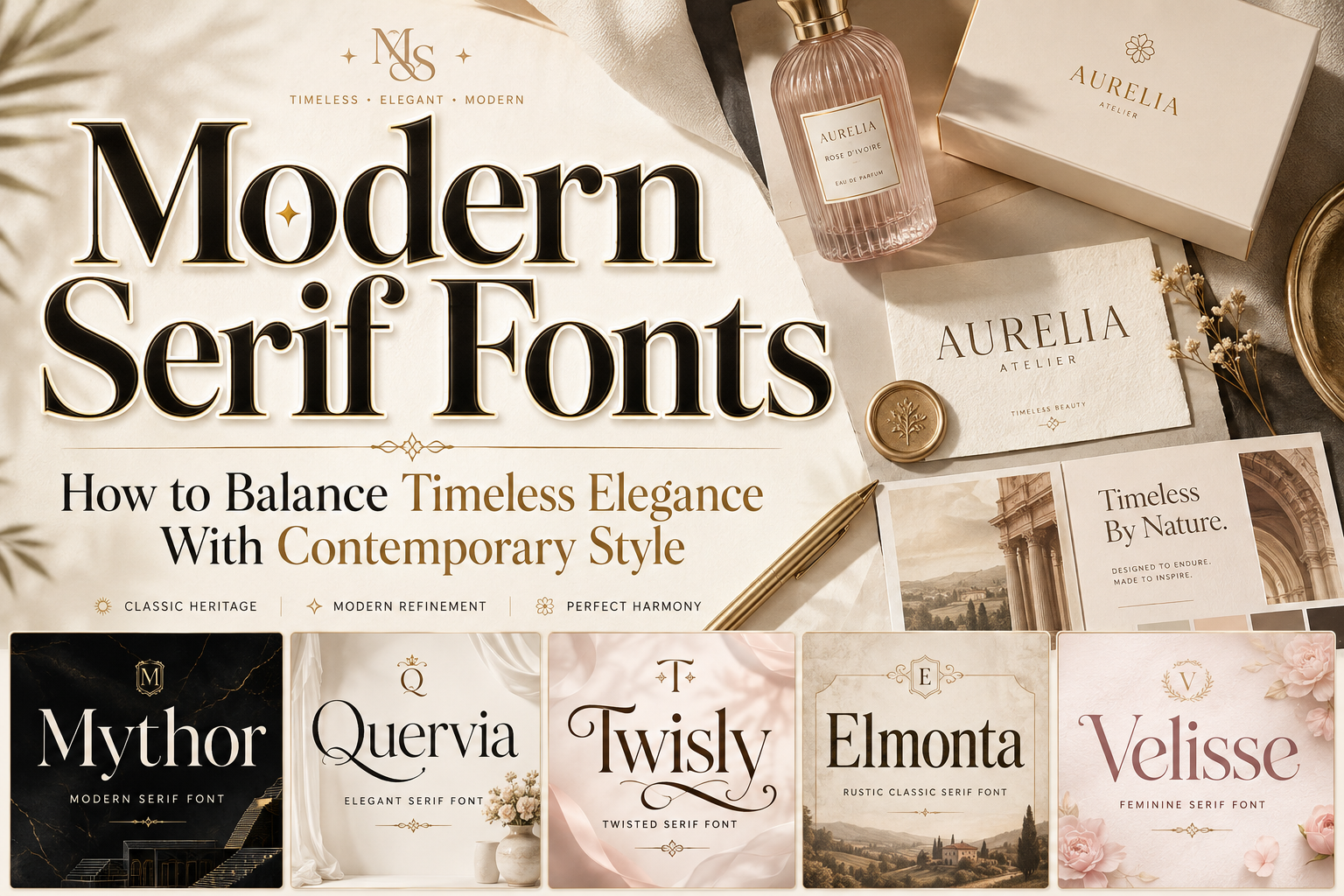
The best modern serif fonts do more than add decorative strokes to letters. They combine the authority and sophistication associated with traditional serif typography with proportions, spacing, and details that feel relevant to contemporary design.
Before selecting a font, define the personality the brand should communicate. A luxury skincare company may need softness and refinement. A creative studio might prefer experimental curves and unusual terminals. A hotel or restaurant could benefit from a serif that feels established, warm, and trustworthy.
Write down three qualities the identity should express, such as elegant, modern, confident, romantic, editorial, rustic, or artistic. Use these qualities to evaluate the font rather than choosing a typeface only because it looks attractive in a promotional image.
The font should also work across real applications. Test it in the complete brand name, packaging title, website hero, social graphic, business card, and monochrome logo. A modern serif may look impressive at 100 pixels but lose important details on a small label or mobile screen.
What Makes a Serif Font Feel Modern?
Traditional serif fonts are often associated with books, newspapers, institutions, and heritage brands. Modern serif typography keeps that historical foundation but updates it through cleaner construction, stronger contrast, unconventional proportions, simplified details, or more expressive character shapes.
Clean and Controlled Letterforms
Modern serif fonts often remove unnecessary ornamentation. Their curves, stems, and terminals feel intentional, helping the typeface remain elegant without appearing excessively formal.
Clean construction is especially valuable in digital branding, where letters must remain recognizable across different screen sizes and resolutions.
Balanced Proportions
Contemporary serifs may use tall letterforms, open counters, narrow widths, or carefully controlled spacing. These proportions can create a refined silhouette while helping headlines and brand names fit modern layouts.
Condensed designs work well in narrow packaging panels, magazine covers, and mobile banners. Wider serifs can create calm authority in luxury logos and editorial compositions.
Contrast Between Thick and Thin Strokes
Stroke contrast is one of the strongest characteristics of elegant serif typography. High contrast creates a dramatic, fashion-oriented appearance, while medium contrast feels more stable and versatile.
The correct level depends on the intended application. Very thin hairlines may look sophisticated in large headlines but disappear in small printing, foil stamping, or low-resolution displays.
Contemporary Details
Modern serif fonts often include unusual cuts, curved terminals, alternate characters, distinctive ligatures, or slightly distorted structures. These details can help a brand create a recognizable identity without abandoning the professionalism of serif typography.
The key is moderation. One distinctive letter may make a wordmark memorable, while too many decorative characters can reduce clarity.
Why Modern Serif Fonts Work in Branding
They Communicate Trust and Refinement
Serif typography carries a visual connection to publishing, literature, craftsmanship, and established institutions. In branding, this can suggest quality, expertise, and long-term value.
Modern construction prevents the identity from appearing old-fashioned. This balance makes contemporary serifs useful for companies that want to feel reliable but still culturally relevant.
They Create Strong Editorial Hierarchy
Modern serif fonts can give headlines, product names, quotes, and campaign messages a clear sense of importance. Their contrasting strokes and distinctive shapes separate major content from supporting text.
A practical identity system may use:
- A modern serif for the logo and main headings
- A clean sans serif for navigation and body copy
- A medium serif weight for editorial subheadings
- Alternate glyphs for selected branding moments
This structure creates variety without making the visual system inconsistent.
They Add Personality Without Excessive Decoration
A well-designed serif can feel luxurious, artistic, romantic, or rustic through the shape of the letters alone. The brand may not need additional ornaments, frames, or illustrations.
This is especially useful in premium packaging and minimalist identities, where typography is expected to carry much of the visual personality.
Major Styles of Modern Serif Typography
Elegant High-Contrast Serifs
These fonts use dramatic differences between thick and thin strokes, tall proportions, and refined curves. They are often associated with fashion, beauty, fragrance, jewelry, and luxury editorial design.
Use them for large titles and logos where the fine details remain visible.
Experimental Serifs
Experimental serif fonts modify familiar letter structures through unusual curves, twisted terminals, or unexpected cuts. They feel artistic and contemporary while retaining a recognizable serif foundation.
They are suitable for creative studios, magazines, fashion campaigns, cultural brands, and products that need strong differentiation.
Rustic Modern Serifs
Rustic serifs introduce warmth through vintage proportions, handcrafted details, softened corners, or slightly irregular forms. A clean digital structure keeps them relevant to modern branding.
This direction works well for food products, cafés, hospitality, natural goods, local businesses, and heritage-inspired identities.
Feminine Contemporary Serifs
Feminine serifs typically use graceful curves, slender proportions, moderate contrast, and generous spacing. Their softness can create elegance without making the identity feel fragile.
They are effective for beauty, wellness, fashion, florists, weddings, candles, skincare, and lifestyle businesses.
How to Use Modern Serif Fonts Effectively
Test the Actual Brand Name
Do not evaluate a font only from its alphabet preview. Type the complete business or product name and examine the relationship between letters.
Look for awkward spacing, repeated shapes, weak capital letters, crowded serifs, and unusual combinations. Test available alternates and ligatures, but only use them when they improve the overall rhythm.
Pair Serif and Sans Serif Fonts Carefully
One of the most reliable combinations is an expressive serif paired with a neutral sans serif. The serif provides personality, while the sans serif handles practical information.
For example, a premium skincare brand could use a high-contrast serif for its name and a simple sans serif for ingredients and instructions. An editorial website could use a modern serif for headlines and a highly readable sans serif for articles, menus, and buttons.
Maintain Readability at Small Sizes
Fine strokes and elaborate terminals may disappear on product tags, mobile screens, or textured paper. Test the design at actual output size rather than judging only an enlarged mockup.
Increase spacing when necessary and avoid placing delicate typography over detailed photography. For digital interfaces, maintain sufficient contrast between text and its background.
Use Alternates With Restraint
Alternate letters can turn a standard typeface into a more distinctive wordmark. However, using an alternate for every possible character can make the result difficult to read.
Choose one or two signature details, particularly in the first letter, final letter, or another visually important position.
Jump to Recommended Fonts
Mythor Modern Serif Font | Quervia Elegant Serif Font | Twisly Twisted Serif Font | Elmonta Rustic Classic Serif Font | Velisse Feminine Serif Font
1. Mythor Modern Serif Font

Mythor uses tall, balanced letterforms and a calm visual structure to create a clean contemporary serif identity. Its graceful proportions make short brand names and editorial headings feel polished without becoming overly decorative. The font is particularly effective when a project needs modern sophistication, clear hierarchy, and a stable professional presence.
PROS: Balanced proportions, clean visual rhythm, contemporary elegance, and professional display presence.
BEST FOR: Corporate branding, editorial titles, architecture, premium services, packaging, and modern lifestyle brands.
2. Quervia Elegant Serif Font
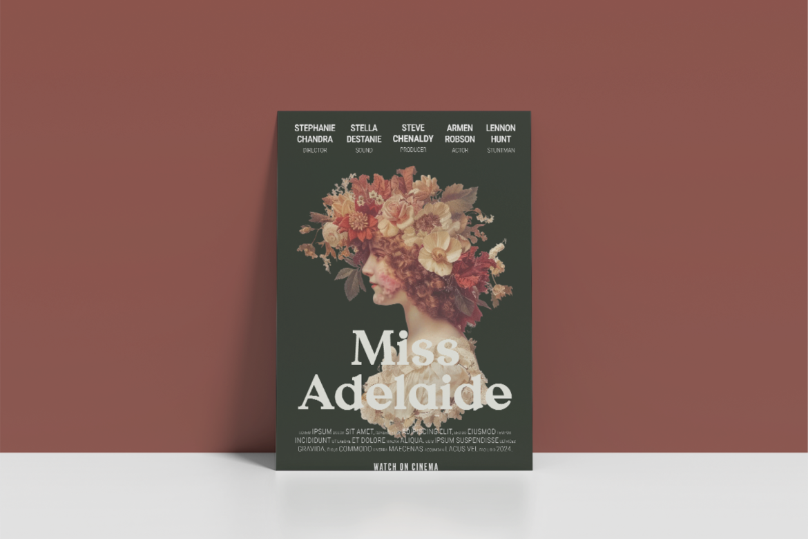
Quervia combines classic serif construction with graceful vintage charm and modern clarity. Its balanced proportions, medium stroke contrast, sharp terminals, and carefully sculpted details produce a polished silhouette while maintaining readability. The result communicates prestige and trust, making it highly suitable for brands that need timeless elegance without appearing traditional or conservative.
PROS: Refined structure, strong readability, premium personality, and versatile editorial character.
BEST FOR: Perfume, jewelry, skincare, weddings, hotels, cafés, floral brands, and luxury packaging.
3. Twisly Twisted Serif Font
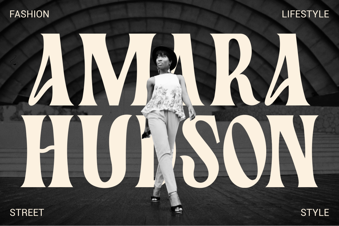
Twisly is a modern display serif with high stroke contrast, tall condensed proportions, curved distortions, and unconventional twisted terminals. Its experimental details create a memorable artistic rhythm while the underlying serif structure preserves elegance and visual authority. This balance makes it a strong choice for brands that want to appear sophisticated, fashionable, and creatively confident.
PROS: Experimental letterforms, strong editorial impact, elegant contrast, and distinctive brand recognition.
BEST FOR: Fashion, beauty, magazines, creative studios, posters, book covers, and premium campaigns.
4. Elmonta Rustic Classic Serif Font
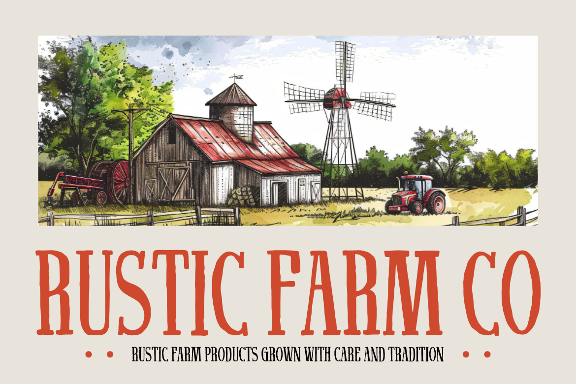
Elmonta combines tall proportions, narrow spacing, vintage serif details, and softened curves to create a warm handcrafted identity. Its classic editorial atmosphere is supported by a clean modern structure, helping rustic and heritage-inspired brands feel authentic without becoming visually outdated. The condensed silhouette also performs well in packaging titles, signs, and logo compositions where space is limited.
PROS: Rustic warmth, space-efficient proportions, handcrafted character, and strong heritage appeal.
BEST FOR: Farm products, coffee, organic food, restaurants, handmade goods, rural tourism, and traditional packaging.
5. Velisse Feminine Serif Font
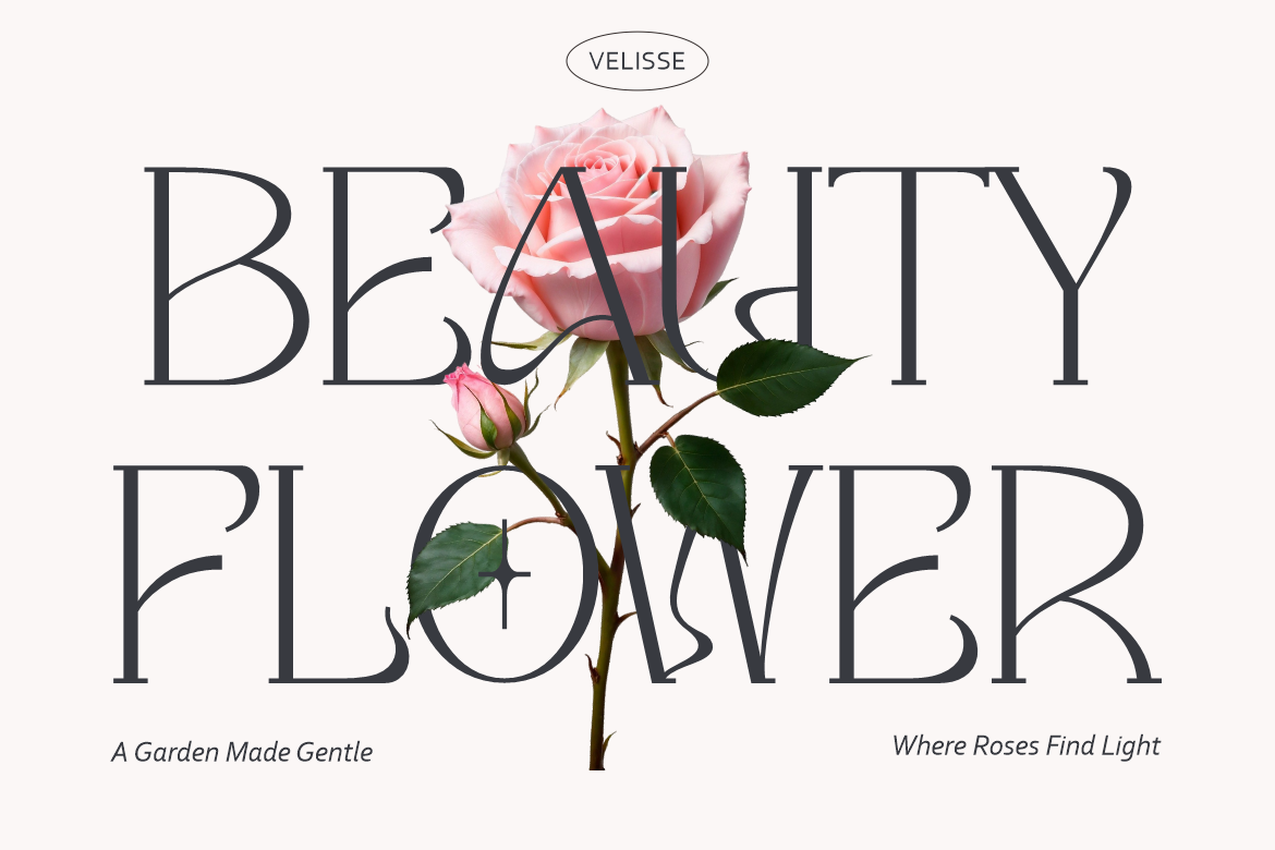
Velisse is designed around elegance, softness, and contemporary femininity. Its graceful serif forms create a refined identity suited to beauty and lifestyle markets, while its balanced structure keeps branding professional rather than overly ornamental. The font can give packaging, logos, and campaign headlines a premium emotional quality that feels gentle, polished, and modern.
PROS: Graceful silhouette, feminine refinement, premium atmosphere, and versatile brand appeal.
BEST FOR: Skincare, beauty, wellness, fashion, florists, candles, boutiques, and lifestyle packaging.
Comparison
| Font | Visual Personality | Strongest Application | Ideal Brand Direction |
|---|---|---|---|
| Mythor | Calm and contemporary | Corporate logos and editorial titles | Modern professionalism |
| Quervia | Refined and timeless | Luxury branding and packaging | Prestige and trust |
| Twisly | Experimental and fashionable | Campaign headlines and magazines | Creative sophistication |
| Elmonta | Rustic and classic | Heritage logos and product labels | Warm authenticity |
| Velisse | Soft and feminine | Beauty logos and lifestyle packaging | Elegant approachability |
Common Mistakes When Using Modern Serif Fonts
The first mistake is assuming that every serif automatically looks elegant. Some typefaces may communicate authority, tradition, playfulness, rustic craftsmanship, or editorial experimentation instead. A font should be evaluated according to the actual brand personality, audience, and product category. A highly feminine serif may not suit an industrial technology company, while a rustic typeface may weaken the precision expected from a clinical skincare brand.
Another mistake is using delicate display serifs at sizes where their details cannot survive. Thin strokes may disappear in foil stamping, small packaging labels, embroidered products, low-resolution images, or mobile navigation. Always test the typeface in the real production method and at the final size. Create simplified logo versions when necessary, and use a more readable companion font for ingredients, instructions, prices, legal text, and long paragraphs.
The final mistake is over-customizing the wordmark. Alternate glyphs, unusual ligatures, extended terminals, and decorative cuts can create originality, but too many modifications make the brand name harder to recognize. Begin with the standard characters, correct the spacing, and introduce only the details that improve balance or distinction. Strong typography usually comes from careful restraint rather than maximum decoration.
Conclusion
The most effective modern serif fonts combine traditional typographic authority with contemporary clarity, balance, and personality. They can make a logo feel trustworthy, give packaging a premium presence, and bring editorial sophistication to websites, magazines, and promotional campaigns.
Choose the style according to the brand’s intended voice. Mythor supports calm modern professionalism, Quervia communicates timeless refinement, Twisly offers experimental sophistication, Elmonta creates rustic authenticity, and Velisse introduces graceful femininity.
Test the actual brand name, pair expressive serifs with functional supporting typography, and evaluate every design at realistic sizes. With thoughtful selection and restrained implementation, modern serif typography can give a brand an identity that feels elegant, memorable, and relevant for years rather than one passing design season.
Explore these fonts and many more at PutraCetol.com to build a business identity that looks professional, trustworthy, and memorable.
Additionally, if you want to explore some free typography options, you can check out Putracetol Studio on Dafont. Happy reading and designing!