
Cropped Layout Discipline & Safe Zone 2026: Designing for Flexible Media
Separate Bleed, Trim, and Safe Content
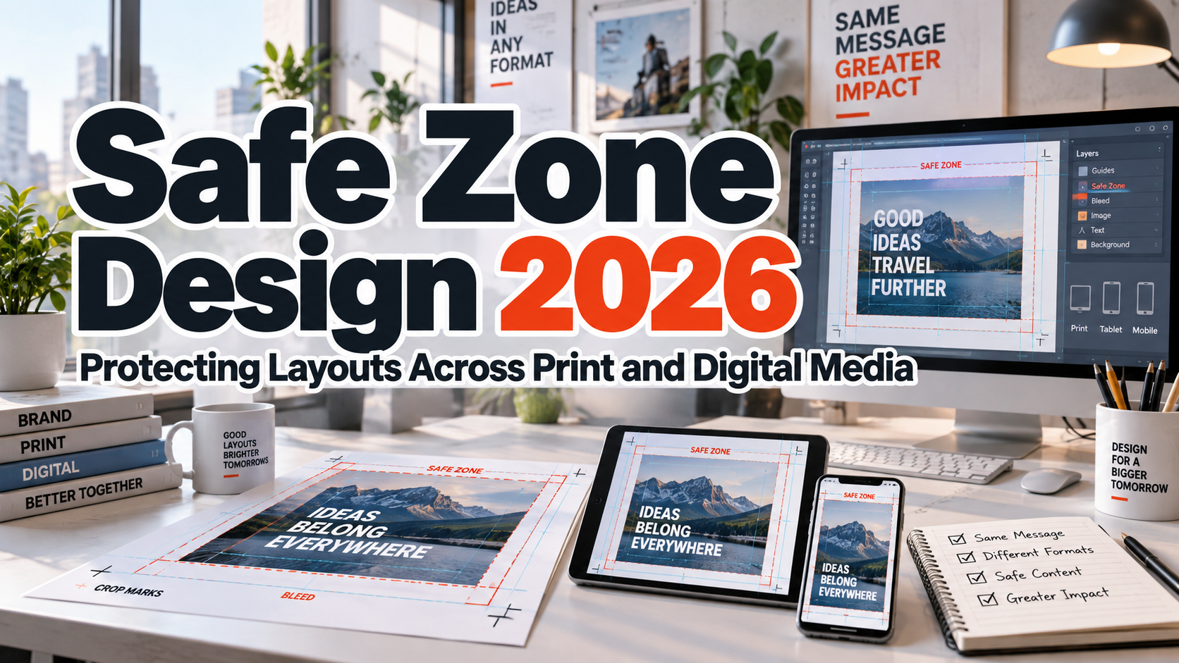
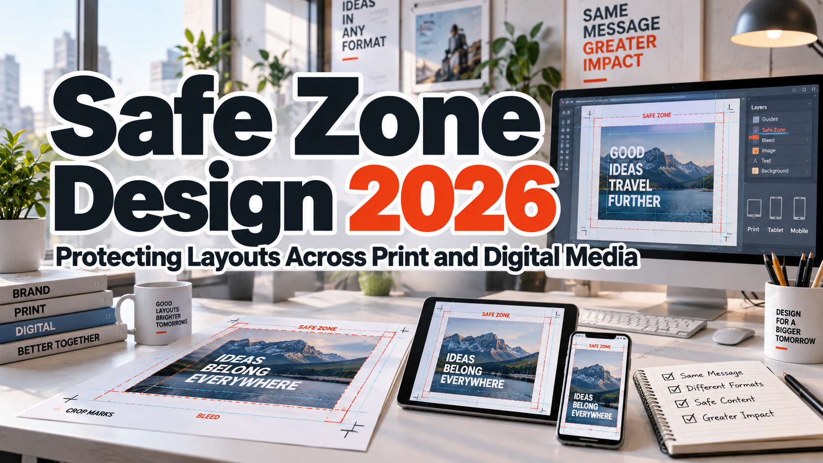
The first rule of cropped layout discipline & safe zone 2026 is to stop treating every boundary as the same thing. In print, bleed extends artwork beyond the finished edge, the trim line marks the final cut, and the safe zone keeps essential text and logos away from areas where trimming variation could cause problems.
Adobe’s current InDesign guidance describes 0.125 inch or 3 mm as a common bleed value, while noting that print providers may require more. Always confirm the printer’s specifications instead of applying one universal number.
Digital layouts face similar risks from responsive containers, aspect ratios, previews, and interface overlays.
Build a Three-Zone Layout System
1. Expansion Zone
This is the area allowed to extend beyond the final visible frame. In print, backgrounds, photographs, and full-bleed color should continue through the bleed so trimming shifts do not expose white edges.
In 2026, Illustrator can use Generative Expand to extend artwork into the print bleed area, but generated edges still need inspection. For digital design, keep extra visual coverage around the subject so multiple crops remain usable.
2. Safe Content Zone
Logos, names, calls to action, prices, dates, and critical typography belong inside the safe zone. The exact margin depends on the medium, printer, platform, and format.
For a campaign that must work across several aspect ratios, overlay those frames during design and identify the region shared by all formats. Keep essential information inside that common area.
3. Flexible Visual Zone
Secondary photography, textures, gradients, patterns, and decorative shapes can sit closer to the edges. These elements may be partially cropped without damaging the message.
Protect Typography More Than Backgrounds
Typography is less tolerant of cropping than photography. Cutting part of a background can feel intentional; cutting half a URL, product name, or headline usually looks like an error.
Keep text away from trim edges and interface overlays, especially swashes and wide display letters. Expressive PutraCetol Studio fonts need enough breathing room to keep their silhouettes recognizable.
Design a System, Not One Perfect Canvas
A campaign may become a poster, banner, website hero, social post, presentation slide, package, or video thumbnail. Define which elements are fixed and which can adapt.
The logo may stay fixed, the headline may reflow, photography may crop, decorative shapes may move, and secondary copy may disappear on smaller formats. This is more reliable than shrinking the master artwork proportionally.
Use Cropping Intentionally
Safe-zone discipline does not mean every element must sit in the center. Cropping can create scale, movement, and editorial energy.
A portrait can extend beyond the frame. Oversized lettering may be cropped when enough remains recognizable. Patterns and textures can continue beyond the trim. The principle is simple: decorative information can be flexible; essential information should remain protected.
Proof the Real Output
Preview bleed and trim conditions before print export. For digital work, test mobile and desktop widths, social previews, thumbnails, overlays, and alternate aspect ratios. A safe zone matters only when the final output respects it. Adobe’s current print workflow supports crop marks and document bleed settings when preparing output for commercial printing.
Comparison
| Weak Cropping Workflow | Disciplined Safe-Zone Workflow |
|---|---|
| One layout scaled everywhere | Layout adapts by format |
| Bleed treated as a margin | Bleed and safe area have different jobs |
| Logo placed near edges | Critical identity remains protected |
| Text follows image crop | Text has independent safe positioning |
| Everything treated equally | Fixed and flexible elements are separated |
| Only editor view is checked | Real outputs are proofed |
Common Mistakes
The first mistake is confusing bleed with the safe zone. Bleed sits outside the final trim so backgrounds can continue beyond the cut. The safe zone sits inside the finished design and protects important information. Moving a logo toward the bleed does not make it safer.
Another mistake is using one fixed safe-zone number for every medium. Printers, packaging templates, social platforms, responsive websites, and video interfaces have different constraints. Build safe areas from actual production specifications and test realistic crops instead of relying on a generic template.
The final mistake is protecting everything equally. If every shape and photograph is pushed toward the center, the composition becomes static. Protect critical typography and brand elements, but allow secondary imagery and decoration to interact with the edge. Good cropping discipline creates freedom because the designer knows what may move and what must stay.
Conclusion
Cropped layout discipline & safe zone 2026 is about designing for uncertainty without losing control. Print can shift during trimming, digital platforms can reframe content, and one campaign may appear across many aspect ratios.
Separate bleed, trim, safe content, and flexible visual areas. Protect typography and brand-critical information, allow nonessential imagery to crop intentionally, and proof real outputs instead of trusting one master canvas.
Combined with distinctive PutraCetol Studio typography, this approach helps create branding systems that remain expressive, readable, and professional across print and digital media.
Explore these fonts and many more at PutraCetol.com to build a business identity that looks professional, trustworthy, and memorable.
Additionally, if you want to explore some free typography options, you can check out Putracetol Studio on Dafont. Happy reading and designing!