
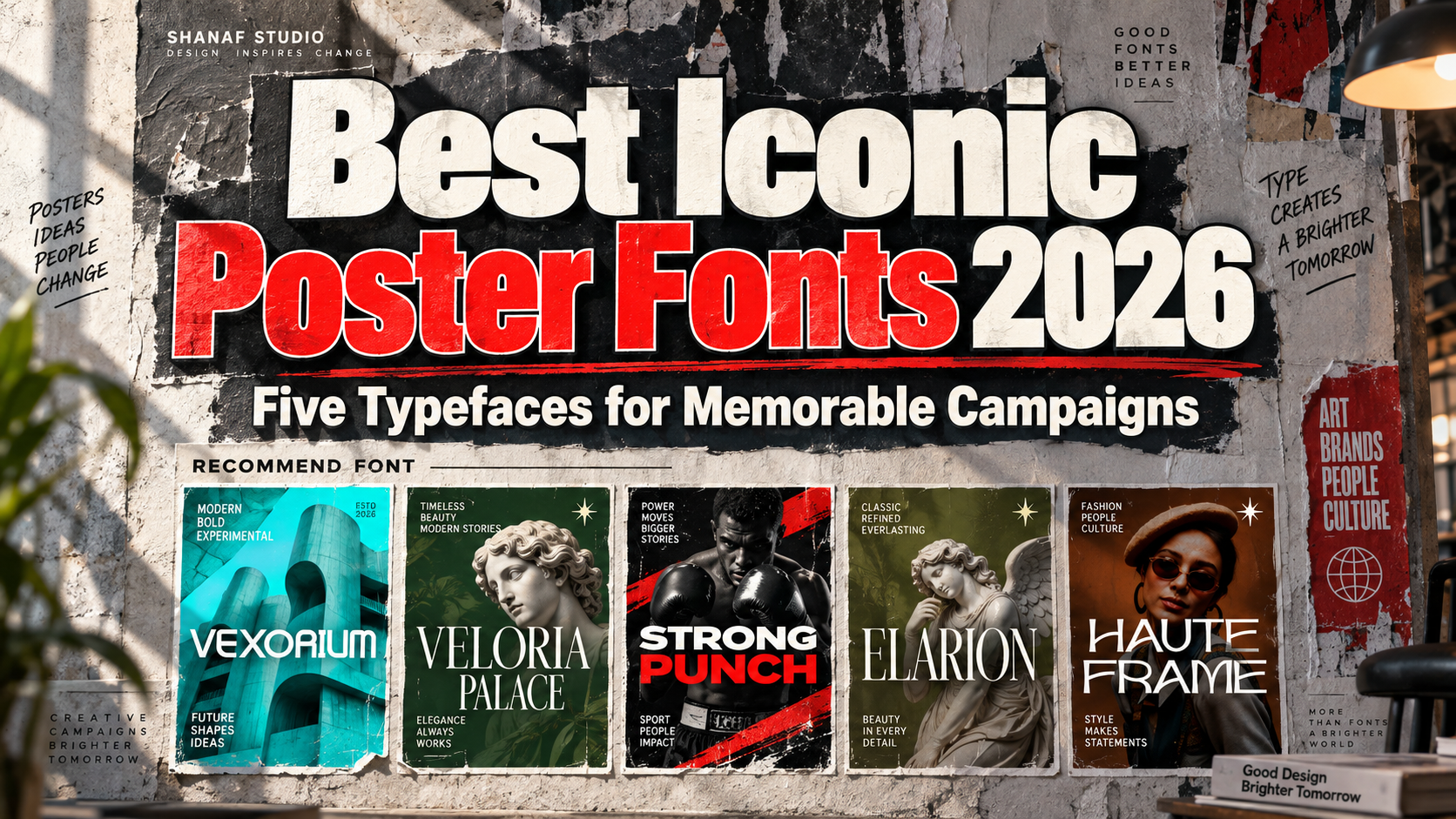
Best Iconic Poster Fonts 2026: Give Your Campaign a Recognizable Voice
Define the Message Before Choosing the Font
Choosing the best iconic poster fonts for 2026 starts with one question: what should the audience understand and remember?
A sports campaign may need forceful lettering, while a cultural exhibition could benefit from quieter editorial typography. Decide the emotional direction before comparing specimens.
These are contemporary recommendations for creating memorable posters, not claims that the fonts appeared in historical advertisements. Treat “iconic” as a creative ambition rather than a guaranteed outcome.
Use the display font for the main title and a readable companion for dates, venues, prices, and booking information.
What to Test in a Poster Typeface
Set the actual headline, including its longest word and punctuation. Start in monochrome and compare a full-size print with a small mobile preview.
Check whether letter spacing remains balanced and whether fine details survive reduction. Ask someone unfamiliar with the brief to identify the message and next action. Shorten the copy or adjust the hierarchy before reaching for more effects.
Jump to Recommended Fonts
1. Vexorium Modern Experimental Font
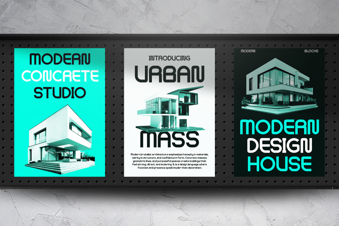
Vexorium combines tall proportions, rounded corners, consistent strokes, and architectural geometry with unconventional character details. Its experimental structure offers a distinctive direction for posters about innovation without relying on distressed textures. For a design conference, try a large Vexorium title beside one geometric illustration, with the event schedule arranged in a restrained supporting typeface.
PROS: Architectural character, rounded geometry, distinctive letter construction.
BEST FOR: Technology launches, design festivals, architecture exhibitions, and creative campaigns.
2. Veloria Palace Classic Serif Font
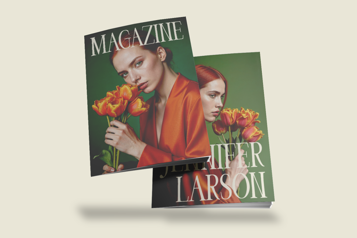
Veloria Palace uses tall, condensed letterforms, pronounced stroke contrast, and graceful curves. Its narrow proportions offer an elegant starting point when a poster needs a substantial title without excessive horizontal width. For a boutique exhibition, test a stacked headline against a quiet background and let the serif details provide decoration instead of adding elaborate borders.
PROS: Condensed silhouette, graceful contrast, classic editorial character.
BEST FOR: Cultural events, beauty campaigns, boutique promotions, and premium launches.
3. Strong Punch Sport Font

Strong Punch combines heavy, wide letters with sharp cuts and angled details that suggest forward movement. Its substantial construction gives short titles an assertive athletic personality. For a boxing poster, try a compact phrase such as “OWN THE RING” beside tightly cropped photography, keeping names, dates, and ticket information in a simpler supporting font.
PROS: Heavy weight, broad proportions, energetic angular detailing.
BEST FOR: Boxing events, fitness launches, sports advertising, and action campaigns.
4. Elarion Elegant Serif Font
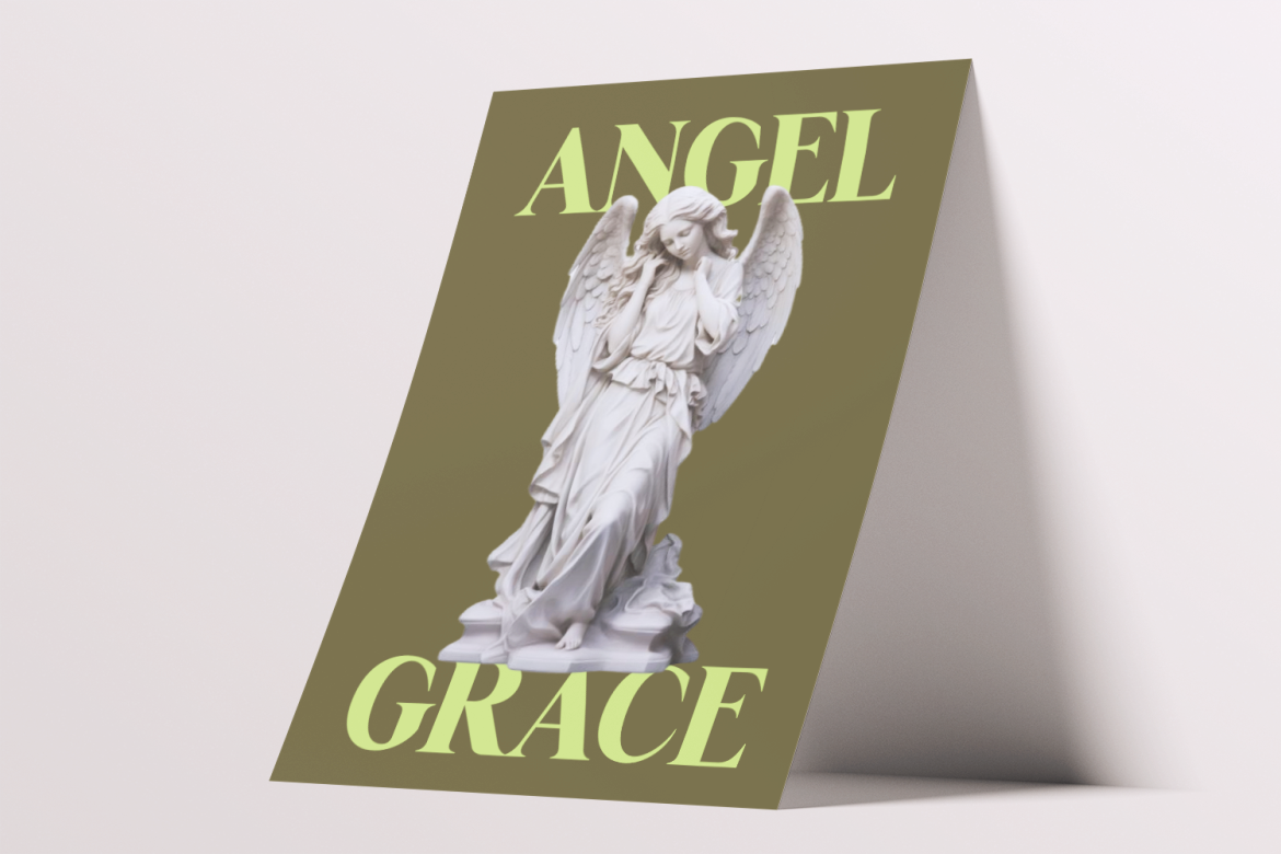
Elarion pairs tall serif letterforms with refined contrast, graceful curves, and soft terminals. Its balanced structure suggests a calmer editorial approach than an aggressive sports display. For a literary festival, consider a spacious composition with one illustrated object and a prominent title, using typography to create atmosphere without overwhelming the story.
PROS: Refined serif structure, soft terminals, composed visual rhythm.
BEST FOR: Literary festivals, gallery posters, premium products, and cultural branding.
5. Haute Frame Fashion Font
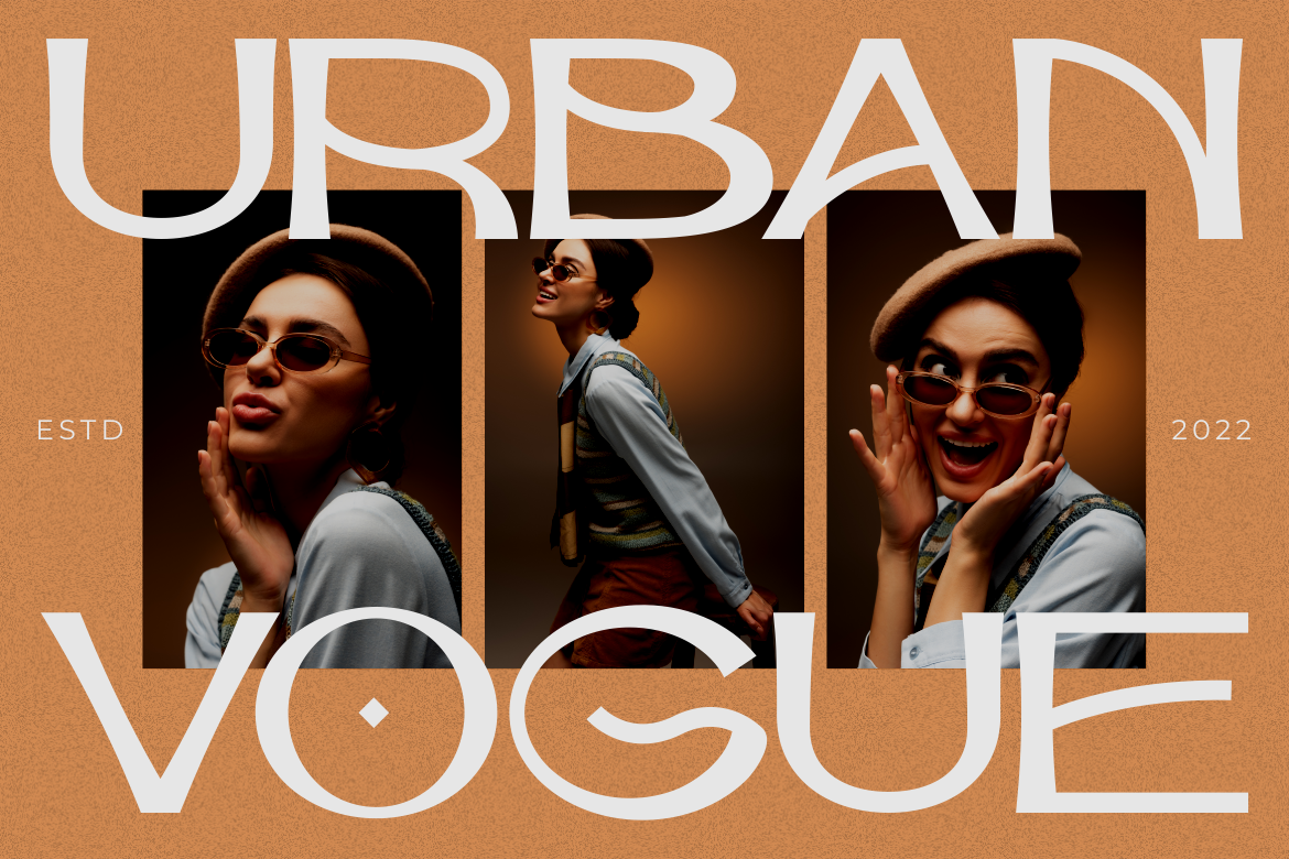
Haute Frame combines tall geometric forms, slim-to-medium strokes, soft curves, and elongated terminals. Its editorial personality provides a fashion-oriented alternative to heavier display lettering. For a fragrance launch, try a short campaign title above a carefully cropped product photograph, with generous space around the distinctive letter endings.
PROS: Elegant geometry, elongated details, light editorial character.
BEST FOR: Fashion posters, jewelry campaigns, cosmetics, and lifestyle advertising.
Comparison
| Font | Suggested Visual Direction | First Poster Concept to Test |
|---|---|---|
| Vexorium | Experimental and architectural | Design conference |
| Veloria Palace | Classic and condensed | Boutique exhibition |
| Strong Punch | Athletic and forceful | Boxing event |
| Elarion | Refined and literary | Cultural festival |
| Haute Frame | Fashion-led and spacious | Fragrance launch |
Common Mistakes
The first mistake is expecting typography alone to create an iconic campaign. Establish one clear idea, a relevant image, and a recognizable brand signature. Avoid reproducing a famous poster’s composition too closely; translate its communication principles into an original concept.
Another mistake is styling every information layer equally. Keep the main headline expressive, but make practical details easy to locate. Test posters at viewing distance, review digital crops, and check that ornamental strokes do not collide with photography or disappear against textured backgrounds.
The final mistake is ignoring commercial scope. PutraCetol’s Custom License distinguishes printed production, digital advertising, webfont embedding, and other uses. Match coverage to the complete campaign rather than assuming permission for a printed poster automatically covers every digital extension.
Conclusion
The best iconic poster fonts 2026 should help you connect visual personality with a clear advertising idea. Choose the tone that matches your audience, then refine spacing, imagery, hierarchy, and supporting information.
Explore these five PutraCetol Studio fonts using your actual campaign headline. Aim for a poster people can understand immediately and recognize again, not simply one that looks impressive in a mockup.
Explore these fonts and many more at PutraCetol.com to build a business identity that looks professional, trustworthy, and memorable.
Additionally, if you want to explore some free typography options, you can check out Putracetol Studio on Dafont. Happy reading and designing!