
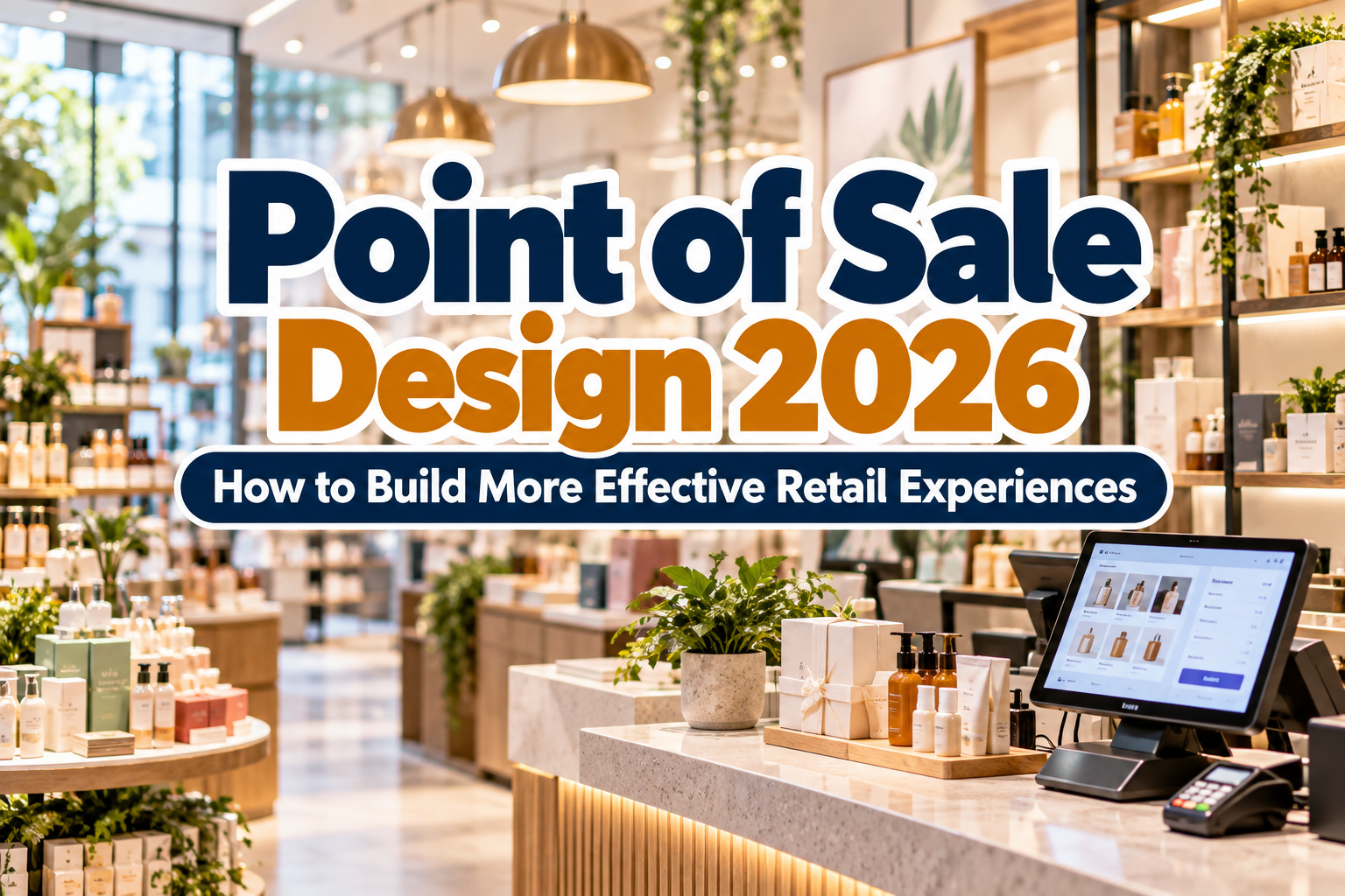
Point of Sale Design Inspiration 2026: Creative Retail Ideas That Get Attention
The point of sale is one of the most valuable visual spaces in retail.
It is where customers make final decisions, discover add-on products, notice limited promotions, and interact directly with the brand before purchasing. That makes good POS design more than decoration. It is a combination of visual merchandising, branding, communication, and customer psychology.
The strongest point of sale design inspiration 2026 focuses on clarity, experience, and brand consistency. Retail environments are becoming more visually competitive, so POS materials need to communicate quickly without overwhelming customers.
From countertop displays to digital screens and temporary pop-up installations, effective POS design should guide attention toward the product and make the next action obvious.
Initial Suggestion: Start With One Clear Objective
Before choosing colors or display materials, define what the POS needs to accomplish.
Is it introducing a new product? Increasing impulse purchases? Promoting a bundle? Encouraging customers to scan a QR code? Supporting a seasonal campaign?
Trying to communicate everything at once usually weakens the display.
A skincare brand launching a new serum, for example, could structure its POS around one main message such as “Hydration for Everyday Skin”, supported by the product, one benefit statement, and a clear price or call to action.
When the goal is clear, typography, color, layout, and physical structure become easier to control.
Use Product-First Display Design
The product should remain the visual hero.
A common mistake in retail design is allowing decorative graphics to become more dominant than the item being sold. Instead, use the display structure to frame the product and direct attention toward it.
Elevated platforms, stepped displays, recessed shelves, transparent holders, and product grouping can create hierarchy without adding unnecessary visual clutter.
For smaller products such as cosmetics, snacks, accessories, or stationery, repeating several identical units can create visual impact. Larger products may work better with one hero item accompanied by supporting information.
The display should help customers understand what matters within a few seconds.
Build Strong Signage Hierarchy
POS signage often has very little time to communicate.
Create a clear hierarchy:
Headline → benefit → product → price or action
The headline needs to work from the greatest viewing distance. Secondary text can provide information once shoppers move closer.
Avoid placing long paragraphs on countertop displays or promotional stands. Retail typography needs to be scanned rather than studied.
Font choice strongly influences this hierarchy. Bold display typography can help promotional messages stand out, while cleaner supporting fonts keep prices, product details, and instructions readable.
Brands looking for distinctive display typography can explore PutraCetol Studio for bold, retro, serif, script, food, experimental, and branding-oriented fonts that can give POS campaigns a stronger personality.
Use Color Strategically, Not Randomly
Strong color can stop shoppers, but excessive color can make a display difficult to understand.
A practical strategy is to let the brand palette establish the foundation, then introduce one campaign accent color.
For example, a premium coffee brand with brown and cream packaging might use those colors across its permanent retail display while introducing bright orange for a seasonal promotion.
Color can also create hierarchy.
A bright promotional panel behind a neutral product immediately draws attention toward the offer. However, prices, disclaimers, and important instructions still need sufficient contrast.
The objective is not maximum brightness. It is controlled attention.
Create Modular POS Displays
One useful direction for POS design in 2026 is modularity.
Retail campaigns change constantly, while rebuilding entire displays for every promotion is expensive. Modular systems allow brands to reuse the same base structure while changing panels, headers, graphics, shelves, and product arrangements.
A modular cosmetics display, for example, could maintain the same frame throughout the year but swap seasonal graphics for Valentine’s Day, summer, or holiday campaigns.
This reduces production waste and helps maintain consistency across multiple store locations.
It also benefits visual merchandisers because the same design system can adapt to different shelf sizes and retail environments.
Combine Physical and Digital Experiences
Point-of-sale design no longer needs to end with printed signage.
QR codes can connect physical shoppers with product demonstrations, reviews, tutorials, loyalty programs, extended product information, or mobile checkout.
A furniture retailer might place a QR code beside a chair that allows customers to view additional colors. A beauty brand could connect packaging displays to application tutorials. An exhibition booth could use QR codes to collect leads instead of relying only on printed brochures.
Digital integration should remain optional and useful.
Do not require customers to scan a code simply to discover basic information such as price or product name. The physical POS should still communicate the essentials by itself.
Experiment With Material and Texture
Material choice can make a POS display feel immediately connected to the product.
A sustainable brand might use recycled cardboard, raw wood, or minimal ink coverage. A luxury perfume company may prefer polished metal, acrylic, mirrored surfaces, or textured paper.
Food brands can use illustrated cardboard displays with bold typography, while technology companies may benefit from clean surfaces, geometric construction, and controlled lighting.
Texture adds a physical dimension that digital advertising cannot reproduce.
The best materials should also consider practicality. A beautiful display still needs to survive transportation, frequent customer interaction, cleaning, and weeks of retail use.
Design for Social Sharing
Retail displays increasingly have a second audience: smartphones.
A visually memorable POS installation can become social content when customers photograph it and share it online.
This does not mean every store needs an oversized “Instagram wall.” Instead, consider whether the display contains one recognizable visual moment: unusual typography, dimensional lettering, strong color blocking, creative product stacking, or a memorable branded object.
Pop-up stores and exhibitions are particularly suitable for this approach because the POS can function as both a selling environment and a content-generation space.
Comparison: Different POS Design Approaches
| POS Style | Main Strength | Best Use |
|---|---|---|
| Minimal display | Product clarity | Premium retail |
| Bold promotional signage | Immediate attention | Sales and launches |
| Modular system | Reusability | Multi-location retail |
| Interactive digital POS | Product education | Technology and beauty |
| Sustainable display | Brand values | Eco-conscious products |
| Experiential display | Memorability | Pop-ups and events |
The best approach depends on the product, retail environment, customer journey, and campaign objective.
Common Mistakes in Point of Sale Design
One common mistake is overcrowding the POS with too many products, colors, prices, logos, and promotional messages. When everything demands attention, customers do not know where to look. Create a clear focal point and remove elements that do not support the main selling message.
Another mistake is designing the display only on a computer screen. A POS needs to work at real scale, under actual retail lighting, surrounded by competing products. Print test pieces, inspect them from multiple distances, and consider where customers will stand or walk. Typography that looks large in a design file can appear surprisingly small in a busy store.
Finally, do not separate POS design from the wider brand system. Different fonts, colors, photography styles, or messaging can make a campaign feel disconnected from packaging, advertising, and the website. Consistency helps customers recognize the brand faster and makes even temporary promotions feel intentional.
Conclusion
The best point of sale design inspiration 2026 combines clear communication with memorable visual identity.
Product-first displays, strong signage hierarchy, modular structures, digital interaction, thoughtful materials, and consistent typography can transform POS from a simple promotional surface into a strategic part of the retail experience.
The goal is not to make every display louder. It is to make the message easier to notice, understand, and remember.
For brands developing stronger retail identities, distinctive typography from PutraCetol Studio can help create POS signage, promotional graphics, packaging, and campaign materials that feel recognizable across every customer touchpoint.
Explore these fonts and many more at PutraCetol.com to build a business identity that looks professional, trustworthy, and memorable.
Additionally, if you want to explore some free typography options, you can check out Putracetol Studio on Dafont. Happy reading and designing!