
Define What “Playful” Means for the Project
The best playful fonts for book covers and branding are not simply colorful or irregular. They communicate a specific kind of fun that matches the audience, story, product, and emotional purpose of the design.
A picture book for preschool children may need soft, rounded letters that feel safe and welcoming. An activity book can use chunkier block typography to communicate movement and participation. A snack brand may benefit from wide, heavy lettering, while a creative fashion label could use quirky geometric forms that feel playful without looking childish.
Before selecting a font, define three qualities the project should express:
- Cheerful, soft, and friendly
- Bold, energetic, and adventurous
- Creative, handmade, and imaginative
- Quirky, rebellious, and youthful
- Warm, delicious, and comforting
- Retro, colorful, and expressive
This gives the font a strategic role. It also prevents the design from becoming a collection of random cartoon elements, bright colors, and decorative letters.
A useful typographic system normally contains:
- One playful display font for the title, logo, product name, or campaign headline
- One functional companion font for subtitles, descriptions, instructions, and longer text
- One optional accent treatment such as a decorative version, outline, alternate glyph, or contrasting color
The display font brings personality. The supporting typeface keeps the design clear and professional.
What Are Playful Fonts?
Playful fonts are typefaces designed to express joy, spontaneity, warmth, curiosity, or visual humor. They often use forms that feel less formal than conventional corporate typography.
Common characteristics include:
- Rounded corners
- Thick or inflated strokes
- Bouncing baselines
- Irregular proportions
- Soft geometric construction
- Hand-drawn details
- Decorative cuts
- Cartoon-like shapes
- Unexpected alternates
- Monoline strokes
- Friendly counters
- Exaggerated terminals
Playfulness does not mean careless drawing. A strong playful font still needs controlled spacing, recognizable characters, balanced proportions, and a clear internal rhythm.
The irregularity should look intentional.
A poorly spaced font can make a project look amateurish. A well-built quirky font can appear expressive, distinctive, and professionally designed even when its letters are intentionally unusual.
Why Playful Fonts Work So Well on Book Covers
They Establish the Mood Before the Story Begins
A book cover introduces the emotional world of a story before the reader opens the first page.
Rounded letters may suggest warmth and humor. Block-shaped typography can communicate construction, games, or active learning. A monoline font may feel handmade and personal, while geometric characters can introduce a more modern and experimental personality.
The font helps answer several immediate questions:
- Is this book funny or serious?
- Is it intended for young children or older readers?
- Does it focus on food, adventure, friendship, creativity, or learning?
- Is the story gentle, energetic, strange, or rebellious?
Typography should support the illustration and title rather than compete with them.
They Make Short Titles More Memorable
Children’s and creative book titles are often relatively short, giving the typeface enough room to become one of the main visual elements.
Titles such as:
- The Little Builder
- Noodle Day
- Our Wild Garden
- The Loudest Lunch
- Flumbo’s Big Idea
- Play All Day
can become recognizable visual shapes when set in the right display font.
A distinctive title silhouette can also help the book remain identifiable when viewed as a small ecommerce thumbnail.
They Can Become Part of the Illustration
Playful typography does not always need to sit above or below the artwork.
The letters can:
- Wrap around a character
- Sit inside clouds
- Form part of a building
- Resemble blocks or toys
- Follow a winding path
- Interact with food illustrations
- Include flowers, stars, or geometric forms
- Appear to bounce across the cover
The title then feels connected to the story instead of being added after the illustration is finished.
Playful Fonts Are Not Only for Children
Playful typography is naturally effective in children’s publishing, but it can also support many adult-facing or family-oriented businesses.
Suitable categories include:
- Snack and beverage brands
- Cafés and bakeries
- Craft companies
- Creative studios
- Casual restaurants
- Lifestyle products
- Fashion accessories
- Festivals
- Greeting cards
- Social media campaigns
- Family entertainment
- Educational technology
The surrounding design determines whether the font feels childish, retro, artistic, fashionable, or contemporary.
For example, a chunky rounded typeface paired with primary colors and cartoon illustrations may feel appropriate for a toy company. The same font in black and cream, combined with editorial photography and generous space, can feel modern and fashion-led.
Major Styles of Playful Typography
Rounded and Chunky Fonts
Rounded display fonts use thick strokes, soft corners, broad counters, and substantial silhouettes.
They communicate:
- Friendliness
- Confidence
- Sweetness
- Comfort
- Energy
- Approachability
This style is especially effective for children’s books, food packaging, toy brands, family services, and social media covers.
Because the letters contain considerable visual weight, they normally work best in short titles.
Block-Based Playful Fonts
Block typography can reference toys, building games, educational materials, and physical play.
Its forms may be compact, sturdy, geometric, or slightly uneven. These characteristics create a sense of stability while preserving an energetic personality.
Block fonts work well for:
- Activity books
- Educational products
- Toy stores
- Learning centers
- Children’s apps
- Construction-themed stories
- Craft kits
Use bright color blocks, simple illustrations, and controlled spacing to reinforce the visual concept.
Monoline Playful Fonts
Monoline fonts use strokes with relatively consistent thickness.
Their smooth curves can feel handwritten, relaxed, friendly, and contemporary. They are particularly useful when a brand needs warmth without the heavy mass of a bubble or chunky display font.
This direction works for:
- Food and restaurant branding
- Activity books
- Casual lifestyle products
- Friendly logos
- Menus
- Stickers
- Craft projects
A monoline display font can also pair naturally with simple illustrations because neither element needs to dominate the entire layout.
Quirky Slab Fonts
Slab fonts use strong serifs and substantial letter structures. When their forms contain cuts, uneven edges, unusual proportions, or expressive details, they can feel playful and powerful at the same time.
This direction works well for:
- Comic-style covers
- Youth campaigns
- Posters
- Adventure books
- Merchandise
- Bold packaging
- Creative editorial design
A quirky slab font is often more energetic than a soft rounded sans serif, making it useful when the project should feel humorous, rebellious, or loud.
Geometric Quirky Fonts
Geometric playful fonts may combine circles, triangles, rounded forms, angular shapes, or decorative symbols.
They can create a modern and highly recognizable visual language for:
- Creative brands
- Fashion accessories
- Children’s products
- Art events
- Educational campaigns
- Stickers
- Editorial covers
The geometry should remain consistent enough for the words to be readable. Randomly changing every letter rarely produces a strong identity.
Multi-Style Playful Families
Some playful font families include coordinated clean, decorative, block, outline, or filled versions.
These families are valuable because they allow designers to create variation without introducing unrelated typefaces.
A clean version can handle the primary wordmark. A decorative style can appear on a special book cover, while a filled or block version can support stickers, posters, or packaging.
The project gains flexibility while preserving one recognizable typographic voice.
Choosing a Playful Font by Age Group
Preschool and Early Childhood
For very young readers, prioritize:
- Large forms
- Open counters
- Strong letter distinction
- Rounded edges
- Simple silhouettes
- Generous spacing
Avoid excessive texture or complicated decorative details in small titles.
The cover can still feel imaginative, but important words should remain easy to recognize.
Early Readers
Books for early readers can support more personality.
Use:
- Slightly irregular baselines
- Chunky display letters
- Friendly monoline forms
- Bright but controlled color
- Selected illustrations inside the typography
The title should feel exciting without becoming visually confusing.
Middle-Grade Books
Older children can respond well to more unusual typography, including quirky slab serifs, hand-cut details, retro forms, and stronger geometric experimentation.
The design can feel adventurous, humorous, mysterious, or rebellious without looking intended for preschool audiences.
Family and General Creative Brands
For brands serving both children and adults, combine playful personality with a more structured layout.
The logo can be expressive, while product information, prices, instructions, and website navigation use a simple supporting font.
This balance helps the brand appeal to children without losing the trust of parents, teachers, or buyers.
Creating a Strong Book Cover Hierarchy
A playful cover still needs a clear reading order.
1. Book Title
The title should normally receive the strongest typographic personality and visual scale.
It may use:
- Multiple lines
- Curved arrangements
- Color changes
- Decorative alternates
- Interaction with illustrations
Keep the complete title recognizable.
2. Series or Category
A series name should be visible but secondary.
For example:
THE LITTLE MAKERS SERIES
can use a compact sans serif above a larger playful title.
3. Subtitle
A subtitle provides explanation and should usually use a simpler typeface.
Do not force a long subtitle into the same expressive display font as the title.
4. Author and Illustrator Names
These names should remain clear and professionally presented.
They can use the supporting family or a quieter style from the same font system.
5. Publisher Mark
The publisher logo should remain legible without competing with the cover title.
Using Playful Fonts in Branding
Logo and Wordmark
A playful font can turn a simple name into the main brand asset.
Test the wordmark in:
- Horizontal format
- Stacked format
- One color
- Multiple colors
- Small icon size
- Packaging
- Social profile
- Signage
The standard wordmark should remain effective without relying entirely on gradients, shadows, or illustrations.
Packaging
Use the display font for:
- Brand name
- Product name
- Flavor
- Collection
- Short promotional statement
Use a functional companion for:
- Ingredients
- Age guidance
- Instructions
- Quantity
- Safety information
- Contact details
Playful packaging should attract attention without hiding what the product is.
Posters and Advertising
Posters allow the display font to become larger and more expressive.
A useful hierarchy might be:
Primary: Event or campaign title
Secondary: Short supporting message
Functional: Date, location, price, and website
The headline can be loud and playful. The practical information should remain easy to locate.
Social Media
Playful fonts work well for:
- Carousel covers
- Reel titles
- Product announcements
- Activity prompts
- Parenting content
- Educational tips
- Campaign slogans
Keep the headline short so it remains readable on a phone.
Examples include:
- LET’S MAKE SOMETHING
- BIG FUN, SMALL HANDS
- PLAY. LEARN. GROW.
- NEW SNACK DROP
- CREATE YOUR WAY
Building a Playful Color System
Soft Pastels
Use cream, lavender, pale pink, mint, butter yellow, and sky blue.
This palette suits gentle picture books, baby products, stationery, and soft lifestyle branding.
Bright Primary Colors
Use red, blue, yellow, green, and strong black or navy.
This direction works for educational products, toys, activity books, and energetic children’s branding.
Retro Playful Colors
Combine orange, mustard, burgundy, dusty pink, avocado green, and warm cream.
This creates a nostalgic but expressive identity for food, fashion, publishing, and creative campaigns.
Modern Monochrome
Use black, white, and one strong accent.
This approach can make a quirky font feel more contemporary and suitable for fashion, art, or design-led brands.
Food-Inspired Colors
Use cream, warm brown, red, orange, green, and soft yellow.
These colors pair naturally with rounded or chunky typography for restaurants, snacks, cafés, and bakery packaging.
Pairing Playful Display Fonts
Rounded Display + Humanist Sans Serif
This creates a friendly, readable system.
Best for: children’s books, family brands, toys, and educational products.
Block Display + Clean Geometric Sans Serif
The block font provides physical energy, while the geometric companion keeps information structured.
Best for: activity books, learning brands, games, and creative kits.
Monoline Display + Neutral Sans Serif
The monoline style introduces warmth without overwhelming the layout.
Best for: food, cafés, lifestyle brands, and casual publishing.
Quirky Slab + Compact Sans Serif
The slab font creates impact, while the compact sans handles event information or product details.
Best for: posters, comics, youth campaigns, and bold packaging.
Geometric Quirky Font + Simple Serif
A restrained serif can add editorial contrast to a lively geometric display font.
Best for: creative publishing, art brands, fashion, and contemporary lifestyle projects.
Keep Digital Playful Typography Accessible
Decorative fonts can become difficult to read when they are too small, low in contrast, or placed over complicated illustrations.
For digital text, WCAG 2.2 specifies a contrast ratio of at least 4.5:1 for ordinary text and 3:1 for qualifying large text. W3C also notes that unusual or thin letterforms may appear fainter in practice, so stronger contrast may be needed even when the mathematical ratio passes.
Use stronger contrast for:
- Buttons
- Prices
- Instructions
- Links
- Educational information
- Event details
- Product labels
A decorative logo can remain expressive. Functional information should never require the same effort to decode.
A Practical Font-Selection Workflow
Step 1: Define the Audience
Identify the age, interests, reading context, and buying decision-maker.
Step 2: Define the Emotional Direction
Choose three qualities such as warm, adventurous, handmade, bold, or quirky.
Step 3: Test the Real Title or Brand Name
Do not select a font only from its promotional specimen.
Type the exact words and inspect repeated letters, capitals, punctuation, and line breaks.
Step 4: Work in Black and White
Confirm that the typography has a strong silhouette before adding color or effects.
Step 5: Test the Smallest Use
Reduce the wordmark to a spine, social thumbnail, packaging label, or mobile header.
Step 6: Select a Supporting Font
Choose a companion that makes longer information comfortable to read.
Step 7: Test Real Production
Review printed proofs, cover thumbnails, packaging mockups, and screen-based applications.
Step 8: Confirm Licensing
Make sure the selected coverage matches the intended logo, book cover, publishing, packaging, merchandise, advertising, webfont, or editable-template use.
Jump to Recommended Fonts
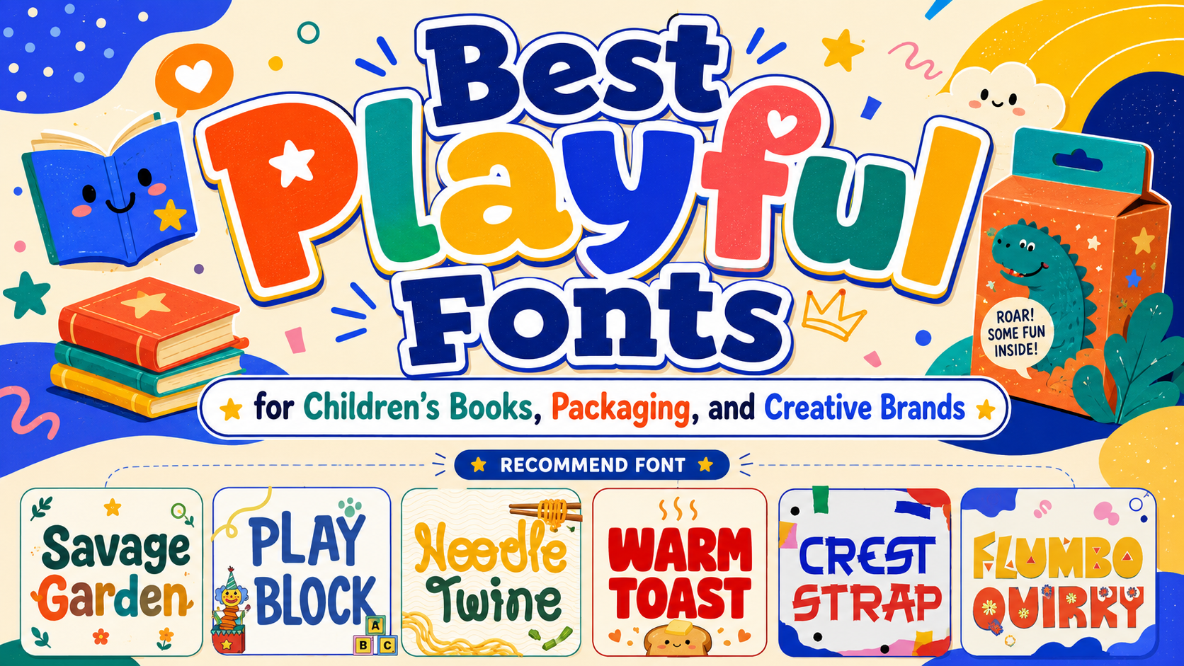
Savage Garden – 3 Quirky Playful Font | Play Block Playful Display Font | Noodle Twine Playful Monoline Font | Warm Toast Playful Fat Sans | Crest Strap Playful Font | Flumbo Quirky Playful Font
1. Savage Garden – 3 Quirky Playful Font

Savage Garden is a coordinated trio with clean or regular, decorative, and block or filled versions. Its intentionally irregular letterforms create a whimsical visual rhythm, while the related styles allow a designer to move between logos, book titles, invitations, posters, and decorative graphics without changing the core personality. This flexibility makes it especially useful for complete children’s publishing systems in which the cover, chapter pages, promotional materials, and merchandise need related but varied typography.
PROS: Three coordinated styles, whimsical irregularity, flexible visual hierarchy, strong child-friendly character, and broad publishing use.
BEST FOR: Children’s books, baby products, birthday graphics, educational posters, greeting cards, invitations, playful logos, and family-oriented branding.
2. Play Block Playful Display Font

Play Block uses thick, compact letterforms with rounded edges, soft corners, and slightly uneven curves. Its consistent weight creates strong visibility at display sizes, while its friendly geometry communicates fun without making the words appear unstable or difficult to recognize. The typeface is particularly effective for titles that need the physical energy of toy blocks, games, learning activities, or hands-on creativity.
PROS: Bold rounded construction, compact silhouette, strong display clarity, friendly geometric rhythm, and useful OpenType options.
BEST FOR: Toy branding, activity books, educational products, nursery services, children’s centers, game packaging, book covers, stickers, and craft projects.
3. Noodle Twine Playful Monoline Font

Noodle Twine is built from smooth, rounded letterforms with consistent single-weight strokes. Its moderately short ascenders and descenders keep words compact and tidy, while the flowing curves give titles a natural, hand-drawn warmth without introducing excessive visual noise. Although it has a strong connection to casual food branding, its approachable monoline structure also works well for friendly books, menus, stickers, and lifestyle identities.
PROS: Clean monoline rhythm, rounded forms, compact word shapes, relaxed personality, and clear display readability.
BEST FOR: Food-themed books, noodle shops, cafés, casual dining, packaging, children’s cooking projects, menus, greeting cards, stickers, and friendly logos.
4. Warm Toast Playful Fat Sans
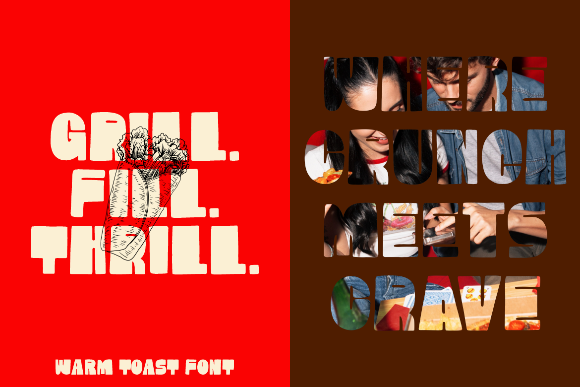
Warm Toast uses heavy, rounded strokes, compact character heights, broad structures, and tight curves to create a full and confident word shape. Its small quirks add personality without undermining clarity, making the typeface useful when a project needs friendly visual weight rather than delicate or highly irregular lettering. The chunky construction is especially effective for food, book, packaging, and social campaigns where short text must remain noticeable at a glance.
PROS: Heavy visual impact, soft rounded forms, compact rhythm, clear geometry, and strong food-and-lifestyle appeal.
BEST FOR: Children’s book titles, snack packaging, cafés, bakeries, posters, logos, magazine covers, invitations, social media graphics, and bold family brands.
5. Crest Strap Playful Font

Crest Strap combines a geometric slab foundation with jagged strap-like cuts running through its letterforms. These irregular slices introduce comic-book energy and a rebellious handmade edge, while the underlying slab structure preserves enough clarity for large headlines and logos. It is a strong option when playful design needs to feel louder, more expressive, and less conventionally cute.
PROS: Bold slab structure, distinctive hand-cut details, strong contrast, dynamic visual rhythm, and memorable comic attitude.
BEST FOR: Adventure books, comic-inspired covers, youth campaigns, merchandise, posters, sticker designs, bold invitations, packaging, artistic editorials, and energetic logos.
6. Flumbo Quirky Playful Font
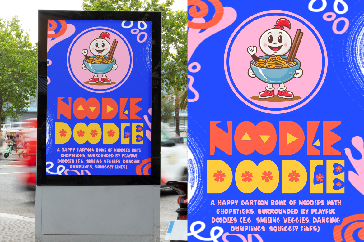
Flumbo Quirky combines bold geometric construction with rounded forms, triangular details, and optional decorative elements such as floral icons. Its retro-meets-modern personality gives titles strong visual character, while the mixture of angular and soft shapes keeps the rhythm lively without sacrificing basic legibility. This makes Flumbo especially effective for joyful branding systems that need to feel creative, colorful, and contemporary.
PROS: Bold geometric personality, rounded and angular contrast, decorative options, retro-modern energy, and strong cross-media versatility.
BEST FOR: Children’s book covers, creative packaging, youth fashion, stickers, merchandise, colorful posters, food campaigns, lifestyle branding, animated graphics, and playful logos.
Comparison
| Font | Main Structure | Visual Personality | Strongest Book-Cover Role | Ideal Branding Direction |
|---|---|---|---|---|
| Savage Garden | Multi-style quirky family | Whimsical, versatile, and imaginative | Flexible title system across a series | Children, babies, celebrations, and education |
| Play Block | Rounded compact display | Friendly, sturdy, and energetic | Large activity or learning title | Toys, games, schools, and creative kits |
| Noodle Twine | Rounded monoline | Warm, relaxed, and handmade | Gentle food or lifestyle title | Cafés, food, family, and casual brands |
| Warm Toast | Heavy rounded sans | Chunky, comforting, and confident | Bold short title with strong shelf impact | Snacks, books, cafés, and cheerful retail |
| Crest Strap | Cut geometric slab | Loud, rebellious, and comic-inspired | Adventure, humor, or youth title | Merchandise, events, comics, and campaigns |
| Flumbo Quirky | Mixed geometric display | Colorful, funky, and contemporary | Highly visual creative title | Fashion, packaging, art, food, and youth culture |
Best for a Complete Children’s Book Series
Savage Garden offers the greatest flexibility because its three coordinated styles can create variation across covers, internal headings, promotional graphics, and related products.
Best for Educational and Activity Books
Play Block provides the strongest connection to physical play, building, learning, and hands-on creativity.
Best for Food-Themed Stories and Brands
Noodle Twine creates a softer handcrafted mood, while Warm Toast provides greater weight and immediate shelf visibility.
Best for Bold Adventure or Comic Covers
Crest Strap offers the strongest slab structure and rebellious visual energy.
Best for Modern Quirky Branding
Flumbo Quirky delivers the broadest combination of geometric experimentation, rounded charm, decorative details, and retro-modern personality.
Common Mistakes
The first mistake is using playful typography everywhere. A quirky display font may create an excellent book title or logo, but it can become exhausting in subtitles, long descriptions, product instructions, page numbers, navigation, or body copy. Assign the expressive typeface one major role and choose a calmer companion for practical communication. The contrast between personality and function usually makes the playful font feel more distinctive, not less important.
Another common mistake is assuming that children’s design needs as many bright colors, illustrations, patterns, and decorative letters as possible. When every character uses a different color and every empty area contains a star, cloud, toy, or doodle, the title loses its focal power. Begin with the typography in black and white, refine the spacing, and add a limited palette that supports the story or brand. Playfulness should create joy and movement, not visual confusion.
The final mistake is approving the font only at a large presentation size. Small counters may close on a book spine, decorative details can disappear in an online thumbnail, and fine cuts may become unclear during printing, embroidery, or sticker production. Test the real title and brand name at every intended size, prepare simplified alternatives where necessary, and verify licensing before publishing or manufacturing the final product.
Conclusion
The strongest playful fonts for book covers and branding combine emotional warmth with a recognizable and carefully controlled structure.
They can make a children’s story feel more imaginative, turn a snack package into a friendly character, give an educational brand greater energy, or help a creative business move beyond generic corporate typography.
Savage Garden provides a versatile three-style family for broader visual systems. Play Block delivers friendly block-based strength, while Noodle Twine offers a smoother monoline personality. Warm Toast creates chunky and comforting impact, Crest Strap brings comic-inspired rebellion, and Flumbo Quirky combines rounded charm with modern geometric experimentation.
Fonts from PutraCetol Studio give designers several different interpretations of play rather than one repetitive cartoon aesthetic.
Choose the typeface according to the age group, story, product, and emotional direction. Test the actual words, refine the spacing, pair the display font with readable supporting typography, and give the letters enough room to become part of the visual storytelling.
A playful font succeeds when it attracts attention without making the message harder to understand.
When that balance is achieved, typography becomes more than a cheerful decoration. It becomes one of the most memorable voices of the book or brand.
Explore these fonts and many more at PutraCetol.com to build a business identity that looks professional, trustworthy, and memorable.
Additionally, if you want to explore some free typography options, you can check out Putracetol Studio on Dafont. Happy reading and designing!