
Packaging Color Psychology & Brand Perception 2026: Design With Intent
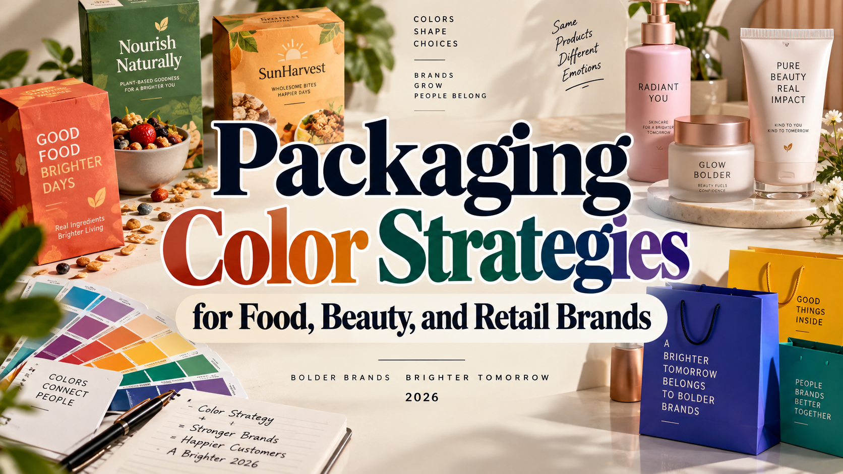
Treat Color Meanings as Hypotheses
Begin your packaging color psychology & brand perception 2026 strategy with the intended customer, product category, and buying situation. Avoid choosing green because it supposedly guarantees trust or black because it automatically signals luxury.
Color meanings depend on context and learned associations. Psychological research cautions against treating color effects as universal across audiences and situations.
Instead, define three qualities the package should communicate, such as energetic, approachable, and affordable. Then test whether your palette actually communicates them.
What Color Psychology Can Tell Designers
Packaging color psychology examines how color contributes to expectations and judgments about a product or brand. Research by Lauren Labrecque and George Milne found that hue, saturation, and value can influence brand-personality judgments and purchase intentions. That does not establish a guaranteed sales increase for a particular packaging color.
The practical lesson is to evaluate the complete design. Keep the logo, wording, imagery, and layout constant when testing color, so the comparison answers a clear question.
What Matters in 2026?
Adobe’s 2026 Creative Trends forecast emphasizes sensory experiences, emotional connection, playful experimentation, and cultural authenticity. It is a creative forecast, not proof that one palette will outperform another.
For packaging teams, use these directions to explore texture, contrast, and locally relevant storytelling. Keep the main brand colors stable while experimenting with a seasonal accent.
Build a Palette Around the Product
Look Beyond the Hue
Describe colors precisely. Hue identifies the color family, saturation describes intensity, and lightness distinguishes lighter from darker appearances. Research considers multiple color dimensions rather than treating the hue name as a complete description.
Instead of requesting “blue packaging,” compare muted blue, pale blue, and saturated cobalt. Keep their roles explicit: background, product name, accent, or variant indicator.
Balance Category Recognition and Difference
Audit competing packages before designing. Identify repeated palettes and ask what customers use them to recognize.
For a hypothetical fruit snack, compare a familiar fruit-colored design with an unexpected violet background. Test whether people correctly identify the flavor and product category before asking which package they prefer. Standing apart is useful only when the product remains understandable.
Organize the Product Range
Choose a stable brand color, supporting neutrals, and clearly defined variant colors. Keep the logo position and typography consistent across flavors or sizes.
Add written variant names and recognizable symbols rather than relying exclusively on hue. For ecommerce pages, this follows W3C’s requirement that color must not be the sole visual way of conveying information. Apply the same practical principle to physical labels.
Connect Color With Typography and Materials
Test typography alongside the palette. Try an expressive display face for the product name and a calmer companion for ingredients, quantities, and instructions.
PutraCetol Studio’s playful display typography offers one direction for character-led packaging. Explore it within your actual composition rather than treating the font as an isolated decoration.
Check print reproduction early. Adobe explains that soft-proof accuracy depends on the display, profiles, lighting, and output conditions; paper and ink simulation can help anticipate differences.
Request a physical proof on the intended material. Review it under realistic lighting and as a small ecommerce image before approving production.
Comparison
These are creative directions to test, not fixed psychological rules.
| Palette Direction | Suggested Positioning | Main Question to Test |
|---|---|---|
| Coral and cream | Friendly everyday product | Does it communicate the right category? |
| Forest green and ivory | Botanical storytelling | Does it imply unsupported benefits? |
| Charcoal and burgundy | Premium positioning | Is essential text sufficiently visible? |
| Cobalt and orange | Bold contemporary brand | Can customers distinguish variants? |
| Pastels with dark lettering | Gentle lifestyle identity | Does the contrast survive printing? |
Common Mistakes
The first mistake is treating a color chart as consumer research. Test with people who represent the target market, including different language and cultural backgrounds. Ask what they expect about flavor, quality, price, and brand personality. Compare those answers with the brief instead of selecting the founder’s favorite palette.
Another mistake is confusing natural-looking packaging with environmental evidence. Green ink, leaves, and brown paper cannot establish a product’s sustainability. In the United States, FTC guidance cautions against broad, unqualified environmental claims and recommends specific, substantiated explanations. Check the requirements of each market rather than relying on visual suggestion.
The final mistake is measuring preference alone. Ask participants to locate a variant, read the product name, and distinguish the brand among alternatives. Test one major change at a time, then review actual sales or conversion data without assuming color caused every difference.
Conclusion
Effective packaging color psychology & brand perception 2026 connects visual intention with customer evidence. Define the desired impression, test alternatives, protect readability, and verify the printed result.
Combine a disciplined palette with distinctive PutraCetol Studio typography and consistent layouts. The strongest package does not merely attract attention: it sets expectations the product can honestly fulfill.
Explore these fonts and many more at PutraCetol.com to build a business identity that looks professional, trustworthy, and memorable.
Additionally, if you want to explore some free typography options, you can check out Putracetol Studio on Dafont. Happy reading and designing!