
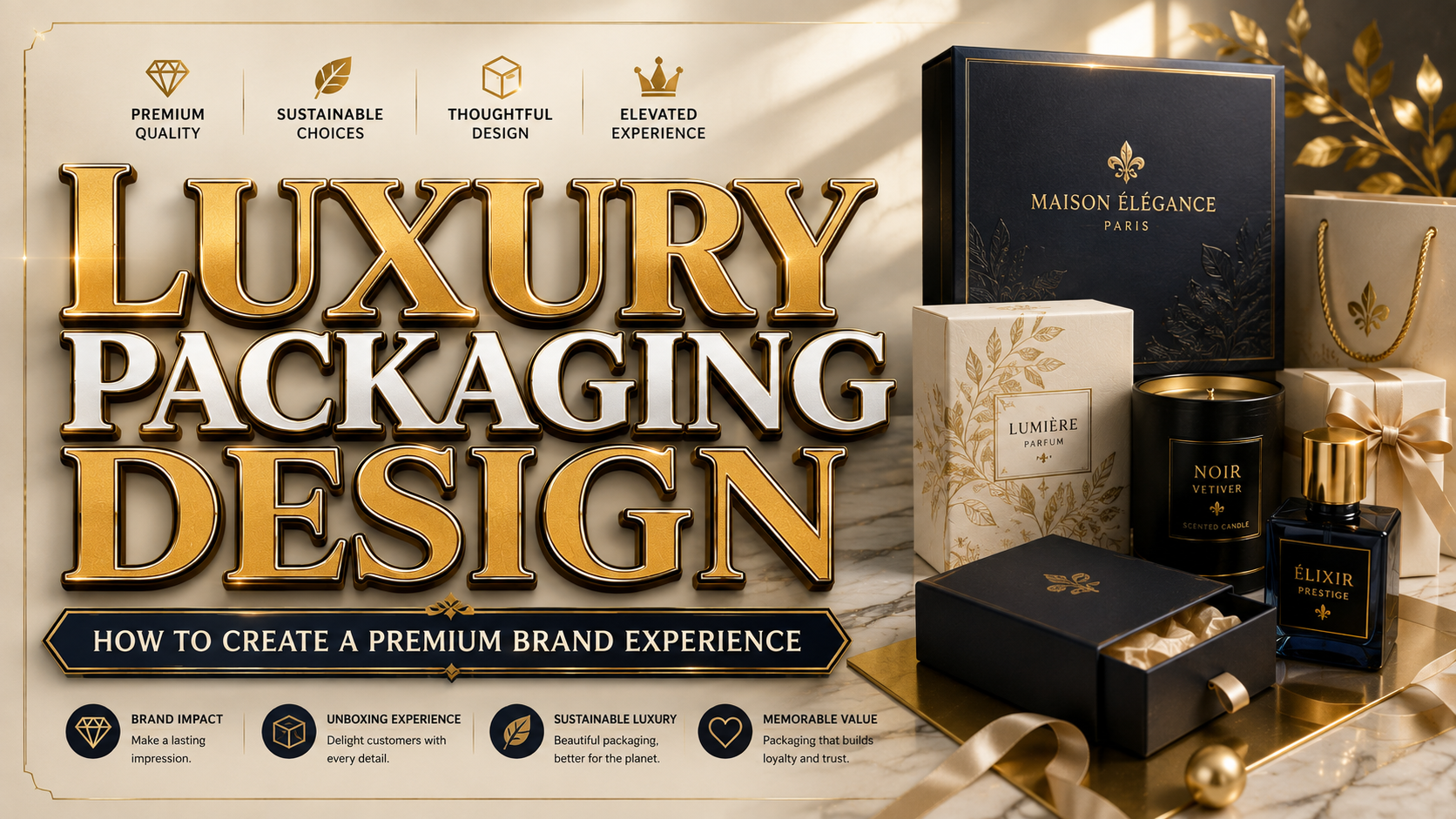
The strongest luxury packaging design does not begin with gold foil, glossy paper, or an elaborate box. It begins with a clear definition of what luxury means for the product and its audience.
A premium skincare brand may communicate luxury through clinical precision, soft neutrals, and restrained typography. A handcrafted chocolate company might emphasize rich color, tactile paper, and an artisanal opening experience. A fashion label may prefer quiet minimalism, while a fragrance brand could use dramatic contrast and decorative details.
Create three words that describe the intended experience, such as refined, intimate, and timeless. Every decision involving materials, color, typography, structure, and finishing should support those qualities.
Packaging research shows that visual elements can influence how consumers evaluate products and make purchase decisions. This means packaging is not simply a container. It is an important part of the product’s communication and perceived value.
What Makes Luxury Packaging Feel Premium?
Begin With Material and Structure
Premium packaging should feel considered before the customer reads a single word. Weight, texture, rigidity, opening resistance, and structural precision all contribute to the experience.
Common options include rigid paperboard boxes, textured uncoated stock, glass containers, metal tins, fabric pouches, molded paper inserts, and carefully constructed sleeves. The right choice depends on the product, price point, shipping conditions, and brand story.
A luxury box should also protect the product properly. An attractive package that arrives crushed, opens awkwardly, or fails to secure its contents immediately weakens customer confidence.
Consider the complete structural journey:
- How will the customer hold the package?
- Which side will they see first?
- Where will they open it?
- How will the product be revealed?
- Can the package be stored, reused, or recycled afterward?
The best structure creates a deliberate sequence without making the customer fight through unnecessary layers.
Create a Controlled Color Palette
Black, white, gold, and burgundy are associated with premium packaging because they create strong contrast and visual authority. However, these colors are not automatically luxurious.
Luxury depends on how the palette relates to the product. Forest green and antique gold may suit premium tea or botanical skincare. Navy and ivory can support fine dining or specialty beverages. Burgundy and copper may feel more appropriate for chocolate, wine, or heritage-inspired products.
A practical palette usually includes:
- One dominant brand color
- One neutral background
- One restrained accent
This creates hierarchy while preventing the package from becoming visually crowded. Research into packaging color also suggests that black and metallic tones can act as quality cues, but their effect still depends on product category and customer expectations.
Use Finishing to Direct Attention
Premium finishing should highlight important elements rather than decorate every surface.
Foil stamping can emphasize a logo, product name, border, or small pattern. Embossing raises selected details, while debossing presses them into the material. Spot gloss creates contrast against matte areas, and soft-touch coatings can make a package feel more tactile.
These techniques are most effective when they have a clear role. For example:
- Use blind embossing for a quiet, understated logo.
- Apply gold foil only to the brand name or product line.
- Add spot gloss to a subtle pattern rather than the entire surface.
- Combine a matte exterior with a contrasting interior for a controlled reveal.
Using foil, embossing, gloss, texture, gradients, and multiple patterns at the same time can make the package look expensive but not sophisticated. Premium design usually benefits from restraint.
Treat Typography as the Brand’s Voice
Typography can make packaging feel elegant, artistic, contemporary, or timeless. A refined serif may communicate heritage and quality. A modern display font can make a fashion or cosmetics brand feel editorial. Calligraphy can introduce intimacy, while a coordinated font duo can provide both personality and structure.
Use the most distinctive typeface for the logo, product name, or collection title. Supporting information such as ingredients, size, instructions, flavor, and legal details should use a simpler font with strong readability.
Test the typography at the actual packaging size. Thin strokes may disappear on textured paper, closely spaced letters may fill during printing, and decorative scripts may become unclear on small labels.
Design the Unboxing Experience With Purpose
For ecommerce brands, the packaging may be the customer’s first physical interaction with the company. The shipping box, seal, tissue paper, insert, product container, and thank-you message should feel like parts of one visual system.
The experience does not need to be complicated. A well-fitted box, a clean opening mechanism, one thoughtful message, and a carefully positioned product can feel more premium than several decorative layers.
A strong unboxing sequence should create anticipation while remaining practical. It should also be easy for customers to understand how to reuse, recycle, or dispose of each component.
Make Sustainable Choices Credible
Luxury packaging should not rely on unnecessary volume or excessive material. Responsible sourcing, reduced layers, reusable structures, refill systems, and clear disposal instructions can support a more contemporary definition of premium quality.
For paper-based packaging, FSC certification can help brands demonstrate that materials come from responsibly managed or recycled sources. FSC also recommends considering the complete packaging lifecycle, including sourcing, production, material reduction, reuse, and end-of-life recovery.
Sustainability claims should be specific and verifiable. Avoid vague statements such as “earth-friendly” when the business cannot explain the material, certification, or disposal process behind the claim.
Luxury Packaging Examples by Industry
Cosmetics and Skincare
Combine warm ivory with champagne accents, a refined serif logo, and a rigid box with a molded paper insert. Keep ingredient and usage information clean and highly readable.
Fashion and Accessories
Use matte black, burgundy, or deep navy with blind embossing and a contrasting interior. A display font or elegant duo can create an editorial identity across boxes, tags, tissue paper, and shopping bags.
Premium Food and Beverage
Try forest green, cream, cocoa, or burgundy with copper or antique-gold details. Tactile paper and strong typography can communicate craftsmanship while clear labels protect product credibility.
Jump to Recommended Fonts
Agaiz Modern Display Font | Lotus Heart Classy Ligature Font | Glamorous Carpet | Velisse Feminine Serif Font | Greatness Culture Stylish Duo Font | Cozy Caps Luxury Duo Font
1. Agaiz Modern Display Font
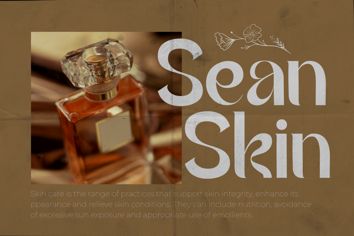
Agaiz combines modern magazine-inspired lettering with elegant alternates, ligatures, and extended swashes. Its distinctive shapes can turn a short product name into a recognizable packaging centerpiece while maintaining a contemporary editorial mood. Use it for logos and major titles, then pair it with a quieter font for product details.
PROS: Modern elegance, alternate characters, ligatures, and strong logotype potential.
BEST FOR: Fashion, cosmetics, fragrance, premium stationery, editorial packaging, and lifestyle products.
2. Lotus Heart Classy Ligature Font
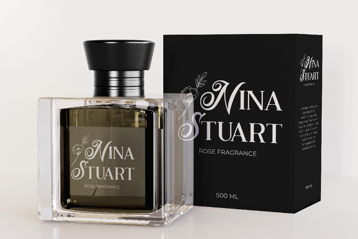
Lotus Heart is a luxurious display font with a classic serif foundation and expressive ligatures. Its refined letter combinations can give packaging a custom-lettered appearance without requiring an overly decorative layout. The style is especially effective when the brand needs timeless sophistication rather than loud visual impact.
PROS: Elegant ligatures, timeless structure, OpenType alternates, and multilingual support.
BEST FOR: Beauty, fashion, jewelry, luxury food, boutique retail, and premium product branding.
3. Glamorous Carpet
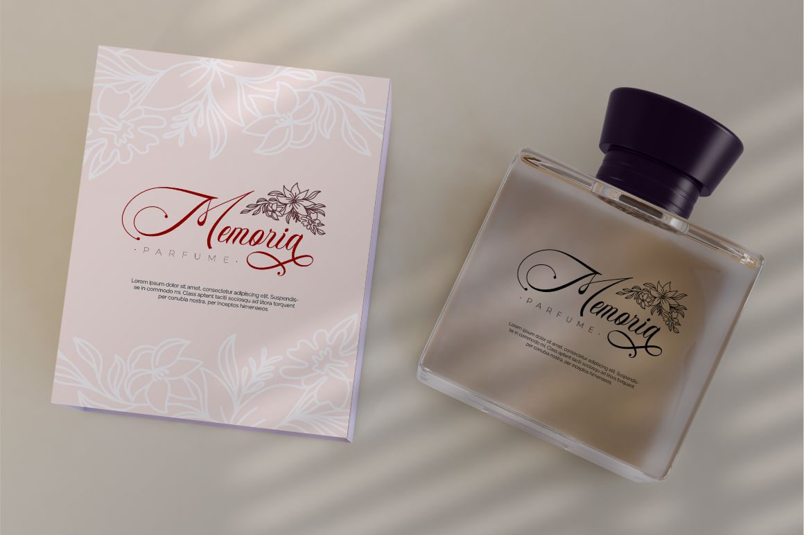
Glamorous Carpet is a classic calligraphy font influenced by delicate ink lettering, wedding calligraphy, and minimal luxury branding. Its flowing forms create an intimate, handcrafted quality that can soften rigid packaging structures and add emotional character. Use it selectively for a logo, signature line, or collection name.
PROS: Graceful calligraphy, romantic character, elegant alternates, and personal visual tone.
BEST FOR: Fragrance, candles, weddings, boutique cosmetics, gifting, and limited-edition collections.
4. Velisse Feminine Serif Font

Velisse uses refined serif forms to express softness, elegance, and modern femininity. Its polished proportions can give beauty and wellness packaging a premium identity without making the brand feel distant or excessively formal. It works particularly well with ivory, blush, burgundy, muted green, and restrained metallic accents.
PROS: Graceful silhouette, modern femininity, premium character, and clear display presence.
BEST FOR: Skincare, beauty, wellness, fashion accessories, candles, and feminine lifestyle brands.
5. Greatness Culture Stylish Duo Font
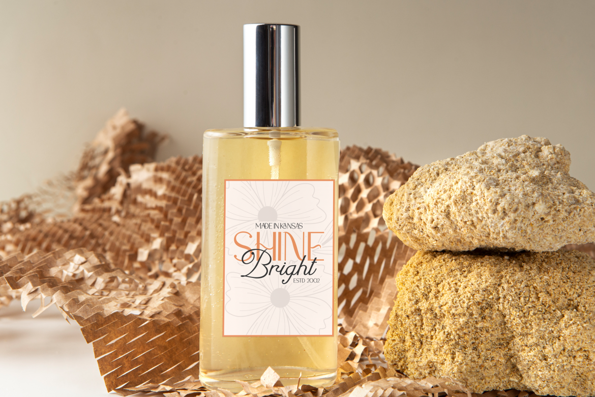
Greatness Culture combines a clean, professional sans serif with a flowing script, giving designers two coordinated voices within one identity. The sans serif can organize product information, while the script adds personality to a logo, collection name, or short message. This contrast makes the family practical for packaging systems that need elegance and functional hierarchy.
PROS: Coordinated font pairing, flexible hierarchy, modern elegance, and expressive contrast.
BEST FOR: Premium fashion, hospitality, beauty, gifting, magazines, and sophisticated ecommerce brands.
6. Cozy Caps Luxury Duo Font
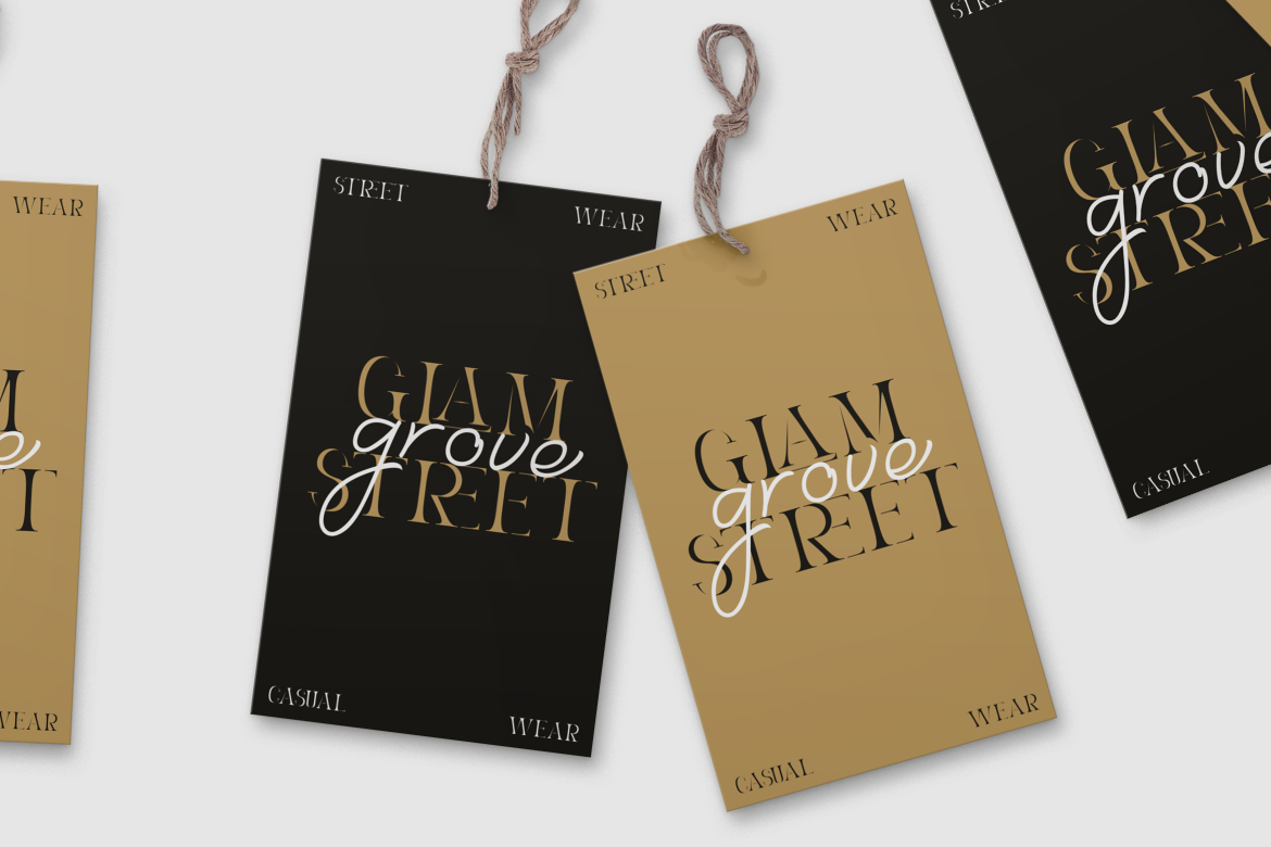
Cozy Caps pairs a distinctive display style with an elegant script, allowing a brand to create both structured headlines and softer decorative accents. The combination is designed for luxury branding, high-end packaging, and professional identities where one typeface alone may not provide enough hierarchy. It can support a complete system across boxes, labels, inserts, and promotional graphics.
PROS: Two complementary styles, strong hierarchy, luxury character, and broad branding flexibility.
BEST FOR: Boutique products, premium food, fashion, hospitality, invitations, and lifestyle packaging.
Comparison
| Font | Visual Personality | Strongest Packaging Role | Ideal Brand Category |
|---|---|---|---|
| Agaiz | Modern and editorial | Product names and bold logotypes | Fashion and cosmetics |
| Lotus Heart | Classic and refined | Premium logos and collection titles | Beauty and luxury retail |
| Glamorous Carpet | Romantic and calligraphic | Signature accents and limited editions | Fragrance and gifting |
| Velisse | Feminine and polished | Elegant product identities | Skincare and wellness |
| Greatness Culture | Modern and expressive | Complete typographic hierarchy | Fashion and hospitality |
| Cozy Caps | Sophisticated and versatile | Logos, headings, and inserts | Lifestyle and premium food |
Common Mistakes in Luxury Packaging Design
The first mistake is assuming that black and gold automatically communicate luxury. These colors can look refined, but they can also feel generic when they have no relationship to the product, audience, or brand history. Begin with positioning and customer expectations, then build a palette that belongs naturally to the product. A botanical skincare brand may communicate more credibility through warm ivory, deep green, and restrained brass than through glossy black packaging.
Another mistake is designing only for a digital mockup. Fine lines, thin type, subtle gradients, small foil details, and low-contrast text may look excellent on a large screen but fail during real production. Print physical samples, check the dieline, confirm finishing tolerances, and test barcodes, ingredients, instructions, and legal information at actual size. The packaging must also survive shipping, storage, handling, and changes in lighting.
The final mistake is equating luxury with excess. Oversized boxes, multiple inserts, plastic windows, ribbons, magnets, foam, and several layers may create a dramatic opening but can also feel wasteful and difficult to dispose of. A more credible premium experience uses fewer, better-considered elements. Material quality, structural precision, typography, and a controlled reveal can create stronger value than unnecessary decoration.
Conclusion
Effective luxury packaging design brings material, structure, color, typography, finishing, and storytelling into one coherent experience. It does not need to use every premium technique. It needs to make each decision feel purposeful.
Begin with the brand’s meaning of luxury, choose materials that protect the product, create a restrained palette, and apply finishing only where it strengthens hierarchy. Test everything under real production conditions and consider what happens to the package after it has been opened.
Fonts from PutraCetol Studio can help give the final design a recognizable voice. Agaiz offers modern editorial confidence, Lotus Heart provides timeless refinement, Glamorous Carpet adds calligraphic intimacy, Velisse introduces feminine elegance, while Greatness Culture and Cozy Caps provide versatile font pairings for complete premium packaging systems.
Explore these fonts and many more at PutraCetol.com to build a business identity that looks professional, trustworthy, and memorable.
Additionally, if you want to explore some free typography options, you can check out Putracetol Studio on Dafont. Happy reading and designing!