
Best Fonts for Logo Design 2026: Typography That Builds Recognition
A logo may contain only a few letters, yet those letters can carry much of a brand’s personality.
Typography influences whether a company feels professional, handcrafted, technological, energetic, premium, or approachable. That is why choosing the best fonts for logo design 2026 requires more than following current trends.
A successful logo font needs three qualities: recognizability, appropriate personality, and scalability. The typeface should work on a website header, social profile, product label, business card, packaging, and possibly a large storefront without losing its identity.
The strongest logo typography also leaves room for customization. Kerning, alternate characters, modified letterforms, ligatures, and spacing can transform a commercial typeface into a more distinctive wordmark.
Initial Suggestion: Start With Brand Personality, Not Font Style
Before browsing fonts, describe the brand in a few clear words.
Is it corporate, innovative, handcrafted, athletic, premium, playful, or rebellious?
A technology company may benefit from precise geometric lettering, while a BBQ restaurant can use rough handcrafted typography to communicate authenticity. A fitness brand may need motion and energy, whereas a professional consultancy may require structure and stability.
Then test the actual company name.
A font specimen can look excellent because the designer selected flattering letter combinations. Your brand name may contain repeated characters, difficult capitals, or awkward spacing. Always preview the real wordmark before making a decision.
Jump to Recommended Fonts
1. Bellique Logo Script Font
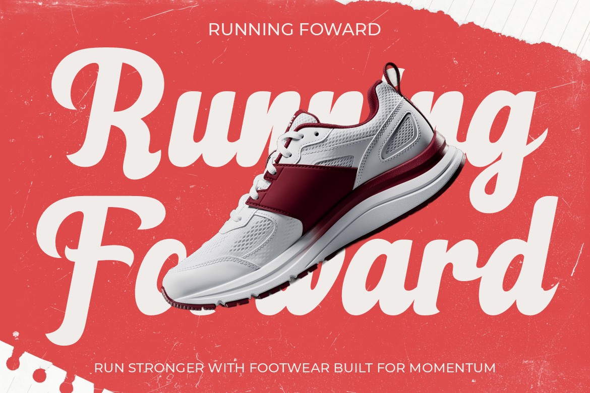
Bellique is an expressive logo script built with thick strokes, sweeping curves, tapered endings, and connected letterforms. Its moving baseline gives short brand names energy without sacrificing the strong silhouette needed for a recognizable logo. PutraCetol positions it particularly well for sports, footwear, fitness, apparel, and active-lifestyle branding. PutraCetol Studio
Bellique is a strong choice when the brand should feel personal and dynamic rather than purely corporate.
PROS: Bold silhouette, energetic rhythm, connected forms, strong wordmark personality.
BEST FOR: Sports brands, fitness, footwear, apparel, lifestyle businesses.
2. Bloxine Rough Logo Font
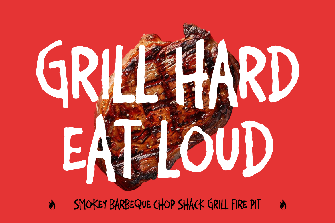
Bloxine brings a handcrafted direction to logo design through rough edges, textured strokes, and intentionally imperfect forms. Its visual language resembles hand-painted signage while retaining enough weight to produce a strong brand mark. PutraCetol recommends it for restaurant branding, BBQ businesses, food packaging, product labels, and other rustic identities. PutraCetol Studio
This makes Bloxine especially effective when polished geometric typography would make the brand feel too artificial.
PROS: Handmade appearance, rough texture, bold structure, authentic personality.
BEST FOR: Restaurants, BBQ brands, coffee businesses, craft products, rustic packaging.
3. Montavox Corporate Logo Font
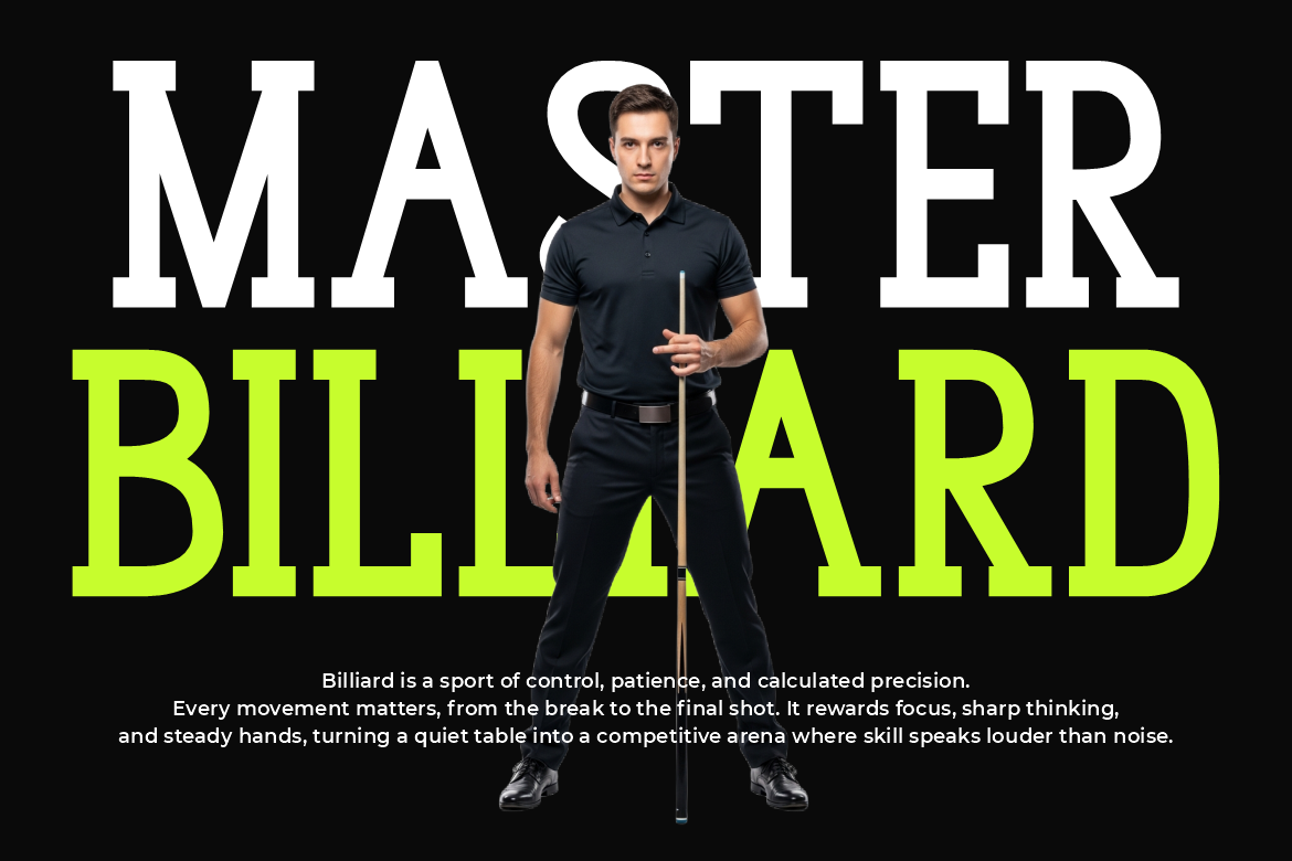
Montavox takes a more structured approach. It is a bold slab-serif typeface with thick vertical strokes, broad rectangular serifs, tall proportions, and consistent weight. Its firm geometric rhythm communicates stability and confidence, making it particularly effective for professional identities that still need a strong display presence. PutraCetol highlights corporate logos, sports branding, competitive events, entertainment venues, and promotional applications. PutraCetol Studio
The slab-serif construction gives Montavox a more established personality than a typical modern sans serif.
PROS: Strong slab serifs, stable geometry, clear structure, authoritative presence.
BEST FOR: Corporate brands, sports clubs, gaming venues, events, professional services.
4. Boldra Unique Logo Font
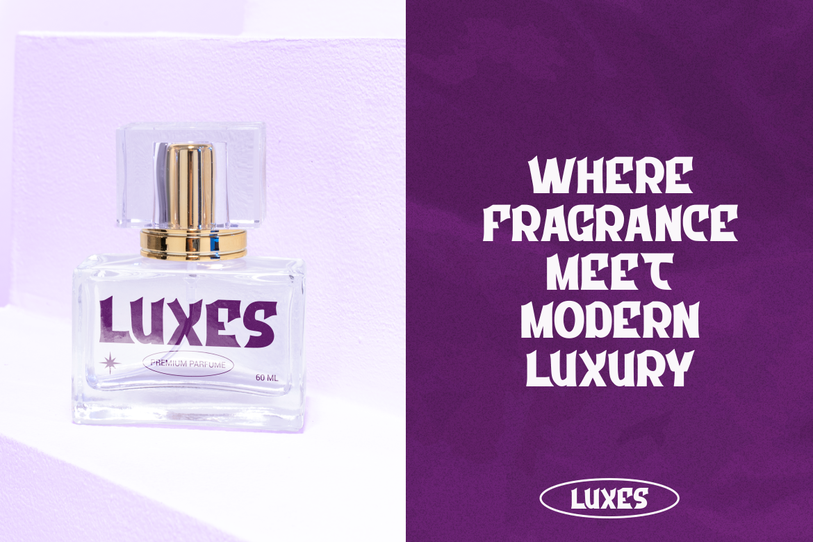
Boldra is designed for brands that want a contemporary and immediately recognizable identity. PutraCetol describes it as a strong modern logo option with high visual impact, clean construction, good scalability, and memorable letterforms. It is especially suitable for startups, technology companies, creative agencies, digital products, and modern ecommerce businesses. PutraCetol Studio
Its straightforward visual strength makes it useful when the logo needs to look modern without becoming overly decorative.
PROS: Clean construction, scalable forms, strong visibility, contemporary character.
BEST FOR: Startups, technology, agencies, digital products, ecommerce brands.
5. Xalton Corporate Logo Font

Xalton is a bold modern display face built around thick strokes, tall vertical proportions, clean edges, and strong geometric construction. Rounded internal counters soften the rigid outer forms, creating a balance between precision and readability. PutraCetol positions Xalton for corporate logos, technology branding, business identities, advertising headlines, and promotional design. PutraCetol Studio
Its subtle technological personality makes it particularly useful for companies that want to appear innovative without looking experimental.
PROS: Geometric structure, clean edges, strong vertical proportions, professional appearance.
BEST FOR: Technology brands, corporate identities, startups, consulting, modern business.
Comparison: Which Logo Font Fits Your Brand?
| Font | Main Character | Best Brand Direction |
|---|---|---|
| Bellique | Dynamic, script | Sports and lifestyle |
| Bloxine | Rough, handcrafted | Food and artisan |
| Montavox | Strong, slab serif | Corporate and sports |
| Boldra | Modern, clean | Startups and digital |
| Xalton | Geometric, professional | Tech and corporate |
There is no universal best logo font. The right choice depends on what customers should feel when they first see the name.
Test Scalability Before Finalizing the Logo
A wordmark should survive multiple sizes.
Test the logo as a small social-media avatar, website header, product label, business card, and large sign. Fine details that look attractive at 300 pixels tall may disappear at 30 pixels.
Also test the logo in black and white. If the identity depends entirely on gradients, shadows, or effects to remain recognizable, the typography may not be strong enough on its own.
Spacing deserves equal attention. Custom kerning can often improve a logo dramatically because default font spacing is designed for general text, not necessarily for one permanent brand name.
Common Mistakes
A common mistake is selecting a logo font because it is currently fashionable. Trends move quickly, while a business may use the same identity for many years. Choose typography that matches the brand’s positioning first, then consider whether contemporary styling supports that direction.
Another mistake is using the chosen font without customization. Even small changes to kerning, alternate characters, proportions, or individual terminals can make a logo feel more intentional. However, modifications should preserve the typeface’s quality rather than distort it randomly.
Finally, do not overlook licensing. PutraCetol treats logo and trademark use as a dedicated licensing category, with coverage based on factors such as registered-logo count and business scale. Confirm the appropriate logo and trademark coverage before using a typeface in a commercial brand identity. PutraCetol Studio
Conclusion
The best fonts for logo design 2026 combine personality, readability, and long-term visual recognition.
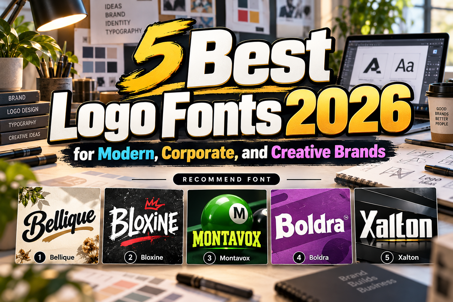
Bellique creates movement, Bloxine delivers handcrafted authenticity, Montavox communicates strength, Boldra offers modern simplicity, and Xalton provides precise corporate character.
The font is only the starting point. Test the actual brand name, refine spacing, check scalability, and make sure the typography aligns with the company’s audience and positioning.
Explore these fonts at PutraCetol Studio to build logos, wordmarks, packaging, digital identities, and branding systems that feel distinctive and professional.
Explore these fonts and many more at PutraCetol.com to build a business identity that looks professional, trustworthy, and memorable.
Additionally, if you want to explore some free typography options, you can check out Putracetol Studio on Dafont. Happy reading and designing!