
Japanese Style Fonts for Branding, Anime, Gaming, and Packaging
Choose the Japanese Mood First
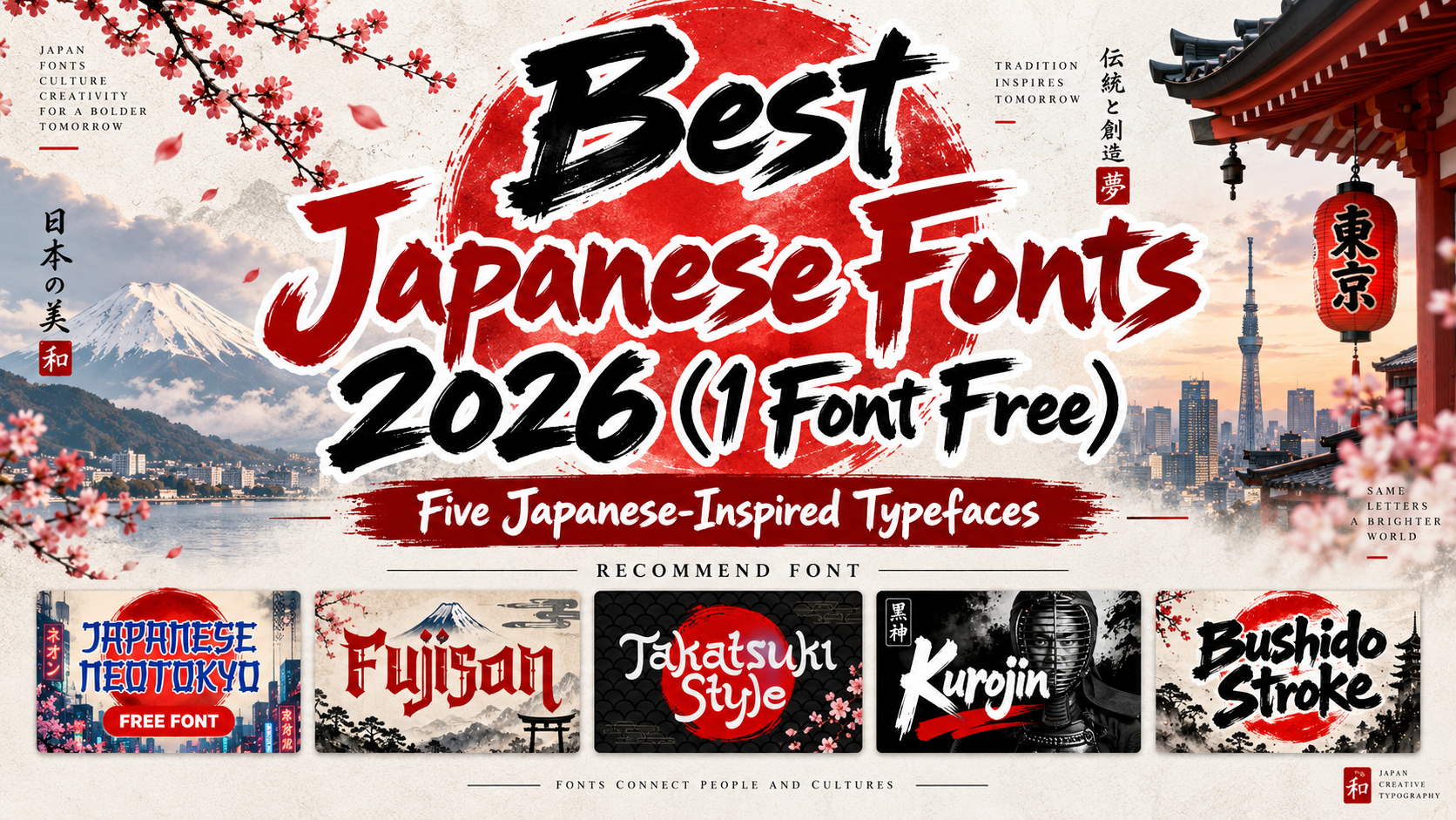
The best Japanese fonts 2026 work when they support a specific visual direction. A ramen package may need energetic brush texture, while a cyberpunk poster benefits from stronger geometry and futuristic tension. A tourism campaign may need a more traditional, handcrafted atmosphere.
Use these fonts mainly for short Latin-script titles, logos, packaging names, posters, and display text. They are Japanese-inspired display typefaces, not substitutes for fonts designed to typeset kanji, hiragana, or katakana. For real Japanese-language copy, pair them with an appropriate Japanese typeface. The available character maps for fonts such as Japanese Neotokyo and Kurojin show Latin-script coverage rather than native Japanese scripts.
Japanese visual culture offers references ranging from calligraphic brush movement and traditional craft to neon cities, manga, gaming, and street fashion. Instead of adding random Japanese-looking symbols, create one coherent direction through typography, spacing, color, imagery, and composition.
Jump to Recommended Fonts
1. Japanese Neotokyo Japanese Style Font — FREE

Japanese Neotokyo combines hand-painted brush texture with balanced geometric construction and exaggerated proportions. It bridges traditional calligraphic energy with modern Tokyo-inspired graphics, giving posters and branding a bold cultural mood with a neo-futuristic edge.
PROS: Free option, brush texture, geometric balance, strong display presence.
BEST FOR: Anime-inspired posters, ramen branding, cyber-Asia campaigns, packaging, merchandise, and social content.
Japanese Neotokyo is currently free under PutraCetol’s Free License with Standard License Coverage. It permits personal and limited commercial static use, while trademark, app/game, editable-template, SaaS, and broadcast uses are not included in that free coverage.
2. Fujisan Display Font

Fujisan combines bold strokes and distinctive character shapes with a cleaner, more polished Japanese-inspired personality. Compared with rough brush styles, its controlled structure makes it easier to place inside elegant commercial layouts while retaining a recognizable cultural atmosphere.
PROS: Bold structure, polished appearance, traditional-modern balance.
BEST FOR: Logos, invitations, packaging, posters, book titles, magazines, and hospitality branding.
3. Takatsuki Style
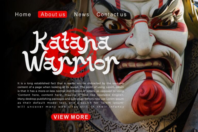
Takatsuki Style brings cultural references into a more decorative display system. Swashes, stylistic sets, stylistic alternates, contextual alternates, and ligatures give designers multiple ways to customize short titles and wordmarks.
PROS: Extensive alternates, decorative personality, customizable word shapes.
BEST FOR: Japanese restaurants, clothing brands, cultural campaigns, logos, packaging, and posters.
4. Kurojin Japanese Brush Font

Kurojin uses thick bodies, tapered endings, rough edges, expressive cuts, and wide shapes to produce strong brush energy. Its irregular ink-like contours feel fast and handcrafted while remaining clear enough for large headlines and short brand names.
PROS: Rough brush energy, wide silhouette, expressive movement.
BEST FOR: Ramen shops, sushi bars, martial arts, gaming titles, menus, stickers, and event posters.
5. Bushido Stroke Japanese Brush Display Font
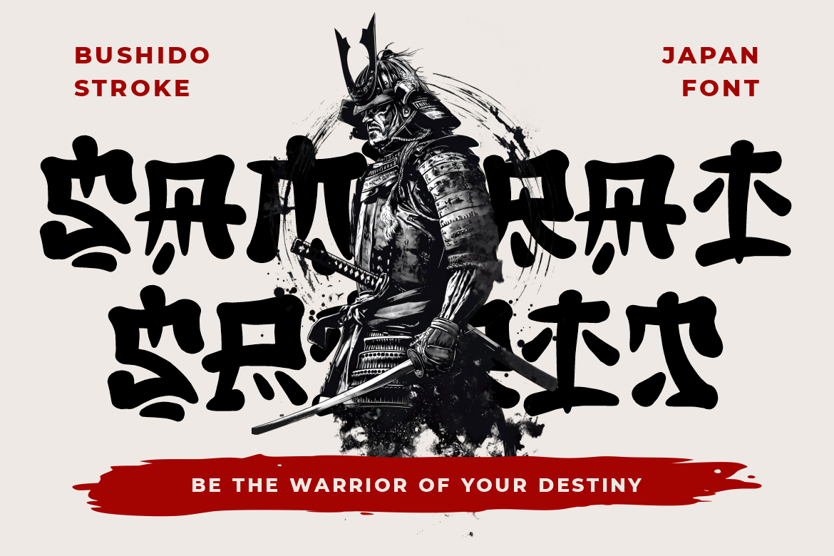
Bushido Stroke uses thick handcrafted marks, compact proportions, uneven edges, and organic details. Its concentrated silhouette creates a dramatic style suited to warrior themes, historical storytelling, craft, and cinematic action.
PROS: Compact construction, dramatic brush texture, powerful cultural atmosphere.
BEST FOR: Samurai graphics, game artwork, movie titles, tourism, tea brands, book covers, and cultural events.
How to Use Japanese-Inspired Fonts Effectively
Keep display text short so distinctive strokes remain visible. Pair decorative lettering with a clean sans serif for menus, descriptions, prices, captions, and other functional information.
Color can shift the mood. Black, cream, and muted red can support a traditional direction, while neon cyan, magenta, violet, and dark backgrounds push the same concept toward cyberpunk. Photography, grid structure, texture, and motion should reinforce that choice.
Comparison
| Font | Main Direction | Strongest Use |
|---|---|---|
| Japanese Neotokyo | Brush + neo-futuristic | Modern campaigns |
| Fujisan | Refined cultural display | Branding and packaging |
| Takatsuki Style | Decorative cultural | Custom logos |
| Kurojin | Rough energetic brush | Food and action graphics |
| Bushido Stroke | Dramatic brush | Games and cinematic titles |
Common Mistakes
The first mistake is treating every Japanese-inspired font as interchangeable. A futuristic Tokyo poster, traditional restaurant, samurai game, and premium tea package need different visual voices. Define the cultural reference, audience, and emotional tone before choosing the typography.
Another mistake is using decorative Latin letters as fake Japanese writing. A Japanese-inspired Latin font can create atmosphere for an English brand name, but it does not automatically support authentic Japanese text. For bilingual work, use proper fonts for kanji, hiragana, and katakana and verify the language when accuracy matters.
The final mistake is combining brush lettering, rising-sun imagery, neon signs, manga graphics, waves, and random symbols in one composition. Select a limited visual language and give typography space. Also confirm the appropriate PutraCetol license for trademarks, webfonts, advertising, apps, games, merchandise, or embedded uses.
Conclusion
The best Japanese fonts 2026 cover very different personalities. Japanese Neotokyo offers a free brush-meets-future option, Fujisan delivers polished cultural character, Takatsuki Style provides ornamental flexibility, Kurojin brings rough movement, and Bushido Stroke creates dramatic impact.
Use these PutraCetol Studio fonts as Japanese-inspired Latin display tools, then build the surrounding visual system with equal care. Strong cross-cultural branding comes from understanding references and turning them into a coherent contemporary design rather than copying surface symbols.
Explore these fonts and many more at PutraCetol.com to build a business identity that looks professional, trustworthy, and memorable.
Additionally, if you want to explore some free typography options, you can check out Putracetol Studio on Dafont. Happy reading and designing!