

Understanding Gothic Fonts in Modern Design
Typography has always played a major role in shaping visual identity, emotion, and storytelling. Among the many typography styles used throughout history, Gothic fonts remain one of the most recognizable and visually powerful. Known for their dramatic appearance, sharp edges, and ornate structures, Gothic fonts continue to influence modern branding, posters, fashion, entertainment, and digital art.
Often referred to as blackletter typography, Gothic fonts originated from medieval European manuscripts and sacred religious texts. While deeply historical, Gothic typography has evolved into a modern design tool capable of communicating mystery, elegance, rebellion, and artistic depth.
Today, gothic fonts in modern design are widely used for:
- Luxury branding
- Streetwear fashion
- Music artwork
- Horror posters
- Fantasy games
- Festival promotions
- Editorial graphics
The unique visual identity of Gothic typography allows designers to create bold and emotionally charged visuals that instantly stand out.
In this article, we’ll explore the origins of Gothic typography, its visual characteristics, and how modern designers use Gothic fonts to create impactful branding and creative projects.
The History of Gothic Typography
Gothic typography emerged in Europe during the Middle Ages.
Blackletter writing became popular in:
- Religious manuscripts
- Sacred texts
- Royal documents
- Medieval literature
The typography style was valued because it allowed scribes to fit more text into limited manuscript space while maintaining decorative beauty.
Why Gothic Fonts Were Important
Before modern printing, handwritten manuscripts represented knowledge, religion, and authority.
Gothic lettering symbolized:
- Sacred tradition
- Prestige
- Intellectual power
- Cultural identity
This historical depth is one reason Gothic typography still feels dramatic and meaningful today.
Characteristics of Gothic Fonts
Gothic fonts have several highly recognizable visual traits.
1. Sharp and Angular Letterforms
Most Gothic typography features:
- Pointed edges
- Vertical emphasis
- Sharp decorative strokes
These details create a dramatic and structured appearance.
2. Ornamental Styling
Blackletter fonts often include:
- Decorative flourishes
- Intricate curves
- Stylized terminals
This gives Gothic typography its artistic richness.
3. Bold Visual Weight
Gothic fonts typically feel:
- Heavy
- Dense
- Powerful
This strong visual presence makes them highly effective in branding and poster design.
Why Gothic Fonts Still Matter in Modern Design
Despite their medieval origins, Gothic fonts remain relevant because they communicate emotion and identity in ways that modern minimalist typography often cannot.
Gothic typography helps create visuals that feel:
- Dramatic
- Mysterious
- Luxurious
- Rebellious
- Sacred
- Cinematic
This emotional depth makes Gothic fonts valuable for modern creative industries.
Modern Uses of Gothic Fonts
Today, Gothic typography appears across many creative fields.
Luxury Branding
Elegant blackletter typography creates:
- Premium atmosphere
- Prestige
- Exclusivity
especially in fashion and luxury packaging.
Streetwear & Urban Culture
Modern urban fashion often combines:
- Gothic typography
- Graffiti aesthetics
- Punk influence
to create bold visual identity.
Horror & Fantasy Design
Dark Gothic fonts naturally support:
- Horror themes
- Fantasy storytelling
- Cinematic posters
- Gaming visuals
because they evoke mystery and tension.
1. Kryst Gothic – Sharp and Luxurious
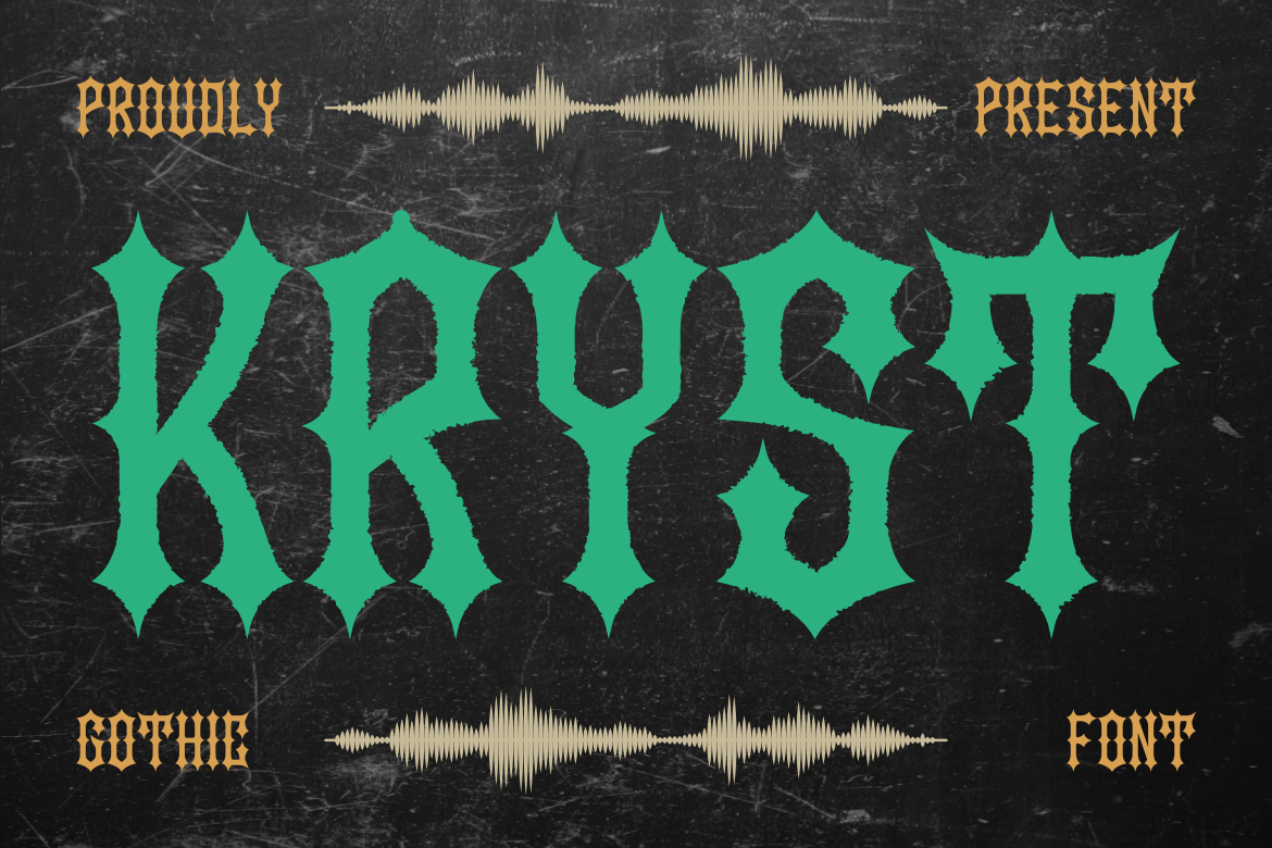
Kryst Gothic combines classic blackletter styling with elegant modern structure.
Why It Works
The font creates:
- Sophisticated darkness
- Premium atmosphere
- Dramatic elegance
while remaining visually clean.
Best For
- Dark luxury branding
- Premium packaging
- Editorial titles
Visual Personality
Kryst Gothic feels:
- Sharp
- Elegant
- Powerful
- Exclusive
making it ideal for upscale visual identity.
2. Colide Gothic – Modern and Flexible

Colide Gothic modernizes traditional Gothic typography with cleaner proportions and contemporary readability.
Why It Works
The font balances:
- Blackletter personality
- Modern usability
- Strong readability
This makes it highly versatile.
Best For
- Music posters
- Fashion branding
- Creative advertising
Design Strength
Colide Gothic adapts well to both print and digital media.
3. Grim Aura Dark Fantasy – Cinematic and Mysterious

Grim Aura Dark Fantasy captures the atmosphere of fantasy worlds and dark storytelling.
Why It Works
Its decorative structure creates:
- Mystical energy
- Fantasy atmosphere
- Dramatic visual tension
perfect for immersive branding.
Best For
- Fantasy novels
- Game titles
- Movie posters
Visual Personality
The font feels:
- Dark
- Cinematic
- Enchanted
- Epic
4. Spikera Black Letter – Traditional and Strong
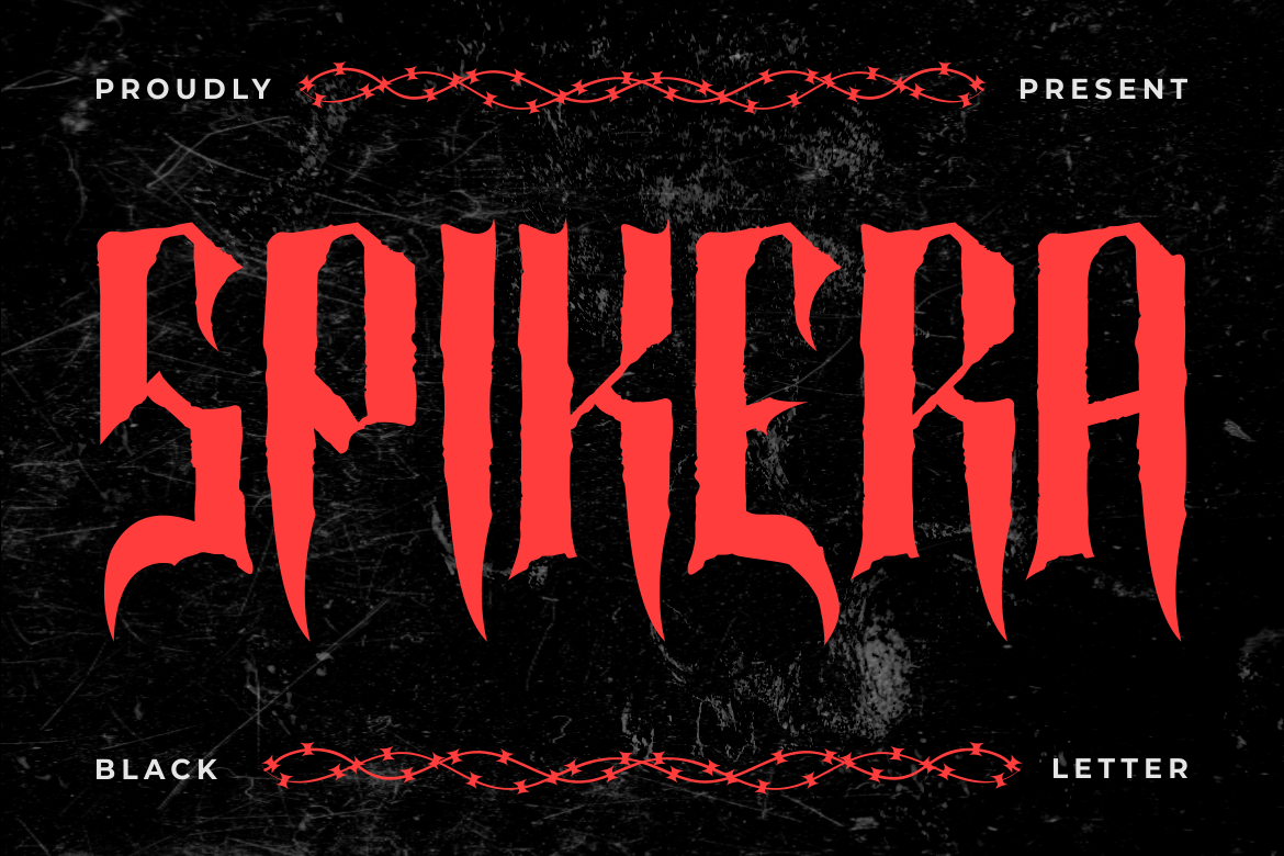
Spikera Black Letter maintains the classic blackletter tradition while emphasizing strength and readability.
Why It Works
Its bold structure communicates:
- Authority
- Heritage
- Timelessness
making it effective for classic branding.
Best For
- Classic signage
- Heritage branding
- Vintage merchandise
5. Black Crest Pirates – Adventure and Themed Design
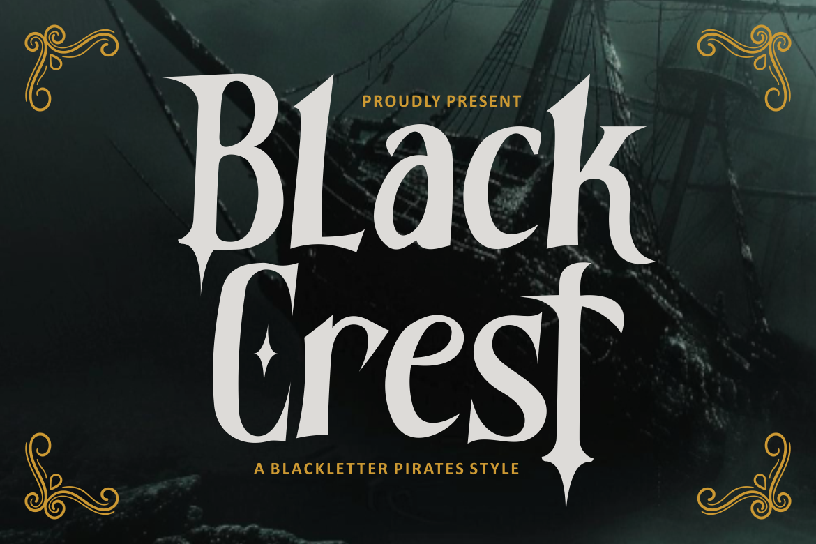
Black Crest Pirates combines Gothic aesthetics with pirate-inspired typography.
Why It Works
The font creates:
- Adventure atmosphere
- Historical mood
- Theatrical identity
perfect for themed experiences.
Best For
- Pirate events
- Festival branding
- Entertainment posters
6. Bold Rune Blackletter – Mystical and Symbolic
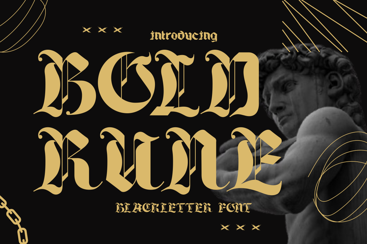
Bold Rune Blackletter incorporates rune-inspired forms and mystical styling.
Why It Works
The typography feels:
- Sacred
- Mythological
- Spiritual
while maintaining bold visibility.
Best For
- Festival posters
- Fantasy branding
- Cultural projects
7. Blckpunk Blackletter – Urban Gothic Style
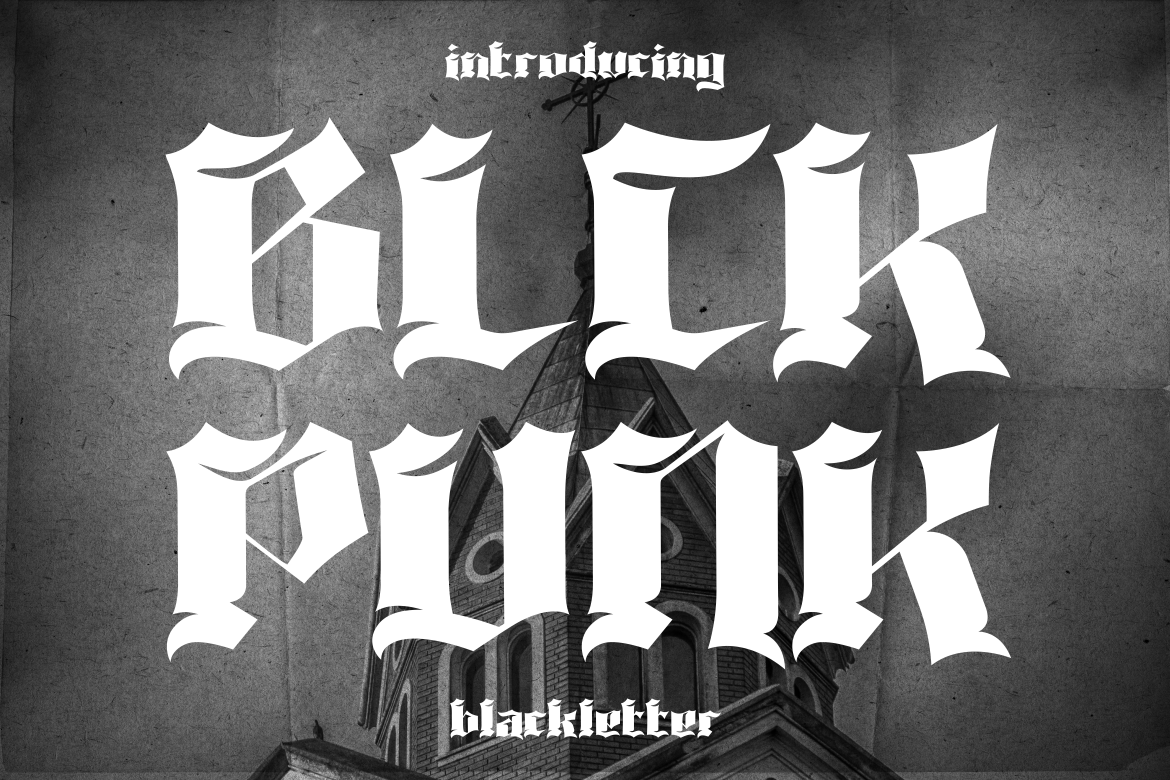
Blckpunk Blackletter merges Gothic typography with streetwear aesthetics.
Why It Works
The font combines:
- Urban rebellion
- Gothic drama
- Modern edge
creating strong youth appeal.
Best For
- Streetwear branding
- Music merchandise
- Underground campaigns
8. Cradle Dust Black Letter – Horror Gothic Atmosphere

Cradle Dust Black Letter delivers intense horror-inspired blackletter styling.
Why It Works
Its distressed details create:
- Fear
- Chaos
- Dark tension
perfect for horror visuals.
Best For
- Halloween posters
- Horror films
- Haunted attractions
9. Drakord Blackletter – Elegant and Sacred

Drakord Blackletter feels refined while maintaining Gothic heritage.
Why It Works
The font creates:
- Religious elegance
- Luxury atmosphere
- Sacred visual identity
Best For
- Premium branding
- Editorial projects
- Event invitations
10. Horror Whisper – Creepy and Expressive

Horror Whisper combines expressive brush energy with Gothic horror styling.
Why It Works
The font feels:
- Unstable
- Disturbing
- Psychological
making it highly cinematic.
Best For
- Horror posters
- Thriller branding
- Dark gaming visuals
Quick Summary Table
| Font Putracetol | Characteristics | Best Use |
|---|---|---|
| Kryst Gothic | Sharp, classic | Dark luxury branding |
| Colide Gothic | Modern, flexible | Music posters |
| Grim Aura Dark Fantasy | Dark fantasy | Novels, games |
| Spikera Black Letter | Strong, traditional | Classic signage |
| Black Crest Pirates | Pirate-themed | Themed events |
| Bold Rune Blackletter | Mystical, rune-style | Festival posters |
| Blckpunk Blackletter | Urban gothic | Streetwear |
| Cradle Dust Black Letter | Horror gothic | Films, Halloween |
| Drakord Blackletter | Elegant, sacred | Premium branding |
| Horror Whisper | Creepy, expressive | Horror posters |
Best Practices for Using Gothic Fonts
Prioritize Readability
Decorative typography should still remain readable enough for audiences to understand quickly.
Use Gothic Fonts Strategically
Blackletter typography works best for:
- Headlines
- Logos
- Titles
- Posters
rather than large body text.
Pair with Simple Typography
Combining Gothic fonts with minimalist sans-serif typography improves visual balance.
Common Mistakes in Gothic Typography
Overusing Decorative Elements
Too much ornamentation can reduce clarity.
Poor Context Matching
Not every brand fits Gothic aesthetics.
Ignoring Brand Personality
Typography must align with:
- Audience
- Message
- Brand tone
Gothic Typography in Modern Branding Trends
Modern designers increasingly combine Gothic typography with:
- Minimal layouts
- Streetwear aesthetics
- Dark luxury branding
- Cinematic visuals
- Experimental graphics
This blend creates fresh modern interpretations of classic blackletter design.
Final Thoughts
Understanding gothic fonts in modern design helps designers create visuals that feel powerful, mysterious, elegant, and culturally rich. Gothic typography is no longer limited to medieval manuscripts or historical decoration. Today, it has become a versatile creative tool for branding, entertainment, fashion, music, and digital design.
Fonts like Kryst Gothic, Colide Gothic, Grim Aura Dark Fantasy, Blckpunk Blackletter, and Horror Whisper demonstrate how Gothic typography can adapt to modern creative industries while maintaining its dramatic visual identity.
The best Gothic typography balances:
- Ornamentation
- Readability
- Emotional atmosphere
- Brand personality
When used thoughtfully, Gothic fonts create unforgettable visual experiences that feel timeless, artistic, and emotionally intense.
For more inspiration, creative resources, and practical design tips, visit Putracetol.com and explore creative resources that can elevate your next web project. Thank you for taking the time to read this article. If you are looking for more great articles, feel free to visit Putracetol Blog.
Additionally, if you want to explore some free typography options, you can check out Putracetol Studio on Dafont. Happy reading and designing!