
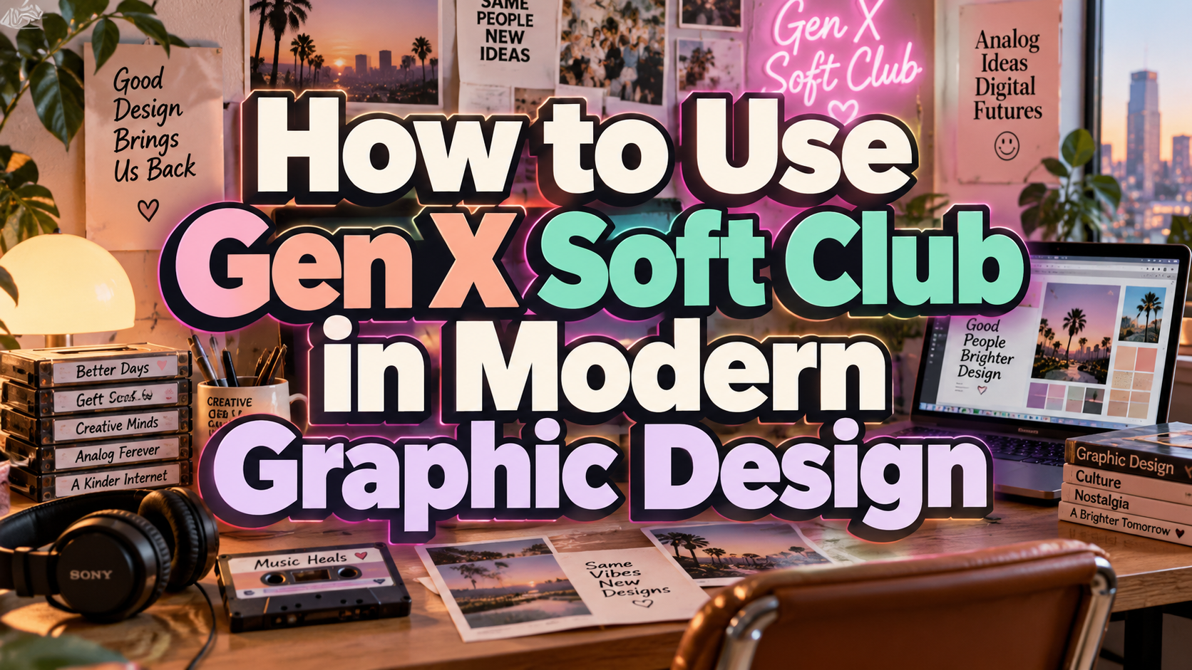
Gen X Soft Club Aesthetic 2026: Nostalgia With a Contemporary Point of View
Separate the Aesthetic From the Age Group
Start with audience interests, not generational assumptions. Ask which music, places, publications, and everyday experiences suggest comfort or belonging.
Gen X Soft Club is an aesthetic label, not a personality profile. The Consumer Aesthetics Research Institute (CARI) traces it to visual culture from the early 1990s through the mid-2000s, originally addressing young adults through an urban interpretation of club culture.
For a contemporary campaign, borrow the visual principles while researching what feels relevant to your actual customers.
What Does Gen X Soft Club Look Like?
Think understated city life rather than glittering nightlife. CARI describes muted greens, beige, gray, and black, alongside a mixture of organic and restrained futuristic references. Its account also connects minimalist typography with urban signage.
“Soft” does not necessarily mean pink, cuddly, or cheerful. This look can feel cool, introspective, and slightly distant. A warmer, more welcoming version is a deliberate contemporary adaptation, not a requirement of the historical style.
Why Revisit It in 2026?
Envato’s September 2026 coverage identifies renewed interest in Soft Club across fashion, music, and graphic design, including younger audiences. Treat this as a reported creative direction, not evidence that every Gen X customer wants nostalgic branding.
Canva’s 2026 forecast also highlights restrained layouts, tactile surfaces, and early-computing nostalgia. These broader directions provide a useful context for revisiting Soft Club without reproducing an entire decade.
Build the Visual Language
Use Muted Color With a Clear Focal Point
For a starting palette, try stone gray, moss green, dusty blue, and off-white. Choose one dominant background, one dark text color, and a restrained accent.
To introduce warmth, test cream against cool blue or combine subdued city photography with natural materials.
Let Photography Carry the Atmosphere
Envato’s guide highlights blurred movement, diffused light, transport settings, and industrial textures. These references frame everyday urban life as atmospheric rather than spectacular.
Create your own images around a quiet train journey, reflective windows, or friends leaving a listening session. Use blur selectively: preserve a clear subject and avoid making every photograph look accidentally out of focus.
Keep Typography Restrained but Recognizable
Begin with a clean sans serif and a consistent alignment system. Use scale, spacing, and placement to create hierarchy instead of adding futuristic effects to every headline.
PutraCetol Studio offers modern display, serif, and retro typography for brand exploration. Test a distinctive headline option alongside a readable text family, rather than forcing a decorative font into captions or navigation.
Turn Inspiration Into a Brand Experience
Consider a hypothetical listening café targeting adults who enjoy music and unhurried conversation. Build the identity around muted blue packaging, warm interior photography, a straightforward wordmark, and editorial event posters.
For social content, combine short customer stories, staff playlists, and behind-the-scenes photographs. Keep booking and opening hours obvious, and make motion optional.
Make Inclusion Practical
Do not assume softer colors automatically create inclusive design. Represent different ages, bodies, and backgrounds, and ask intended customers to review the tone.
For web text, WCAG AA generally requires 4.5:1 contrast for ordinary text and 3:1 for qualifying large text, with defined exceptions. Muted palettes still need readable controls and clear information.
Comparison
Use these creative directions to test your brief, not to classify audiences.
| Direction | Visual Starting Point | Question to Test |
|---|---|---|
| Soft Club-inspired | Muted city imagery, restrained type | Does it feel atmospheric or distant? |
| Warm reinterpretation | Cream accents, candid community images | Does it feel welcoming without becoming generic? |
| Futuristic contrast | Metallic highlights, stronger geometry | Does technology overwhelm the human story? |
| Minimal editorial | Spacious layouts, limited imagery | Is the identity still recognizable? |
Common Mistakes
The first mistake is treating nostalgia as a universal emotional shortcut. Interview customers about specific references instead of assuming shared memories. A style can interest someone who never experienced its original era, while another person may find it irrelevant.
Another mistake is collecting references without creating an original system. Avoid reproducing old advertisements, album covers, or photography. Document your own palette, typography, image treatment, and layout rules, then test them across packaging, web, and social content.
The final mistake is confusing visual softness with weak communication. Do not hide navigation, shrink captions, or blur essential product details. Keep the atmosphere in supporting imagery while protecting the clarity of names, prices, instructions, and calls to action.
Conclusion
The Gen X soft club aesthetic 2026 offers a starting point for exploring nostalgia through quieter, more personal design.
Use the historical references thoughtfully, then adapt them to real audiences and modern usability. Combine original photography, controlled color, and carefully selected PutraCetol Studio typography. The strongest result should feel familiar enough to invite people in and distinctive enough to belong to your brand.
Explore these fonts and many more at PutraCetol.com to build a business identity that looks professional, trustworthy, and memorable.
Additionally, if you want to explore some free typography options, you can check out Putracetol Studio on Dafont. Happy reading and designing!