
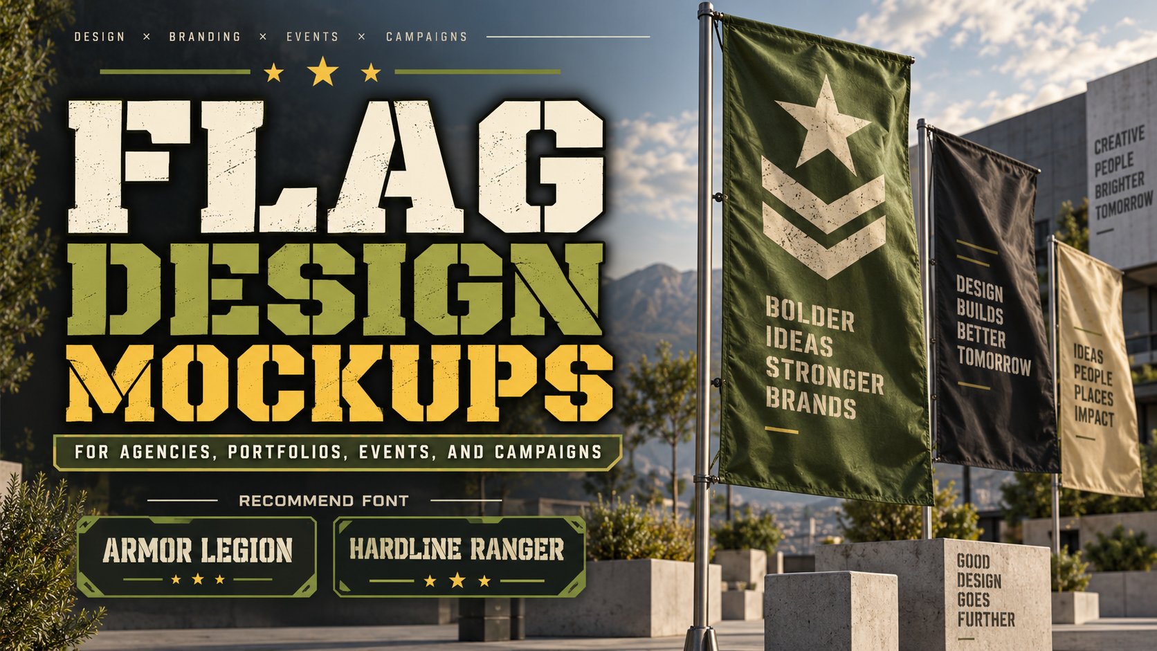
Flag Mockups for Designers 2026: Present Branding With Movement and Context
Design the Flag Before Choosing the Mockup
The strongest flag mockups for designers 2026 begin with a clear flat design. A realistic fabric texture cannot rescue weak typography, poor proportions, or a logo that becomes unreadable once the flag folds in the wind.
Start by designing the artwork in a simple rectangle. Test the logo at several scales, create enough clear space around important elements, and avoid placing small information near edges where fabric distortion may hide it.
Only after the flat composition works should you place it into a mockup.
A good flag mockup does more than make artwork look realistic. It demonstrates how an identity behaves when stretched, folded, viewed from an angle, or placed inside a physical environment. For clients, this provides context that a flat logo presentation cannot always communicate.
Why Flag Mockups Are Useful in Branding
Flags create movement, scale, and environmental presence. They can visualize identities for festivals, sports teams, hotels, outdoor brands, retail environments, corporate events, gaming communities, exhibitions, and promotional campaigns.
The same logo can feel dramatically different on a small stationery item and a large flag outside a building. Mockups help designers test that transition before anything is manufactured.
They are also useful for portfolios. A flag can turn a simple logo into a more immersive case-study image, especially when combined with signage, apparel, packaging, or event graphics.
Build a Strong Flag Layout
Keep the Main Message Large
Wind constantly changes the visible surface of a flag. Fine details may disappear inside folds, so emphasize one dominant element such as a symbol, monogram, wordmark, or short slogan.
A horizontal flag might use a centered logo with generous negative space. A vertical promotional flag could use a stacked name and symbol designed for distance.
Design for Movement
Do not evaluate the layout only when perfectly flat. Imagine portions of the design disappearing temporarily.
Avoid placing every important detail in one narrow region. Strong silhouettes, bold lettering, recognizable symbols, and simple color relationships survive movement better than complicated compositions.
Use Contrast Strategically
Outdoor flags need strong foreground-to-background separation. A black wordmark on dark navy may look sophisticated on a monitor but disappear at distance.
Test the artwork in grayscale and at thumbnail size. If the main identity is still recognizable, it will usually perform better in a realistic mockup.
Create Realistic Flag Mockups
Photoshop Smart Objects are particularly useful for editable mockups. Adobe notes that Smart Objects preserve original image data and allow scaling, skewing, distortion, perspective changes, and warping without permanently changing the source artwork. (adobe.com)
Place the design as an embedded or linked Smart Object, transform it to match the flag plane, and use the mockup’s existing displacement, shadow, highlight, or fabric layers where provided. Linked Smart Objects are especially useful for presentations containing several scenes because updating the source can update related instances. (adobe.com)
Do not erase every wrinkle. Fabric folds, subtle lighting changes, and environmental shadows are what make the presentation believable.
Jump to Recommended Fonts
1. Armor Legion Display Font

Armor Legion is a bold stencil-inspired display font built around geometric cuts, strong vertical and diagonal strokes, and robust spacing. Its military-influenced structure creates authority while its modern construction makes it suitable beyond literal army themes. On a moving flag, its substantial shapes can maintain impact even when parts of individual letters are affected by folds. (putracetol.com)
PROS: Bold stencil construction, geometric cuts, strong visibility, modern tactical character.
BEST FOR: Esports flags, extreme sports, gaming events, tactical branding, outdoor campaigns, apparel, and bold promotional displays.
2. Hardline Ranger Military Stencil Font
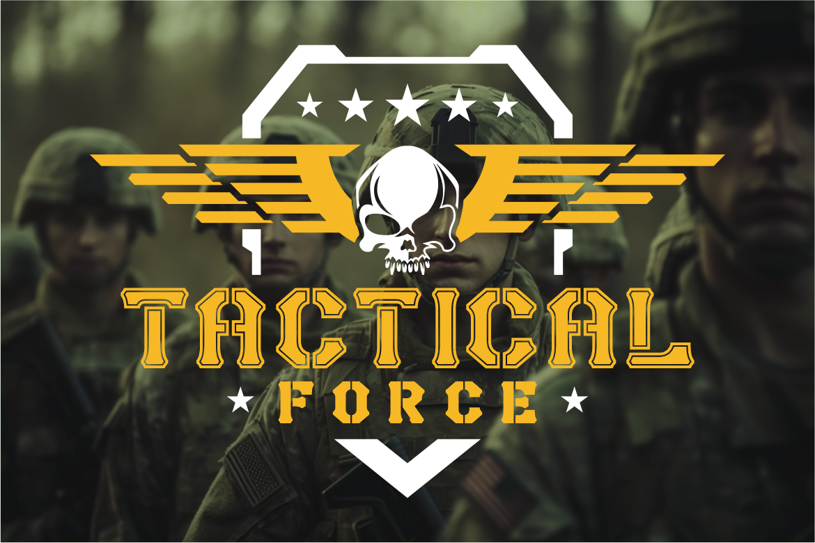
Hardline Ranger uses octagonal corners, sharp indentations, industrial cuts, and compressed bold forms inspired by functional military stenciling. Its modular construction and uppercase-focused personality give short titles a disciplined, commanding appearance that translates naturally to flags, patches, signage, and event graphics. (putracetol.com)
PROS: Compressed silhouette, sharp stencil details, strong modularity, authoritative tone.
BEST FOR: Military-inspired campaigns, survival brands, team flags, action events, outdoor products, film graphics, and gaming communities.
Comparison
| Approach | Main Benefit | Best Use |
|---|---|---|
| Flat flag artwork | Tests hierarchy clearly | Early design review |
| Fabric flag mockup | Shows folds and movement | Client presentation |
| Outdoor flag scene | Adds environmental scale | Branding case studies |
| Vertical event flag | Demonstrates visibility | Events and retail |
| Close-up fabric view | Highlights print and texture | Premium presentation |
| Multiple flag scene | Shows system consistency | Campaign visualization |
Common Mistakes
The first mistake is designing for the mockup instead of the actual flag. Dramatic lighting and realistic fabric can make almost anything look attractive in a presentation. Always return to the flat artwork and verify that the identity still works without photographic effects.
Another mistake is using typography that becomes too detailed when distorted. Thin scripts, small captions, narrow outlines, and long slogans can disappear in fabric folds. For expressive display fonts such as Armor Legion or Hardline Ranger, keep wording concise and provide sufficient spacing so their distinctive structures remain visible.
The final mistake is making every portfolio image equally dramatic. One hero mockup is often enough. Support it with a flat flag, close-up detail, color variation, or environmental view so clients understand both the design system and its realistic application.
Conclusion
Flag mockups for designers 2026 are valuable because they transform static branding into an experience of movement, scale, and environment.
Start with strong flat artwork, use simple hierarchy, test readability at distance, and apply realistic fabric distortion only after the design works independently. Fonts such as Armor Legion and Hardline Ranger from PutraCetol Studio can add bold character when a project needs authority, energy, or tactical personality.
A successful flag mockup does not merely decorate a presentation. It proves that the visual identity can survive real-world conditions while remaining recognizable and professionally designed.
Explore these fonts and many more at PutraCetol.com to build a business identity that looks professional, trustworthy, and memorable.
Additionally, if you want to explore some free typography options, you can check out Putracetol Studio on Dafont. Happy reading and designing!