
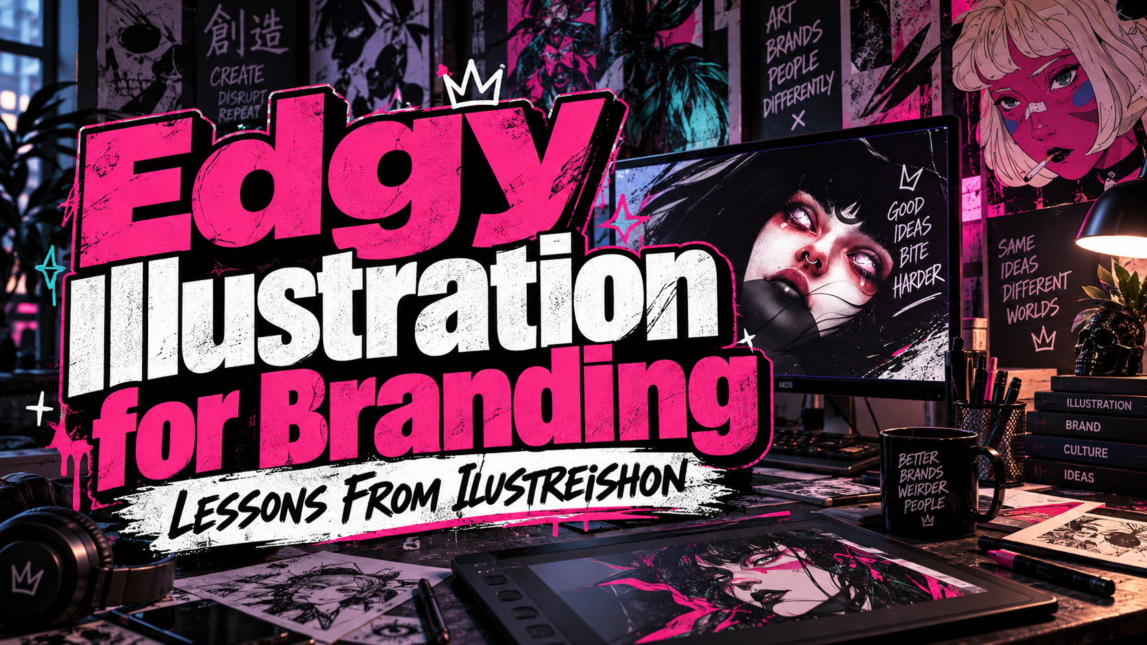
Ilustreishon Edgy Illustration Profile 2026: More Than a Dark Aesthetic
Look Beyond the Mood
Begin by asking what an illustration communicates before examining its textures. Does it suggest transformation, uncertainty, wonder, or conflict? Darkness is a visual treatment; the underlying idea gives it purpose.
An earlier identifies Ilustreishon as Leonardo González, describing his specialty as dark, edgy illustration. This article revisits documented earlier work for designers working in 2026, rather than presenting it as a newly released collection.
Study the decisions behind the images, then develop your own visual language instead of copying recognizable motifs.
What His Documented Work Reveals
Detail Works Best Inside a Clear Structure
An illustration credited to Ilustreishon on Dribbble account combines a large serif A with an armadillo’s head. The animal’s patterned surface breaks into scattered marks, while the restrained background leaves the letter recognizable. My reading is that the contrast between solid typography and fragmented texture creates the image’s tension.
Try a similar structural exercise with an original subject: establish one dominant silhouette, then concentrate intricate drawing inside it. Check the image at thumbnail size before adding more detail.
Dramatic Art Can Express Wonder, Not Only Fear
Ilustreishon’s Slingshot cover won the Books & Magazine category in the 2016. The published description explains how a female figure dissolves into outer space, connecting a character with the story’s science-fiction setting. González described his ambition as uplifting and concerned with humanity’s relationship to the universe.
This example broadens the meaning of “edgy.” Read it as a reminder that unusual imagery can invite wonder rather than merely threaten.
For a fictional exhibition campaign, begin with an emotional contrast, such as isolation within a vast landscape. Choose details that strengthen that relationship instead of assembling unrelated supernatural symbols.
Collaboration Belongs Inside the Creative Process
In his published comments accompanying the award, González recommended discussing ideas with clients before beginning and protecting the standard of work an artist is willing to present. His advice connects creative identity with communication, not simply technical execution.
Translate that into a practical brief: agree on the audience, emotional direction, main deliverables, revision stages, and final applications. Present early compositions before investing in complex rendering.
Apply the Lessons to Branding and Portfolios
For a hypothetical independent music release, create one original illustrated figure, a controlled palette, and a recurring symbol. Adapt them into cover art, a poster, and short motion graphics. Keep the title and release information easy to find.
For your portfolio, show the problem, an early composition, a close-up, and the finished application. Explain your contribution and distinguish commissioned work from personal experiments. Include process material only when you have permission to share it.
This approach gives potential clients a way to evaluate your thinking rather than only your preferred aesthetic.
Find Opportunities Without Losing Your Identity
99designs currently offers both design contests and direct one-to-one projects, with designer profiles supporting discovery and client matching. These are possible routes to commercial work, not guarantees of income. Check current eligibility and terms before applying.
Choose briefs that fit your abilities and interests. Review project scope, fees, rights, and revision expectations before committing. Maintain an independent portfolio archive, and measure useful inquiries and repeat collaborations rather than attention alone.
Let Typography Complete the Story
For your own projects, explore PutraCetol Studio’s bold display and serif typography for titles, packaging, and campaign graphics. Pair expressive lettering with a readable companion for descriptions, credits, and practical information.
Leave space for the title during composition, not after finishing the illustration. When the artwork is intricate, try simpler lettering; when the image is restrained, test a more distinctive headline.
Comparison
Use this framework when reviewing your own illustration.
| Focus | Surface-Level Treatment | More Purposeful Direction |
|---|---|---|
| Mood | Make everything dark | Define a specific emotion |
| Detail | Fill every empty area | Concentrate detail around the focal point |
| Symbolism | Add unrelated strange objects | Connect imagery to the narrative |
| Branding | Use one striking image | Build related applications |
| Portfolio | Show finished artwork only | Explain the brief and decisions |
Common Mistakes
The first mistake is treating darkness, skulls, or dense texture as proof of originality. Begin with a meaningful relationship between subject and setting. Ask viewers what they notice and understand, then remove details that distract from the intended reading.
Another mistake is blurring inspiration, attribution, and commercial permission. Credit references, do not reproduce another artist’s composition as your own campaign, and obtain approval before publishing client materials. Verify dates and project credits when writing profiles rather than presenting historical recognition as a new achievement.
Conclusion
The Ilustreishon edgy illustration profile 2026 offers a starting point for studying narrative imagery, deliberate detail, and professional presentation.
Develop the story before the surface, discuss direction before rendering, and test the artwork across its intended formats. Combine your original illustration with carefully selected PutraCetol Studio typography to build a visual identity that communicates as strongly as it looks.
Explore these fonts and many more at PutraCetol.com to build a business identity that looks professional, trustworthy, and memorable.
Additionally, if you want to explore some free typography options, you can check out Putracetol Studio on Dafont. Happy reading and designing!