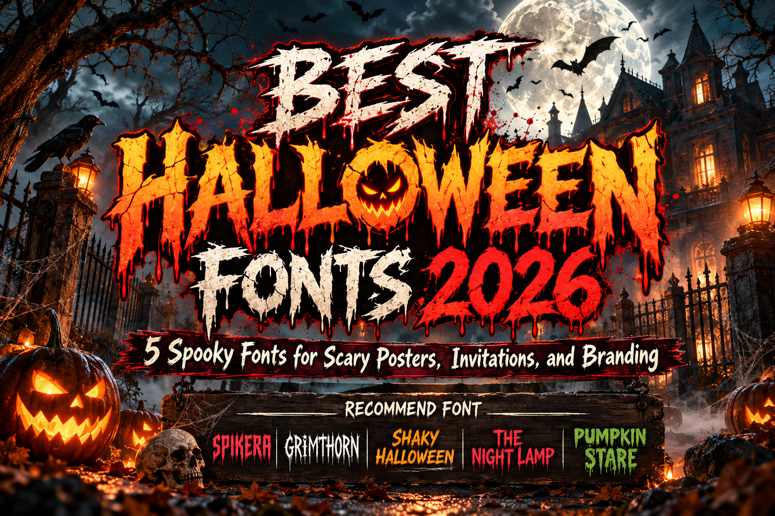
Best Halloween Fonts 2026: Typography for Spooky and Creative Designs
Halloween design is one of the rare situations where typography can become almost as expressive as the illustration itself.
Sharp terminals can suggest danger. Uneven outlines can make lettering feel unstable. Gothic construction introduces darkness and history, while rounded monster-inspired characters can transform the same Halloween theme into something playful enough for children and family events.
That is why choosing the best Halloween fonts 2026 is not simply about finding the scariest typeface available. The font should match the specific mood of the campaign, whether that means sinister, cinematic, mysterious, rebellious, or fun.
For posters, invitations, event banners, YouTube thumbnails, packaging, and seasonal promotions, decorative display typography works best when it creates atmosphere while keeping the main message recognizable.
Initial Suggestion: Choose Your Type of Halloween First
Before selecting a font, define what kind of Halloween experience you are designing.
A haunted attraction might need jagged blackletter. A horror-film poster can use rough cinematic lettering, while a children’s Halloween party may benefit from quirky characters and pumpkin-inspired forms.
This distinction matters because “scary” is not one visual style.
Limit the decorative font to important words such as the event title, product name, or main promotional phrase. Dates, addresses, prices, schedules, and longer information should usually use a simpler supporting typeface.
The result feels frightening where necessary without becoming difficult to read.
Jump to Recommended Halloween Fonts
1. Spikera Black Letter Font
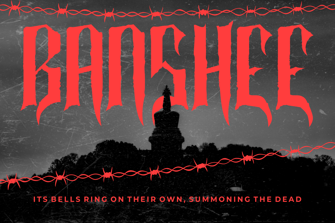
Spikera combines traditional blackletter influence with a much more aggressive horror personality. Its tall proportions, pointed terminals, rough edges, narrow spacing, dramatic vertical strokes, and angular details create a dark silhouette suited to large-format display typography. PutraCetol specifically positions it for horror branding, movie titles, gothic events, tattoo businesses, dark packaging, underground music, and Halloween-oriented creative work. PutraCetol Studio
Its strongest selling point is the balance between recognizable blackletter structure and modern underground intensity, making it suitable when conventional Gothic typography feels too traditional.
PROS: Sharp silhouette, rough handcrafted texture, strong Gothic identity, cinematic presence.
BEST FOR: Haunted attractions, gothic Halloween posters, horror movies, dark merchandise, metal events.
2. Grimthorn Hardcore Font
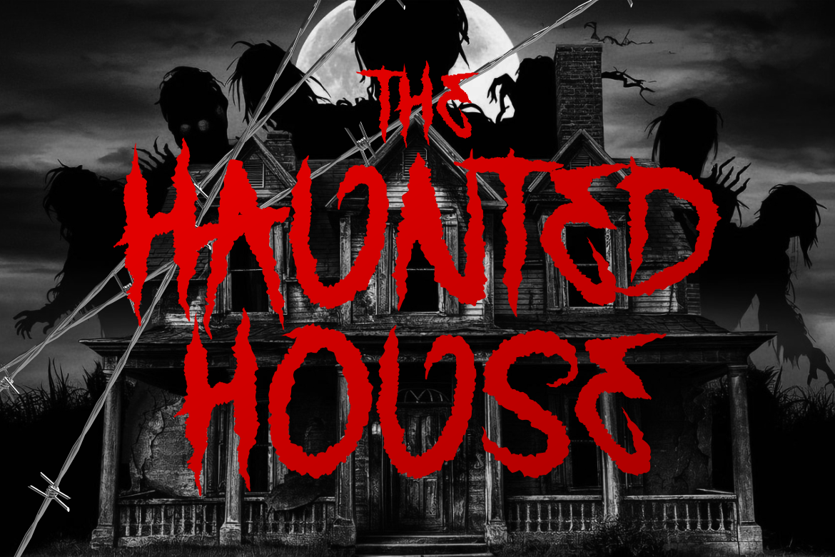
Grimthorn moves further into aggressive territory with tall irregular characters, jagged edges, rough contours, uneven strokes, and thorn-like extensions. The construction mixes gothic influence with hardcore and underground aesthetics while retaining enough structure for large headlines. PutraCetol recommends it for horror and thriller projects, haunted experiences, gaming, dark fantasy, paranormal content, concerts, posters, packaging, and seasonal campaigns. PutraCetol Studio
This is a particularly effective choice when the Halloween visual needs to feel dangerous rather than playful.
PROS: Jagged forms, aggressive personality, distressed texture, immediate visual intensity.
BEST FOR: Extreme horror posters, escape rooms, Halloween concerts, gaming, supernatural branding.
3. Shaky Halloween
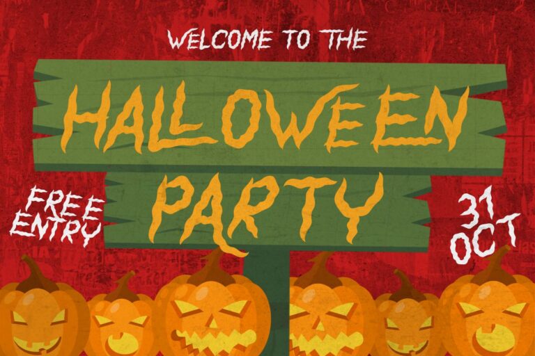
Shaky Halloween takes inspiration from horror movie titles and scary logo typography, but its alternate characters introduce curved beginnings and endings that give designers more flexibility when constructing logos and poster titles. The family includes uppercase and lowercase characters, numbers, punctuation, multilingual support, plus OpenType alternates and ligatures. PutraCetol Studio
That feature set makes Shaky Halloween useful when you want unmistakable horror character without relying entirely on rough or gothic letterforms.
PROS: Horror-film personality, alternates, ligatures, flexible title treatment.
BEST FOR: Halloween logos, movie-inspired posters, book covers, apparel, promotional titles.
4. The Night Lamp
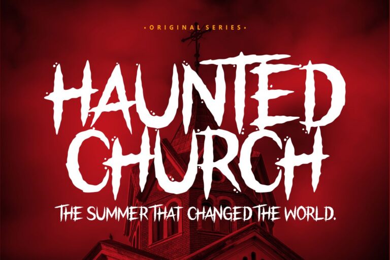
The Night Lamp is designed specifically around horror, thriller, scary, and Halloween themes. PutraCetol recommends it for logos, quotations, apparel, comics, book covers, cards, and posters, making it a straightforward option for designers who want dedicated horror display typography without an overly complex concept. PutraCetol Studio
Its cinematic direction works especially well for mysterious compositions built around dark photography, shadows, abandoned environments, or supernatural imagery.
PROS: Direct horror identity, versatile display applications, multilingual character support.
BEST FOR: Thriller posters, haunted-house promotions, horror covers, Halloween social graphics.
5. Pumpkin Stare Halloween Display Font

Pumpkin Stare represents the lighter side of Halloween. Instead of concentrating entirely on terror, it combines eerie details with quirky, playful forms inspired by pumpkins, monsters, and haunted imagery. The family provides several visual variations that can be used individually or combined, making it useful for branding, invitations, children’s themes, packaging, stickers, posters, and seasonal crafts. PutraCetol Studio
It is an excellent alternative when a campaign should feel unmistakably Halloween without frightening a family-oriented audience.
PROS: Multiple styles, playful spooky personality, versatile decorative character.
BEST FOR: Kids’ Halloween parties, pumpkin events, candy packaging, invitations, family promotions.
Comparison: Which Halloween Font Fits Your Design?
| Font | Visual Personality | Best Application |
|---|---|---|
| Spikera | Gothic, sharp, intimidating | Haunted and dark branding |
| Grimthorn | Jagged, brutal, aggressive | Extreme horror campaigns |
| Shaky Halloween | Cinematic, creepy | Posters and horror titles |
| The Night Lamp | Mysterious, thriller-inspired | Halloween promotions |
| Pumpkin Stare | Spooky, quirky, playful | Kids and family Halloween |
For maximum darkness, Spikera and Grimthorn are the strongest choices. Shaky Halloween and The Night Lamp work naturally with cinematic horror, while Pumpkin Stare is better suited to the playful side of October campaigns.
Make Halloween Typography More Effective
Strong Halloween typography does not require covering every letter with blood, shadows, outlines, and textures.
Start with hierarchy. Use one dramatic typeface for the headline and pair it with a clean sans serif or serif for supporting information. A poster reading “MIDNIGHT HAUNT” can use Grimthorn for the title while keeping the date, venue, ticket price, and website simple.
Color can reinforce the typography as well. Black and red create a darker horror direction, while orange, purple, cream, and green can produce a more playful Halloween identity. Contrast matters more than the number of effects applied.
Common Mistakes
One common mistake is choosing the most complicated font simply because the project is Halloween-themed. Extremely distressed or ornamental lettering can become unreadable when printed small or displayed on mobile screens. Test the final title at its real output size, especially for social posts, event banners, merchandise, and thumbnails.
Another mistake is combining several horror fonts in one design. When every line uses jagged, dripping, gothic, or monster-inspired typography, there is no visual hierarchy. One expressive display font paired with a restrained supporting family usually creates a stronger result.
Finally, match the level of horror to the audience. Typography for a death-metal Halloween concert should not look like a children’s pumpkin festival, and playful lettering may weaken a serious supernatural movie campaign. The font should communicate the event’s personality before viewers even read the words.
Conclusion
The best Halloween fonts 2026 offer more than generic spooky decoration.
Spikera delivers sharp gothic intimidation, Grimthorn pushes into brutal hardcore horror, Shaky Halloween brings cinematic personality, The Night Lamp supports mysterious thriller visuals, and Pumpkin Stare creates a playful seasonal atmosphere.
Explore these Halloween typefaces at PutraCetol Studio and choose a font according to the emotion your design needs to create. With the right hierarchy, color palette, imagery, and typography, a simple October promotion can become a memorable seasonal identity.
Explore these fonts and many more at PutraCetol.com to build a business identity that looks professional, trustworthy, and memorable.
Additionally, if you want to explore some free typography options, you can check out Putracetol Studio on Dafont. Happy reading and designing!