Best Groovy Retro Fonts 2026: Funky Typography With Modern Nostalgia
Retro design continues to offer something that ultra-clean typography often cannot: personality.
Groovy lettering brings together exaggerated curves, chunky proportions, unconventional serifs, psychedelic shapes, and playful rhythm. The result instantly suggests music, freedom, fashion, handmade culture, and the visual experimentation associated with the late 1960s and 1970s.
The best groovy retro fonts 2026 do not need to reproduce vintage typography exactly. Modern designers can borrow its warmth and expressive shapes while using cleaner layouts, contemporary color palettes, and stronger brand systems.
That combination works especially well for music posters, fashion campaigns, cafés, lifestyle products, packaging, social media, merchandise, and businesses that want to appear fun rather than corporate.
Initial Suggestion: Let One Retro Font Become the Hero
Groovy typography works best when it has room to perform.
Instead of combining several decorative fonts, use one expressive typeface for the logo, headline, packaging name, or campaign phrase. Pair it with a simple sans serif or restrained serif for prices, descriptions, dates, and longer information.
For example, a music poster might use oversized psychedelic lettering for “SUMMER GROOVE” while keeping the artist names and event information clean.
Also test the real word before choosing a font. Retro typefaces often have unusual widths, curves, and alternate characters, so the personality of a short brand name can differ significantly from an alphabet specimen.
Jump to Recommended Groovy Retro Fonts
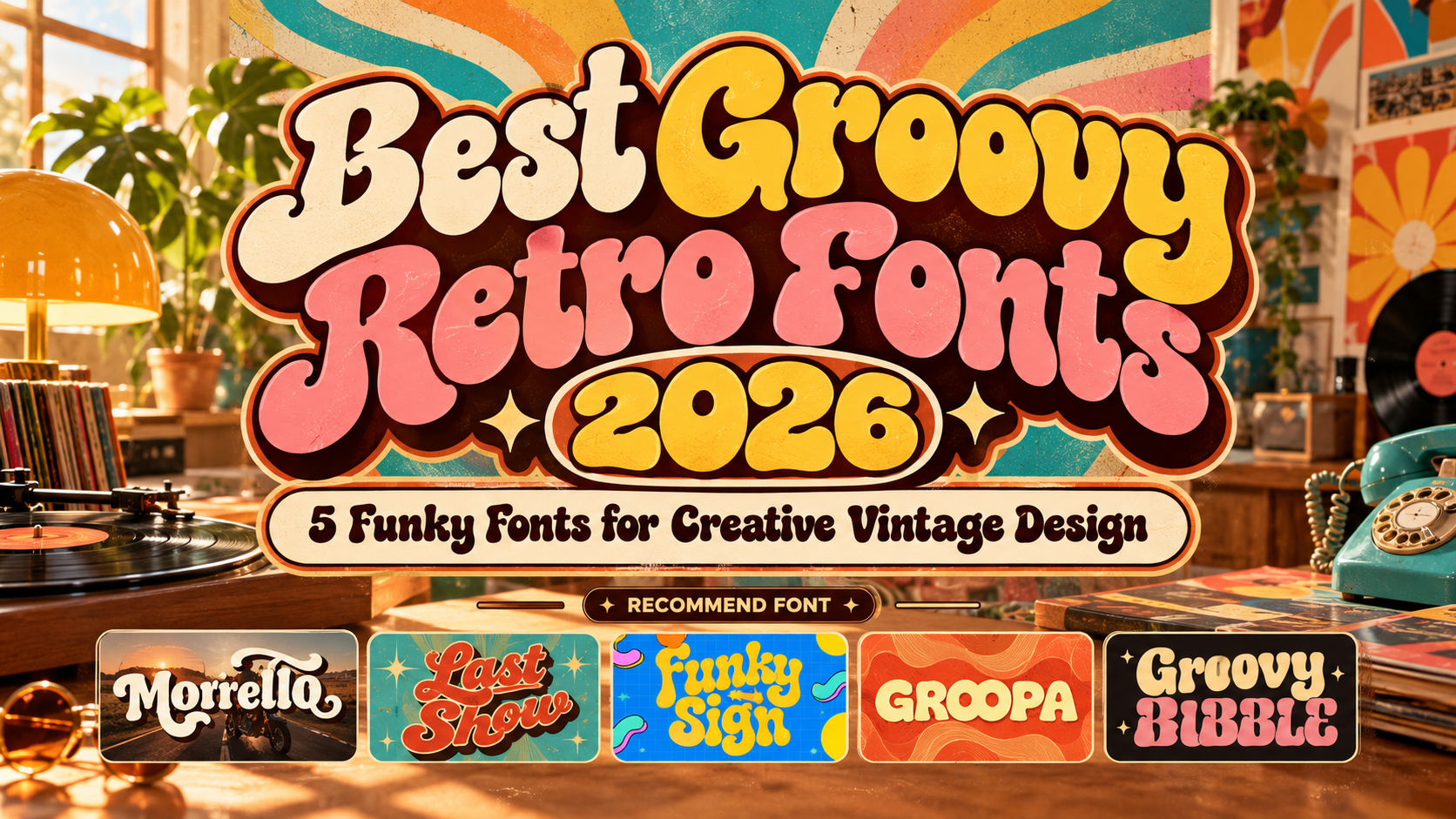
1. Morrello

Morrello is a bold decorative serif created specifically with 60s and 70s-inspired design in mind. It combines strong weight with flowing retro details and includes numerous alternate glyphs and ligatures, allowing designers to make individual words feel more like custom lettering. PutraCetol recommends it for headlines, covers, posters, logos, packaging, merchandise, social media, and other display-focused projects. PutraCetol Studio
Its mixture of serif structure and groovy curves makes Morrello especially useful when you want retro personality without moving completely into psychedelic distortion.
PROS: Many alternates, ligatures, bold structure, strong vintage personality.
BEST FOR: Logos, editorial titles, fashion branding, posters, packaging, lifestyle products.
2. Last Show Bold Retro Script Font
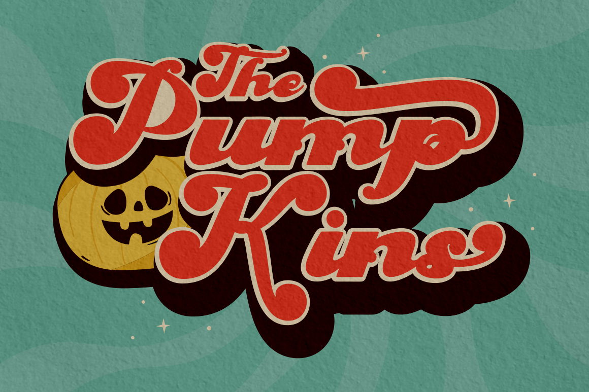
Last Show combines bold construction with groovy vintage movement and expressive script-like details. PutraCetol offers clean and textured versions, giving designers the option of a polished retro appearance or something rougher and more aged. Alternate characters also provide additional flexibility when building distinctive wordmarks and headlines. PutraCetol Studio
Its visual energy feels particularly suited to creative projects that reference vintage entertainment, fashion, cafés, and nostalgic advertising.
PROS: Clean and textured styles, alternatives, strong headline weight, expressive retro movement.
BEST FOR: Music branding, café graphics, fashion, invitations, vintage packaging, posters.
3. Funky Sign Groovy Hipster Font

Funky Sign delivers a more playful interpretation of retro typography. It has a colorful, pop-influenced personality and comes in both clean and textured versions, allowing designers to shift between polished modern retro and a rougher vintage treatment. PutraCetol positions it for posters, logos, landing pages, titles, stickers, branding materials, and music-oriented designs. PutraCetol Studio
This is a strong choice when the project should feel upbeat, youthful, and energetic rather than historically accurate.
PROS: Two visual treatments, playful personality, strong display impact, versatile retro styling.
BEST FOR: Music events, creative brands, stickers, social graphics, lifestyle campaigns.
4. Groopa Bold Groovy Autumn Font
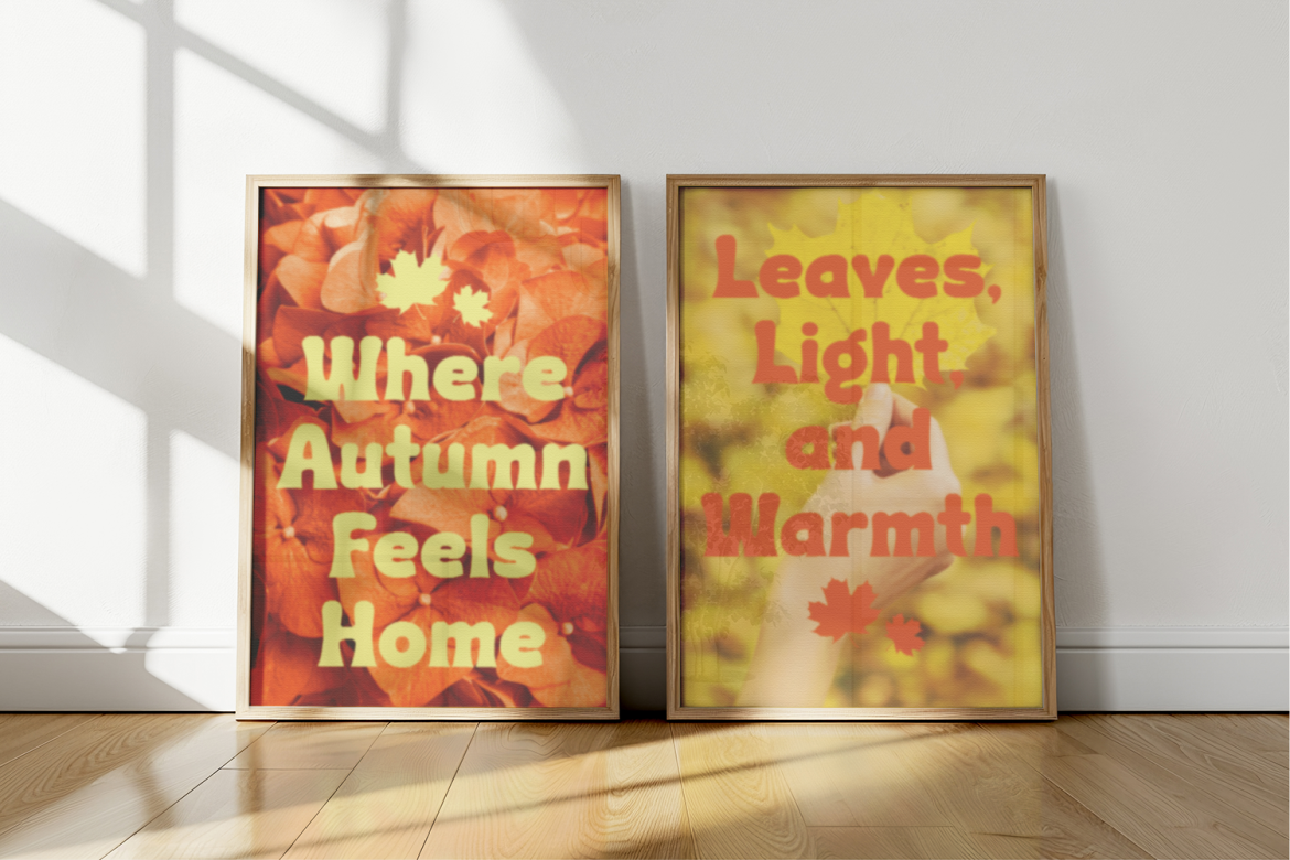
Groopa uses heavy rounded strokes and swelling curves to create an unmistakably warm 70s personality. Its chunky, almost inflated shapes feel friendly and approachable, making it particularly effective for large headlines where the rounded forms can remain visually dominant. PutraCetol highlights uses including logos, posters, packaging, advertising, magazine titles, stickers, fashion campaigns, and merchandise. FontToolbox
Its softer personality also makes Groopa useful for brands that want retro nostalgia without looking overly psychedelic.
PROS: Chunky shapes, rounded weight, warm personality, strong large-size visibility.
BEST FOR: Autumn campaigns, food packaging, fashion, lifestyle branding, posters, merchandise.
5. Groovy Bubble Bold Psychedelic Display Font

Groovy Bubble is the most overtly psychedelic option in this collection. It uses thick strokes, chunky bubble-like characters, smooth rounded edges, whimsical curves, and fluid connections inspired by colorful 60s and 70s visual culture. PutraCetol recommends it for striking headlines, festival promotions, retro packaging, playful branding, logos, covers, invitations, stickers, and other expressive display work. PutraCetol Studio
If your goal is immediate visual fun and unmistakable psychedelic energy, Groovy Bubble is difficult to ignore.
PROS: Bold bubble forms, strong psychedelic identity, rounded construction, memorable silhouette.
BEST FOR: Festivals, children’s products, funky apparel, music graphics, playful packaging.
Comparison: Which Groovy Retro Font Fits Your Project?
| Font | Main Personality | Best Application |
|---|---|---|
| Morrello | Elegant, groovy serif | Branding and editorial |
| Last Show | Expressive, nostalgic | Music and lifestyle |
| Funky Sign | Playful, hipster | Creative campaigns |
| Groopa | Rounded, warm | Packaging and fashion |
| Groovy Bubble | Psychedelic, bubbly | Festivals and playful branding |
Morrello offers the most structured retro direction, while Groovy Bubble delivers maximum psychedelic impact. Groopa feels softer, Funky Sign emphasizes playful pop energy, and Last Show adds expressive vintage movement.
Build a Modern Retro Design Without Looking Outdated
The easiest way to make groovy typography feel contemporary is to simplify everything around it.
Use generous whitespace, fewer colors, strong photography, and a clear hierarchy. A dramatic retro font paired with a clean layout often feels more current than recreating every 1970s design convention simultaneously.
Color also changes the mood. Burnt orange, mustard, brown, cream, avocado green, and dusty red reinforce classic nostalgia, while electric pink, purple, blue, and acid green can push the same typography toward modern psychedelic design.
For branding, test the typeface in monochrome too. A strong wordmark should remain recognizable even when the colorful retro palette is removed.
Common Mistakes
One common mistake is using groovy fonts for too much text. Their exaggerated curves and unusual proportions work beautifully in headlines but can become tiring in paragraphs, product descriptions, or navigation. Use them as display typography and let a simpler companion font handle functional information.
Another mistake is stacking every retro cliché together. Wavy backgrounds, grain, flowers, rainbows, distorted type, multiple vintage colors, and several decorative fonts can quickly make a composition visually chaotic. Choose two or three strong retro signals and allow them enough space to stand out.
Finally, consider the final commercial application before publishing. A logo, merchandise line, website, social campaign, or printed product may require different usage coverage. PutraCetol’s current product pages provide flexible license coverage so designers can select the modules that correspond to the actual project. PutraCetol Studio
Conclusion
The best groovy retro fonts 2026 prove that nostalgic typography does not have to feel outdated.
Morrello brings sophisticated retro serif character, Last Show adds expressive vintage movement, Funky Sign delivers playful energy, Groopa introduces rounded warmth, and Groovy Bubble embraces full psychedelic fun.
Explore these fonts at PutraCetol Studio and combine them with modern layouts, controlled color palettes, and clear hierarchy. The result can capture the freedom of 70s-inspired design while still feeling fresh enough for contemporary branding.
Explore these fonts and many more at PutraCetol.com to build a business identity that looks professional, trustworthy, and memorable.
Additionally, if you want to explore some free typography options, you can check out Putracetol Studio on Dafont. Happy reading and designing!