
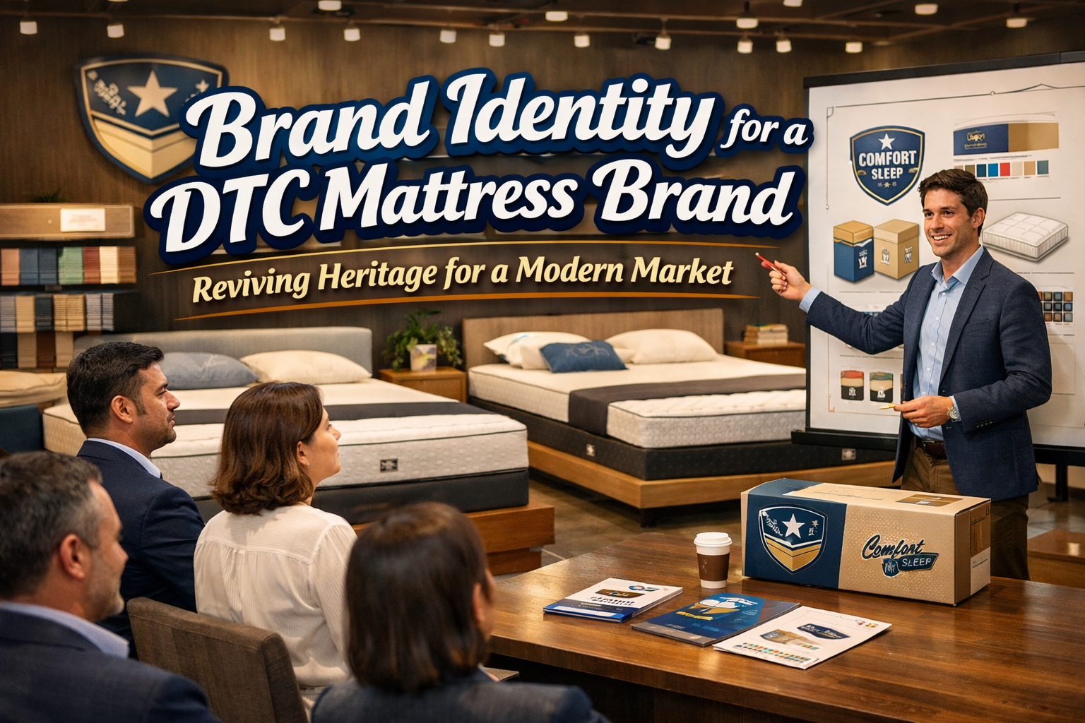
Direct-to-consumer (DTC) brands have reshaped the way people discover, purchase, and interact with everyday products. Among them, mattress companies stand out as a category that blends lifestyle, wellness, and long-term consumer trust. This case explores a branding project designed to reposition a heritage mattress brand for the modern DTC landscape. The goal was to carry forward the weight of history while creating a contemporary visual identity that resonates with younger consumers who value comfort, quality, and authenticity.
The result is a brand identity that feels familiar yet renewed. It honors tradition but speaks fluently in the visual language of modern DTC brand culture. It pursues lifestyle appeal and commercial clarity at the same time.

Understanding the Core Concept: Heritage Meets Comfort
The foundation of the project began with a simple concept: comfort is timeless. Long before mattresses were marketed through digital campaigns and social media, they were products tied to generational rituals, handcrafted heritage, and cultural ideas about rest.
The new identity embraces these roots. It acknowledges that heritage is an asset, not an obstacle. By leaning into the brand’s history, the design builds trust, elevates perceived value, and avoids the generic look that often plagues young DTC brands fighting for attention.
At the same time, the visual language needed to appeal to contemporary consumers who shop online, trust reviews, and make lifestyle-based purchasing decisions. This dual approach shaped the identity strategy.
Visual Identity Direction: Classic Elegance in a Modern System
The visual identity is built upon a balance of classic aesthetics and modern simplicity. Every element is designed to reinforce comfort, quality, and reliability.
Typography
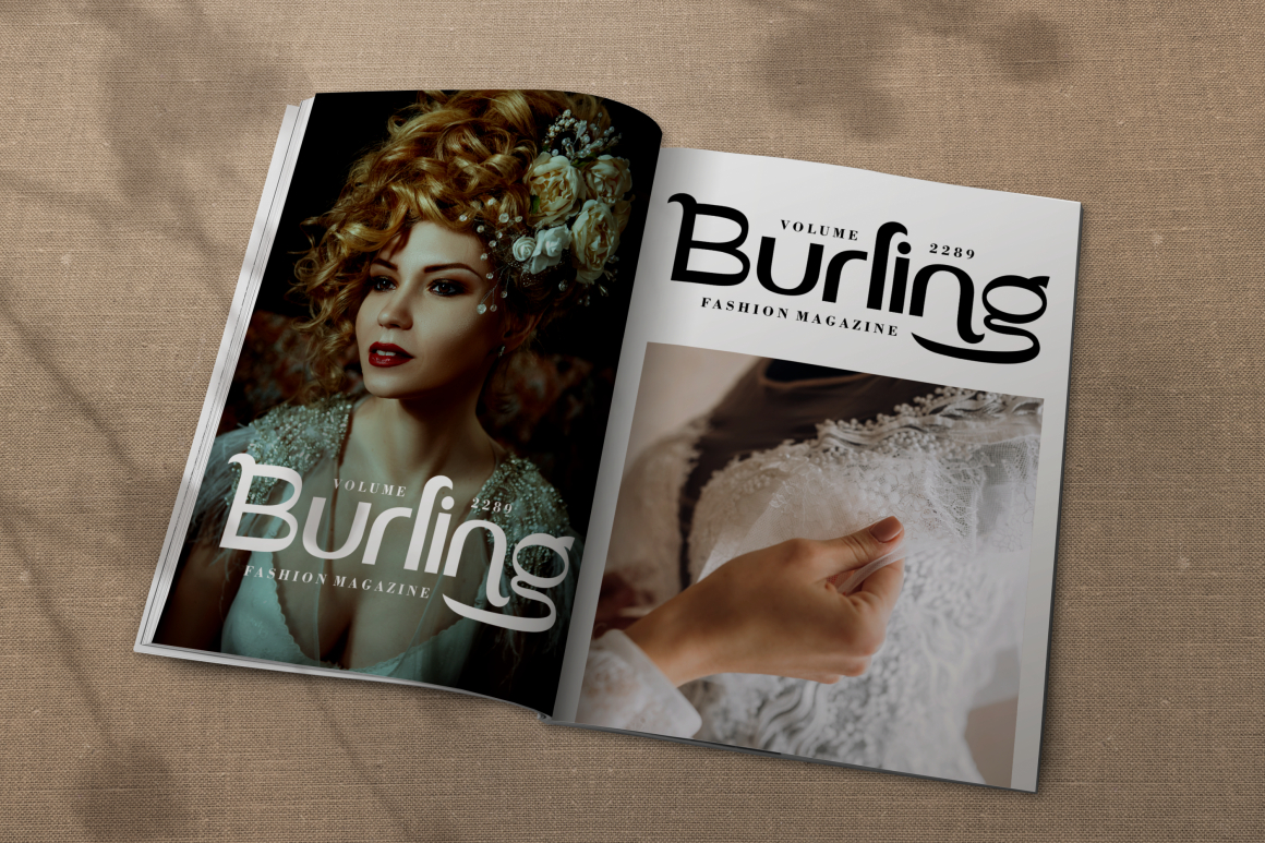
Typography plays a crucial role in bridging heritage and modernity. Serif fonts bring a sense of tradition, quality, and literature, tying back to a world of craftsmanship and detail. Modern editorial layouts bring clarity and DTC familiarity.
Suggested typefaces from Putracetol that reflect this direction include:
- Gilded Glint (Elegant serif)
- Vidage (Elegant serif typeface)
- Cozy Caps (Luxury duo font)
- Deco Frame (Art Deco inspired)
- Malow (Modern display for standout messaging)
These options are ideal for different components of the system, from hero headlines to product descriptions and packaging labels. The serif-driven structure respects the past while clean compositions keep it relevant for mobile-driven digital experiences.
Color Palette
The palette uses warm neutrals such as cream, taupe, soft grey, and muted brown. These tones evoke natural materials, handcrafted finishes, and the quiet intimacy associated with bedding and home environments.
The absence of overly bright colors is intentional. This is a category where serenity outperforms noise. Consumers shopping for mattresses seek reassurance, not adrenaline.
Logo and Mark System
The logo is minimalist and rooted in heritage. It is distinctive enough to be recognizable across small screens, packaging, and stitched labels applied to the product itself.
Secondary marks and micro assets support packaging and digital communication. These help create visual consistency across:
- Website hero sections
- Product detail pages
- Warranty documents
- Packaging inserts
- Social storytelling
- Customer onboarding material
Layout Style
Layouts are designed for legibility and ease. The structure avoids clutter and embraces negative space to mimic the feeling of breathing room. In a category linked to sleep and well-being, space is part of the brand message.
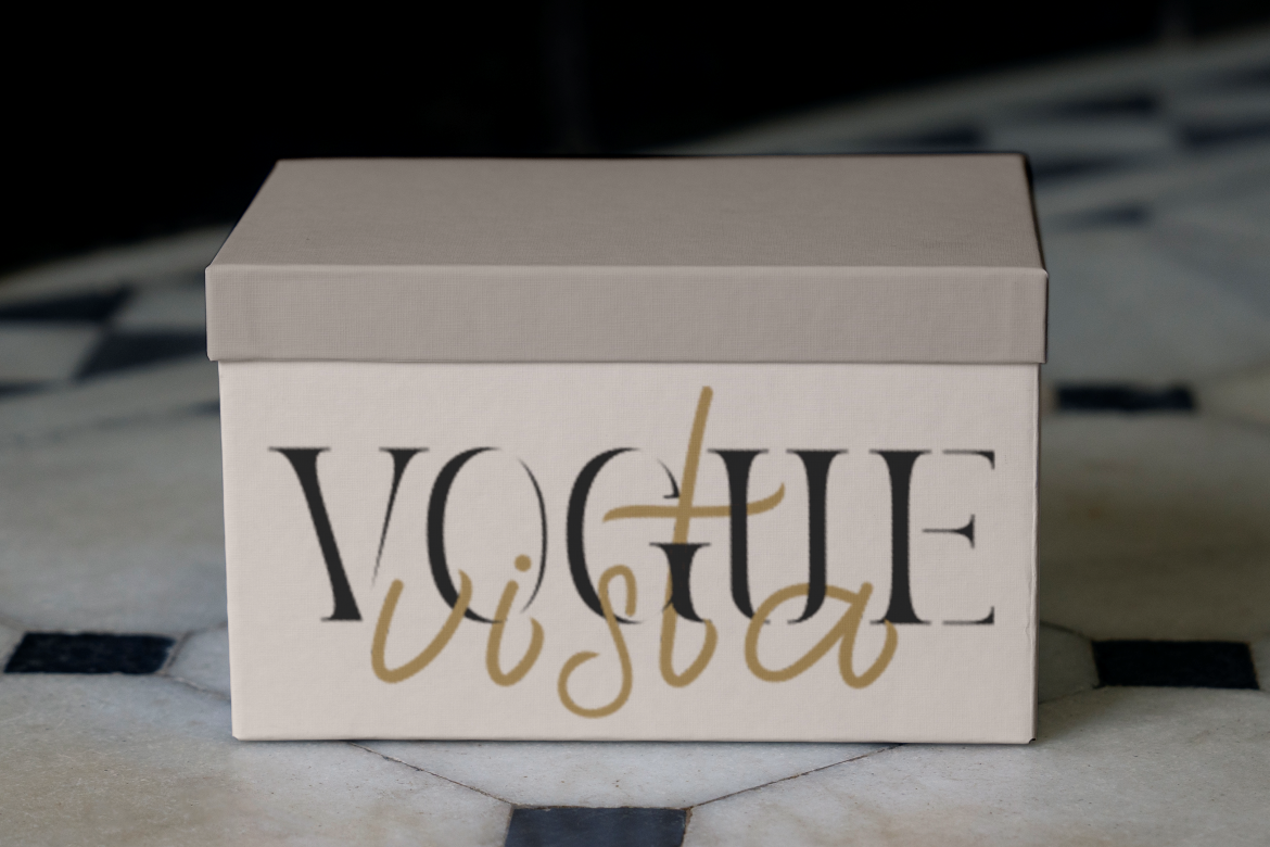
The Brand as a DTC Experience, Not Just a Product
Modern mattress brands are not just selling foam, springs, or fabrics. They are selling comfort, sleep quality, and peace of mind. This is where narrative becomes essential in DTC strategy.
The branding reinforces this narrative through three lenses:
- Heritage storytelling
Communicating quality, tradition, and the brand’s long legacy. - Lifestyle positioning
Showing how the brand fits into real homes, routines, and personal rituals. - User education
Teaching consumers how mattresses improve wellness, sleep cycles, and daily life.
This trifecta helps turn a product purchase into a brand experience that extends beyond checkout.
Packaging Design: Where Heritage Meets Practicality
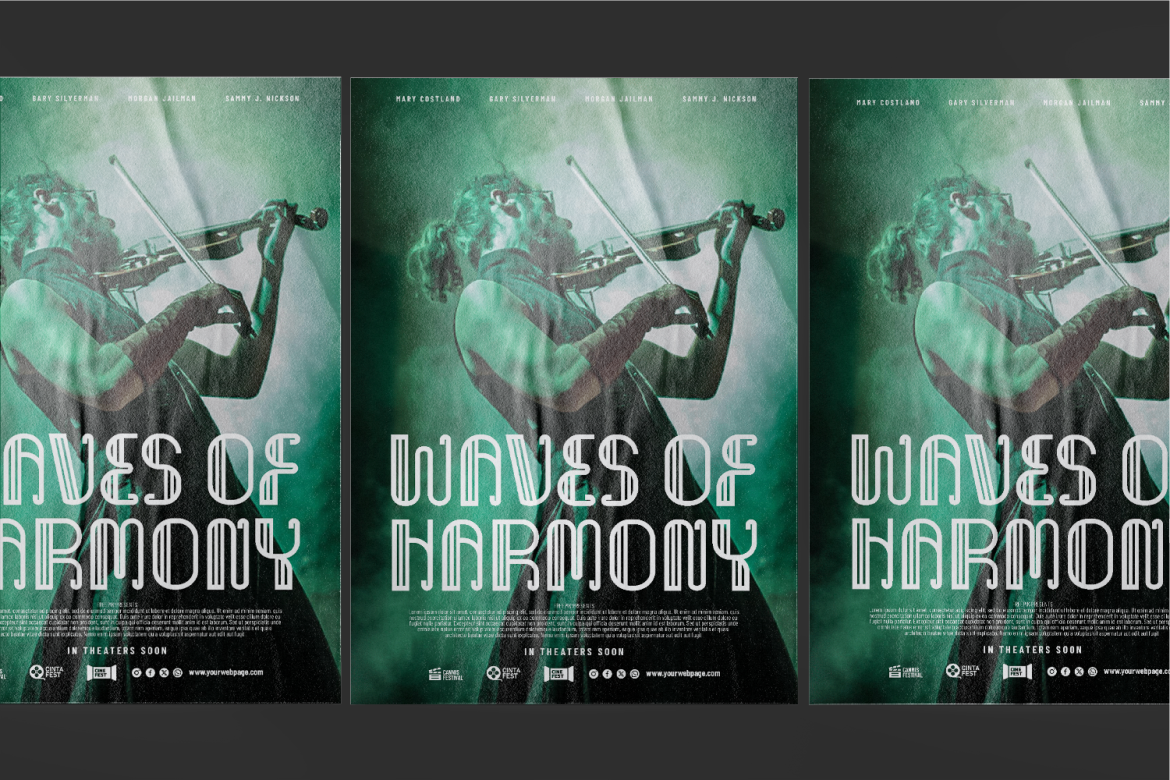
Unlike traditional retail packaging, DTC mattress packaging serves two primary functions: safe delivery and brand introduction.
The packaging uses:
- Clean typography
- Minimal layouts
- Warm neutrals
- Direct labeling for clarity
The unboxing moment is particularly important in DTC because it replaces the in-store trial. Packaging acts as the first physical interaction between brand and customer. It quietly communicates that quality goes beyond the mattress itself.
Discount cards, care instructions, and warranty inserts support the onboarding journey, reinforcing credibility and long-term trust after delivery.
Strategic Value: Why This Identity Works in the DTC Landscape
The branding supports both emotional value and commercial performance:
1. Builds Consumer Trust
Heritage communicates quality. Consumers pay more for brands with history because they assume expertise and durability.
2. Differentiates in a Saturated Market
The mattress category is crowded with white-label aesthetics. Heritage-driven visuals help the brand stand apart from generic DTC start-ups.
3. Supports Premium Positioning
Elegant typography and warm neutrals create premium perception without overcomplicating the system.
4. Strengthens Digital Storytelling
A consistent identity makes content more engaging across media such as:
- Instagram lifestyle shots
- TikTok education content
- YouTube reviews and sleep tips
- Website editorial sections
5. Enhances the Customer Experience
Design connects every customer touchpoint from browsing to sleeping. In DTC, consistency is revenue.
Branding as Sleep Culture and Lifestyle
One of the strongest modern trends in the mattress space is the shift toward wellness and lifestyle content. Sleep is no longer framed as a passive biological function; it is framed as self-care, productivity, and health optimization.
Branding leverages this cultural shift with:
- Sleep education blog articles
- User guides and sleep tips
- Lifestyle imagery of bedrooms and morning routines
This transforms the brand from a mere product seller to a wellness companion. When done well, lifestyle storytelling boosts loyalty and retention far beyond transactional acquisition.
Conclusion
The branding project successfully bridges past and present. By reviving heritage with thoughtful typography, warm colors, and functional packaging, the brand positions itself as a trustworthy DTC player in an increasingly competitive market. It is premium without being elitist, modern without discarding history, and lifestyle-driven without losing strategic clarity.
This approach demonstrates how design can support not only aesthetics and storytelling, but also credibility, differentiation, and customer experience within the DTC business model.
Thank you for taking the time to read this article. If you are looking for more great articles, feel free to visit Putracetol Blog
Additionally, if you want to explore some free typography options, you can check out Putracetol Studio on Dafont. Happy reading and designing!