
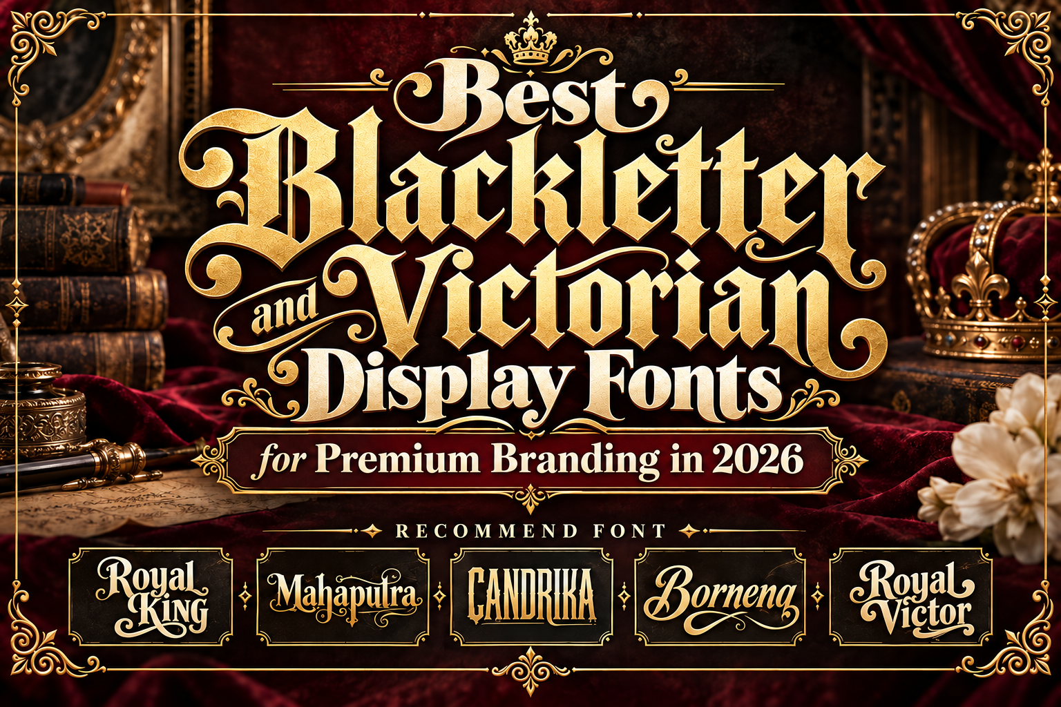
Best Victorian Blackletter Fonts for Branding 2026
Victorian and blackletter-inspired typography can give a brand something modern geometric fonts rarely provide: an immediate sense of history.
Ornamental terminals, dramatic curves, dense silhouettes, decorative alternates, and traditional lettering structures can make a logo feel established even when the business itself is new. This explains why heritage typography continues to appear across fashion, tattoo culture, coffee packaging, spirits, music, hospitality, and premium lifestyle branding.
The best Victorian blackletter fonts for branding 2026 balance historical personality with modern usability.
It is worth making one distinction before choosing. Victorian, vintage display, and blackletter are related visual territories, but they are not identical classifications. Some of the fonts below are explicitly Victorian, while others are decorative vintage faces that work beautifully inside a Victorian-inspired identity system.
Use Historical Character Selectively
Ornamental typography becomes more powerful when it is not used everywhere.
Start with the brand name, emblem, packaging title, or short campaign headline. Then support it with a cleaner serif or sans serif for ingredients, menus, descriptions, navigation, and other functional information.
For example, a craft coffee package could use elaborate lettering for “Royal Reserve” while keeping roast information and origin details simple.
Also test the typography in black and white. If the identity only works after adding gold gradients, shadows, borders, and vintage textures, the underlying lettering may not be strong enough.
Jump to Recommended Victorian and Heritage Fonts
1. Royal King

Royal King is an old vintage display typeface that combines a decorative version with a cleaner alternative. Its design is strongly associated with classic emblems, labels, badges, apparel, packaging, posters, and tattoo-inspired graphics, while alternate glyphs allow designers to introduce more ornamental personality into important letters.
For Victorian-inspired branding, its main advantage is flexibility. The decorative treatment can establish the historical mood, while the cleaner style prevents a complete identity from becoming visually overloaded.
PROS: Decorative and clean styles, alternate glyphs, strong emblem character, versatile heritage aesthetic.
BEST FOR: Whiskey-inspired packaging, barber brands, tattoo studios, labels, vintage apparel, emblems.
2. Mahaputra

Mahaputra approaches heritage typography from a more elegant and luxurious direction. PutraCetol describes it as a vintage display typeface combining classic, elegant, unique, and luxury characteristics, with alternate characters and multilingual support included in the family.
Its character makes it particularly suitable when a brand needs historical prestige without becoming aggressively gothic. It can support ornate wordmarks while still working naturally with sophisticated packaging and editorial layouts.
PROS: Elegant vintage personality, alternates, multilingual support, refined display presence.
BEST FOR: Luxury labels, heritage fashion, premium hospitality, editorial titles, classic product branding.
3. Candrika

Candrika takes inspiration directly from vintage package labels and old signboards. It includes both Solid and Decorative styles plus alternates and ligatures, giving designers the ability to move between stronger everyday display lettering and more embellished compositions.
Its strong, classic, dynamic construction makes it especially useful for brands that want Victorian-era packaging energy without relying on highly intricate blackletter forms. That makes Candrika one of the more practical options for commercial labels and signage.
PROS: Solid and decorative styles, ligatures, alternate characters, excellent label personality.
BEST FOR: Coffee, tea, barbershops, packaging, signage, tattoo branding, heritage food products.
4. Bornena

Bornena has a more decorative and flowing personality. Available previews classify it around fancy, decorative, curly, display, and unique styles, giving it a more artistic appearance than a strict historical blackletter. The typeface contains hundreds of characters in its available character set, making it useful for expressive short-form lettering.
Within a Victorian-inspired identity, Bornena works best when the brand wants elegance and ornament rather than the dense aggression normally associated with gothic typography.
PROS: Decorative curves, unusual silhouette, expressive lettering, distinctive artistic personality.
BEST FOR: Boutique identities, tattoo artwork, event titles, fashion graphics, decorative logos.
5. Royal Victor

Royal Victor is the strongest explicitly Victorian option in this selection. It is a bold display family with numerous alternative glyphs and ligatures, multilingual support, and ornamental styling designed for logos, headlines, packaging, posters, merchandise, and other display applications.
Its extensive alternate forms are especially useful for wordmarks because individual letters can be changed until the complete logo achieves a distinctive silhouette. Although it also carries retro influences, its ornamentation makes it an excellent bridge between Victorian display lettering and contemporary branding.
PROS: Many alternates, ligatures, ornamental character, strong bold silhouette.
BEST FOR: Victorian branding, event posters, fashion labels, music artwork, premium packaging, merchandise.
Comparison: Which Victorian Font Fits Your Brand?
| Font | Main Personality | Strongest Branding Direction |
|---|---|---|
| Royal King | Regal, ornamental | Emblems and heritage products |
| Mahaputra | Elegant, luxurious | Premium and classic branding |
| Candrika | Label-inspired, dynamic | Food, beverage, and signage |
| Bornena | Decorative, artistic | Fashion and alternative culture |
| Royal Victor | Bold, Victorian | Posters and statement identities |
For a distinctly Victorian visual direction, Royal Victor is the strongest starting point. Royal King works particularly well for regal emblems, Mahaputra provides more refined luxury, Candrika excels in old-label aesthetics, and Bornena introduces a more decorative artistic character.
Making Victorian Typography Feel Contemporary
Historical typography does not require an entirely historical layout.
Pair ornate lettering with generous whitespace, modern product photography, restrained color palettes, and clean supporting fonts. Black, cream, burgundy, dark green, and metallic accents can reinforce heritage character without making the project resemble a reproduction of an old poster.
These typefaces from PutraCetol Studio can also be extended across packaging, merchandise, campaign graphics, social visuals, signage, and editorial materials to create a consistent brand language.
Common Mistakes
A common mistake is assuming every ornamental vintage font is technically blackletter. Traditional blackletter has recognizable calligraphic structures and dense angular forms, while Victorian display typography covers a much broader range of ornamental lettering. Classifying a font accurately helps designers choose the right historical tone instead of forcing unrelated styles into the same category.
Another mistake is adding decoration to every element. Victorian letters, ornamental borders, distressed textures, antique illustrations, metallic effects, and elaborate backgrounds can quickly compete with one another. Allow one or two historical elements to dominate and keep the surrounding composition controlled.
Finally, avoid using highly decorative lettering for long paragraphs. These fonts work best in brand names, headlines, packaging titles, badges, and short statements. Supporting information should prioritize clarity.
Conclusion
The best Victorian blackletter fonts for branding 2026 can transform typography into a central part of the brand story.
Royal King delivers regal ornament, Mahaputra brings refined heritage luxury, Candrika captures vintage label character, Bornena adds decorative individuality, and Royal Victor provides the strongest Victorian statement.
The goal is not simply to make a brand look old. The strongest identities borrow historical character and combine it with modern composition, creating typography that feels authentic, memorable, and relevant.
Explore these fonts and many more at PutraCetol.com to build a business identity that looks professional, trustworthy, and memorable.
Additionally, if you want to explore some free typography options, you can check out Putracetol Studio on Dafont. Happy reading and designing!