
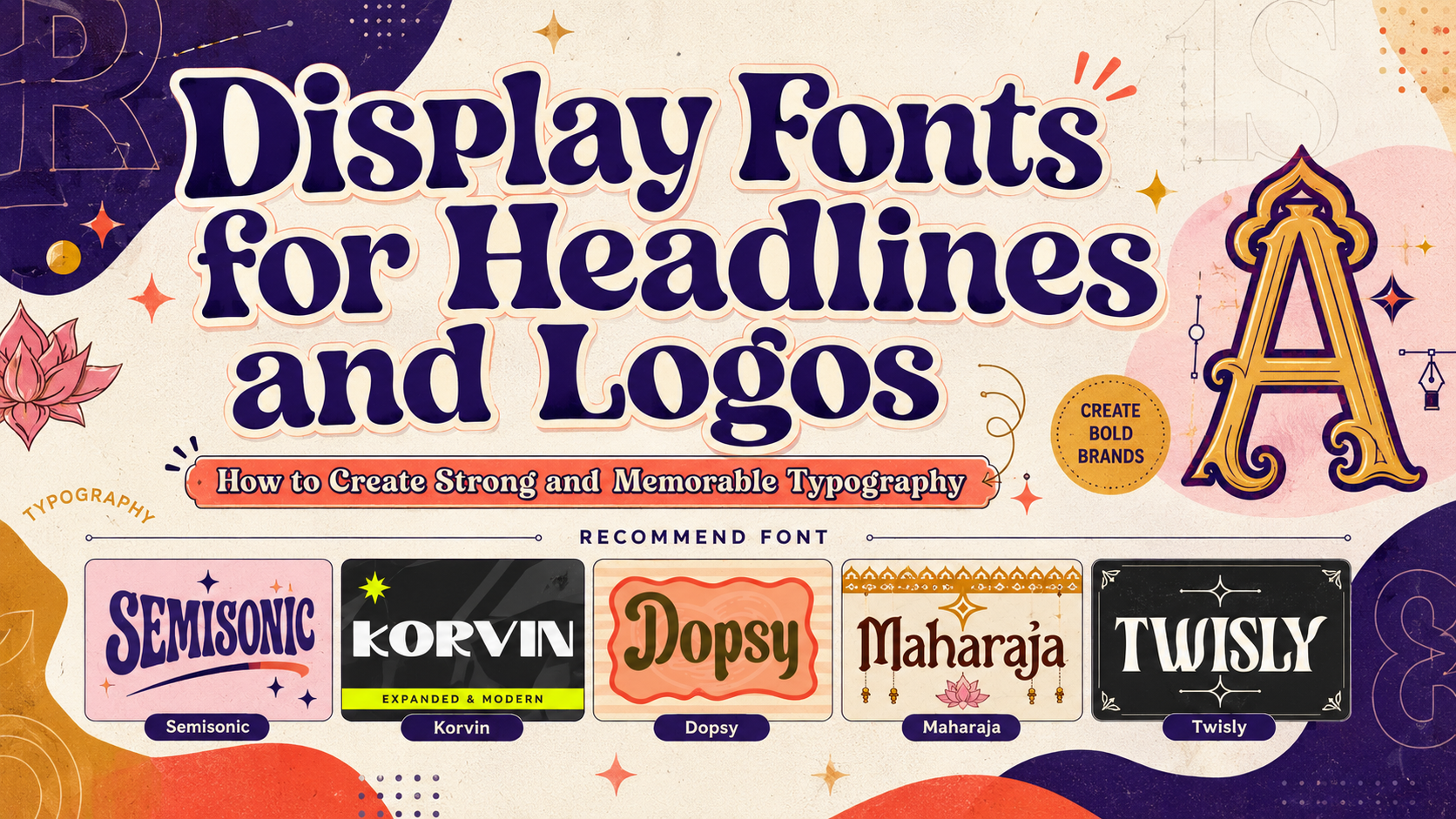
The most effective display fonts for headlines and logos are not expected to handle every line of text in a project. Their primary responsibility is to establish personality, attract attention, and give important words a recognizable visual shape.
Use a display font for the brand name, campaign headline, product title, poster hook, packaging focal point, or editorial cover. Then pair it with a quieter typeface for descriptions, navigation, prices, ingredients, instructions, captions, and long-form content.
This division creates a clear hierarchy:
- Display font: Recognition and emotional character
- Supporting font: Readability and practical information
- Optional accent style: Selected emphasis, alternate glyphs, or decorative treatment
Material Design separates typography into display, headline, title, body, and label roles. It also notes that display typography can use more expressive styles, while body and label text need to support repeated reading and functional communication.
The goal is not to make every piece of text visually dramatic. It is to reserve the strongest typographic voice for the moments that define the identity.
What Is a Display Font?
A display font is a typeface intended primarily for large, prominent text. It is designed to create impact in short phrases rather than disappear quietly across several paragraphs.
Display fonts commonly appear in:
- Logos and wordmarks
- Advertising headlines
- Posters
- Packaging
- Magazine covers
- Website hero sections
- Book and album covers
- Event identities
- Social media campaigns
- Film titles
- Signage
- Product collections
Their personalities may come from unusual proportions, high stroke contrast, expanded widths, decorative terminals, retro curves, cultural references, ligatures, or experimental letter construction.
A display font can be serif, sans serif, script, blackletter, retro, or culturally inspired. “Display” describes its intended role more than one fixed visual style.
Display Fonts vs. Text Fonts
The main difference is not simply size. Display and text fonts are optimized for different reading conditions.
| Feature | Display Font | Text Font |
|---|---|---|
| Primary purpose | Attention and identity | Sustained reading |
| Typical use | Logos, headlines, posters, and covers | Paragraphs, interfaces, and instructions |
| Personality | Strong and visually distinctive | Controlled and less distracting |
| Detail | May include unusual or decorative forms | Usually simpler and more consistent |
| Best copy length | Short words and phrases | Sentences and paragraphs |
| Spacing | Often customized for each composition | Designed for predictable reading rhythm |
| Small-size performance | May lose detail when reduced | Usually optimized for smaller sizes |
| Pairing role | Creates the visual focal point | Supports the wider communication system |
Display fonts often contain details that attract the eye, such as twisted serifs, extended forms, irregular curves, decorative ligatures, or culturally inspired shapes. Those same features can make long reading slower.
Text fonts generally prioritize open counters, consistent spacing, familiar letterforms, and comfortable rhythm. They may look less dramatic in a logo but perform better in product descriptions, articles, forms, and interfaces.
Why Display Fonts Work for Logos
They Turn a Name Into a Recognizable Shape
A logo often needs to be identified before every letter is consciously read. Distinctive typography can give the brand name a memorable outer silhouette.
Wide forms may communicate stability. Tall condensed letters can suggest fashion or elegance. Rounded characters feel more approachable, while high-contrast serifs can establish refinement.
A strong display font can reduce the need for a separate symbol because the wordmark itself carries enough personality.
They Communicate Brand Positioning
Typography creates expectations about the business.
A broad expanded sans serif can make a technology or automotive company feel confident and modern. A soft retro display font may suit a café or lifestyle product, while an experimental serif can support luxury fashion or cultural branding.
The right font should answer an emotional question:
How should people feel before they understand every detail of the brand?
Possible answers include:
- Confident
- Refined
- Energetic
- Nostalgic
- Innovative
- Artistic
- Welcoming
- Cultural
- Premium
- Rebellious
The design should support the real product and customer experience rather than applying personality as an unrelated surface.
They Offer Customization Opportunities
Display fonts often include alternates, ligatures, swashes, or distinctive letter combinations that help a designer refine a wordmark.
Use these features selectively.
One unusual capital or custom ligature may make the logo memorable. Applying an alternate to every possible letter can make the brand name feel decorative but difficult to recognize.
How to Test a Display Font for a Logo
Type the Real Brand Name
Do not approve a typeface from its specimen image alone.
Font previews usually feature words selected to show attractive combinations. Your business name may include repeated letters, difficult capitals, punctuation, or a very different length.
Test:
- Uppercase and lowercase
- Repeated letters
- Short and long arrangements
- Horizontal and stacked versions
- Initials or monograms
- Numbers where relevant
- One-color applications
The final name is more important than the sample alphabet.
Adjust Kerning Manually
Default spacing is only a starting point for a logo.
Look closely at combinations such as:
AVTALYWAROTT
Wide display fonts may create large empty gaps, while condensed or decorative forms may collide.
Manual kerning helps the wordmark feel intentionally drawn rather than simply typed.
Test the Silhouette
Convert the wordmark to solid black and view it from a distance.
Ask:
- Is the shape balanced?
- Is one letter unexpectedly dominant?
- Does the name remain recognizable?
- Are the first and final letters strong?
- Does the wordmark still work without color or texture?
A strong logo should not depend entirely on gradients, shadows, outlines, or mockup effects.
Prepare Responsive Versions
One detailed wordmark will not fit every placement.
Create:
- Primary horizontal logo
- Stacked version
- Compact wordmark
- Monogram or initial
- Monochrome version
- Simplified small-scale version
Decorative details that work on packaging may disappear in a profile icon, favicon, garment label, or mobile header.
How to Use Display Fonts in Headlines
Keep the Message Concise
Display typography needs enough room to show its character.
Compare:
How to Build an Effective and Memorable Visual Identity for Your New Business
with:
BUILD A BRAND PEOPLE REMEMBER
The second headline gives the font more space and creates a clearer reading hierarchy.
Move supporting details into a subtitle or body copy.
Control Line Breaks
Line breaks influence meaning and composition.
Consider:
DESIGN WITH
CONFIDENCE
versus:
DESIGN
WITH CONFIDENCE
The strongest arrangement depends on which word deserves emphasis and how the typeface fills the available space.
Do not allow software to make every line break automatically. Treat each line as a visual shape.
Use Scale Before Adding Decoration
A headline can become powerful through size, weight, and placement alone.
Before adding outlines, gradients, shadows, textures, or illustrations, test whether a larger scale and stronger contrast solve the problem.
One clear typographic statement often produces more impact than several competing effects.
Give Expressive Letters Enough Space
Display fonts with expanded forms, long terminals, twists, or decorative curves need room around them.
Use generous margins and avoid placing equally detailed imagery directly behind the text.
White space does not weaken a bold font. It gives the letterforms enough visual independence to become the focal point.
Choosing a Display Font by Brand Direction
Modern and Experimental
Choose a contemporary display font with unusual cuts, hybrid construction, or geometric distortion.
This direction works for:
- Creative studios
- Technology
- Digital culture
- Innovation campaigns
- Contemporary fashion
- Art events
The font should feel unusual without becoming impossible to recognize.
Expanded and Corporate
Wide sans serif typography creates a stable and commanding presence.
It can support:
- Technology companies
- Architecture
- Automotive brands
- Corporate campaigns
- Fitness
- Modern agencies
Expanded proportions use considerable horizontal space, so they work best with short names and concise headlines.
Soft Retro
Rounded display fonts communicate warmth and nostalgia.
They suit:
- Cafés
- Bakeries
- Desserts
- Lifestyle products
- Hospitality
- Handmade goods
- Retro advertising
Pair them with modern layouts and clean supporting typography so the identity feels inspired by the past rather than outdated.
Cultural Display Typography
Culturally inspired fonts can establish a strong geographical or thematic atmosphere.
Use them carefully for:
- Restaurants
- Festivals
- Tourism
- Film titles
- Cultural events
- Packaging
- Hospitality
A culturally inspired Latin display font should not automatically be treated as a complete native-script typeface. When a project contains actual local-language text, inspect the character map and pair the display font with an appropriate script-specific family.
Fashion and Experimental Serif
High-contrast serifs with unusual terminals or distorted curves create an editorial and premium personality.
They are especially effective for:
- Fashion
- Beauty
- Jewelry
- Luxury packaging
- Magazines
- Book covers
- Creative campaigns
Very thin details need careful testing in print, foil, embroidery, and small digital formats.
Pairing Display Fonts With Supporting Typography
Experimental Display + Neutral Sans Serif
This combination lets the headline feel distinctive while practical information remains clear.
Best for: Technology, creative studios, posters, and digital campaigns.
Expanded Sans + Humanist Sans Serif
A broad display face can lead the identity, while a more natural humanist font handles paragraphs and interfaces.
Best for: Corporate branding, architecture, fitness, and automotive projects.
Retro Display + Clean Grotesque
The nostalgic title creates warmth, while the grotesque prevents the wider system from appearing old-fashioned.
Best for: Food, cafés, packaging, and lifestyle brands.
Cultural Display + Script-Specific Typeface
Use the culturally inspired display font for short Latin-script titles and a verified native-script family for translated content.
Best for: International packaging, hospitality, tourism, and cultural events.
Experimental Serif + Minimal Sans Serif
The serif provides editorial sophistication, while the sans serif keeps product details and navigation restrained.
Best for: Fashion, beauty, luxury, publishing, and boutique brands.
Display Fonts in Digital Interfaces
Display fonts can give a digital product or website a memorable personality, but their role should remain focused.
Use them for:
- Homepage hero headings
- Branded onboarding moments
- Campaign landing pages
- Report covers
- Editorial section titles
- Product-launch banners
- Empty-state illustrations
Avoid using highly decorative display typography for:
- Form labels
- Buttons
- Error messages
- Tables
- Navigation
- Account information
- Long explanations
- Small chart labels
For accessible digital text, WCAG 2.2 specifies a minimum contrast ratio of 4.5:1 for standard text and 3:1 for qualifying large text. W3C also warns that thin or unusual fonts can render more faintly than expected, so stronger weight or contrast may be needed in practice.
When the visual presentation can be achieved through web typography, W3C recommends using live text instead of images of text so users can adjust font size, color, spacing, and other presentation settings. Logos and essential representations of a typeface are recognized exceptions, but functional page content should usually remain live and adaptable.
Display Fonts in Packaging
Packaging must combine recognition with practical communication.
Use the display font for:
- Brand name
- Product line
- Flavor
- Collection title
- Limited edition
- Short campaign message
Use a simpler supporting font for:
- Ingredients
- Weight
- Instructions
- Warnings
- Contact details
- Legal information
Test the design on the actual packaging size and material.
Thin strokes may disappear on textured paper. Tight counters can fill during printing. Wide letterforms may not fit narrow labels, while highly decorative terminals can be difficult to reproduce through foil stamping or embossing.
Display Fonts in Posters and Advertising
Posters give display typography room to become the central visual.
A clear poster hierarchy might use:
Primary: Event, product, or campaign name
Secondary: Short explanation or supporting phrase
Functional: Date, location, price, website, and CTA
Use the expressive font for the primary level. Keep functional information easy to locate.
For social advertisements and mobile graphics, test the design at thumbnail size. A headline that works on a printed poster may become too complex when reduced inside a feed.
A Practical Display Font Selection Workflow
Step 1: Define the Brand Personality
Choose three qualities the font should communicate.
For example:
- Modern, experimental, and intelligent
- Wide, stable, and confident
- Warm, nostalgic, and friendly
- Cultural, artistic, and expressive
- Elegant, fashionable, and distinctive
Step 2: Identify the Primary Application
Decide whether the font will lead:
- A logo
- Headline system
- Packaging
- Posters
- Website hero
- Editorial covers
- Social campaigns
A font suited to a one-word logo may not work equally well for long headlines.
Step 3: Test Real Words
Use the actual brand name, product titles, campaign language, dates, and numerals.
Step 4: Compare Standard and Alternate Characters
Begin with the standard glyphs. Introduce alternates only where they improve rhythm, distinction, or difficult spacing.
Step 5: Test in Monochrome
The typography should remain effective without color and effects.
Step 6: Test at the Smallest Size
Reduce the logo or headline to the smallest expected digital or printed use.
Step 7: Select the Supporting Font
Choose a companion that protects readability and creates intentional contrast.
Step 8: Confirm Production and Licensing
Check the intended uses before release. Finished static artwork, live webfont embedding, registered logo or trademark use, digital advertising, applications, and customer-editable platforms can require different coverage. PutraCetol’s current selector separates these categories so buyers can match the license to the actual production environment.
Jump to Recommended Fonts
Semisonic Modern Display Font | Korvin Expanded Display Sans Font | Dopsy Retro Display Font | Maharaja Hindi Display Font | Twisly Twisted Serif Font
1. Semisonic Modern Display Font
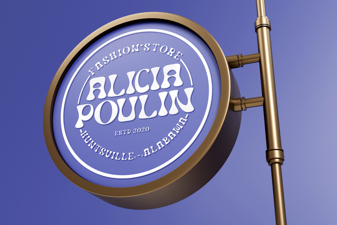
Semisonic combines a modern sans serif foundation with decorative, unconventional character details. Its unusual shapes give logos and headlines an experimental personality without locking the design into one narrow industry, making it useful across branding, invitations, packaging, posters, magazines, and campaign graphics. It is a strong option when a project needs contemporary individuality rather than neutral geometric typography.
PROS: Modern sans serif foundation, unusual decorative forms, versatile creative direction, memorable silhouette, and strong branding potential.
BEST FOR: Creative studios, modern logos, event graphics, packaging, editorial headlines, posters, invitations, and contemporary campaigns.
2. Korvin Expanded Display Sans Font
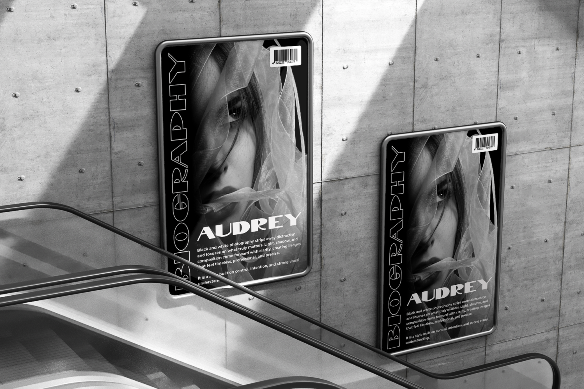
Korvin uses wide proportions, bold weight, clean strokes, and open spacing to create a broad, stable, and commanding appearance. Smooth curves balance its geometric edges, while selected sliced cuts and angled terminals introduce modern movement without weakening the professional structure. Its expanded silhouette is especially effective for short brand names and headlines that need corporate confidence with a futuristic edge.
PROS: Expanded proportions, bold visibility, open spacing, geometric precision, modern cuts, and strong corporate authority.
BEST FOR: Technology, architecture, automotive branding, agencies, startups, fitness, photography studios, magazine covers, and promotional campaigns.
3. Dopsy Retro Display Font

Dopsy features bold rounded letterforms, thick consistent strokes, smooth curves, compact spacing, and a soft vintage character. Its slightly condensed proportions help headlines remain visually tight, while rounded terminals and wide counters create a friendly, approachable mood. The result combines nostalgic signage influence with enough modern clarity for contemporary packaging, logos, and promotional design.
PROS: Bold rounded forms, warm retro personality, wide counters, compact proportions, friendly readability, and strong shelf appeal.
BEST FOR: Cafés, bakeries, desserts, food packaging, menus, storefronts, greeting cards, stickers, book covers, and cozy lifestyle branding.
4. Maharaja Hindi Display Font

Maharaja uses tall, slender proportions, flowing curves, and gently ornamental terminals inspired by Hindi calligraphic forms and South Asian visual culture. The combination of traditional influence and controlled modern structure gives large titles an elegant cultural rhythm while keeping the overall composition stable. It can bring immediate thematic character to branding and promotional work, although actual Hindi-language projects should always verify character coverage and use appropriate native-script typography where required.
PROS: Tall elegant structure, flowing curves, South Asian-inspired personality, artistic terminals, cultural atmosphere, and strong large-format presence.
BEST FOR: Indian-inspired hospitality, food packaging, cultural festivals, invitations, film titles, travel campaigns, editorial covers, and event branding.
5. Twisly Twisted Serif Font
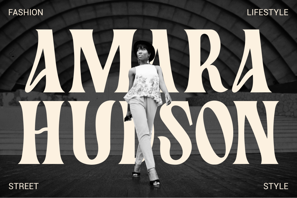
Twisly combines a high-contrast serif structure with tall, slightly condensed proportions and distinctive curved distortions. Twisted terminals and unconventional bends add experimental character, while the underlying classical construction preserves sophistication and editorial authority. This makes it particularly effective for premium identities that need elegance without looking predictable or traditionally conservative.
PROS: High stroke contrast, twisted serif details, tall proportions, premium mood, editorial rhythm, and memorable experimental character.
BEST FOR: Fashion, beauty, luxury packaging, magazines, creative studios, book covers, boutique branding, advertising, and cultural projects.
Comparison
| Font | Main Visual Direction | Strongest Role | Ideal Brand Categories | Recommended Companion | Use With Care |
| Semisonic | Modern and experimental | Unique logos and creative headlines | Studios, events, editorial, and contemporary products | Neutral modern sans serif | Unusual shapes need generous size |
| Korvin | Expanded and geometric | Commanding corporate wordmarks | Technology, automotive, architecture, and fitness | Humanist or compact sans serif | Wide forms require horizontal space |
| Dopsy | Rounded and retro | Friendly packaging and nostalgic branding | Food, cafés, desserts, and lifestyle | Clean grotesque or simple serif | Compact spacing may need adjustment at small sizes |
| Maharaja | Tall and culturally inspired | Thematic titles and cultural branding | Hospitality, festivals, food, travel, and entertainment | Neutral sans serif plus verified native-script font | Do not assume visual style equals language support |
| Twisly | Elegant and experimental serif | Fashion logos and editorial headlines | Beauty, luxury, publishing, and culture | Minimal sans serif | Thin strokes and twists need production testing |
Best for Experimental Modern Branding
Semisonic offers the most flexible contemporary direction for creative businesses that want unusual letterforms without entering a highly specific genre.
Best for Wide Corporate Impact
Korvin creates the strongest horizontal presence for technology, automotive, architecture, and modern business identities.
Best for Warm Retro Packaging
Dopsy brings softness, nostalgia, and friendly visibility to food, hospitality, and lifestyle projects.
Best for Culturally Inspired Display Work
Maharaja provides a tall and ornamental South Asian-inspired direction for events, hospitality, packaging, and entertainment.
Best for Fashion and Editorial Luxury
Twisly combines classical serif authority with enough distortion to make premium branding feel contemporary and artistic.
Common Mistakes
The first mistake is using a display font as if it were a complete text family. A typeface that looks excellent in a logo may become tiring in paragraphs, navigation, form labels, or product instructions. Decorative details, expanded proportions, high contrast, and unusual terminals require more attention from the reader. Give the display font responsibility for recognition and hierarchy, then pair it with a quieter family for functional communication.
Another mistake is selecting typography from a promotional specimen without testing the real words. A carefully chosen sample may hide awkward combinations, narrow counters, difficult punctuation, or weak numerals. Type the actual brand name, campaign headline, product variant, and multilingual copy before approving the font. Adjust kerning manually, compare standard and alternate glyphs, test the design in monochrome, and review it at the smallest required size.
The final mistake is confusing visual distinction with strategic fit. An experimental font may attract attention but communicate the wrong industry, price level, or cultural context. A Hindi-inspired display style should not be used as a substitute for proper Devanagari typography, just as a retro food font may weaken the credibility of a serious technology platform. Match the font to the audience and brand promise, then confirm that the license covers the intended logo, webfont, advertising, packaging, application, or commercial distribution.
Conclusion
The best display fonts for headlines and logos create recognition without taking over every part of the communication system.
They are designed for important moments: the brand name, campaign hook, packaging title, editorial cover, poster headline, or website hero. Their unusual shapes, proportions, curves, and decorative details help audiences understand the personality of a project before reading the complete message.
Semisonic offers contemporary experimentation. Korvin creates wide geometric authority, while Dopsy brings friendly retro warmth. Maharaja adds a culturally inspired, ornamental rhythm, and Twisly combines luxury serif structure with modern distortion.
Fonts from PutraCetol Studio give designers several distinct approaches rather than one repetitive display aesthetic.
Choose the font according to the brand’s emotional direction, test the actual words, control the spacing, prepare responsive versions, and pair the expressive typeface with a functional companion.
A successful display font does not need to make every line louder.
It needs to make the most important words impossible to forget.
Explore these fonts and many more at PutraCetol.com to build a business identity that looks professional, trustworthy, and memorable.
Additionally, if you want to explore some free typography options, you can check out Putracetol Studio on Dafont. Happy reading and designing!