
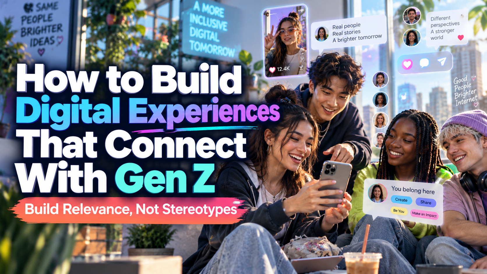
Digital Experiences for Gen Z 2026: Build Relevance, Not Stereotypes
Research the Community, Not Just the Generation
Start with the people your product serves. Interview potential users about their goals, budgets, devices, language preferences, and frustrations before designing.
Gen Z is not one audience with one taste. Pew Research Center cautions that generational categories contain substantial differences in experience and behavior.
Define a group, such as student illustrators seeking affordable tools. Design around their actual tasks rather than defaulting to neon graphics, memes, or gamification.
What Current Research Suggests
Deloitte’s 2026 Digital Media Trends report surveyed 3,575 US consumers in late 2025. Among self-identified Gen Z fans, 73% said social media was their primary way of discovering new entertainment content. This describes entertainment fans, not every Gen Z purchase or learning journey.
Test continuity between discovery and destination. A creator’s recommendation should lead to the relevant product, episode, or event, not a generic homepage.
Practical Design Priorities
Make Mobile Tasks Easy
Design the complete journey on a phone: discovery, comparison, registration, payment, and support. Keep important information visible, minimize unnecessary fields, and test slower connections.
WCAG 2.2 AA generally requires pointer targets of at least 24 by 24 CSS pixels, with spacing and other exceptions. Prefer larger controls when space allows.
Avoid covering the screen with overlapping banners, chat invitations, and floating buttons.
Personalize With Permission and Control
Ask users which topics, styles, or goals interest them. Explain recommendations and provide options to change preferences, dismiss suggestions, or browse without personalization.
W3C’s Privacy Principles recommend limiting data use to what supports users’ goals and providing meaningful control.
Use AI for useful tasks such as finding relevant resources or comparing options. Label automated assistance and preserve a route to human support. Do not infer sensitive traits simply to make recommendations feel personal.
Make Authenticity Verifiable
Show how the product works, who created it, and what customers actually receive. Present realistic demonstrations, identify paid collaborations, and explain limitations alongside benefits.
For a hypothetical sustainable-fashion brand, replace a vague “planet-friendly” slogan with specific material information and care instructions. Make pricing, delivery, and returns easy to locate. Treat authenticity as accountable communication, not a deliberately rough photographic style.
Build Participation, Not Engagement Pressure
Offer useful ways to contribute: product feedback, creator showcases, collaborative challenges, or moderated question sessions. Credit contributors and obtain permission before republishing their work.
Provide clear community rules, reporting, and blocking. Let users control notifications and leave activities without punishment. When younger users are involved, design age-appropriate privacy and safety settings without treating participation as permission for more data collection.
Make Inclusion Functional
Include people with disabilities in research and test keyboard navigation, captions, readable forms, and alternative text. W3C’s design guidance emphasizes clear navigation, identifiable controls, and alternatives for visual and media content.
For digital text, WCAG AA generally requires 4.5:1 contrast for ordinary text and 3:1 for qualifying large text, with defined exceptions.
Offer room for different languages, names, and identities without forcing unnecessary personal disclosure.
Give the Brand a Recognizable Voice
Choose typography and imagery according to the community, not a supposed universal Gen Z style. PutraCetol Studio offers bold display, retro, and handwritten directions for distinctive campaign design.
Use expressive lettering for titles and branded moments, then a readable companion for navigation, captions, prices, and instructions. Repeat those roles across social content, landing pages, and the product interface.
Test Value Before Scaling
Prototype one journey and invite representative users to complete it. Observe task success, errors, and confusion before visual preference.
Track activation, repeat use, satisfaction, and relevant purchases alongside engagement. Compare devices and acquisition channels. Do not optimize session duration without checking whether people accomplished something useful.
Comparison
| Design Choice | Trend-Driven Approach | Audience-Led Alternative |
|---|---|---|
| Visual identity | Copy popular aesthetics | Build recognizable brand rules |
| Personalization | Hidden tracking | Clear preferences and controls |
| Interactivity | Features for extra clicks | Tools that solve real tasks |
| Community | Follower counts | Supported, meaningful participation |
| Success | Time spent alone | Task completion and satisfaction |
Common Mistakes
The first mistake is confusing youth appeal with forced slang. Test your language with the intended community and keep product explanations direct. Leave space for both quick summaries and detailed information rather than assuming everyone prefers the shortest possible content.
Another mistake is promising inclusion while ignoring everyday barriers. Review affordability, accessibility, language, and device limitations together. Avoid prioritizing impressive animation over working forms or helpful support.
The final mistake is measuring popularity instead of trust. Investigate complaints, unwanted notifications, abandonment, and repeat-use quality. Make customer feedback part of ongoing design decisions rather than a launch-only exercise.
Conclusion
Effective digital experiences for Gen Z in 2026 begin with understanding specific communities. Combine mobile usability, transparent personalization, meaningful participation, and accessible design.
Use PutraCetol Studio typography to strengthen brand recognition while keeping essential interactions clear. The goal is not to look younger. It is to create an experience people choose because it respects their needs, time, and individuality.
Explore these fonts and many more at PutraCetol.com to build a business identity that looks professional, trustworthy, and memorable.
Additionally, if you want to explore some free typography options, you can check out Putracetol Studio on Dafont. Happy reading and designing!